Looking for suggestions on what to add to the scene… the current list:
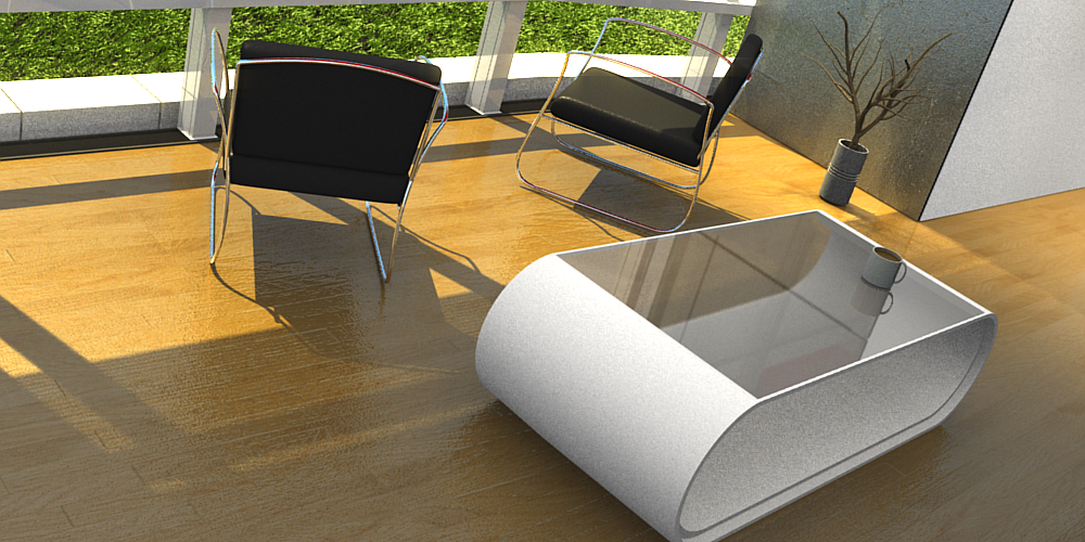
Coffee Table
Coffee Cup
Newspaper
Book
A bed or some kind of bar\dining table down the hall.
Staircase
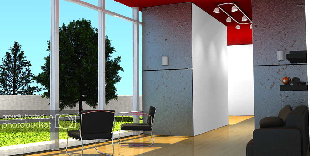
Pathway Outside
Some kind of water feature outside
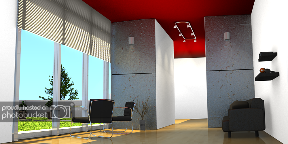
Blinds
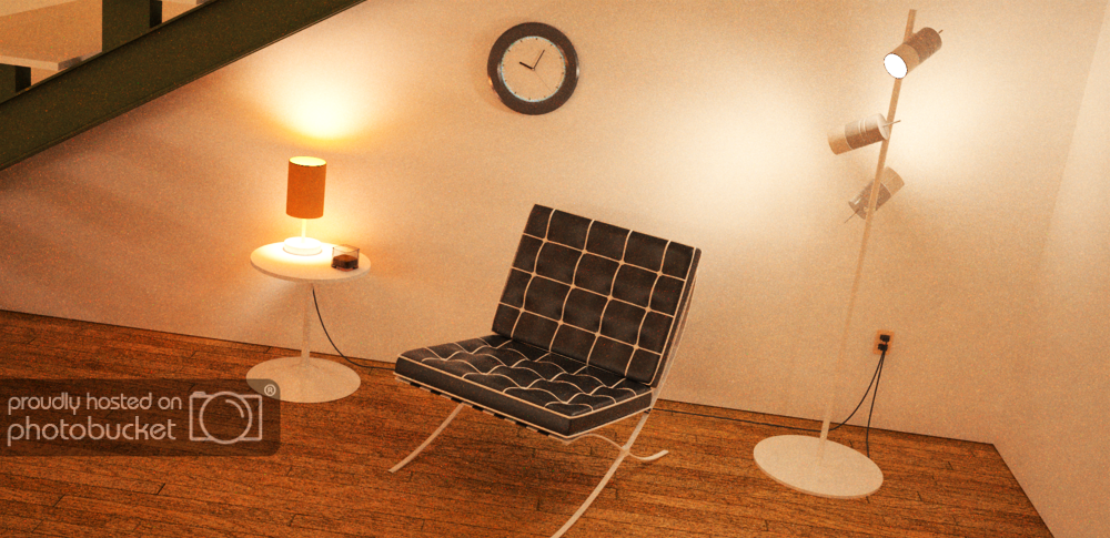
Yeah those are headphones… they are from another one of my projects a few months ago… there is also an ipod behind those headphones, but you cant see it from this angle, obviously…
Ill render the scene from another angle soon.
And yes, im going to put something in the hallway, im just still trying to figure out what.
Perhaps a book case, but that would require a LOT Of texturing…
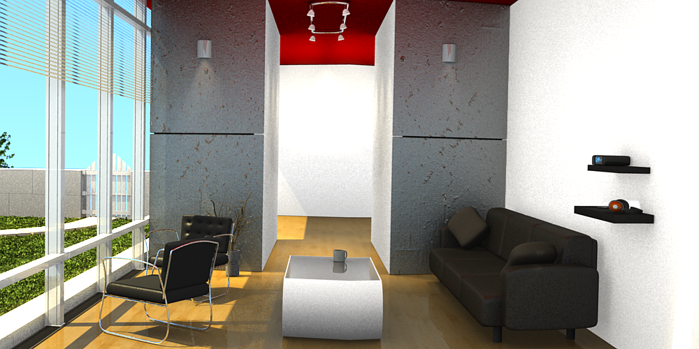
The interior is great.
But the grass is far too bright and saturated and the trees are far too dark.
So to sum up, I think improving your exterior will lift up the realism of the ‘whole’ image.
Very good work. I think it would be a good idea to model the whole house full of objects. That way you can render many different angles from different rooms.
i would try rendering it with AO, also walls usually have a crown molding, and a floor board. This would help the walls to look like they’re not just disappearing into the floor/ceiling. Also, i think that cement wall needs work, either make it a wood fence, or put a hedge or something out there. Judging by the interior, the house probably isn’t sitting in the middle of a jail.
good work though on the modelling. And indoor ligting, the floor looks great.
really? well maybe you need to change the number of samples cuz i can’t tell. The Ceiling and walls looks to ‘flush’ to me AO would usually put some shadows in the cracks.
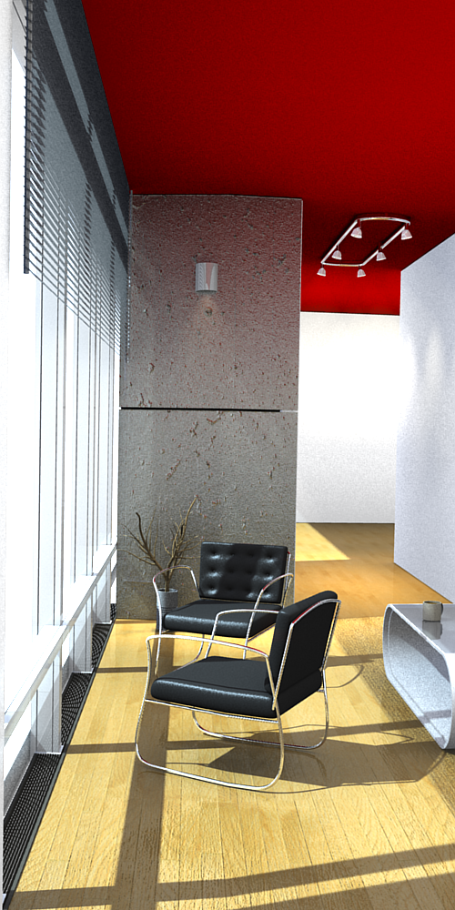
I’m liking the update, Godzilla123. Definitely like the render from another angle, as well as the new plant and blinds.
A couple more crits/comments.
The grass does seem very saturated/bright. I know someone already mentioned this, but I think it’s worth mentioning again.
Something about the little clock is bothering me, I think it’s the fact that the numbers are pretty large, but they’re blurry. The digital clock in the room I’m in now is smaller, yet I can see it fine.
You’ve done a great job, and it’s great to see you working to improve your image.
I’m liking the update, Godzilla123, I think the grass looks much better, and the addition of the coffee table/cup. My only comment at this point, other than the things that have already been mentioned is that the coffee cup’s proportions seem a bit off, or at least, not normal.
I’m not sure if this is what you’re looking for but: Edit mode -> Hit the ‘C’ key.
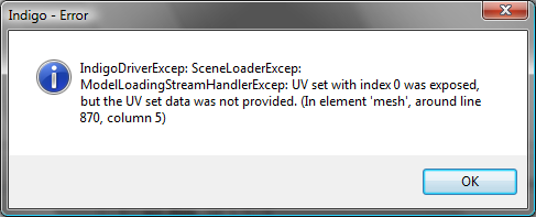
And I don’t know much about indigo, so I can’t help you with that last issue.
About the uv problem, try making sure that in the indigo exporter under the materials tab in the UV set: box that it says something around the lines of UVTex, it is most likely that the uv map didn’t get assigned in the indigo exporter. If that doesn’t work, try and unwrap the object again and re-assigning the texture, and hit the convert button in the materials tab of indigo. Have you been able to pinpoint which object is giving the problem? If it is a non-textured one, you may have assigned a texture without a UV map.
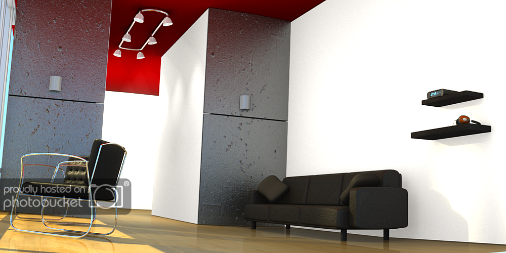
Its looking good so far, just a few things. The concrete pillars have a rather strong bumpmap to them, maybe scale down the texture size and reduce the bump map. Have you tried the Oren-Nayar material? The room seems a bit cramped. The floor is a bit glossy and shows that the wood texture is a bit low res? maybe it just looks that way. The pillow on the left side of the sofa looks oddly propped. In the second picture of your last post the table looks a bit bent. The wall behind the sofa looks bare.
Other than that the scene is coming along nicely :).
Oh btw, which version of indigo are you using?