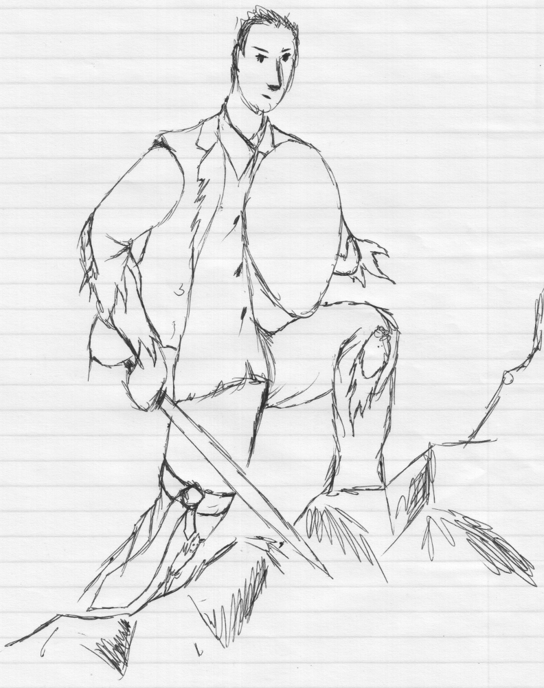
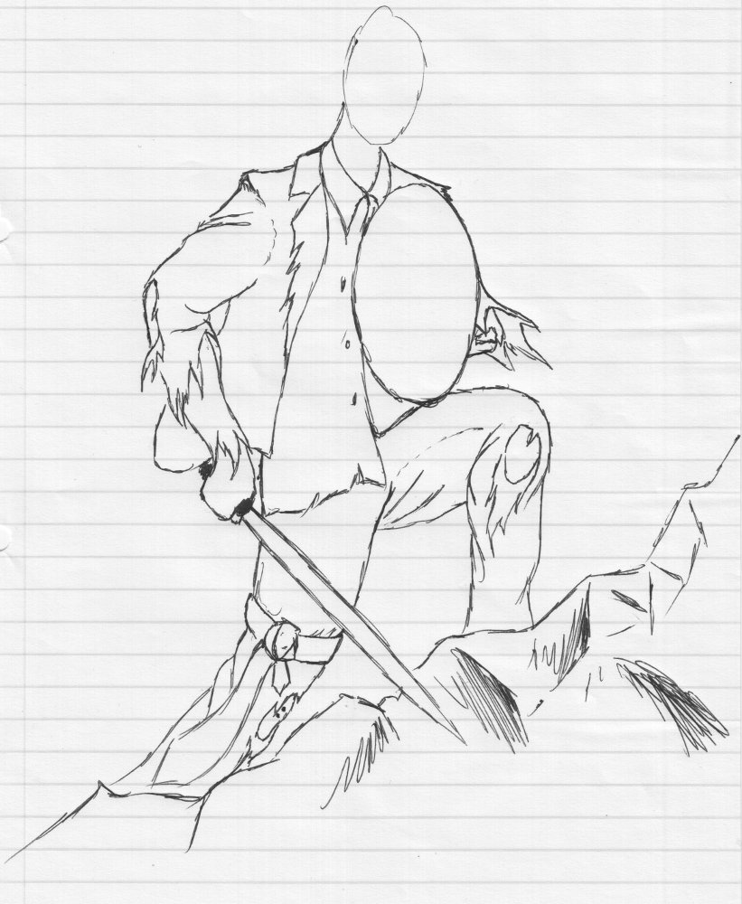
For Christmas I wanted to do images for my brother and his fiance. While she never told me what she’d like, my brother said he wanted to be portrayed as some sort of business warrior (he’s been given promotions on a regular basis lately).
So anyway, as much as I’m not crazy about the idea, it is his request. This was a blank figure sketch to just work on pose (yes, the wrist is bent too far back)
I redid the above, without the face, because that is not the focus of the sketch, to add more detail to the tears. I think it looks cool, but there’s more to be done on the shield and the sword:
I’ve started doodling on sword designs, but I really should go look on Google or museum websites at some intricate designs. But I’ll add 'em on the next post.
PS, this will be my second human figure, but I believe this one will work out a lot better.
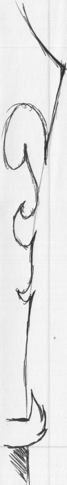
This one I like, because it’s simple, having an eagle claw-like handle (I know it doesn’t resemble a claw properly, but that’s why it’s a doodle, not a final).
This one is my pick of the three already done, but the pattern needs thinning and revising, because right now, it means the blade will be non-existent in the middle, lol. Still wanna check out references for more intricate designs for both handles and blades.
Then to do the shield. Maybe something viking-ish, LOL!!!
Thank you! I’ve done generic anime style drawings for years (mostly faces and hair), but the same principle applies to cloth, just more wavy (can you believe the spell checker recognizes it as an actual word, LOL)
Nope. I have considered it and I have downloaded it before, but removed it.
This one is gonna be modeled using a cube or plane (^^,) (like I model everything else), only in this case I need to take pics of my brother (side, front, back and top), but no clue if he’s gonna be home tonight. I wanna use them as proportion references. The face’ll have to be different (don’t know how his bosses will react to a warrior image, lol)
So, I’m gonna get started on the rest first, like the landscape, some cloth tests (I’ve got a previous human figure that I may test those on) and possibly even the lighting and materials. Come to think of it, it’d look great as a landscape image too, so this could end up being a 2-in-1.
awesome i cant wait to see some 3D work ive been doing anime and manga for a while too, there’s something about the eyes that i just love lol, my girlfriend wasnt too impressed though when i done a naked anime version of her… everyone else on facebook loved it though!
i really like mh, for getting a basic structure of a human down it saves so much time, although can be a pain when imported into blender with broken rigs and missing textures lol.
Yeah, I wouldn’t be impressed either tbh.
The eyes are very cool, but there are a huge variety of ways to draw them too.
It can save time.
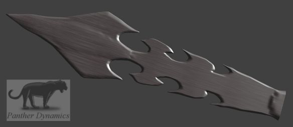
Here is the third sword’s blade modeled. Not very happy with the bottom of the blade (too boxy) and where the blade is the thinnest (in width, not thickness), there’s a small weird looking bump. There shouldn’t be a bump, since it’s flat, but I’ll have to double check that. The texture I do like. It’s a stretched hard cloud texture to create that metallic stretch look.
Thanx!
Didn’t even think of adding scratches to give a used look. I would like an engraving or inscription on the blade (just to break the flatness or to make on purpose). Maybe some shameless marketing, LOL.
So, I split the sword in two sections (I remember seing it on some game cover), where the sharp edge is a seperate, lighter material from the majority flat area. I fixed the bumps and made the part at the handle a sharp point, instead of that blocky thing that was there (though I still want to fix it more, but have to resist not fixing it so much it’s ruined, haha).
After, I added some deep chips (that could come from other similar swords stricking it) and some crackle lines (to show some age) and another crackle lines texture with a much higher level of detail for more scratches.
Already made a render, but we have a bit of thunder going here, so I’ll try to post it tomorrow sometime.
Next: The blade’s edge’s chips, scratches and small cracks.
no worries
haha, cant beat shameless marketing… theres always ‘bizla’ in my scenes somewhere whether its a brand of clothing, make of a TV or the number plate on a car lol
Haha, I remember the TV one from the show room. Somehow our alphabet has never looked as cool as the Chinese or Japanese alphabets do weapons, so I think I will use the panther, but in a pattern or something. Something that can look philosophical, I don’t know, lol.
Anyway, the thunder went away almost immediately after the last post, so I wanted to make sure I post the sword’s progress early:
I do think it looks a lot better than the first one, especially near the handle, but it’s not shiny or metallic enough, so I still need to play around with those. It looks almost like carved slate. So I plan to shallow the longer cracks and sharpen them and shrink the main chips and dents, because I don’t think a sword would have that size of dents (I do know that they are covered in small ones).
But I kinda like this one as a museum piece: swords of rock exhibit, LOL.
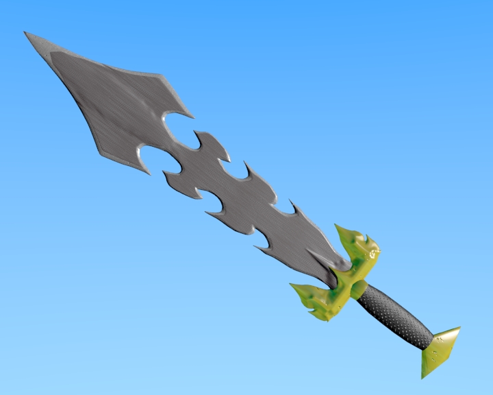
Yey! A sword! I like how it finally came out. It looks very video game-ish, but I like it and it’s about it’s shape, not it’s detailing (it’s gonna be fairly shaded in the final, because I want it to be sunset).
Next up: the scenery (still don’t have photos, lol).
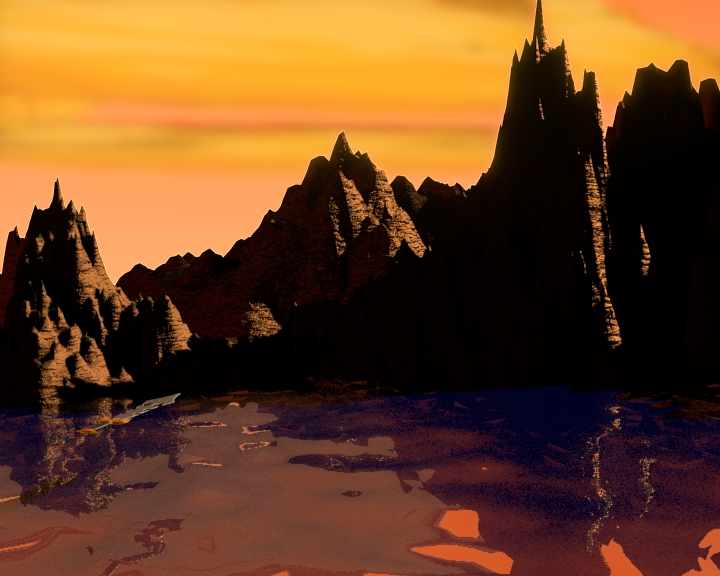
Current scenery. I’m still playing around with light, because whatever I do in the background, will come forward for the character too. So there needs to come some light from the shadow side. Remember this is background, not the focus.
thats looking damn good i love the scenery, the effect you got from the water is amazing, a plane with cloud texture and normal turned up with mirror switched on?
Close. The difference here is that I used the landscape generator for the water as well, so it has original displacement.
I’m going to switch the extra displacement I added after to the cloud texture method (I can’t get the detail on the water I want with displacement only). You can see on the water there is a lot of triangles (eeew, lol), so that should get fixed with the normal value method. It will also bring scale way up to where it should be. Because of the amplitude and frequency of the water waves and the sword’s size, the mountains look a few feet high.
I added clouds in a different way as well. Because of volume’s limitations in BI, I received the incredible idea of separating the clouds to a different render layer, but here’s the surprise, they don’t have to be volumetric. You just blur that layer (after color adjustments, if needed) and you ‘alpha over’ (it’s a node) it. The only catch is that it tends to blur the hard edges a bit too, but for the sake of speed, it’s fine. Double layering minimized the bleed over.
Here’s what it looks like when clouds are done like the above:
(just ignore the sword floating over the water, LOL)
The clouds are spherical landscapes, squashed and stretched with a solid material, mixed with a little bit of ZTransparency, but no volume was used. Yey!
This a soft cloud texture on the water, but it looks like those noise windows, so I want make it hard and reverse the default gradient, so it’ll a create sharp points.
I also changed the clouds a bit. They get their color and brightness value from being reflective, so I upped the reflective value and took some adjustments out of the node set-up, but I’m not quite happy with them yet (too white, but they match the reflection this time). Maybe a reduction in reflectivity will do the trick (just to make them a bit darker).
i dont know about nodes but i like how the water is coming along, i think once you’ve made your changes it will be cool
i have to ask though, which render engine is this rendered in?
Btw im not on blenderartists updating my zonda just yet because im working on a secret scene for the blender guru competition
Good ol’ BI.
I prefer not to touch cycles atm, because my PC is waaaaaaaay too slow to really use it:
2.4GHz duo core, 1 GB RAM, 256MB AGP ATi graphics card. Some of my friends from America call it ol’ school! Hahahaha!
Has Andrew announced a new one?! How cool! What’s the theme?


 are you using make human for the body?