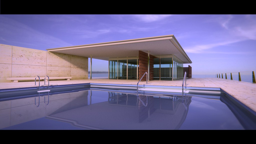
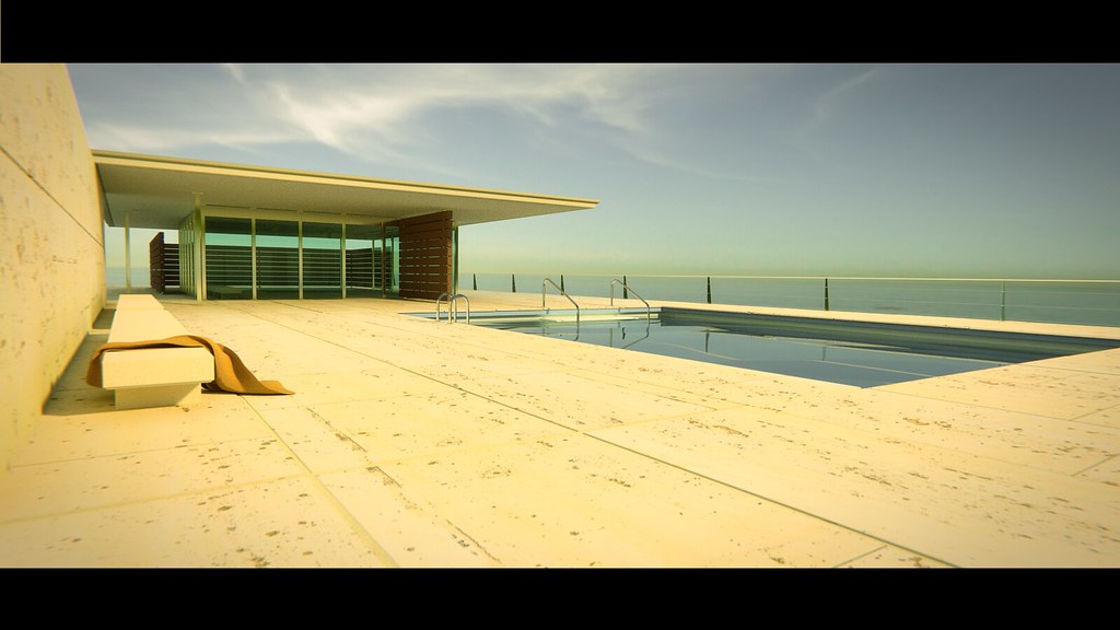
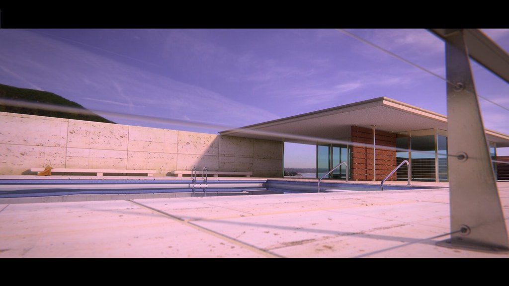
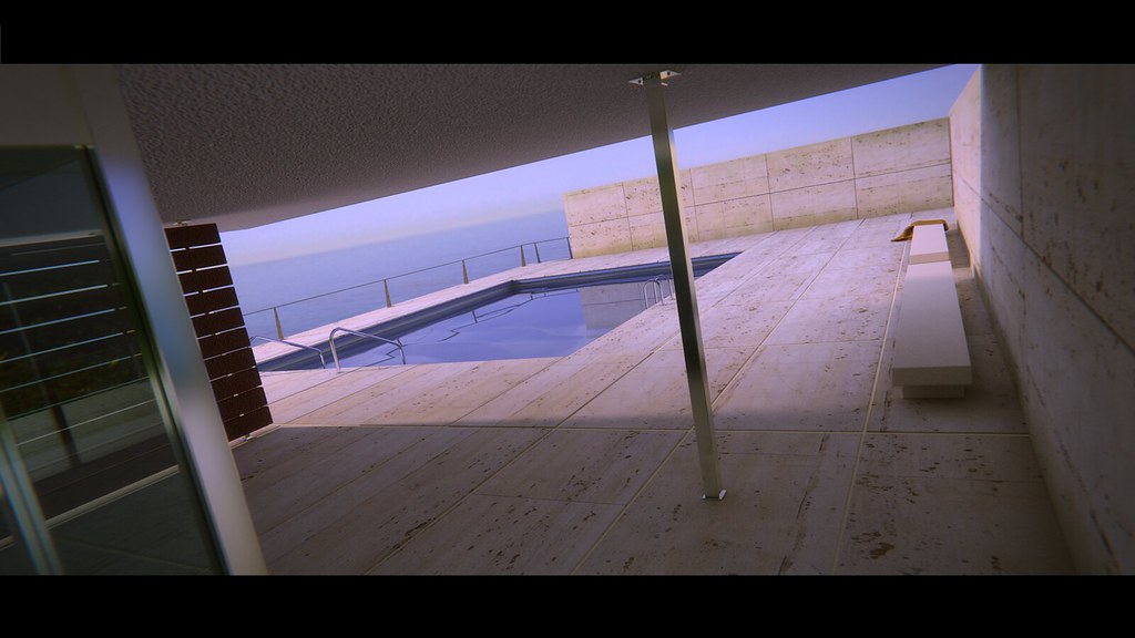
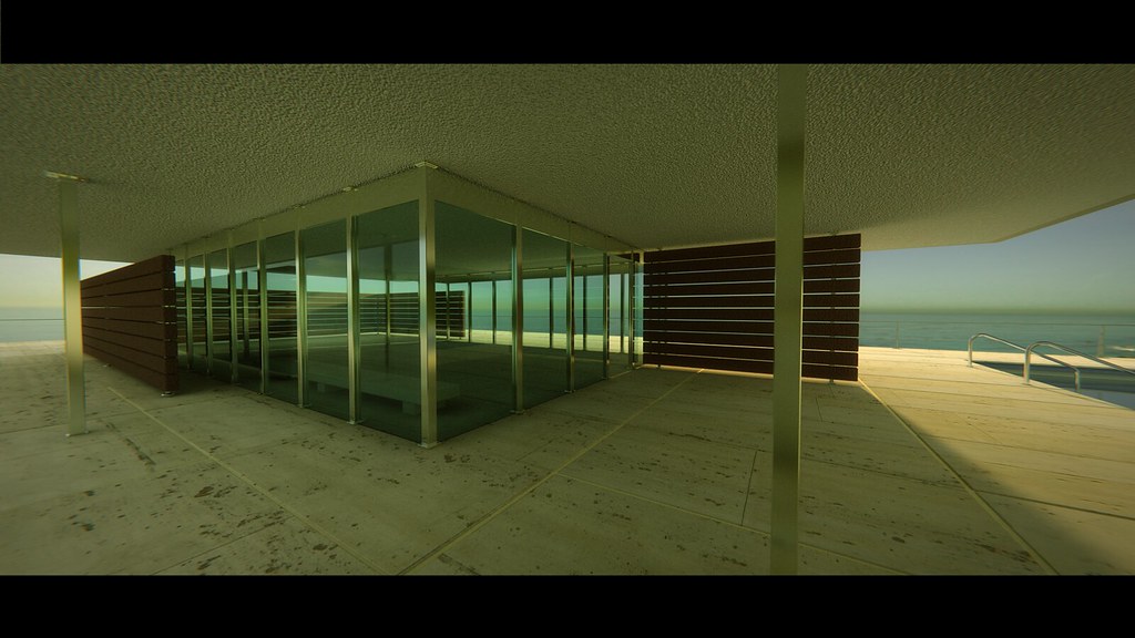
My focus was on texture and lighting/ambience with Cycles.
The sky/environment is “Malibu Overlook” from HDRLabs. Real textures from cgtextures.com, plus a few Cycles procedural textures.
There are three things that bothered me, though. (1) The lighting looks artificial, (2) a lot of the objects and surfaces look too perfectly clean, (2) the perspective looks exaggerated, unlike anything you would see in real photos or with your naked eyes.
Well done!!!
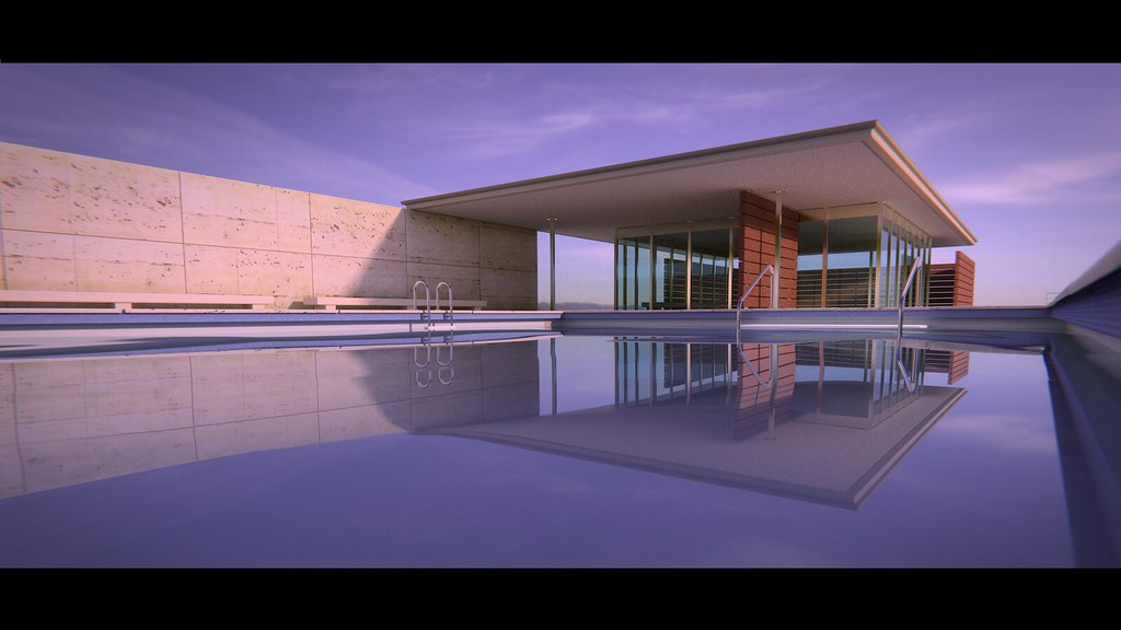
Water is calm but you cold try to make it a little noisier.
Blender/cycles is an excellent tool, everything you need is there.
BTW I don’t particularly like this kind of architecture. Too offensive for being a peaceful scene. Just my opinion of course.
georg - thanks for your reply. Point taken on some of the perfect surfaces. For the perspective, I’m going to pull the prerogative of the artist and just say I liked the way the lines looked
Alain - The slight wave is done through geometry displacement - I needed it to be extremely subtle. Looking at some reference pictures, on windless a day, the water surface in a pool is virtually flat with only very slight distortions of reflection. That’s the look I was going for. All DOF is one in Cycle - I am not using defocus in the compositor. Thanks for the Ray Length Node link - it looks like an incredible addition.
georg - would you mind telling me why you feel the lighting looks artificial? Is it for all pictures or just a few? The only picture I would agree on for the moment is the last (bottom) one because the sky looks a bit dark in the direction that the sun should be shining from. Is that what you are referring to or is there something else?
Unless meant for dramatic scenes for films, they might all seem too “color-filtered” for Arch Vidz, the purpose of which is to show to the clients how their buildings or facilities will look when completed. I think you might have add the colors on purpose, though, since they all can easily be fixed by CC as below: