Linux - Make Gimp look like Photoshop

Hi,

It’s been a while since I last posted this and the old link have gone - thought it was time for a reminder how to do it for all those new to Gimp.

Ever wished Gimp looked more like Photoshop? tired of the default ugly layout that appears to have no thought put into it? well, look no further - with just a few little mods, you’ll have this:


I wish the Gimp devs would take note of how it could be, real shame… anyhu I digress
Note: I’m using elementary OS (elementaryos.org) which is based on Ubuntu, so ht emethod here applies to both, and probably other distros, but I haven’t checked

First up you’ll require a recent version of Gimp, as I write I think the Software Centre is only offering 2.6 which is missing some important features to us. So if you don’t know how to, here’s how to download the latest Gimp offering 2.8+, enter the Terminal and add this PPA:

sudo add-apt-repository ppa#otto-kesselgulasch/gimp
sudo apt-get update
sudo apt-get install gimp

(Please replace the remove the ‘#’ above with a ‘:’, as I can’t get rid of the smiley that keeps appearing in the BA forum)

This will also update through your elementary Update Manager as the Gimp improves, so it’s a handy way to be bang-up-to-date. The only issue you may have as that as my post ages over time, the PPA may not be available, but there will aways be another to replace it – just do a search online if you’re stuck.

If you want to disable the PPA, you can do it easily by opening up the Software Centre, go to menu item 'Edit; and choose “Software Sources”. Move over to the second tab titled “Other Software” and uncheck the PPA - easy as beans on toast without an egg.

Here’s the download link for the icon set:

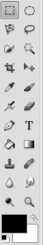
As Photoshop has icons In the Tool Panel that can change if you hold them down, you’ll have to approximate the layout to your taste in Gimp. Here’s my Layout that I chose:


The ‘.gimp-2.8’ directory is located in your Home folder, but it’s hidden, so just press CTRL+H to toggle the hidden folders.
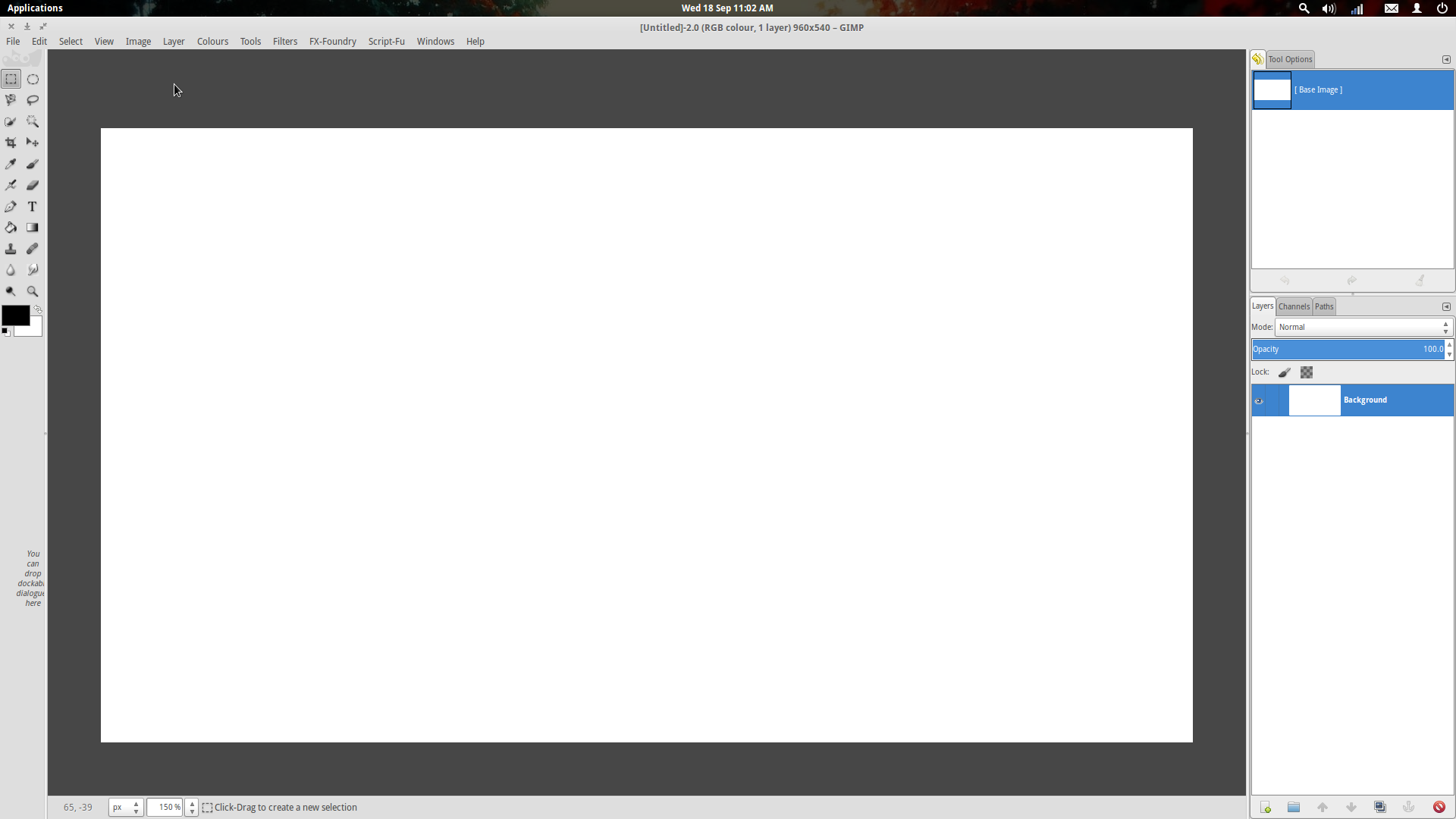
Gimp UI:

1) If you prefer Single-Window mode (as in the screenshot), select it now in the menu “Windows”.

2) To get the Tool Palette narrower you’ll need to drag the Brushes away from the panel. I prefer a minimal layout and really only use the Layer and History Palette, but feel free to add/remove what you like. This is one of the big annoyances with Gimp’s default layout – there’s just too much on show at once and those brushes take up way too much space!

3) The Canvas colour also needs to be adjusted as it’s not dark gray, to change this, head into ‘Preferences’ under the “Edit” menu and change 'Appearance” >‘Custom padding colour’ and also ‘Custom Padding Mode’ Having a dark canvas is easier on the eyes after you’ve been playing with gimp for several hours. Plus it makes it less distracting when working with photos or images.

4) Now you can jig around your Tools in ‘Preferences’>Toolbox>Tool Configuration to suit.

5) I increased the Layer Thumbnail size, but that’s up to you.

6) Now if only I could get rid of that silly message under the tools palate “You can drop dockable dialogs here” oh hum.

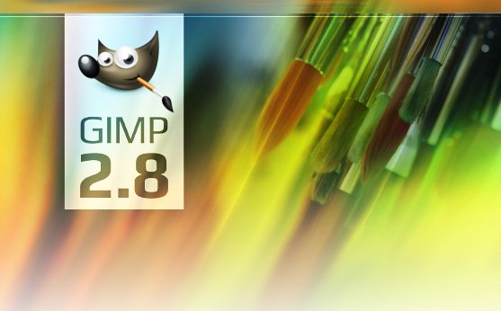
I also hate the Splash screen in Gimp, as do many other users – there’s other slpashes available online – it’s looks so unprofessional, so I threw a quick one together myself for you to use.


If you wish to use it, replace the one in usr/share/gimp/2.0/images/

For elementary OS:

Start by opening up your file manager (Pantheon-Files) and copy (CTRL+C) the ‘gimp-splash.png’ image, then in the Terminal type:

gksu pantheon-files /usr/share/gimp/2.0/images/

This will open up Elementary Pantheon files manager as root, so be careful!

Type your password, re-name the original “gimp-splash.png” to something like “gimp-splash-old.png, then simply paste the new one in with CTRL+V.

For Ubuntu etc:

Just follow the procedure above and use ‘nautilus’ or whatever other file manager you use instead of ‘pantheon-files’

When you’re all done I hope it inspires you to use Gimp more and also not feel like you’re using a second class app compared to Photoshop – there’s a lot of cool features in Gimp that Photoshop doesn’t have out of the box – Gimp, love it, use it and be inspired!

Jay.

I wish Gimp would change its name and take on a more professional image to be honest. The devs dont really leave a good first impression either. I think I would rather see Krita advance and take over the role Gimp current fills.

Hello, you have a typo in the PPA.

I really like the GIMP 2.8 splash: :slight_smile:

But this splash you’ve posted is a good one too.

Regards.

About that “no thought” allegation… That’s half-true :slight_smile: We spent some time discussing this in 2007 and adjusting the default look, but never again, really — at least, no major changes.

Personally, I’m not quite happy with the default layout either (did quite a few of customizations of my own), and a while ago I started collecting thoughts and input. I’m a little surprised that you have Undo History and Tool Settings in the same group. Are they of same importance to you?

The dark padding color — noted (that’s what I have too).

We also intend to replace the existing colorful icons with symbolic ones in v3.0 (GTK3 port).

I’ve been a Gimp user since I don’t remember when and have been fine with its layout. I’m not one of the “make it look like xxx” types anyways. Lots of folks want Linux to “look just like windows” or “act just like windows” and I disagree with that crowd too.

cest la vie…

I find it amazing that now that I’m using Blender I use Gimp even more than I used to… :wink:

Hello prokoudine.
I hope you will not change much the interface only to satisfy PhotoShop users. I’ve never used PhotoShop and I would feel really lost there.

Are there any new open discussion about it?

Except Photoshop users are the ideal market. 1) they have money to spend and thus contribute, 2) their work is generally better because they attracted far more professionals and 3) They are more likely to be considering alternatives with the CC move by adobe.

The problem with a lot of open source projects is that they sometimes try to be different for the sake of being different, there is often no need to reinvent the wheel, and innovation should usually come after building a familiar platform. The other problem with some open source projects is that based on what I previously said, it often leads to smaller pockets of users who form a club in which few are welcome to join or influence, meaning they are happy with its size and scope because it fits within their little world instead of pay heed to a larger and wider target audience.

Theres a fine balance between familiarity aka intuitiveness and innovation, about attracting the larger audience and working within the needs of the larger industry rather than play the cheap non serious alternative game.

Graphics Image Manipulation Program, I suppose that means gimp?

So it would be More Professional Graphics Image Manipulation Program = MPGIMP

When I first heard GIMP, I immediately thought of a GIMP suit… not a Photoshop-type graphics software. I’m sure others have thought that too. GIMP is also slang for someone who has a disability or something… for example, “That dog has a gimp leg.” When I found out it was an image-editing software, I laughed a little on the inside because it almost suggests that the GIMP software is a little sexually naughty and weak at the same time.

Kris beat me to it (pun intended). GIMP is both slang and a derogatory word. There is nothing positive associated with it. Its most commonly used as an insult or for bondage (imagine the guy in a black tight suit with a ball in mouth bent over about to take it in the rear…thats a gimp suit).

So yes, its “hard” to take Gimp seriously when it conveys such an immature and childish…unprofessional, naming convention. Its practically asking studios and those wanting to be seen as professionals to not use it. You think they want GIMP under their “skills” on a resume. Even if was obvious that it was in regards to software, the image is still called upon.

It also doesnt help when some past splash screens play on it with tag lines such as “here comes the GIMP”. Additionally to that you have Wilber, who is what? Why would anyone want some toon made by a 4 year old as the logo? Everything about it screams amateur and immature.

The software is obviously far more than that, but until thats changed it will be hard to be seen for anything past that.

As for professional sounding names, anything better will do. Its not like the market is original at this point… i mean you have photoshop, photoline, paint shop pro, paint.net, corel painter…ect you get the idea.

I did not know that “gimp” had another meanings in English (I am Spanish speaker)
Anyway, that you are discussing about the splash, the name or mascot makes me happy. It must mean that there is nothing more important in GIMP to improve… :stuck_out_tongue:
I’ve never seen anyone stop using GIMP because the name or the splash. Unlike, I have seen some new users try GIMP and then abandon it because other annoying things, such as when users accidentally takes away one Dock or remove a tab from dock, and then they never find how to restore it. Lock tab’s by default and/or confirmation message dialog warning to the user is about to execute that action would be great.
I’ve also have seen people complain about the small preview window in the filters window, for example.

Luckily developers are focused on more important things that splash, name or mascot, wich are really going to be very useful for professionals:
http://wiki.gimp.org/index.php/Roadmap

With these features implemented and working properly, the program could be called “I’m a dumb” and people will use it anyway.

If you are hinting at GIMP, that would be a poor decision :slight_smile: Whenever people come to ask us for changes in UI referencing to Photoshop, we always (as a rule) ask them for a rationale. We don’t make decisions based on “should be different from Photoshop”, we make decisions based on what appears to be a good point after a careful consideration.

Not all of the decisions prove to be right in the long run, and not all (far from that!) parts of UI have been revisited since their inception, but it’s a work in progress.

I am hinting at FOSS in general. Even Blender, which I support, has this problem… I think though on the development side there is a bit more realization coming about in regards to usability the larger target audience.

With GIMP, there is a strong element within its community and from I have seen, its developers as well, which opposes the thought that it is competing in the same sphere as Photoshop and that it needs to be “different” for the sake of being “GIMP”. It is sentimental bull crap though for the most part. Whether GIMP developers see it or not, it IS competing for the same market, and that was in part decided by the market itself.

It also plays a part in attracting or pushing people away from Linux. If linux is to grow, adoption rate must be faster and familiarity/expectation must be seen. A lot of linux minded developers exist in their own little world, a kind of “anti-establishment goth” kind of world, where what they do is often not better than what is used but in their minds at least its “different”. When you consider the tool’s purpose is function with the end user in mind, making everything easier for the end user while empowering them further should always be the number 1 goal. Not sentiment about being different, or not being seen as photoshop lite. None of that matters.

I guess what I am trying to say is that its time to stop fiddling your thumbs and acting like a boys club for the people who want to be different. Turn on the professional mindset, think about marketing, target audiences, larger implications of software and how it can help make or break Linux as an OS. Think about supply and demand, the current needs of the industry and even all the ire people have at Adobe right now. I mean there are thousands upon thousands of photoshop users pissed off at adobe and they are looking for that good alternative to drop in their lap…but GIMP (both its image, development and usability) keeps them at bay. If the gimp peeps dont wake up then then other software will eventually pop up and it will even diminish Gimps user base as a result. Krita again comes to mind.

Their mind is in the right place, they know their target audience, they know what software they have to compete with, they are not ashamed to think professionally and as a result start making serious progress that many end users can appreciate.

You say that you ask people for a rationale behind their requests, this is expected. All requests should be sold with logic and experience as well as show the benefits… but what I dont believe is that the gimp developers can truly appreciate or accept that rationale due to having a severe confirmation bias regarding photoshop and the larger market. Many users just dont believe you guys have your priorities straight, and if thats not true…then start looking at why that is happening. What kind of image is being given and find ways to fix that.

I am telling you a good place to start is with your branding and image. Move away from offensive slur/bondage naming convention, hang wilber up on the wall with fondness and tie his face to GIMP’s legacy but move forward past that and begin to embrace something more professional with the frustrated photoshop end user in mind as well as those in the business of working with such graphics applications. Then again dont do such changes and something like Krita will come along and take away that share of users while it makes a name for itself both for hobbyist and professionals.

It doesnt even have to be far from its current branding, just something more professional. At the top of my head, something like Gimage is a good example. Its starting to be used as slang for “finding an image on the web” usually in conjunction with google’s image search. Over all its something that really hasnt been claimed.

This of course is just my opinion and one coming from having an ever growing dissatisfaction with Gimp and its direction as a whole. It is not irrational, but it is frustrating to see an application lose out on so much potential.

OK, I can see how this could be a bit confusing.

This is the project vision that the team came up with in 2006:

http://gui.gimp.org/index.php/GIMP_UI_Redesign

Let me quote that for you:

— GIMP is Free Software;
— GIMP is a high-end photo manipulation application and supports creating original art from images;
— GIMP is a high-end application for producing icons, graphical elements of web pages and art for user interface elements;
— GIMP is a platform for programming cutting-edge image processing algorithms, by scientists and artists;
— GIMP is user-configurable to automate repetitive tasks;
— GIMP is easily user-extendable, by ‘one-click’ installation of plug-ins.

Does it look like “competing in the same sphere as Photoshop”? Absolutely, yes.
Does it actually mean “competing in the same sphere as Photoshop”? Yes and no.
Are we looking forward to competing against Photoshop? No.

Let me explain that.

The driving force behind the project comes from various sources, to name a few:

— the interest to try new compelling ideas, inspired by latest researches in CG;
— feature requests from users that are interesting and makes sense;
— the challenge to make a great hi-end image editor.

Hence your understanding of the situation as “acting like a boys club for the people who want to be different” is both amusing, disturbing, and, above all, incorrect.

You already explained the “yes and no” part, when you said “Whether GIMP developers see it or not, it IS competing for the same market, and that was in part decided by the market itself.”

Start what I’ve been personally doing for, uh, 2+ years now? I can see that’s one hell of a helpful advice :slight_smile:

Users want hi-end precision. We are willing to give them that, and we’ve been working on it for years.
Users want great editing tools. We are willing to give them that, and we’ve been working on it for years.
Users want better user interface. We are willing to give them that, and we’ve been working on it for years.

All of the above is a publicly available information that’s distributed all the time across all channels we can lay our hands on: website, news, G+ page, various forums such as this one, etc.

There are quite a few things we intend to change (like the website) and quite a few things we are curious about (like our recent personal crowdfunding campaigns), but every job needs a person to do it, and it should be a person we trust. We don’t always have that person. Suggesting that we don’t want to change is, frankly, myopic at best.

Given that you heard all of the above from me probably half a dozen of times over the last year and still continue to insist on your perception, it seems to me that you are deliberately neglecting a lot, if not everything we’ve been saying and doing. I’m not sure how I’m supposed to deal with this other than saying my thing and letting you work things out on your own, at your own pace.

Personally I think it’s fine that people grow dissatisfied with things over time: it’s a natural order of things. I just don’t want to give you a “Meh” for a reply, because it’s obvious to me that you are trying to be helpful.

Yeah, I agree about the Gimp branding, The mascot (mascot? I’m not an a 11 year old), looks poor as a cartoon character all together, certainly not Pixar, Warner or Disney etc - kids European Yoghurt-pot characters have more appeal than this, get rid of it please!

“Gimp” does sound negative and in English speaking languages is associated with the PVC/S&M kind, just check out the film Pulp Fiction if you’re not sure :wink:

It’s niche is as far as I understand it, is ‘Photo Manipulation’ software, the title and the splash should really reflect this. No matter where you go, it gets compared to Photoshop mainly because there isn’t anything else comparable I guess. The Likes of Krita and MyPaint are more geared towards painting and not photos.

It’s about time Gimp grew up and became more professional - both in branding and its attitude. Yeah it misses feature compared to PS, but it works really well for the majority of projects.

They layout as I did above is a bit of a rip-off of PS, but lots of other software titles, both freeware, Open Source and commercial addoped this layout years ago - and why not? Really it works and looks professional, plus if you’re following a tutorial for PS, then you’ll probably have less issues finding your way around if the interface looks similar.

I always get the feeling that the Gimp devs are mainly programmers with no real interest in UI layout and graphic design sadly, otherwise Gimp would be a totally different beast alltogether.

@Jay-artist

Over the years I’ve heard all possible arguments against the acronym “GIMP” and the mascot. Everyone in the team have.

The “grow up” argument could easily be reworked into “grow up and stop getting offended at a drop of a hat”.

Perhaps it’s time to stop thinking that English world problems with particular words are more important than everything else? (Actually, a fraction of the English speaking world.)

BTW, speaking of mascots for 11 yo, are you quite prepared to argue about that against GitHub and Twitter? That would be a sight to see :slight_smile:

I think as you commented, it’s only fair that I reply :wink:

I’ve been a artist for many years (30+ years) and I would hope that I have a good idea of what looks like a professionally design cartoon character and what looks amateurish.

The mascot for Gimp to me, and many other artist/designer friends see it as amateurish, same as many others mascots in Open Source, take the one for Linux, ‘Tux’ - now that’s something that’s really ugly! It’s got so much more potential to be cute, but just isn’t.

Of course some would shoot me down for saying such a thing, but there are re-works of the character around the net that look so much better and stylised.

A character that’s been initially designed by someone who can’t draw and been pimped over the years, to look not dissimilar at all from the original, as nobody it appears likes change in Open Source – and as much as new artists try to change things, the just can’t make any impact on tradition.

Take though ‘Pidgin’, ‘Birdie’, ‘TuxGuitar’, ‘Firefox’ for example, these all look good and don’t make the mascot idea look cheap at all.

Additionally a character with a paintbrush in it’s mouth would suggest that it’s a paining application, when it’s more geared towards Photo Manipulation – this makes no sense.

Gimp as a name for a product is embarrassing, imagine having a client over your shoulder in your studio and loading up Gimp, imagine what connotations go through their head initially. On top of that we have the pointless mascot that makes Gimp look like some kids painting package.

But putting some of these things aside, it’s more to do with the greater good of Open Source and trying to encourage others to take it seriously - this is something that’s always plagued Open Source and Linux. When you have a product that is the only rival to something massive and commercial such as Photoshop, it makes no sense that the development doesn’t try to make Gimp more pro looking, both in terms of ID and interface to attract more users.

Putting a development foot down and hard, pushing into the soil and refusing to do anything is crazy and stubborn to the largest degree.

All I hear online is how ugly Gimp is to Photoshop users, and how they could never change, with a few simple tweaks and possibly a more mature look in the ID, Gimp could bring more MS/OSX developers and Artists over helping the Open Source community as a whole.

It also saddens me that you see so many people do concepts of how Gimp could or should look online “Deviant Art” springs to mind - users come up with ideas how to improve things for the better, and most commenter’s agree on the posts - no one says “Don’t change it, it’s ideal the way it is!”, but nothing seems to change - Gimp looks pretty much like it did 10 years or more ago - such a missed opportunity I think.

This isn’t a criticism of the hard work that devs have put into it over all this time, believe me, I’m grateful for it’s existence, really. But it’s about time it stepped up a notch, ain’t it? Took some feedback from it’s more pro users. Look at Blender for example, see how far it’s come in 10 years!

I have to agree with Jay in this thread.

Thanks Kris :wink:

Kris and I aren’t the only ones to share a similar view, check out this recent post on OMG Ubuntu, makes for some interesting reading to understand users mixed opinions of Gimp and it’s ID:

Jay.

Just to make sure we are on the same page. Are we still talking about https://git.gnome.org/browse/gimp/plain/desktop/256x256/gimp.png?

What it boils down to is that you are criticizing (which is perfectly fine), while having 30+ of experience at painting and still not attempting to fix it.

Oh, is it?

Does it have painting dynamics system that rivals Photoshop’s one? It does.
Does it have canvas rotation? it does.
Does it have symmetric painting? It’s getting one.
Does it support other brush engines? There’s agreement to use MyPaint’s brush system. And a proof-of-concept patch.

Also, historically GIMP is General Image Manipulation Program. Which it is. The photography bias is somewhat subtle. So it does make sense to have a brush in the logo.

I already told you: English isn’t everyone’s native language, and fewer people care about the Pulp Fiction movie than you think.

Since we are talking about anecdotal evidences here, here’s another. Pantone’s Huey calibration device sounds very nearly like a rude word for male reproductive organ in my native language. The name causes no end of smirks. There are probably 150 mln of us around the globe. Should Pantone rebrand it?

Should everyone start rebranding everything, if the word means something else somewhere, or looks like something else somewhere? I don’t think so, but you are, of course, at liberty to think otherwise.

Basically you are staring the evidence in the face and keep denying it.

Do you use free/polyline selection tool? We improved it.

Advanced painting dynamics UI? Single-window mode? Cropping and rectangular selection based tools? We improved it all. There are also tons of much smaller changes that contribute to the whole picture.

Our usability guys did two large sessions with pro users. Part of the UI changes is the direct result of those. Let’s deny that as well, shall we?

What’s most amazing is that here I am talking to you, but there you go again denying that the team is getting feedback from pro users.

P.S. Since the discussion seems to have spiralled down to the same old game of denials, I don’t think anything constructive is going to arise. So I think I’m done here. However, should you want to go back to constructive, I’m still around.