Hello everyone, this is my first post here
I’m new with Blender and with 3D software in general. I started few months ago and I think it is really awesome.
After many tutorials, I decided to develop something by myself. I usually like to focus on real problems, so I decided to work for a friend without his knowing it.
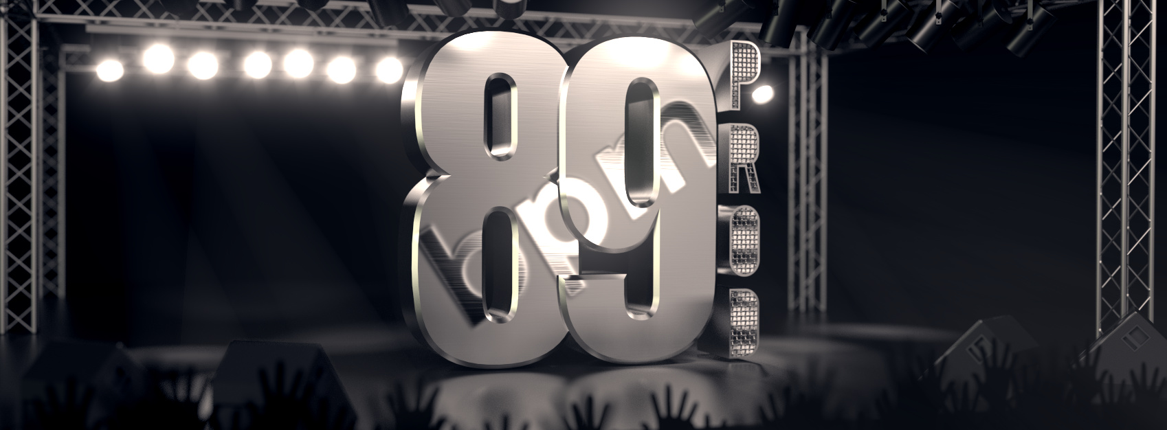
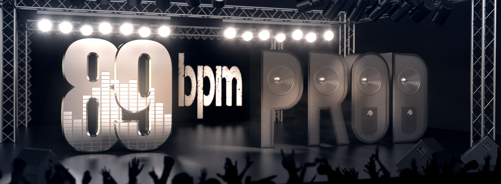
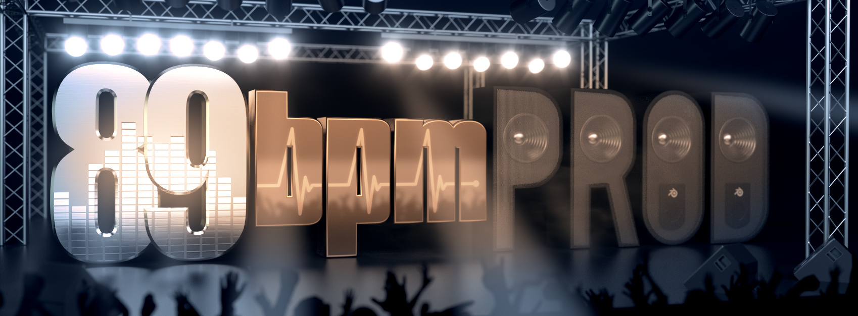
“89 bpm productions” is the project of a record label that this friend of mine is working on and my goal was to create an image for his facebook page’s cover.
For my image, I wanted to create the feeling of a concert and this is the result (15000 samples):
I’m quite happy with the result, but I realized the volumetric lights with Blender Internal Render, so I wanted to have some try with the new cycles volumetric.
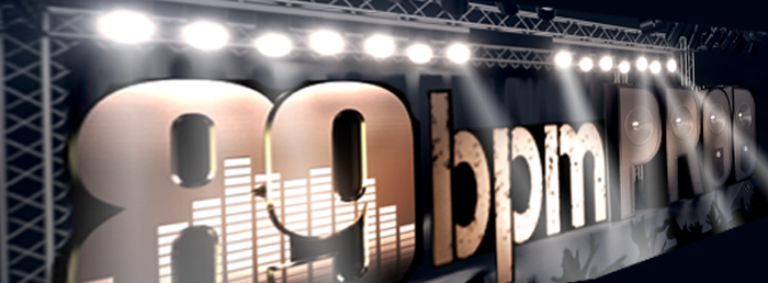
I used the Volume Scatter node with 0.005 density (I wanted to try something really subtle), Volume Sampling Homogeneus: Equi-angular, Light Paths Volume: 0 and in World panel, Volume --> Homogeneous Volume was selected.
At 15000 samples I had that noisy result (only the lights with everything else masked):
Is there a reason you don’t use the whole word ‘Production’ Seems like it would be better to use the full word unless there is a good reason not to. Right now it looks to my eye to read: ‘89 prod’
The bpm really should be after the 89…you are looking to match that company…you really do kinda have to follow that wording.
89 bpm Productions. I know the bpm inside the 89 is a clever idea and all but I’d say it’s not selling the name well.
All the letters need equal importance, right now the 89 is so much larger than the other letters it looks like it is the most important word when that is not true.
‘89 BPM PRODUCTIONS’ —all with equal importance. You can use small letters with capitals…like ProductionS, or all caps but change to a smaller size for roduction…
Try going for a single size but use your textures…they are cool.
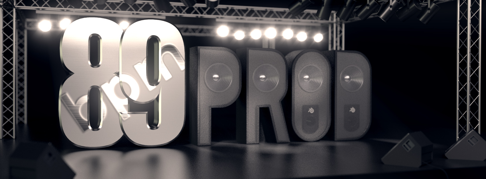
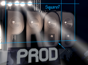
I dig the speaker letters, very cool idea. You do know they are not quite square to each other or the stage…not a big thing but it can’t be left that way for your final…don’t worry about it now, you can always clean that up latter.
You still have more stage room, so yes you can still spread out more…go closer to the edges–but not to the edge :)…you have plenty of room to play with even now.
You are looking to be on the right track…keep going. Just know that this is a hard task to do well…as I am sure you are finding out…so keep going as you are. Your progress looks right on the money.
We all have to go through stages like this till we get a design that is a win.
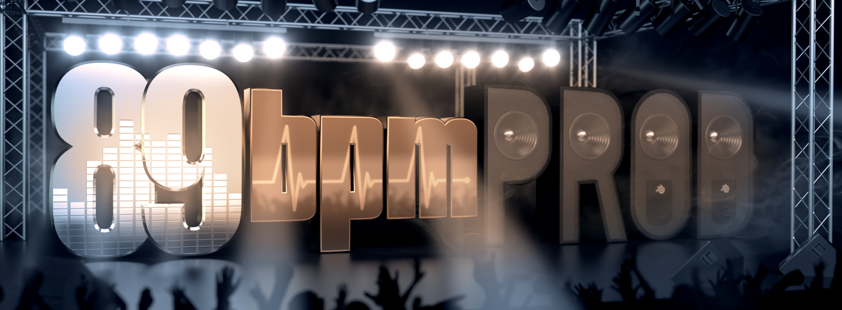
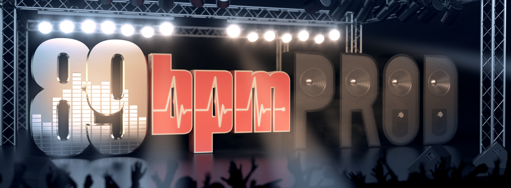
The first reason I used “Prod” is because my friend himself often refers to his label that way. The second reason is I thought the whole word would be too long for the scene.
You are completely right about the “bpm”, so I tryed to be creative and put it on a sheet in the back of the stage. To do so, I had to tone down the depth of field for the main scene and I created a new scene for the sheet with an even lower DoF. I think the result is nice, but criticism is always accepted.
This is in contrast with what you say about the letters with equal size and importance, but I think the bright color and center position of “bpm” creates a nice compromise.
I’m sorry, but my english sucks and sometimes I have hard times to understand… What do you mean with “You do know they are not quite square to each other or the stage”? That they are not at the same distance from each others?
I also tryed to add some color (something really subtle), but I’m colorblind (for real), so I’m not sure if it is nice or terrible
Well right now the color is so subtle that it is not showing up as more than just warm grey…which is fine.
I think your size can still be bigger…you can do a bit more if you you want to. You can add volumetric lights for your spot lights. They can add excitement.
Let the text FILL the stage…use ALL the space…why not…its the star
What do you mean with “You do know they are not quite square to each other or the stage”? That they are not at the same distance from each others?
The don’t look straight…the have a wobble look to them…I think it’s the lighting for ‘PROD’ the shadows make it look like it was built out of square to the world around it. Try some brighter lights…your contrast for you overall image could also be increased for more drama.
Any how…you have done improvements by leaps and bounds…great work.
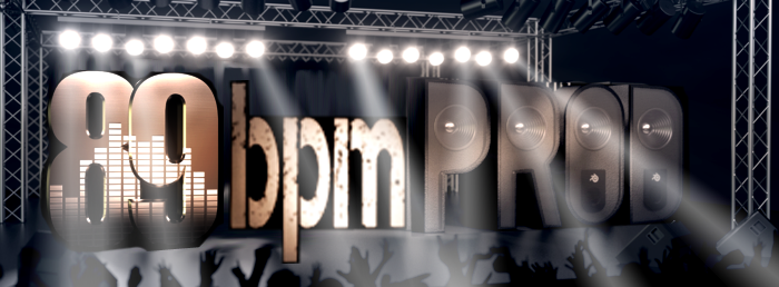
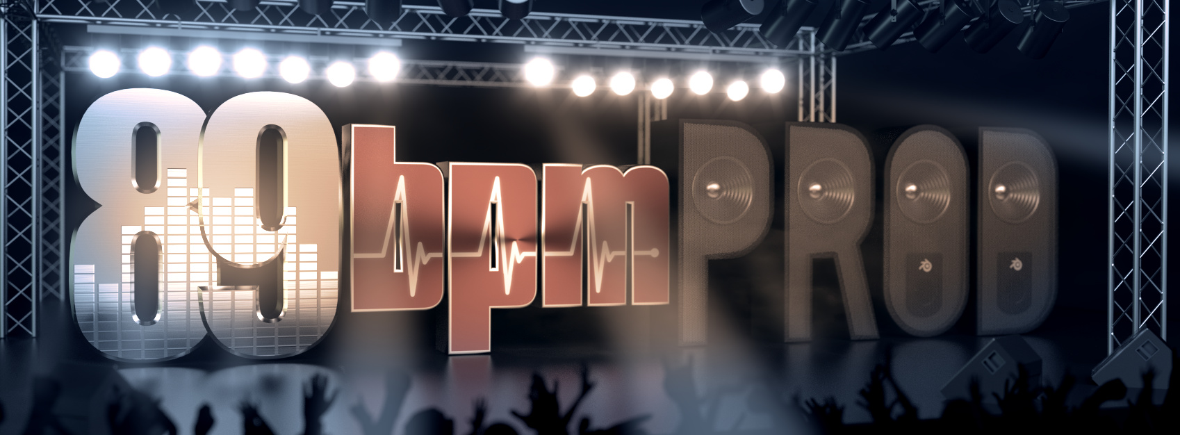
I also worked on volumetric lights (the previous version was barely visible) creating these beams. I didn’t add too many because they are so bright I fear they could cover the text too much.
I bumped the color using a complementary scheme (with my colorblindness is it better to follow some schemas to reduce chances to make a mess ) and bumped contrast slightly.
I experimented some different materials for “bpm” as you can see.
Rubber-like:
Wow! Nice…they look great. I think your volumetric lights are ‘spot’ on.
I hope your friend likes it and appreciates all your hard work.
One idea you might try is for the 89 letters. Right now those mix lights read as a ‘city’ and not a studio console. You might try changing the texture a bit. Make those lights glow or have colors like a mixing board.
Now that you have gotten here, what else can you do? You have some fine work. I always ask myself one question when I get to this point.
how can I make it even better?
So is it done? That is your call. I would look at other work and see if you get some ideas to use.
To learn glowing effects for instance. check out this
As I said good job sticking to this and getting to this point.
Thank you
My volumetric lights are spot lamps in internal render, if this is what you mean
I tryed volumetric lights in Cycles, but I could not get it right.
Thank you for your support and suggestions, I really appreciate it. I will do some other experiment looking for an improvement. I already tryed to add color to the 89’s texture, but it looked horrible. I will try a different way I thought about today. Now I’m going to watch the tutorial you suggested.
I boosted the light cones, changed the smoke texture and added some smoke with blender itself (after some experiment, because it is a feature I had never used before).
I tryed some glare streaks effect but I didn’t like it.
I’m obviously a little late to the party. I like the lights and stage and crowd! It all looks good! The layout and text, not so thrilled. I honeslty stared at “prod” for a minute and wondered what that was? An abbreviation? Short form? It wasn’t clear.
I thought you could stack it. and use only 2 fonts. not 3. It would be more legible and appealing and maybe your friend could turn it into a legit logo in the future.
Every critique is well accepted
Your fast work is really cool and professional. I understand I still have a lot to learn.
I agree with you about the 3 fonts, my work is a bit confusing. The “prod” have more sense in italian, where it is a common abbreviation for “produzioni” (= productions) and my friend himself often use it.
Some day I will probably develop another version of that, when my skills with blender and art in general will be improved