Hi guys! This is a new work I did for my portfolio. I hope you enjoy! =]
“Orc Warrior” - Blender 2.7 + Gimp 2.8
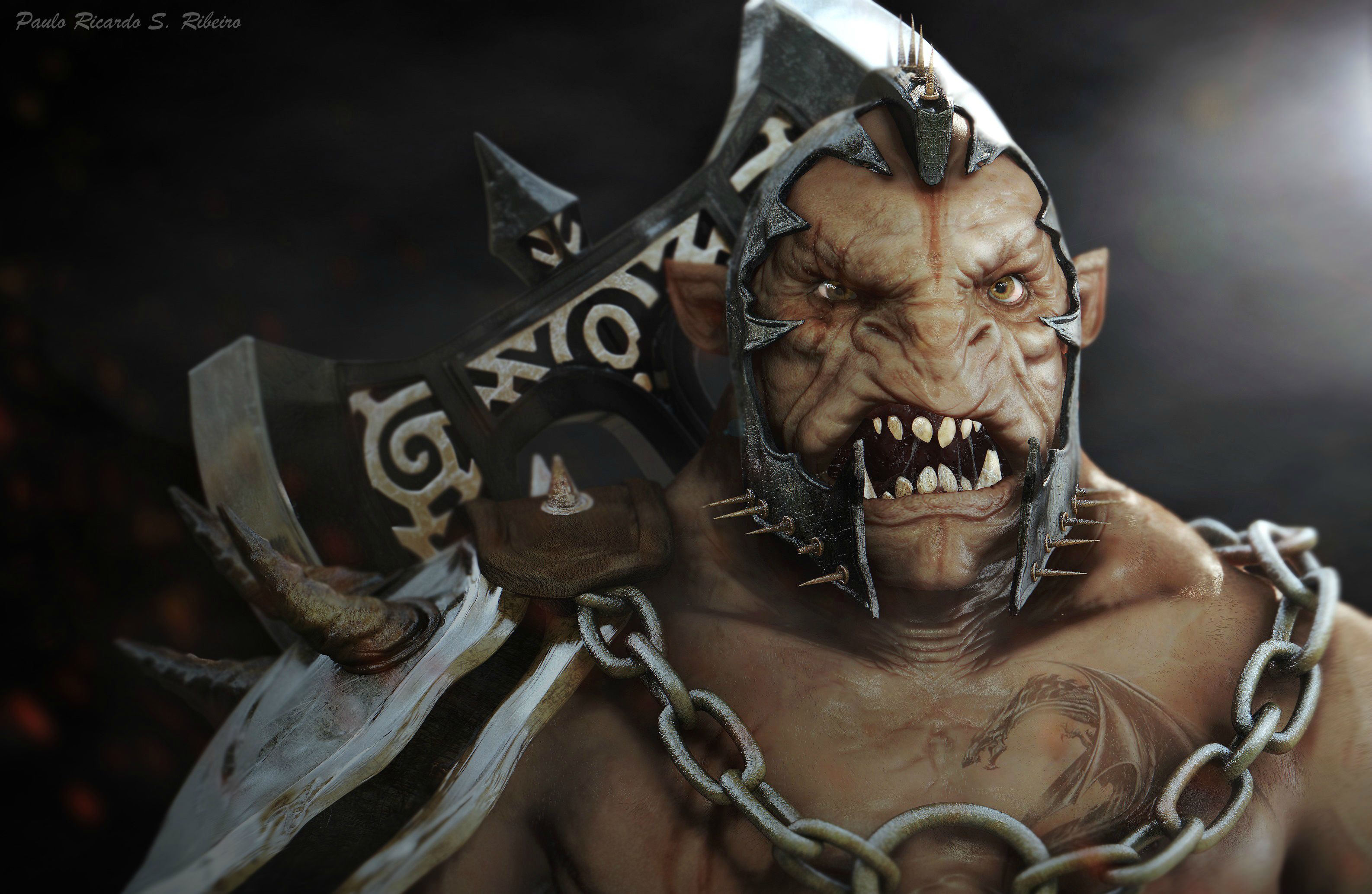
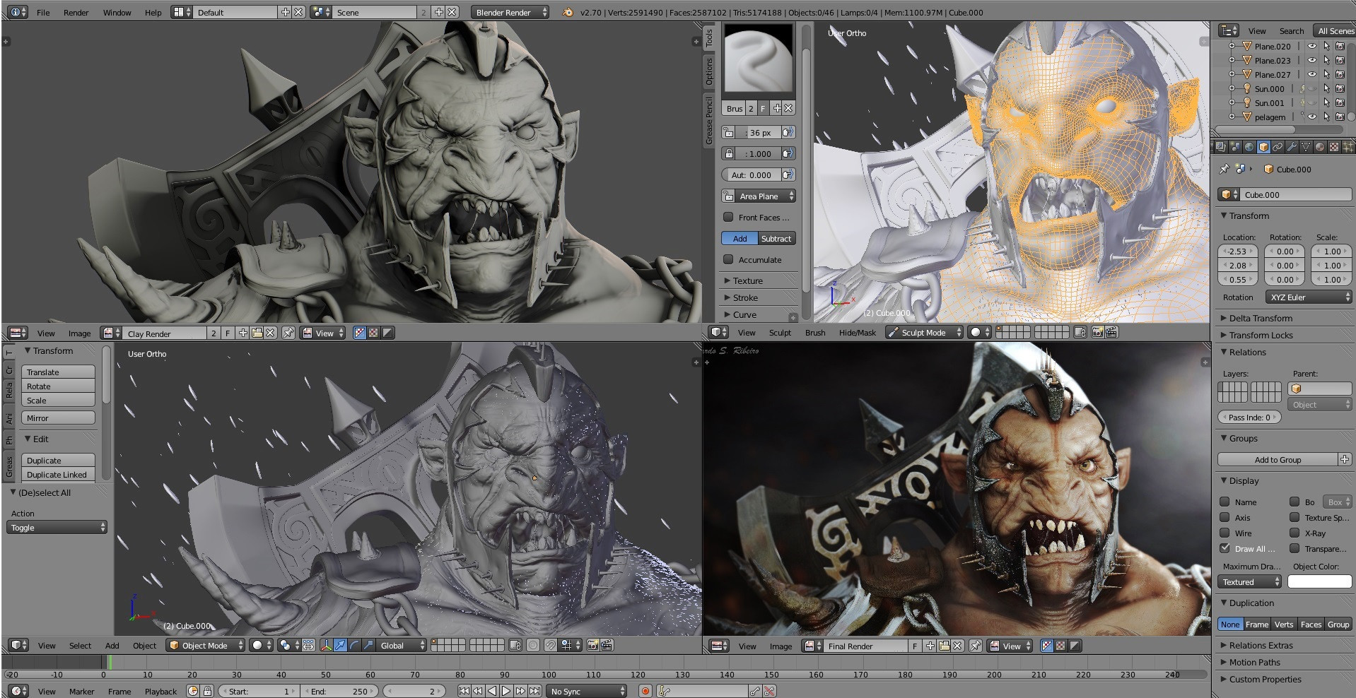
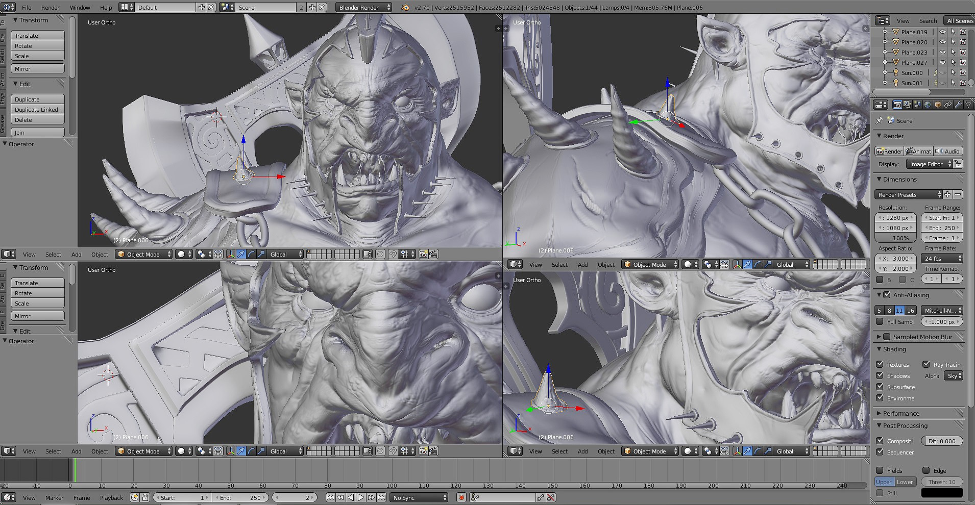
3D View:
Hi guys! This is a new work I did for my portfolio. I hope you enjoy! =]
“Orc Warrior” - Blender 2.7 + Gimp 2.8
3D View:
This is very well done! I wouldn’t be surprised if it got the top bar, very nice. It does look a bit 2-d from that angle, but I don’t know if that is intentional or not, it still looks very nice!
Wow, what a fantastic image, Ricardo! Textures and materials are very well developed, and the lighting is dramatic while still showing detail in the shadows. There is a lot of character in that face; this very large resolution image shows a lot, very cool!
The falloff of sharpness in the DoF is very fast; was it added in post? I wouldn’t expect sharpness to drop off so quickly.
Very, very nice job, this is 5 star quality stuff. I think the reason the image might look a bit flat (as far as depth goes) could be due to the large, flat surface of the weapon filling the background behind the character, and what could be a slightly long lense, which can compress your image a bit. There is always a trade off between the dramatic look of a wide lens, and the image detail a long lens gives us (showing more of the sides, more of an orthographic image).
Wonderful work; all the extra details such as the hair and the nuances in the armor really show you’ve gone the extra mile on this!
nice ork, very well done. Congratulations.
Very well done !!!
However, such a fine artwork tattoo on his chest? On an orc? Very civilized orc he is.
Very well done ! Congrats.
ThatRandomBlend, thanks man! Yes, I did spend a bit of that impression in post production.
James Sweet, thanks for the comment and for the great observations man! Yes, the DOF, I did in post.
yii7, thanks man!
Michalis, thanks man! Hehe, I agree, but my intention was of the opinion that this tattoo is something mystically entered, something magical, you know =)
Ookka, thanks man!
Nicely done, cool character and sculpting.
I like the shading.
Only 2 critics even if I feel too humble to dare :
Pieriko, thanks for the comments man, I agree with you on these points you have observed. Is always something to improve, but it is good to want to evolve over each new job. 
Just saw this on Blendernation and have to say it is a really nice sculpt, well done!
Ricardo 3D, another explication about the tatto is that this is as shiryu orc XD:
the dragon appears when him is in the climax of the battle.
I loved much the skin shader of your character, I hope reach that type of result on my own works, is very inspirational.
+5
Nvl, thanks man!
Joseperez, thanks man! Yes, basically that’s right, hehe =)
This is just amazing, and you don’t even use Zbrush only blender, really incredible.
very impressive! brazilians! what is it with you guys and girls. steaming with creativity  great work!
Dude, that is awesome, thank you for sharing.
that guy is really awesome
dude, that’s some wicked sculpt work right there.
nice one Ricardo 3D, love the detail. a touch more dirt on the textures would look good though.
I would remove that Dragon tattoo ASAP, looks like a photoshop stamp borrowed from deviantArt lol.
Also dirty his teeth up! He looks like he’s angry at the whitening job he just got done
I thought I had already commented, but no! Excellent image! A very believable character from a great model. The eyes are especially convincing!
If you are interested in constructive criticism then see below, if not, then skip the rest of my post :
Overall the image is excellent, and certainly oustide of my typical modelling efforts, but I would personally have approached somet of the materials differently. Anyway, great job!!