Hi everyone,
This is my first post on this forum, so I feel a bit intimidated
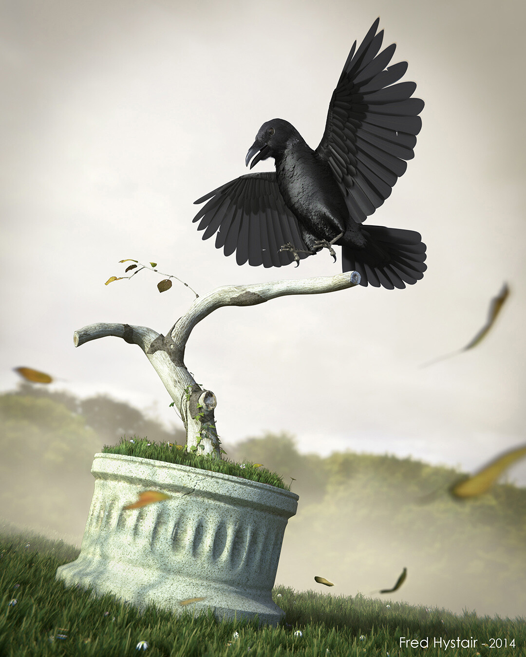
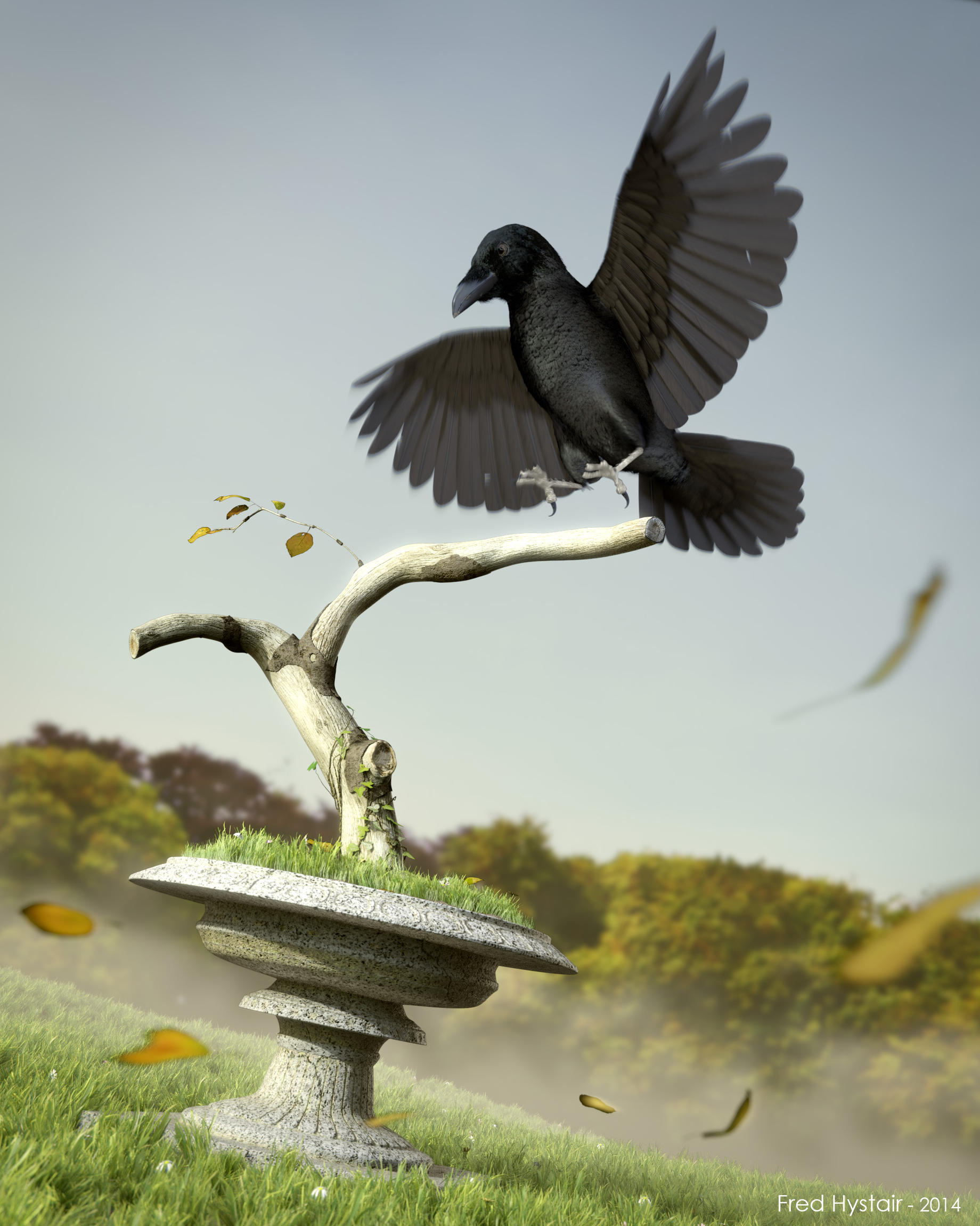
Well here’s a project I’ve just finished - or so. I’m quite new to blender (a few month) and this is my first serious project, I hope you’ll like it.
Modelled, textured, rigged and composited in Blender. Rendered in cycles. I also used Photoshop for textures and minor final tonal changes.
It was first designed to be a simple low poly raven, but things turned out challenging and I pushed a little forward. Final model is fully rigged (based on Kent Trammel’s Piero set up) with extensive use of particles for both the bird and the environment.
Final scene is 2 871 865 faces and took about 6 hours to render in HD (2160X2700 px)! My computer needs a break now !
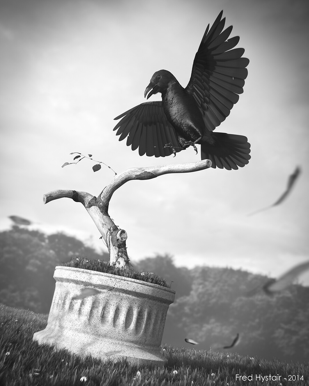
I still cannot tell if I prefer the color or the black and white version. What do you think?
I’m sure ther’s still a lot to do to make this scene better, so, any suggestion and advice is more than welcome.
I’m taking profit of this post to say my gratitude to the whole blender community that make the learning of this software a bit more simple and the developpers who made all this possible. A special thanks to kent Trammel (man, I learned a lot from you), Gleb alexandrov, Andrew “funny” Price and Frederik Steinmetz whose tuts are so brilliant.
Good work! I really like the composition, and I think the DoF works nicely. I would definitely keep it in color, rather than black and white. My biggest critique is that the specularity on the birds chest looks really weird. I’m not sure if it’s too bright, or if it’s just the texture, but something there doesn’t look quite right.
Nice, I like the camera angle and the DOF, and the fallen leaves is a nice touch, the grass looks good. I see some chromatic abration It works really well in this shot.
Some things that looks weird:
The main element in the picture which is the bird, the specularity on it looks weird.
The cylinder thingy looks weird in the middle, or it supposed to look like that ? looks like you added sub div modifier.
How to make it better:
Tone down the specularity on the bird as whole and make it less black.
Add some supporting edges if it’s not supposed to look like that.
Export passes and work with passes, it’s very important to PP with passes.
Passes allows you to tweak your renders without re rendering, like the specs on the bird can be tweaked through passes without re-render
Thank you both for your replies and your kind words.
Your critics are absolutely right and I should push things a little forward.
As concerns the specularity on the bird, I agree with you, something’s a bit wierd. The thing is, I’ve looked at a lot of references for ravens and their feather are actually very shinny and dark. I’ve struggled a bit to make a decent shader, but you’re right and it needs more work. Basically the shader is a mix of diffuse and anisotropic controlled by a fresnel node, plus a bit of bump and other color tweaks. As you suggested Saif, i’ll work on the specular passes as I’ve already rendered them for compositing.
As concerns the “Thingy Cylinder”, you’re also right. It is supposed to be the kind of sculpted granite garden pots you can see in parks and old gardens, but, as it was not my main focus, I’ve not paid enough attention to it. laziness is never a good thing
I’ll rework the picture in these directions.
Thanx again for the advices.
I think this is a really well composed and tasteful piece.
I agree that the bird’s feather look strange.
I think one problem is that the diffuse color is too light and the roughness on whatever glossy element you’re using is probably too high.
I think the other problem is that the feathers on the breast are too rough and small, usually they’re a bit more smoothed down to present a more uniform (if still bumpy, not lumpy) surface.
Also, the lighting looks a little unnatural. There seems to be a white key light coming from below the raven, how is this possible? I don’t disagree with putting some light in like that (unrealistic lighting setups sometimes look the best, after all) but it’s too noticeable here.
I think there is room for improvement on the composition (the grass up close to the camera is a little distracting but doesn’t really add anything to the feel of the piece) but overall it’s not bad.
The falling leaves and the mist in the background really help to sell this render as having 3 dimensions. There’s an obvious show of detail through out the render. The color image is great. The only thing that is a bit off to me is the bird itself. The face and chest show a great deal of detail that isn’t present anywhere else in the picture. While this means you done a great job modeling I find that it makes the bird not fit the picture.
Hi
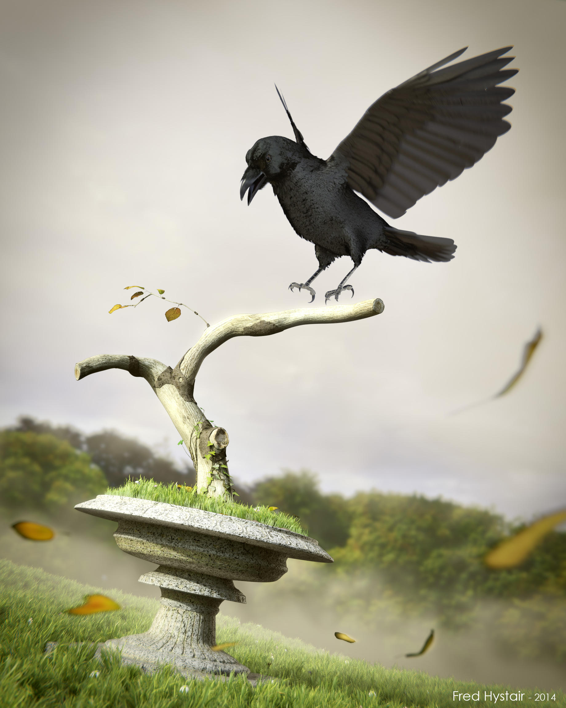
I’m handling some rework on that scene. All your comments have been precious to give it a new look. My computer is now rendering, i’ll post the advancement asap. @kemmler : I’m not sure about the lighting comments. Actually, ther’s no backlighting in the scene. All the lights come from the same direction (3/4 face). The intention was to recreate those bright cold morning lights that are very usual where I live. The sun is low and bright, the fog still crawls on the ground and the sky is a very bright grey, almost white.
@ everyone (:-)): About the raven, the spec is indeed a major issue, giving too much detail on the chest and distracting the eye. It’s currently being handled. Another thing I figured out was that the head is a bit too big. I made it smaller by almost 10%.
More soon and thx again.
The first pose was more dynamic, I think it has to do with tilting the body away from a normal standing position. In the new image, he looks like standing on the branch, just without the branch, while in the first image he was tilted away from camera. Also the back wing gets lost in the new pose, it’s too thin and doesn’t add enough to the silhuette.
You could improve the pose by rotating the tips of the wings, or by bending the feathers. Currently, the wing is quite straight in both your poses.
The light is strange because the shadows are sharp, but the sky is cloudy.
The new feather material is much better, and the tree looks very nice. The raven model is really good.
Hi Ania,
I tried compositing a different version according to your comments. I reversed to the first pose (I had already rendered it) and tried a brighter sky.
The lighting seems more natural, but I think something is lost from the first melancholy feel.
As regards the pose, this one is more dynamic and dramatic, but I think it’s less natural (according to references of ravens landing).
I might try a third. pose again if my computer accepts to render in the weekends
Cheers
Overall I like this image very much. It’s got excellent composition and you pulled off the grass and falling leaves quite nicely. The new poses for the bird are certainly better (I like your second to last one best), but you need to work on its facial structure, which is at the moment a bit disproportionate. Moving the eyes down slightly and perhaps a bit closer to the beak could be the difference between a good image and a great one. =)
Hi
I followed your advice, loonatic, and added an iridescence component to the feathers. You were right, it adds extra depth to the bird.
I also tweaked the facial geometry slightly (thx Owldude).
Tried another pose too.
Hope you’ll like it.