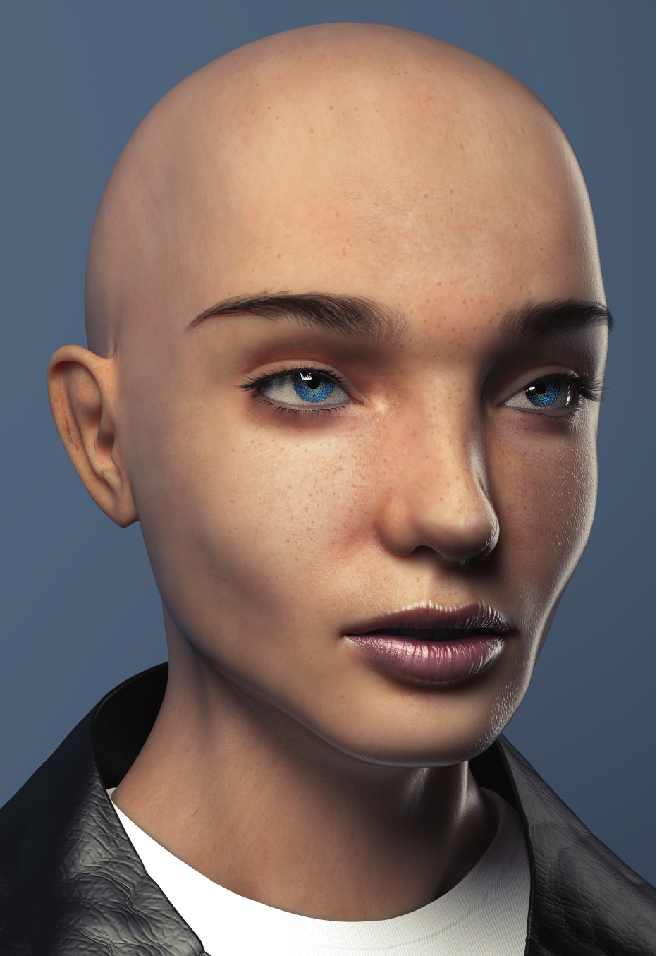
I was wondering if I could get some feedback on this model/rendering as I’m a newbie to Cycles. My goal is 100% realism. It’s a little hard to tell now how it will ultimately turn out, as I’m still working on the hair.
As many fellow artists may know, when you work on something for countless hours, your mind gets used to seeing whatever you’re working on. I would highly value the critiques of fresh eyes. What could be improved? Are any details wrong? I know the bump map on the lips may need to be turned down.
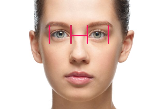
I think she looks a little alienistic with the wide set eyes, but I also like this kind of theme, but usually realism means following through with perfectionism E.g
The width in between eyes is the measurement of one eye, maybe a more moody light set up to take away those sharp shadows running along her neck & under her right nostril :). {You could just make her eyes a little more bigger I guess}
And She is really beautiful! Also fantastic work fAnsonAdams27, I can see you are very passionate ^^
I’m not going to critique it but I do suggest you take a break & get some external refreshments {Go regenerate, socialise it helps when I come back to continue on something I’m fiddling with a lot I make more breakthroughs. ^^
My two cents, clothes’ mesh could be closer to the body, it looks kind of odd right now (I guess you haven’t yet given much time to it). Maybe a quick cloth simulation could make it more believable, mesh-wise.
I love the eyes, eyelashes and eyelids. If you could share your approach (how you did it) and the eyes’ material, it’ll be highly appreciated.
I think she looks a little alienistic with the wide set eyes, but I also like this kind of theme, but usually realism means following through with perfectionism
I’ll double check the eye measurements. I was closely referencing images of faces, so I’m surprised to notice that now too. Thanks for the observation!
My two cents, clothes’ mesh could be closer to the body, it looks kind of odd right now (I guess you haven’t yet given much time to it). Maybe a quick cloth simulation could make it more believable, mesh-wise.
Interesting… I’ll play around with it to see if it looks better tighter (it’s a jacket collar).
I love the eyes, eyelashes and eyelids. If you could share your approach (how you did it) and the eyes’ material, it’ll be highly appreciated.
Thank you! I spent a long time figuring out the lashes. After a few failed attempts, I figured out the best way was to have no child hairs and more parent hairs (I think it was about 8000 hairs to begin with). I used a string of vertices as the density map to begin with, then cut the ones out weren’t on the very rim of the eyelids. Also tapered off the amount of hairs near the tear sacs. Lengthened them appropriately and combed into curved shape. I think the key was the next step. Instead of using clumped children to create the realistic shapes in the lashes, you can set the selection mode to only the tips of the hairs, select 8-12 at once, and scale the tips to ~0, creating the shape. You have utter control of every hair this way.
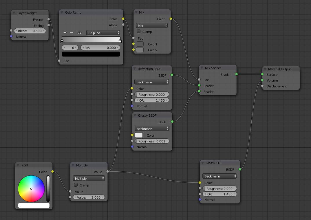
I can’t take credit for coming up with the eye shader- had to study a Blender Cookie tutorial model to find what works best. Here are the shader nodes:
Thanks for taking your time and sharing your approach. It may sound silly, but I never thought about not using children in a situation like this, it makes a lot of sense.
I really like the skin and the eyes look excellent.
If I had to make a few suggestion, then it would we to raise the tip of the nose and make it a bit less bulbous. You could also put the cheek bones a bit higher up and make the face a little more angular. Both of those are stylistic choices, however, and really up to you
Thank you for posting the eye node-setup, that will come in handy.
This looks great! She looks a bit like Angeline Jolie based on her eyes and cheekbone. The skin, eyes and lashes look brilliant (I especially like the freckles on her skin)! I don’t have much to critique here as I don’t think I could do better, but as an observer, maybe the fresnel effect on the side of her face could be turned down a tad since it seems a bit glowing. Also, the clothes could do with a bit of love. Overall, this is great professional work!
Cool model! The eyelashes are nice indeed. The cheeckbones feel a little too low for me and the eyes are kinda too far apart. It’s not that extreme though. Only to a level that it gives her character. The are right below the eyes could use some extra wrinkles.
I’m not sure if it’s intended, but the lip gloss is a bit off. You use a texture for the specular strength right? The skin around her top lips is as shiny as if she had lip gloss there, yet she doesn’t.
She looks just a little bit cross-eyed, and well I dunno, the skin-texture just doesn’t look quite flattering on her in such a close-up. (Let’s hear it for make-up on a girl.) Be very careful that the eyes are properly spaced and that they are looking at something. (I would go so far as to put an “empty” out there, well behind the camera, and have the two eyes track that empty. (“Look at the little birdy!”) Even the slightest mistake in the placement of the e-y-e-s will draw the viewer’s attention away (in a negative way) like nothing else can.
Also … if you look at anyone’s face, including your own, the left-half and the right-half are never exactly the same. Look at the model in post #4 on this thread, holding a piece of paper to cover first the left then the right half of her face. Her mouth is not exactly level; her eyes are not exactly the same; she almost looks like two different people. And that, too, is something that people pick-up on.
I read an interesting making-of article about a horror film, where the character that would turn out to be the bad-guy was supposed to be a very diabolical, yet psychotic, smooth-talker. The makeup artist accented this effect in close-up shots by very slightly making the left and the right sides of the face different. Not such that you would “notice it,” except that some part of you would.
It sorta looks like her eyeballs are a bit closer to the center of the face than her eyelids; sorta like her eyelids are not aligned with the center of her eyeballs the normal way.
A few different angles could help to see if it’s not just an illusion because of the current perspective.
I haven’t commented for a while but I wanted to pop in here and say WOW:) For me this is perfect…great style…great texture…and great character. Imperfection is perfection if done well and you sir have done well! Keep going, let see some hair on this little lady.
I’m put off by the eyes, as mentioned, and the nose, not sure if mentioned. It just doesn’t look right to me, but it could be the camera at a weird focus setting, what is the camera’s focus setting?
“what do you need that for?” - my colleague voice
To me it looks like the camera is off, thus making the face look odd.
Please post your camera settings please. If at default, than that’s the problem!
First off; wow! Looks great. I agree about the eye spacing, but understandable if it’s too late to adjust that without having to readjust your textures too. I agree with Sundialsvc4 about having her look at something specific, might help the eyes a little (I would personally try having her look at the person taking her photo).
A couple minor suggestions:
First, her overall skin has some blotchy areas or a little too much variation for my taste (lighter and darker spots). This can sometime happen due to brush strokes or the stamp/clone tool. I’d just even it out a bit, not too much though. Just a slight layer of makeup
Another thing would be to watch the specular. It could be just the lights or texture but I’d have her skin more softer looking (probably softer lighting?). Not quite sure, try comparisons with real life portraits.
Also, the ear/s need work. They need to look more like the variation on the cheek and around the eye: with a light “baby” skin covering most of it and some more reddish tones in crease areas, etc.
I’d reduce the brow ridge between the eyes and nose a bit and have less of a defined line separating the brow and the nose. You could also try shrinking/toning back the chin a bit, see if that gives her more of a feminine look (not sure if it will).
Finally, I’d try rendering her with an HDR image as your lighting, as a test render. That can put your model in a more realistic lighting environment to show you what it more ought to look like, if she became real. Then you could use it as a reference, and create your own environment and lighting setup based off that and remove the HDRI (or just keep it, whatever)
Here’s an update. I feel as if this model is within uncanny valley territory, with things from here either going very well or very poorly, with no room in-between. ANY other suggestions to help jump that appeal gap? They’ve been extremely helpful so far.
Implemented Changes:
-Remodeled nose and added nose bridge
-Raised cheek bones
-Repositioned eyes/eyelids, tracked eyes to empty, remodeled upper eyelid crease, added veins to eye
-Rounded chin to make more feminine
-Decreased bump amount on lips
-Removed spec map spill onto upper lip
-Made lower lashes less dense but longer
-Added 5 layer hair system (Main shape, large stray strands, softer fade hair for temple and nape regions, detail hairs for soft sideburns and stray hairs on top, and vellus fuzz-like layer all over skin)
-Redid eyebrows
-Softened skin texture (less blotchy)
Still to do:
-Fix problem areas in hair (mostly unifying the flow of each hair layer)
-Make vellus more realistic (less stubby/scratchy, more soft)
-Add bump map to iris (+ turn scale down?)
-Add SSS scale map to make ears / eyelids scatter more
-Add texture/color variation to ear
-Fix neck texture stretching, add crease lines
-Soften hair line
-Floating eyebrows? What fun.
-Redo soft sideburns (too patchy and short) and stray hairs on top (too short)
-Create mouth/tongue/teeth
-Shrink iris slightly
Can’t wait to rig this and get rid of that blank expression!
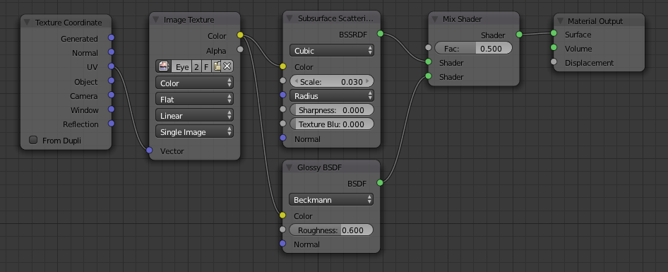
Needing a bit of help with something. The end goal is to make the hairs softer by fading it in from the insertion point. This could be achieved by mixing the hair shader with a transparent shader with the amount controlled by the hair info “intercept” node. This makes sense in theory, but it produces very strange results. Would a different shader work?
In fact, when the brows material is set to just a transparent material, it produces the result below. Not transparent, but completely black. What’s going on?
I think the iris (the colored part of the eye) might be a few percents bigger than it should be. And I’m not 100% sure, but I think the nose might be a little bit too long. And maybe you should pull the hairline a few milimeters or perhaps a little over a centimeter down her forehead? And perhaps increase the SSS a tiny bit? And I think she might be a bit too puffy on parts next to each side of the nose. And the mouth and lower jaw a tiny bit too small.
I’m not seeing anything too obvious though; these are sorta gut feelings more than objective observations.
disable the ‘set eyebrow gravity 0’ option from the eyebrow physics settings. I told the coders it was a bad idea to leave it on as the default, but they never listen to me.


 E.g
E.g