Hi! Today i started modelling a Whisky bottle and i ended up with this… It’s not a mess so i would like to improve it 
So, here it is, a first render, 1920*1080 200 samples:
I’m already working on the grass and i filled the empty spaces in between the fence planks, but i don’t want to make a render now.
What would you add / change here?
Thanks in advance
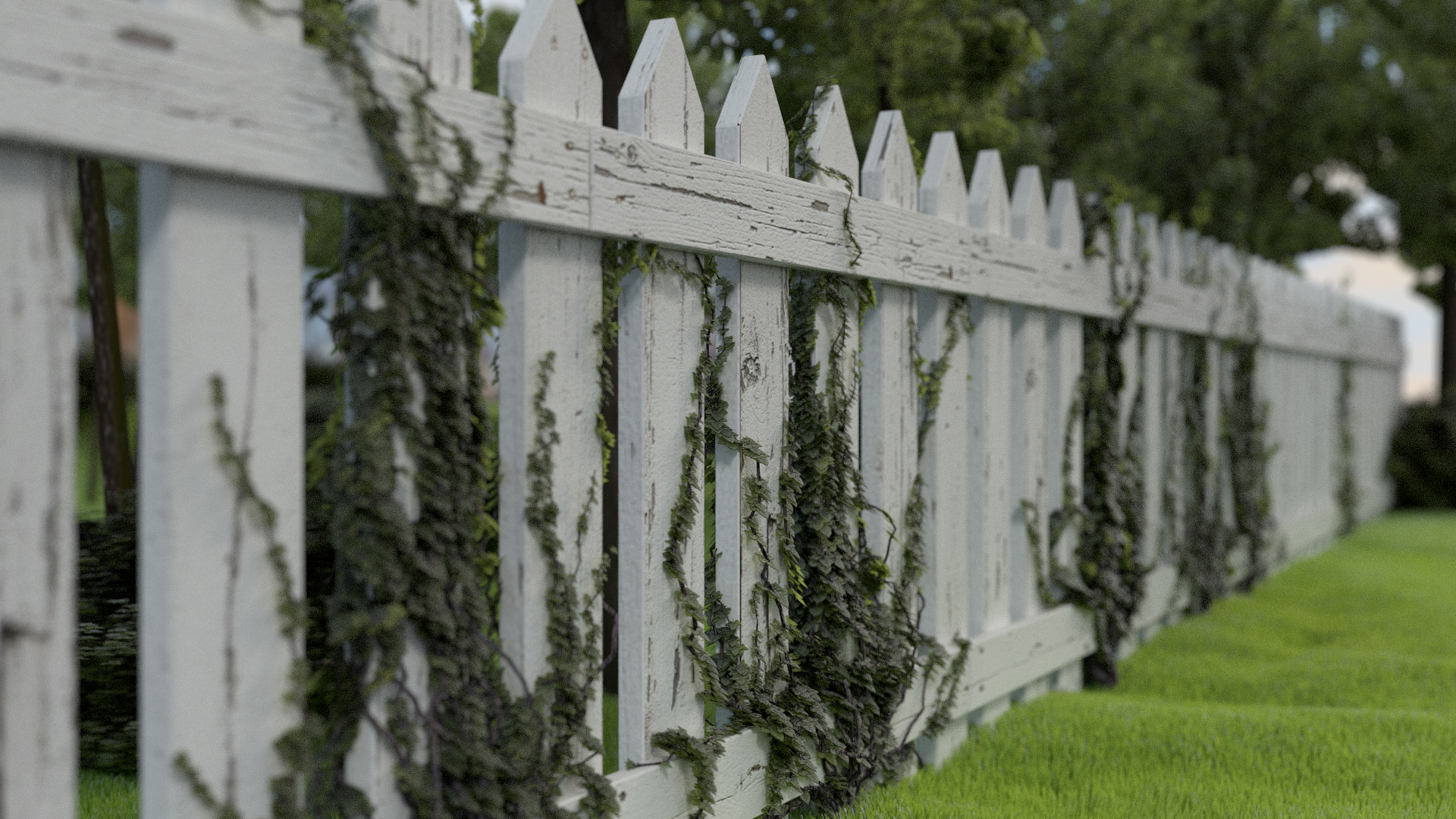
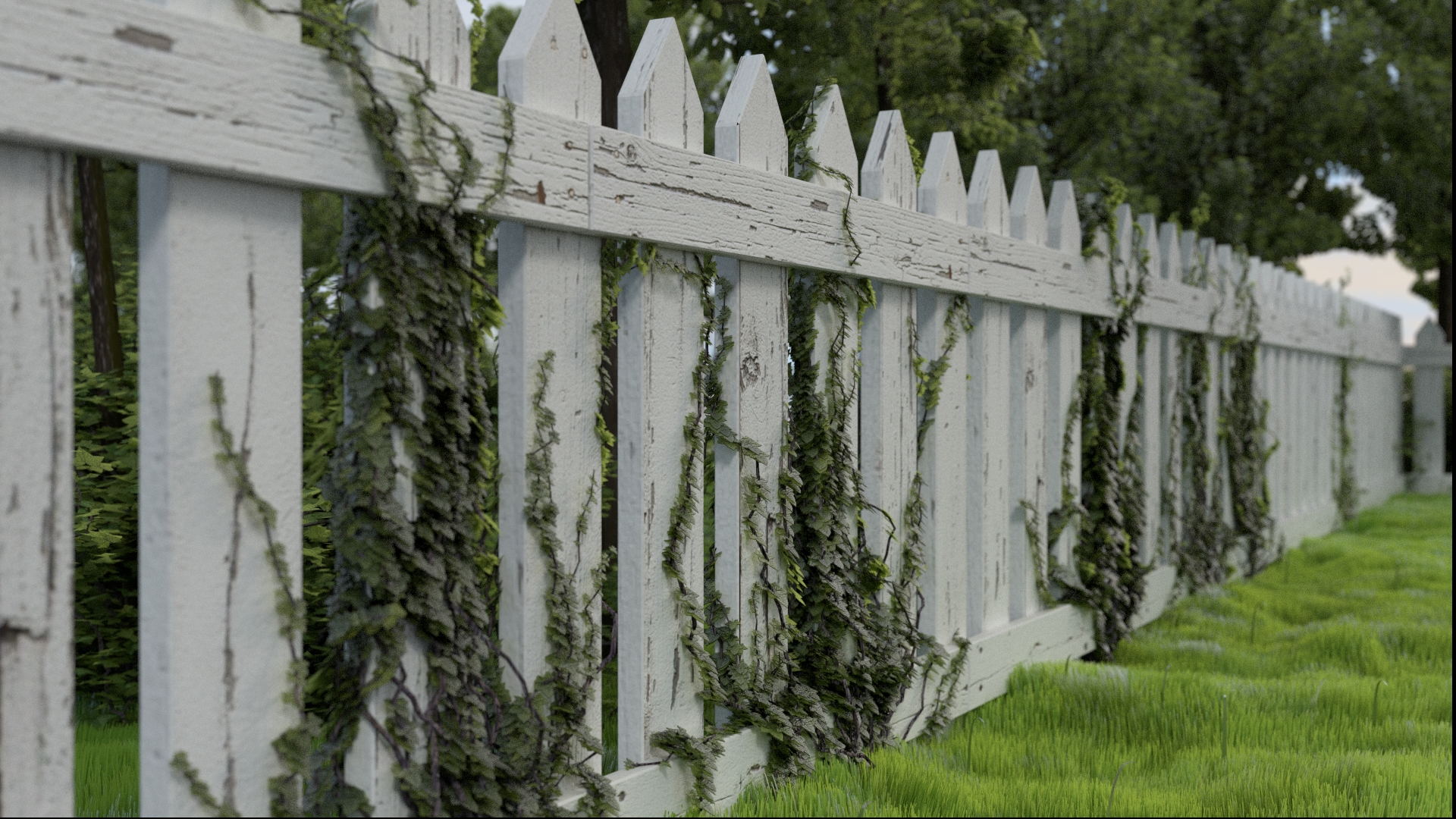
Ok, i made a few changes, not too much work. Added another fence in the back, randomized the grass a bit more ( probably too much ) and replaced the bushes with better ones created with IvyGen ( http://graphics.uni-konstanz.de/~luft/ivy_generator/ ) I’m also planning to replace the actual ivy in the fence (actually made with Blender IvyGen plugin) with IvyGen ones ( The software :rolleyes: ), and to randomize a bit the position of the planks to give that old look. Then probably the most important one, i want to add something, maybe a writing in the focused plank, to focus the attention in something better than a plank and two leaves x)
That’s it:
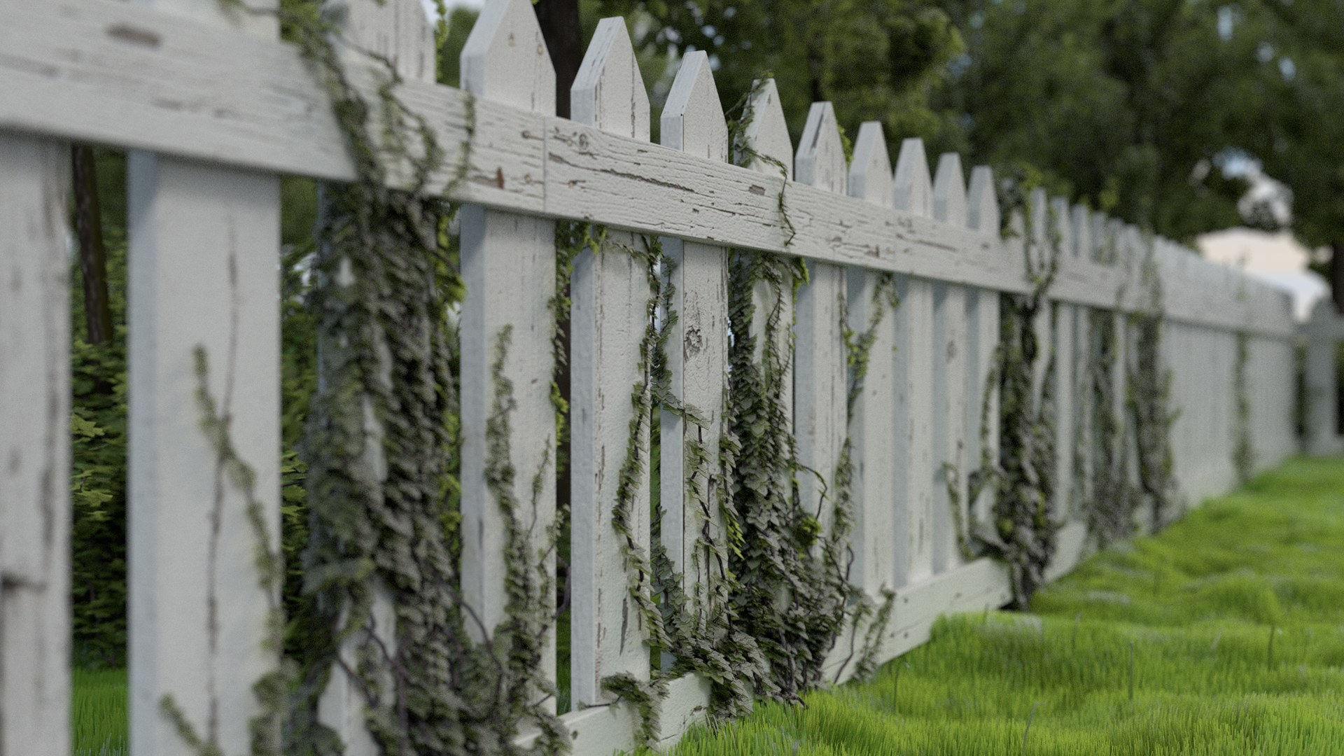
Tell me what you think! Especially if you like or dislike something!
P.S.
Are you experiencing problems with imageshack?
Looking good dude!
i think your right about something to focus on though?
maybe a squirrel, lone flower, i scratched engraving in the wood, RIP plaque, in memory of bench/plaque?
i like the idea of a love heart scratched in saying how two sets of initials are in love.
Thanks!  I was just thinking to make a sculpted heart and two initials hahaha.
What do you think about the camera position and DOF?
as it is, i prefer less DOF.
But i reckon with the engraving, more would add to the focus point?
There probably is a better place to put the camera but i havent a clue about it
ive enrolled into andrew prices architecture course so when i learn more ill advise you more on the camera.
last of all, i agree that the grass is a bit too all over the place?
i noticed you have an AMD card? so your rendering on your CPU?
If you want ill render your final scene for ya?
I LOVE the paint texture on the fence, it looks fantastic!
I would maybe up the boolean a bit on the grass particles to give them a bit more chaos, it’s a bit to uniformly straight right now. Also ground may be a bit too bumpy, maybe that’s just me since I just got done mowing my lawn and I would hate to run the mower over that For added realism, maybe some a little gunge on the underside of the top board and the planks where they meet? Just some thoughts.
well IMO the grass is way too clean and fresh to be in a yard with that fence… try tearing it up a bit. The tree needs more displacement, and if you’re going to keep those mushrooms then I’d suggest varying the height. Keep it up!
yeah basically everything your duplicating, we can see its a duplicate?
just try adding some randomness to the heights, angles, widths…
mushrooms could also be a little more clustered which is how they grow
i think the tree merges to easily with the ground, maybe some thick roots?
finally the displace on the garden floor is a little too strong
only the grass I do not like looks to much the same color texture.’’
the rest is quite nice
Looks great, but I liked it better at the original angle. It feels to linear otherwise. Looks good!