Sure. Perhaps next time you do the same in the starting post to speed things up. Hopefully you see how annoying it is to work with the amount of information provided and having to start it by deciphering what’s in the screenshot, especially when that could be avoided with a single mouse scroll wheel move or by not scaling the image.
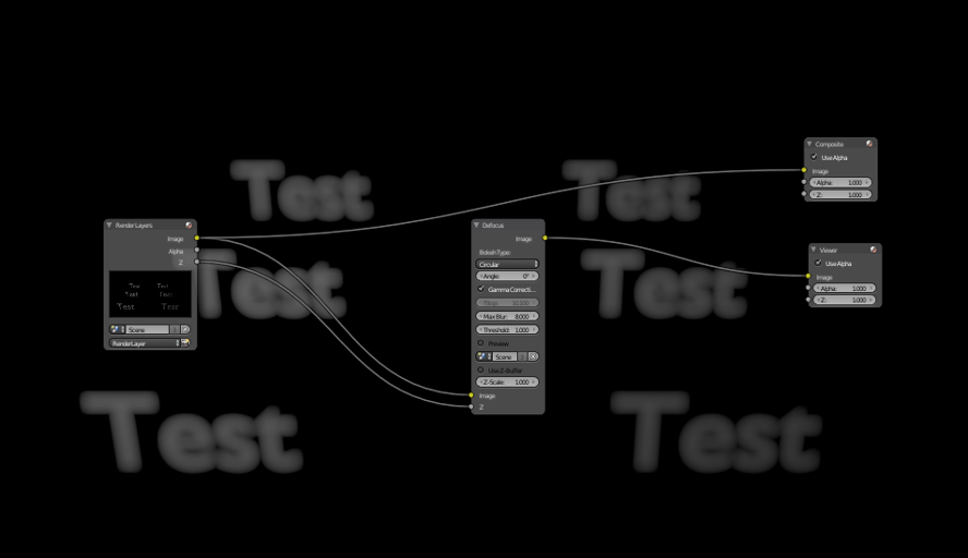
The key is to disable preview quality from the defocus node. Could also try blurring the z pass as Bartek suggested in his post.
Yes, I could have done that, sorry.
Trying your scene I see you also have that behavior when having less defocus, try lowering Z-Scale to 0.5 and you clearly see it.
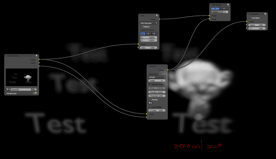
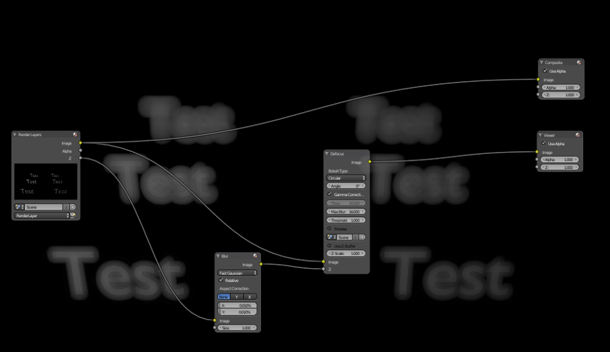
I got a usable result by adding a blur node and rendering in twice the size, perhaps I need to go even higher in the end, so I don’t need to dig deeper in this now. I think though that the defocus node gives really bad results compared to a blur node.
As a general approach, I’d suggest “two, if not three,” parallel treatments of the same geometry:
The original, sharp image.
Behind it (in an “AlphaOver”) is a defocused version … this produces a faint “halo” around the edges.
If the opacity of the sharp image is reduced, the defocus will appear behind it and the sharpness of the original will be reduced … perhaps just the thing for London Fog. On the other hand, you might want to:
Superimpose a third, much more transparent and slghtly less blurred, image in front. Perhaps slightly alter the hue and saturation of this overlay.
To my eye, the totally-sharp image is necessary, or else I’m going to reach for my :ba: reading-glasses.