Here is my most recent work:
1 Like
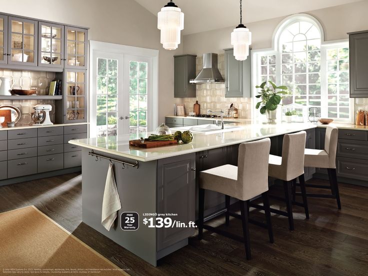
Here are the two first renders I did:
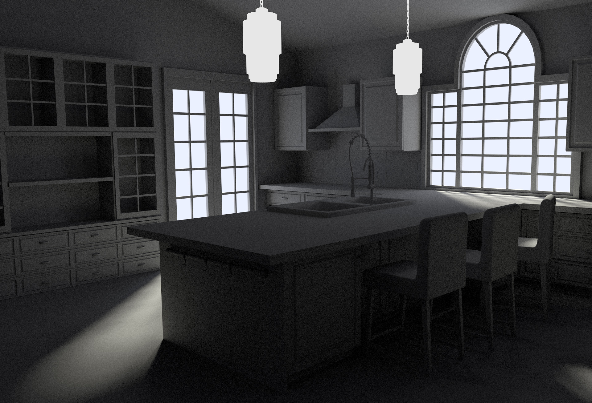
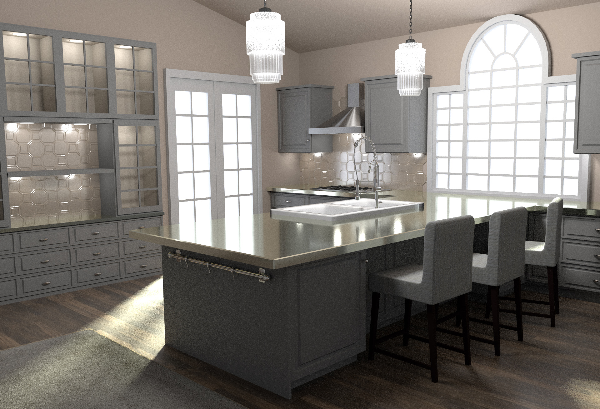
and here is the current status
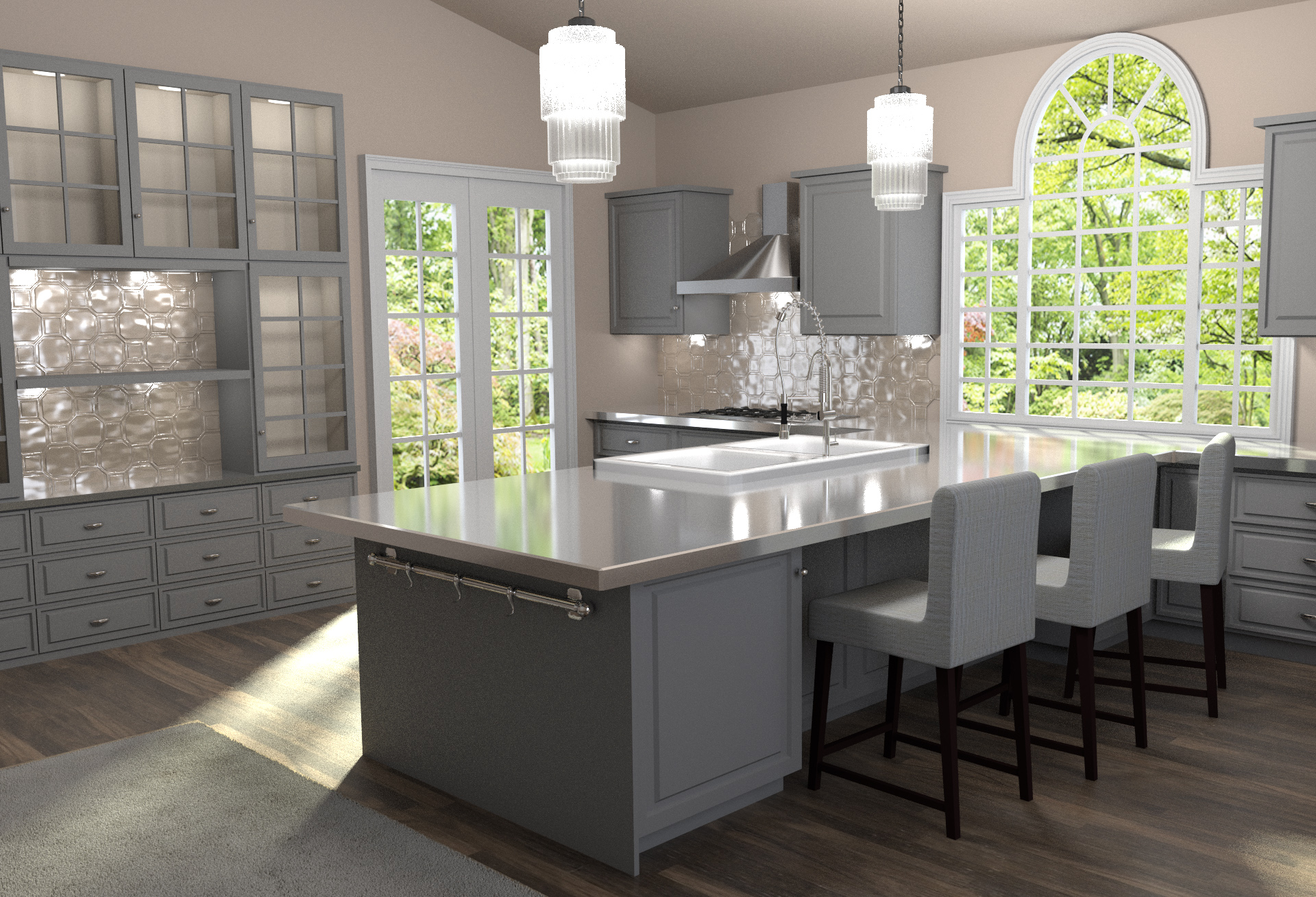
I still need to model some objects to populate the empty spaces. I intend to work on the composition as well.
Feedback much appreciated.
Seems very promising. There’s something just a bit flat…possibly a subtle lighting tweak? But it looks good so far.
Very nice! The first thing I would do is turn the brightness up on the background image, because in the reference it is blown out more. Other than that, you just need to add the everyday objects.
Thank you very much for your precious feedback @MoKD, It’s true I need to desaturate the background at the moment!
Will keep posting updates.
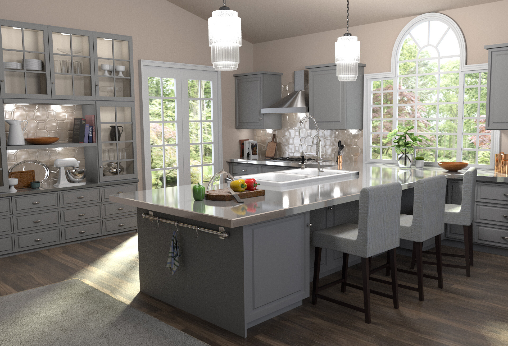
Latest update: I have started to add some basic elements. I also changed the BG (less saturated).
Note: this is a quick render (200 samples): don’t mind the noise.
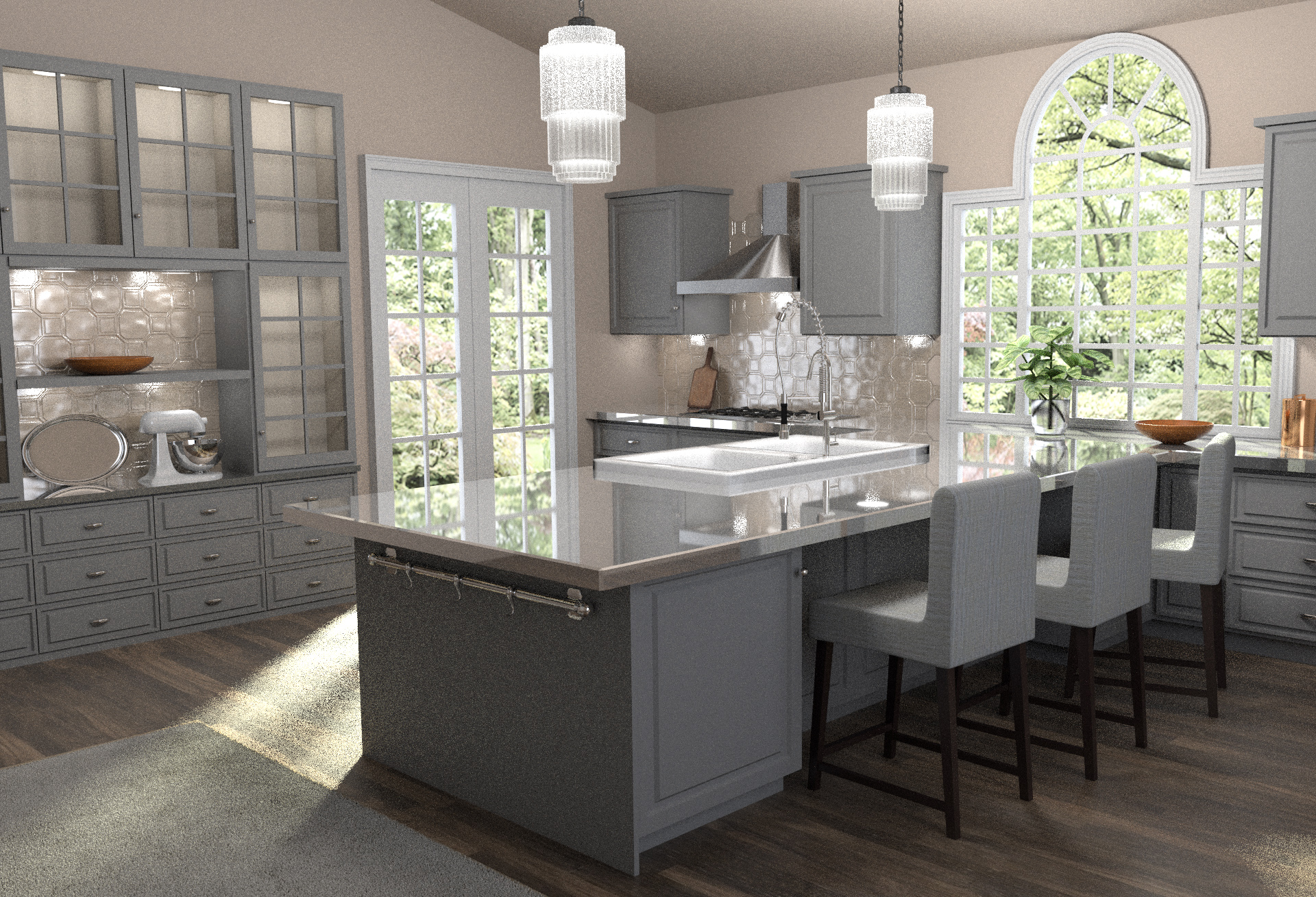
Feedback much appreciated
Wow… amazing details in reproduction. How long did it take to model all these objects?
This is looking much better! Nice job. 
Great work! It will be exciting to see this progress! As far as ideas, dishes on the shelves and something eatable on the nearer counter.
EDIT: I just realized what I suggested is exactly what is in the reference image 
I guess that is a good thing . . . right?
Thanks harishankar, modelling was quite straightforward in that project. So far I’ve been working something like 5-6 hours on that scene. I find lighting to be the most difficult bit on this kind of project. The reference photo seems to have been taken in a studio with several spotlight pointing to different directions (the background seems to have been photoshopped on top).
Thank you!
Thanks, I’m planning to do that ![]()
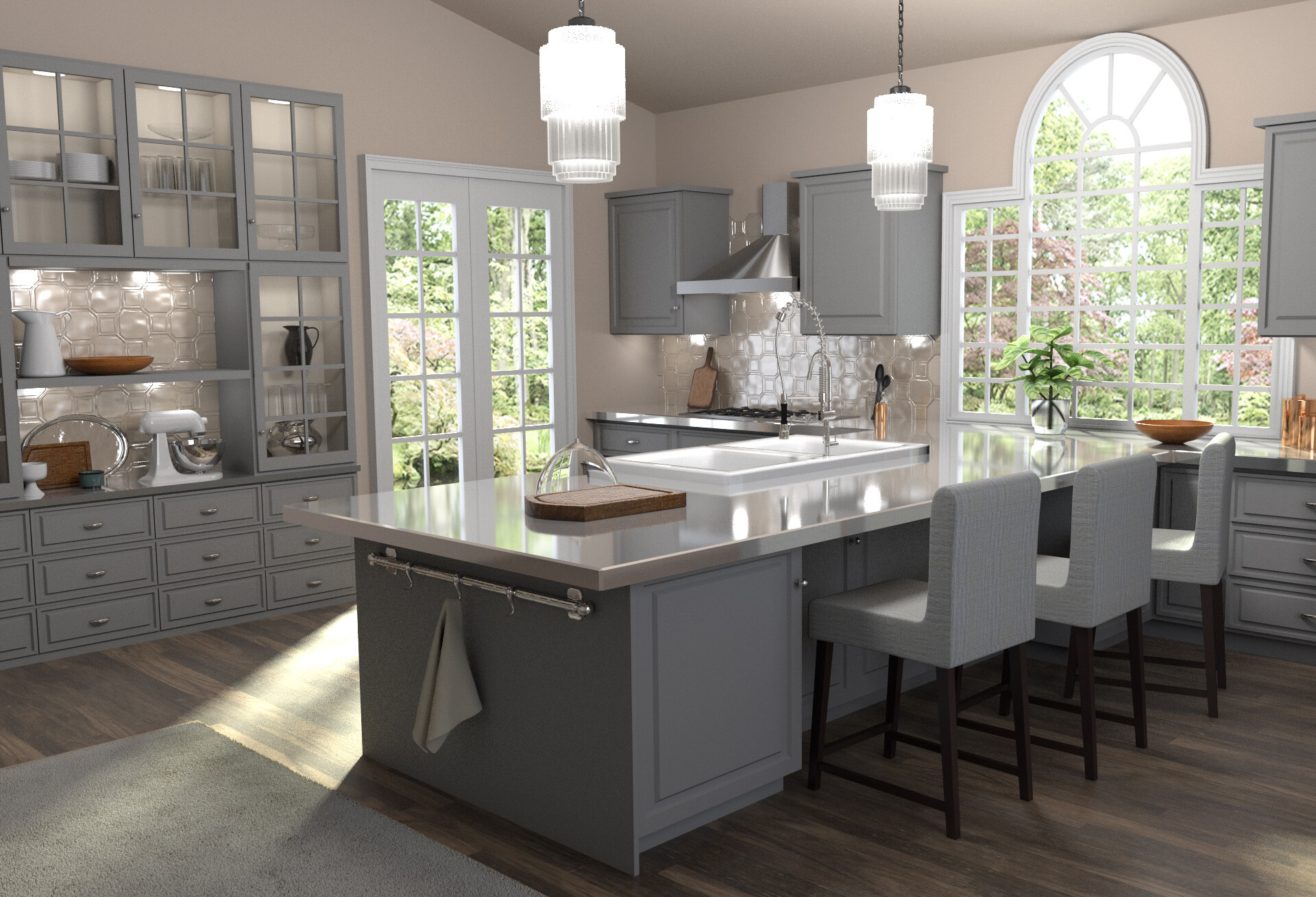
New update: I changed the bg slightly and added some more objects. This rendered in 2h (2000 samples) with 10 bounces max to have the glasses in the cupboard to render properly.
I plan to change the towel hanging on the side as it looks quite off.
Other than the towel, like you mentioned, this is much better! I’m excited to see what else you come up with!
Fabulous design …I very much liked it…
Small thing, but the transition from the bottom drawers to the floor was a bit too abrupt, seems more subtle in the ref. Also, adding some blur to the outside image might help better define the plant on the sink.
Thanks, I appreciate your comment.
Well observed, I will try to fix that.
I like a lot your improvements, good job, my unique suggestion is maybe the window glass is very clean, you could be make him a subtle opaque how you reference.
greetings!