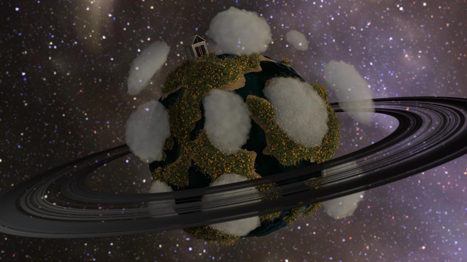
I created this scene in Blender cycles 500 samples, it is a project that just popped into my mind and I like the way it came out but I would love to make it better so tell me what you think!
all of this is personal preference but…
There might be a little too many clouds and the same for the land mass. I would suggest (just a suggestion) one piece of land and one cloud. Also the background is a kinda hazy, maybe a lot more black and less more distinguished stars might help with the isolated look.
I like it so far though, cool idea.
I think you should change the rings to a more pleasing color
Well done, but I would like less clouds too!
Yes, and I think it needs to be better lightened as well; I would use an emission shader…
What is your lighting setup, and what is your ring material?
When I have done planetary rings, I have usually done an even mix of diffuse/translucent shaders for the opaque portions, and that has looked fine to me. Then again, my backgrounds are usually much darker than yours, which makes the rings stand out far better.
As for the clouds, I think I kind of like it, though perhaps fewer would be better. I can imagine them orbiting around and bumping into eachother.
From my POV it seems to be very little contrast between the planet and the background. BG should be darker, specially on the right side and planet should be darker. For example, the oceans of the planet doesn´t seem to be water.
yes i know this is supposed to be a bit “cartoonish”
a small planet would not have a Saturn type ring system
it would be very thin and small and wispy
Really cool idea!
Though I agree about the clouds being too numerous. They seem like copied clones too. A random suggestion but maybe throw in a large cloud over the house and a couple thinner but more expanded cloud on the mid to lower areas.
Brighter rings would help with the cartoony look and maybe a slight atmospheric haze to the planet would look amazing.
Very cool idea though. I’ve wanted to make something like it myself after being inspired by the Little Big Planet games.
naww thats a cute planet xD i like it. keep working on it!
When I see something “goofy” (very far from realism) like this I want to see more color… I think it looks cool, but I think it would look cooler with bright greens and warm yellows and some purplish fuchsia rings… Make it feel like a warm June morning!
I feel like you modelled for cartoon but textured and lighted for photorealism and I don’t think those work well together… (Don’t get me wrong - I like it, I just don’t like the coloring)
If you’re going for something a bit more cartoony, maybe the water on it should be more blueish. And maybe the space be a little more purpley.