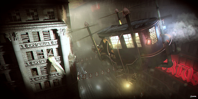
Hello, this is my first post, and I hope that I manage to get the attachment right.
I called that image done, cause I have the feeling that the more I tweak on it, the worse it gets. So I thought to put a “concidered done” version here, and see if someone has an idea of reather or not any changes need to be done.
I made that image for the Steampunk Competition
Any advice is apprechiated.
Sorry for my bad english.
Roman
Its good. The light shinging on the building is quite harsh. I might suggest more detail on the building to the right, it looks a bit plain.
Hei this is a cool work! I know what you mean, when your trying to change something and things get worse. If you wanna change some details without dissasembling the whole scenery…here some inputs
-the blue light looks too straight…like red one would be nicer
-the rails on the ground are too much, two is enough, because if you think about what small things would be running?
maybe give a plank detail in the middle so some lights gives them a line.
-my opinion, the light spot left is too white, a bit warmer lights.
-the roof from the carriage is too flat, a bit elevated from middle up.
-the propeller hats are not smoothed, i think you didnt forget it but maybe try to smooth and make some sharp loops.?
If you liked some inputs or maybe dont…please let me know
This composition has huge potential. From a storytelling perspective it’s my favorite. There’s just a genuine feeling and mood to it, it feels somehow like the person is running away, the height and perspective add to the excitement and ups the stakes. It just works really well, and follows true in the tradition of a flying machine that never could be.
Too much real estate and focal point goes to the building on the left. And with that much fog the shadows are too sharp. I would dial down the lighting and push the focus back to the carriage.
Keep going on this one, and welcome to BA!
Looking good! I concur with the previous things mentioned, but nice work so far 
The ambiance is great, but I agree with others that the building on the left is too bright. In a composition, the eye goes to the elements that are brightest or the most in focus. I would like to see it with the building a little less bright, pulling out attention to the carriage.
This reminds me of a place from Bioshock infinite where you would be clinging on the sky-rail fighting against NPCs.
The image looks incredible. I really like it if you would call it done, I would agree with you.
But since you are asking: You have two problems that most people said: the left building is too bright, but that is a really easy fix. But I find that the right building is too plain. And if you are implying it is a world with neon lights, normally, neon lights are abused. So there should be more. Or just a couple of lights, hopefully, as yellowish as the one from the aircraft, but on the right building.
I would also Add some propaganda in the far left of the frame, a really big one, in Black and White, and it doesnt need to be completely readable, just give some Idea about (for example) a political time where criminals are being chased and that is a building where the criminals lived some time. Whatever, it is just to give some more compelling story behind the guy directing the light to that building.
Whatever you choose to do, the image is already really fuckin good. Good job.
a lot has been said that i don’t need to repeat so: This is a really damn good image
BUT the thing that annoys me is the really intense chromatic abberation. I would really tone that down. It makes the picture a bit blurry which it really doesn’t need to
Thanks to all how wrote. I will take some houres over the weekend and make some additions and tweeks.
Thanks alot, I feel encouraged now!
