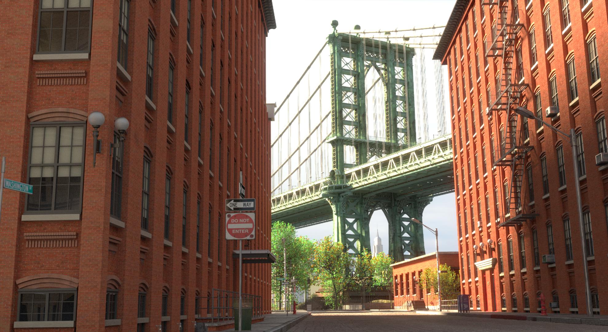
Greetings,
The following image is a work in progress. I would appreciate any insights or suggestions on how to make this better.
Thank you
Pankaj
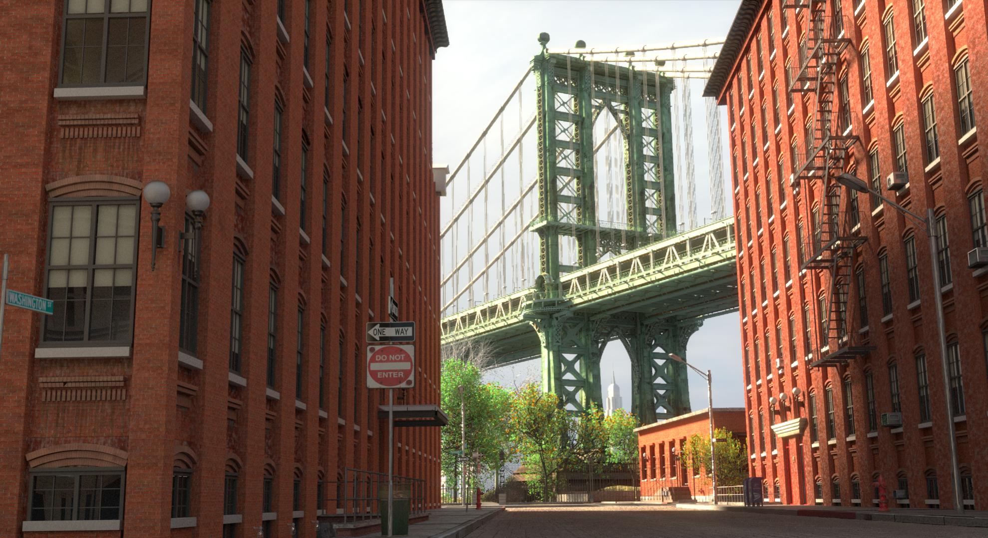
Greetings,
The following image is a work in progress. I would appreciate any insights or suggestions on how to make this better.
Thank you
Pankaj
Compositionally it’s good.
It looks somewhat devoid of life.
Good start, but a few things to improve! Lighting is good. I would add more dirt, especially to the facades of your houses. Yours look too clean. You seem to have an issue with your windows. Your window frames are sticking out of the facade. In reality the window frames would sit a few centimeters inside the masonry. I´ve never seen a house where the windows are sitting on top of the facade.
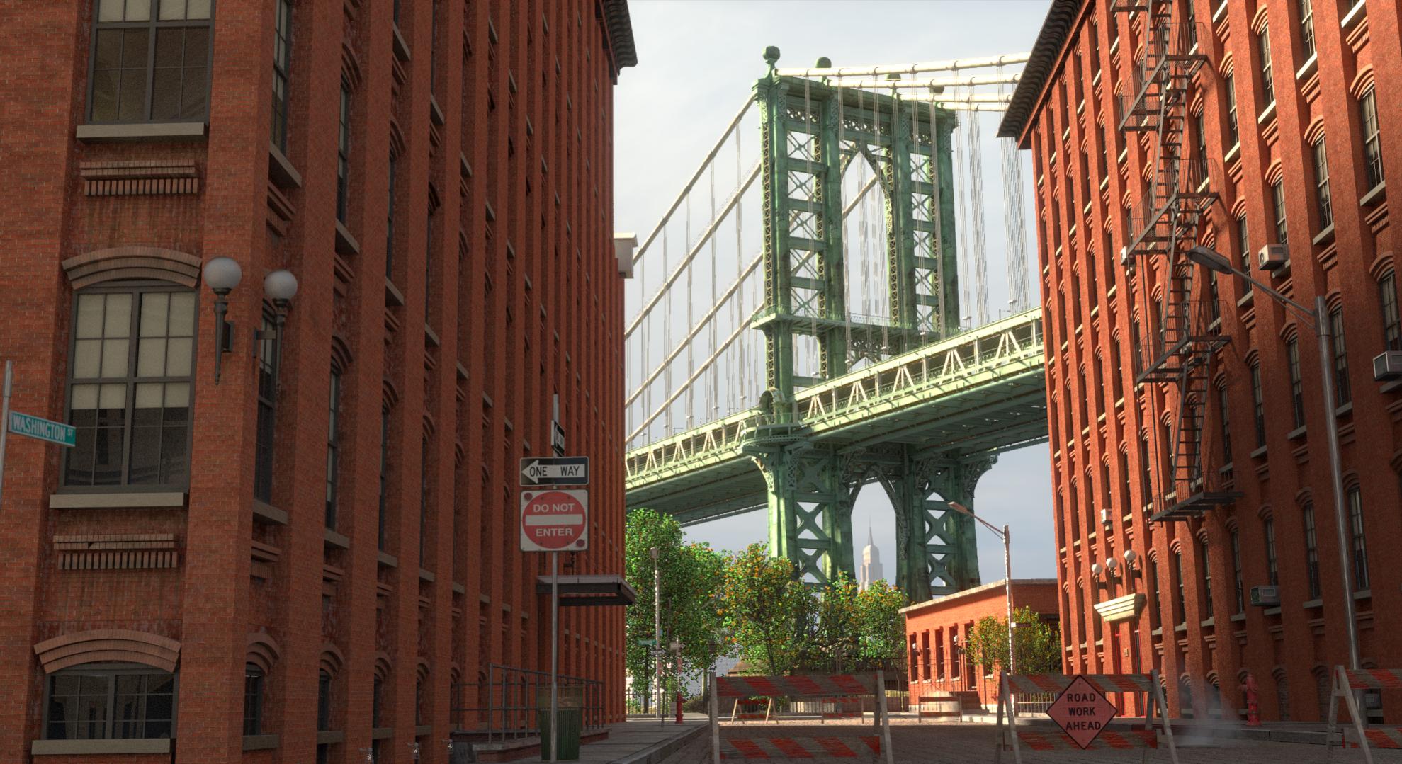
Regarding Manhattan Bridge: this bridge has a more blueish color.
Never been to Manhattan so can’t really comment on the realism aspect of this. But looking at this image to me it looks like a completely new street and new buildings. No signs of weathering or of time taking its toll. Maybe this is the look you are going for… if not then maybe a slightly more worn texture on the road, pot holes/man hole covers maybe? and maybe some dirt added to the walls/windows of the buildings.
Having said that though I really like this image, so look forward to maybe seeing an updated version
That’s a pretty famous vantage from Washington Street. Change the point of view or change the lens. Check the facade on the building on the right - there’s a layer of bricks up and down between the windows that adds more complexity to the scene.
It’s a very solid start, but I’d keep at it to deliver something more uncommon.
Thank you all for you comments. Let me work on your suggestions and I will post an update.
Pankaj
Hi!
Nice image! I think you should make a wider image, like the friend up here said, to catch more things of your scene… more of the street, mainly. Besides that, I think if you change the rotation of the sunlight, so it can hit your buildings, will help us to see more details of your building.
I just wanna say how nice it looks. You could do many things with this!
Hi,
Worked on a few elements and wanted to post an update.
Any comments are appreciated.
Thank you
Pankaj
i think its shaping up nicely, but it still looks kind of empty
also imho you dont visually have a clear subject in the image. It also kind of lacks any depth and scale. It would be better if there was a clear foreground to establish the depth of the image.
Did you try to move the camera closer to one of the buildings or the the signage closer?
Im assuming you want the subject to be the bridge, but its very cramped and overshadowed by the street and buildings.
One way without redoing the scene or changing camera location, would be to go down on the saturation of the brick buildings and the green trees.
Obviously we are talking artistic tweaks here that are not necessarily “realistic” but help sell the image.
Thank you for your comment. Let me try a few things and will post an update.
Pankaj
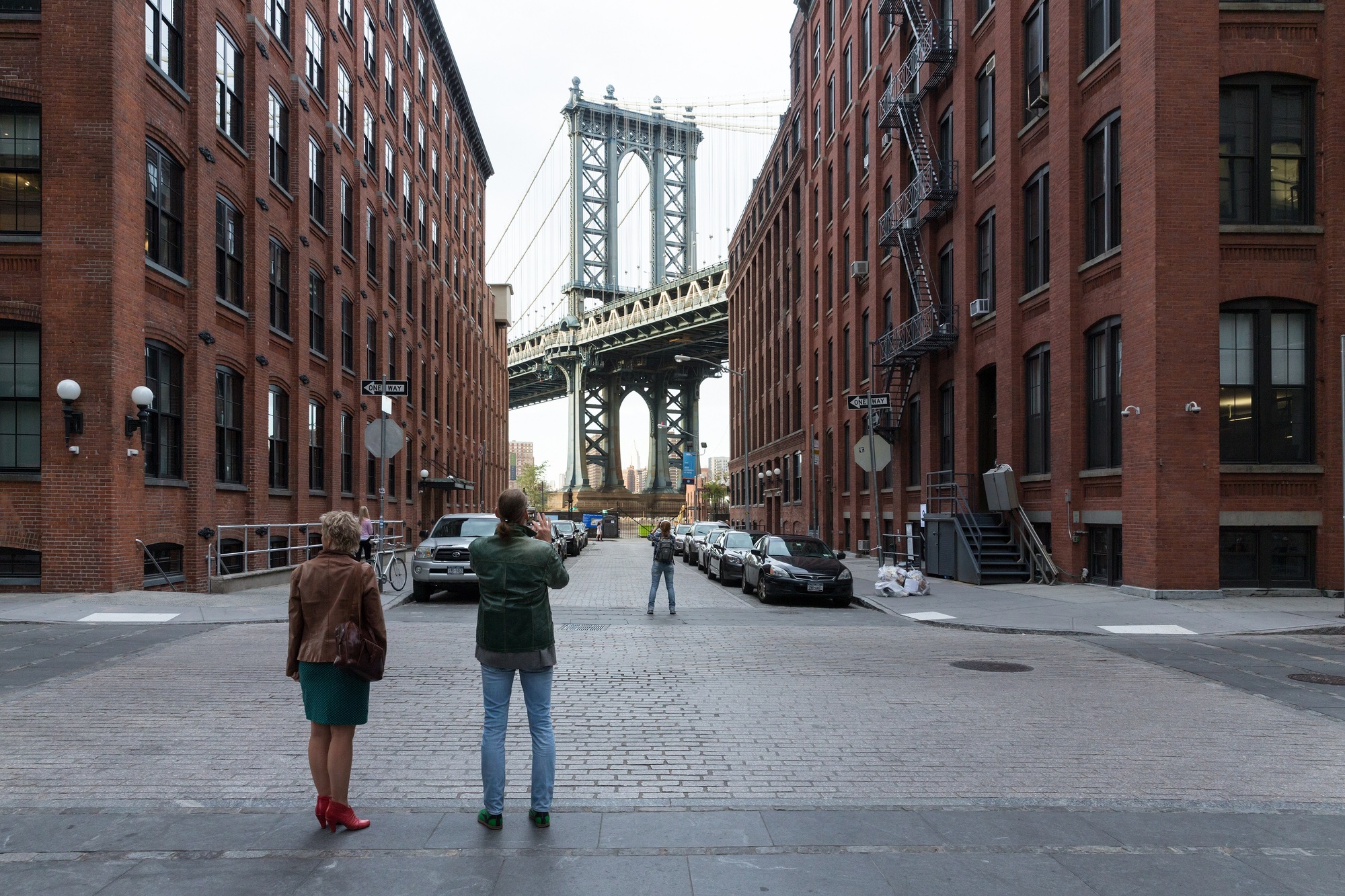
From an artistic point of view, theres nothing wrong with that, except the windows, which are still sticking out of the facade (look at my attached photo, there you see the difference).
You´ve added some color variation to the bricks, which is good. On the left side building the facade looks pretty good and realistic (in my opinion there is still too less dirt, but thats just my point of view), on the right side building the bricks are looking weird. Colour Variation is good, but I don´t think nearly every brick should have a different color (I think the reason of this effect is your dirt mapping!?). This makes the facade look like a chessboard and not like a brick wall.
Besides this, I think theres only 1 thing, that really makes the image look weird to me. Normally New York is drowned with cars. In your picture, there is not a single one. For me they are particularly necessary to make the image look realistic. New York´s a very busy city. Add some street parking cars and it will look more alive to the beholder.
But again: it´s really a good picture and from an artistic point of view you could also leave it as it is. If this was my scene, the only thing which I now would do within Blender, is adding the cars. All the other stuff could also be achieved with some good Post Production.
In the photo, those light globes really stand out, but in the render, they kind of blend in. Also, some trash blowing or sitting around can help add realism to an urban scene. Another thing I would consider, is making a manhole with some steam coming out of it.
It’s looking good. Bricks and pavement tend to have some pretty visible reflections at grazing angles. It would be especially apparent with the overcast sky you have in your background. You can see this in the reference image posted by Jero3d. I’d suggest adding some stronger fresnel reflections on your materials.
Hello All,
Thank you for the additional comments. I have incorporated some of the comments and will be posting an update in a day or so.
Thank you again.
Pankaj
Greetings,
Just wanted to post an update. I have incorporated some of the suggestions and cheated  (I had to solve a no cars problem) on others. Modeling cars is on my project list, but have not got to it yet. Next working to add some more trinkets to the scene and adjusting the texture before calling it good.
Any comments on this render is appreciated.
Thank you again for all the help.
Cheers
Pankaj
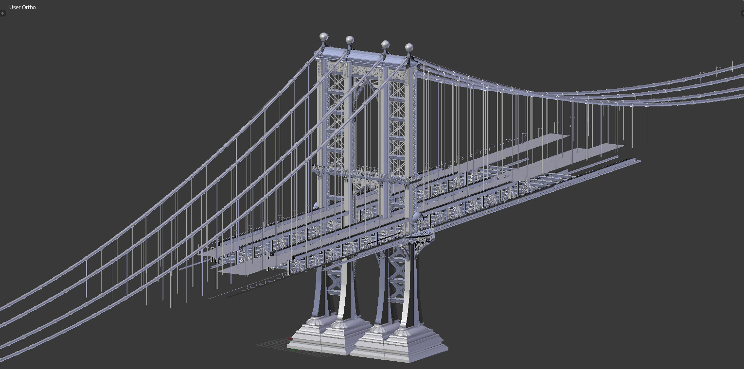
How did you model the bridge?
Awesome work!
Thanks. It was modeled from scratch using reference photos. I only built a small section that I needed for the render.
Cheers
Pankaj
All,
Another minor update. Worked on trees and the facade of the right building. Am working on one final touch up which if time permits will be done by next week and I will call it good.
@Vejn. The following image is the bridge section I modeled for the render.
Cheers
Pankaj
Hi. Very nice work so far. The modelling is really good and materials are ok, even if i think you should add more weathering.
a few things would improve the picture however. First, the lighting is a bit flat and doesn’t convey a particular ambience. Maybe you should try to give a more backlit feel to it ( how do you say contrejour in english?). The second suggestion also refers to the same critique : you should add more story telling on the picture. Nothing is really happening in the picture. Try to think of the story and a bit less to the technical aspects which are good so far. Anyway this is just my opinion and this is already good work…