Hi,
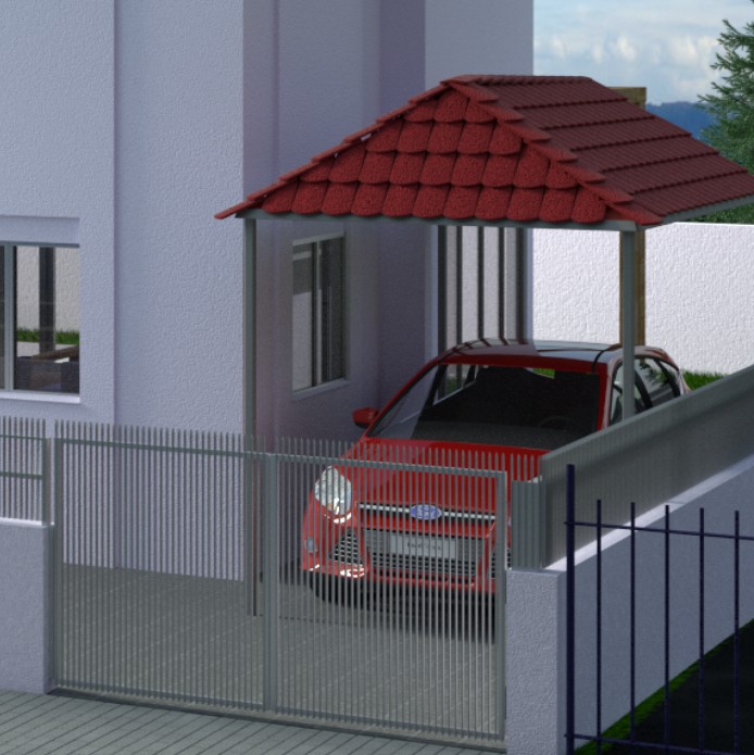
This is my first attempt at architectural visualization in blender (also my first post here).
I would appreciate any feedback or suggestions on how to make this better and what is wrong with it now.
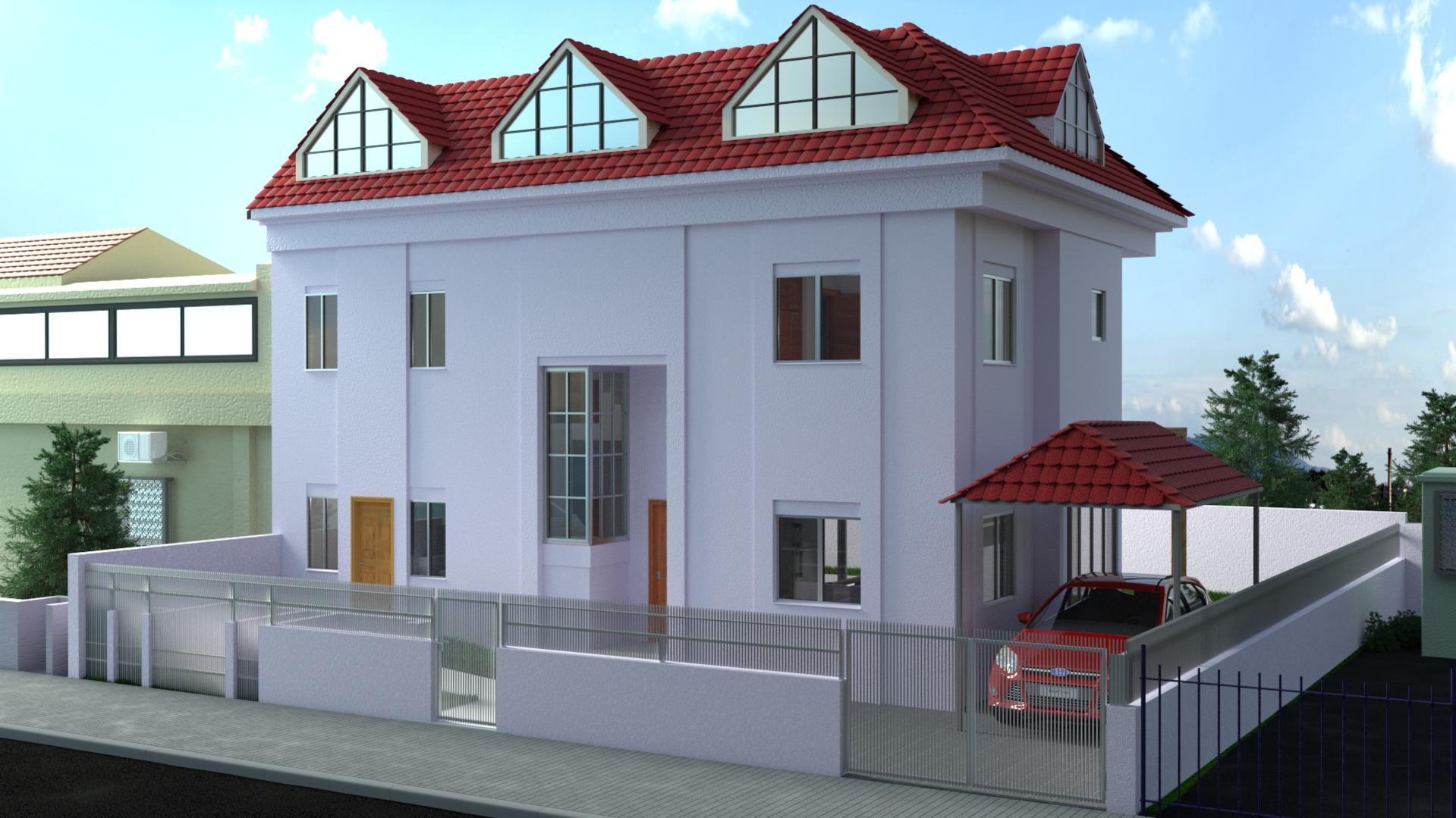
Thank you
Hi,
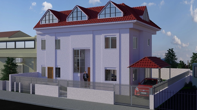
This is my first attempt at architectural visualization in blender (also my first post here).
I would appreciate any feedback or suggestions on how to make this better and what is wrong with it now.
Thank you
Hi DTR69, looks like you did a solid modeling job. I’d focus now on adding textures to the walls and roof tiles to give it a bit less perfectly smooth look.
im with TwoDeer here. The modeling is very very good. But to make this truly realistic you gonna need to get some nice textures. http://www.textures.com/ this place has great textures.
Hi TwoDeer, thanks for the feedback, but i did add textures. but for some reason they are not noticeable.
Do you think that rendering in a higher resolution can help it look more real??
I think to make it look more realistic texture-wise you should add variation to the tiles , as they don`t look that identical in most real life cases .
Also in most houses there is that sort of a wooden window door ( I dont know what its called in English ) which opens to the outside and usually painted in a different color than the house wall , this is not in every house but it gives it a more traditional look .
Your modelling is amazing and the rendering is beautiful also , I like your work very much , keep it up !
@DTR69 it’s a nice job although I agree that the gloss needs to be dialed back a bit. Textures take the correct lighting to really be appreciated and I think I see a poor HDR here. Poor from the standpoint of strong directional light. The kind of light that from a angle will really make textures standout.
Hey, I have quite a few like that since all my HDRs are freebies. In that flat lighting marbles glued to paper wouldn’t read well. So with that in mind I came up with this little slide show below. It’s simply what I do when faced with the same problem. As far as resolution the HDTV 720p Preset should be fine. Many of your friends will probably view it on a Damn iPhone anyway.
Make this lighting front at about 45 degrees and then check your textures.
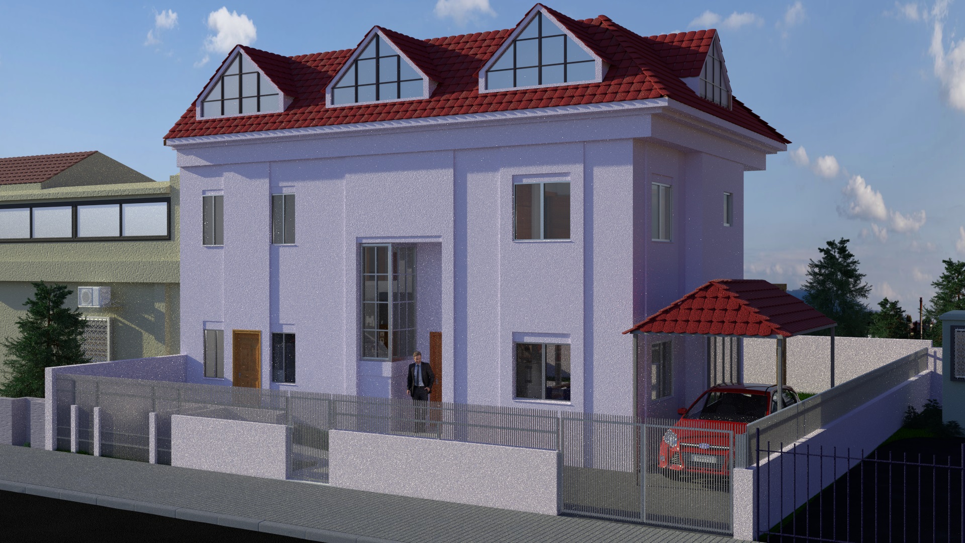
Hi, thanks for all the critic.
i tried to use all the suggestions you said.
DTR69 what part of the world are you in. In much of the U.S. that is a overcast day. : ) And, I mention this because I worked a job in Scotland once and didn’t see a hard shadow for the entire three months.
Personally looking at where you have the HDR set now I think the shadows are right on time. Take the HDR up just a bit in strength and see what you think. It’s really a back and forth thing. With a HDR that was a really overcast day and turning it up was burning out the highlights yes the shadows would have to be cut back to match that. Sun size, strength, HDR strength all have to be played with.
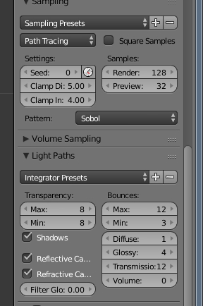
And, you have obviously done this. Now I can see your textures. Personally I would take the HDR strength up just a little and increase the Sun strength slightly to make even more light and shadow but that is a subjective call of course. Also are you clamping. It does increase render time slightly but I leave mine at 4 & 5 for most renders. And, did your glass settings change by any chance.
I would take the HDR strength up a bit and play with the rotation a little now. Personally I like the Sun now but wonder if the HDR couldn’t be rotated some. Regardless the textures are there.
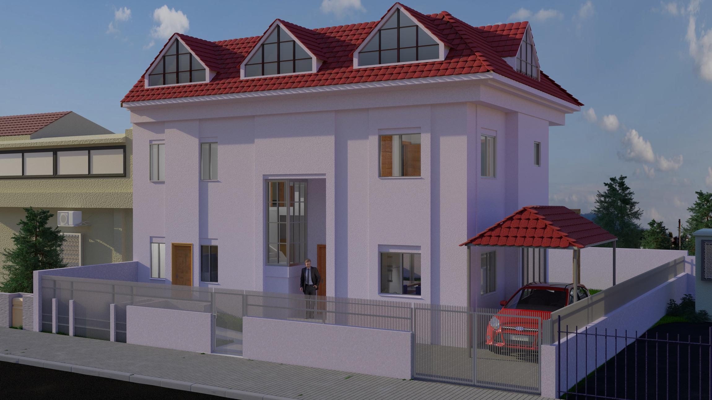
Hi @theoldghost thanks for the advice, i used your suggestion on the clamp and it looks much better in my opinion.still not photorealistic tho…
My clamping advice was totally wrong. AceDragon has been saying for years clamping Direct: Light would ruin your dynamic range. But, every tutorial I have ever seen had Direct: Light clamped so away I went on every render with 4 or maybe 6 in that value box. A monkey see scenario for sure. Then I wondered why white walls were never white regardless of how much light was introduced. I now have a new way of working. Start with Direct: Light unclamped and walk it back if desired.
In a project I’m doing completely unclamped for Direct: Light was a bit much so I set it at 16 then 14 and finally 12 looks nice to me. Sorry about that but quite honestly I had not a clue.