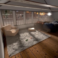
What I’m going for in this room is both realism, and that “I want to be there, laying on that there rug” feeling. I had to play around with a lot of different renders and different lighting which took some time because with my computer I have to render with my CPU. I had a hard time with the volumetric lighting and the material of the floor, so any tips there would be nice, any other feed back is much appreciated.
Seeing as this is my first attempt at volumetric lighting, first attempt at realism of sorts and my first contribution to this forum, I’m hoping for some real good feedback
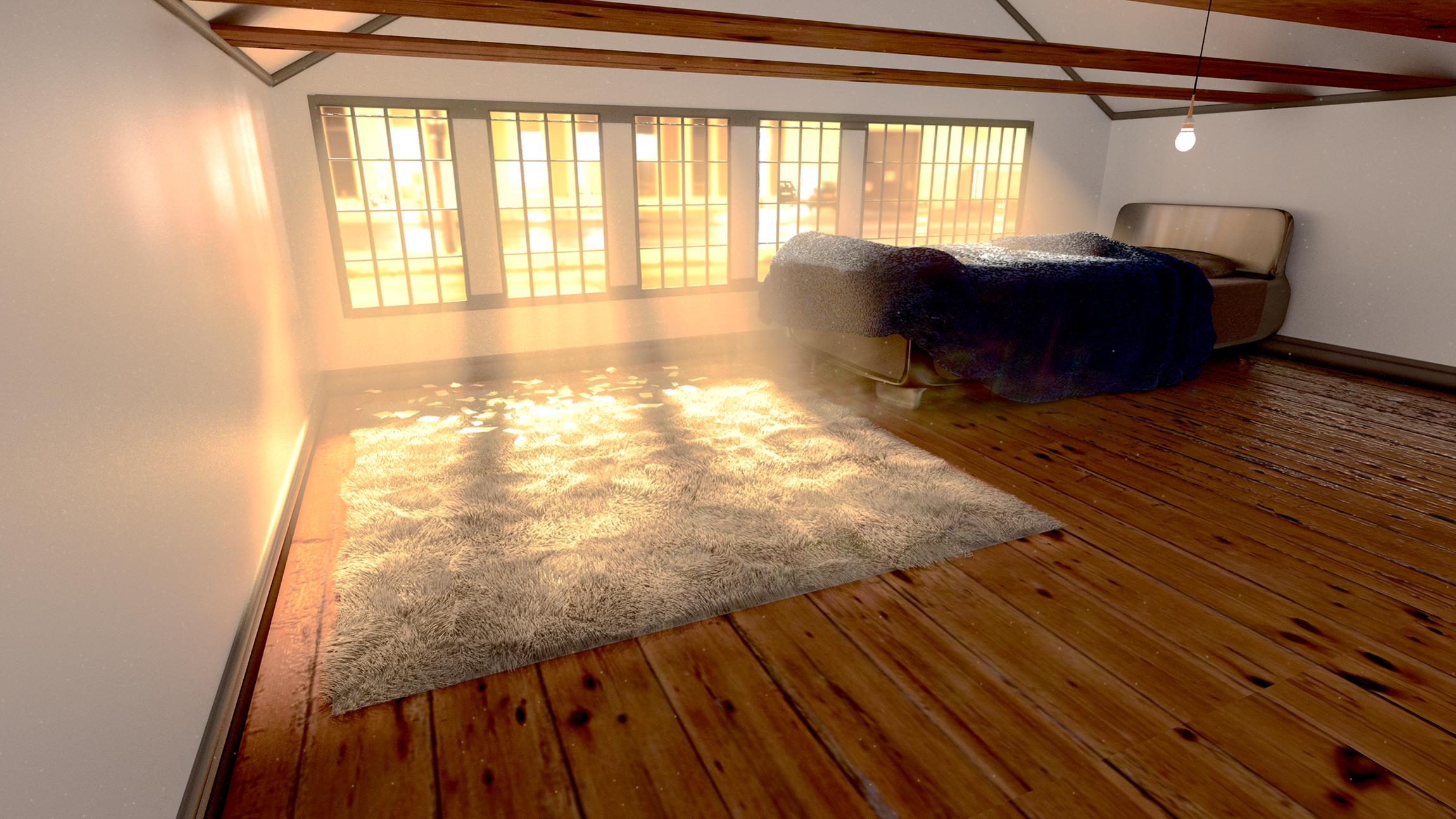
Here are a few more renders that I made, but I decided not to go with. The render in my first post is my most recent.
This one I felt like the compositing became too much
This one I started to render but I stopped a little ways into it to change a few things, but the primary reason I posted this one is because I originally had some volume scatter over the entire scene and this was the only render that showed that.
To me it seems like there are several scale issues:
Either the bed is huge or the room is missing height. Feels like an averagely sized person would permanently bang his/her head on one of the ceiling beams - and the lamp is dangling at chest height. Also the floor boards feel too wide for the rest of the scene…
Basically I think that the volumetric light does not support the realism in this picture. In my eyes it is the one thing that tells me that this is not a photo, but a fake. Don´t get me wrong: it gives your composition a cozy, warm mood. I just think that in this case it is not the best technique to achieve a realistic looking picture. To me the light itself is also too yellowish.
I also agree to what IkariShinji said about the measurement issues. Use the metric unit system of blender to scale your objects to a reasonable value. The floorboards are far too wide and have no cuts on their long side. Use a Black/White Texture to get a displacement that can simulate this. There´s also some issues with the tiling of the wood texture.
Rug: the hair particles look quite good, but it seems that you are using a single, displaced plane for the base of it. The base should have some volume to look realistic. The other thing´s regarding the “foldings”: this kind of rug is basically pretty heavy. So if you put that on your floor, it won´t have such foldings…
I can see that now, there are a few scaling issues. Most of the problem actually comes from bad camera configuration. It’s almost a fish eye lens and thats throwing off the scale of everything, I did measure out actual bed sizes and do research on real life scaling, I just don’ think my camera and composition is bringing that out. As for the floorboard, the more I look at it the more I realize it needs some work, thank you.
I see. I love volumetric lighting, but I agree with you, I need to tone it down, or get rid of it if I have to.
The lighting was really finicky, Especially getting the colors right, but I agree with you now.
Darn those floorboards, I should have just gotten carpet XD
The rug, you’re right I am using a single plane, but interestingly enough there are no folds in it, I think that might be just the grouping of the particles making it look like it’s folding, I’ll work on that.
Thank you for the feedback
Alright well here we go. I made a lot of changes to this one, toned down a lot of things and you guys were right, the volumetric lighting was a bit much.
I changed the camera, lighting, scaling and materials of a lot of different things as to give a more appropriate sizing of the room. It wasn’t so much the scaling of things that were off, it was more of just bad placement, rendering and lighting that was throwing it off.
Well, thats way better than your first attempt. Of course, theres still some room for improvements.
Windows: in my opinion there are 2 things which could (and should) be improved.
The broken windows: I think the broken pieces on the floor are looking good. But: if a window is broken, there will still be some pieces of it, that remain in the frame. In your case it looks like the whole glass pane´s fell out of their frames.
Glass Material: looks like you want your glass to be a bit dull. I think what you did, was increasing the roughness value of your glass shader. Even if this is not really wrong, I think this is not the only thing to do when you´d like to achieve an “old looking” glass. These windows are not 100% flat and perfect. So in my opinion you should add some dispacement to them, to achieve some height variation.
the bed. Imagine having a large room. Would you place the bed exactly next to the wall / window? I´m sure you won´t. You would leave a gap between bed and wall. And I think you should also do this in your render.
the wood beams: they are part of your roof construction and therefore they should have a supporting task. So they should be way thicker than they are now. Their profile should be square like.
your wooden floor is way better than in your first attempt. The only thing I would do is to increase the displacement between the shelves.
Well, I think everybody who has ever entered the 3D business was at a point, where bad lighting and bad materials killed better results. Give yourself the time it needs to improve your skills. You need to be good at modelling, lighting, texturing and of course at material creation, to get a “perfect” result. Thats nothing that can be learned in a few weeks. But you´re well on the way!
Alright, well I think I’m done with this project. I was using this project as more of a learning process and I think I have learned as much as I can without having to do extended maintenance on the scene. As I learn more I just keep finding more things I could have done better (like composition) and at some point I just have to move on to a new scene and start at a new base level.
here is the scene in its final form. I’ll probably render a higher resolution form to post to the finished projects section. Thanks for all the help.