I think i see where you go wrong, let me help you out.
Since i’m also into photography i know photographers use often 50mm lenses as a more natural look.
Although 35mm is maybe more akin to our total wide view, and 70mm might be more close to a paper cut area of our eyesight.
Try out different focal lenghts
Then there are some more tricks to get a more natural look.
Lots of good street photo’s are taken from hip hight, the reason is that you get more engulfed by the people in the scene (as if you where sitting there), and it puts the human as a kind of main focus object. the perspective tends to like for street pictures too.
When your standing, and take a photo, all heads in the picture doesnt matter the distance are at the same 2D Y position, as on a flat earth surface from our eyes goes out a horizon line (not to be mistaken by earth’s horizon). So in relation to that everything else scales. In a normal standing pose, average trees grow about 1/3 below horizon and 2/3 above it. You might use flat transparancy pictures of trees, but keep in mind that rule as you place them, be careful with their seize/scale.
Also when things go to far distance, they get a bit more blue as well…
Also to create a bit more vivid pictures if walls are white and they not metal/glass/plasic, but plaster, then give it a little bit of surface structure.
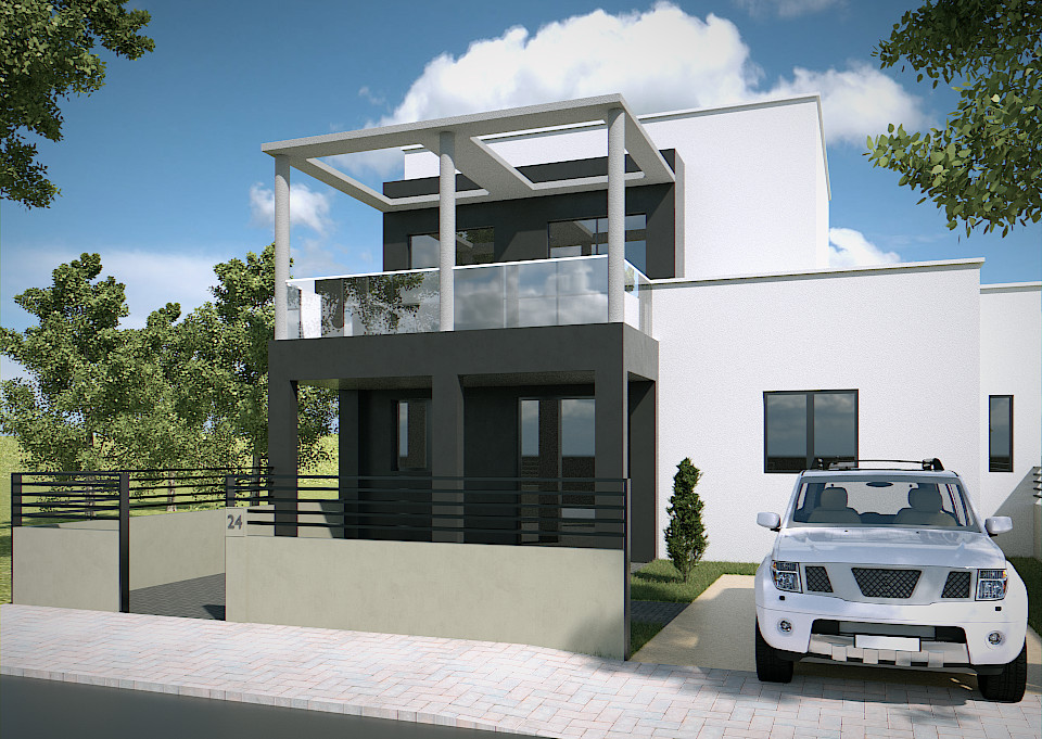
As for the second picture, here attention is drawn to the car, the reason is i think its placed at the “golden ratio” as a more complex object it draws attentions away from your main subject. And then there is maybe another problem with it, its a nicer shaped white object.
I dont know if your architecture is all about white (i’ve think we passed that age a long while ago, but that might depend on area), anyway if you have white and green only your missing out on collor, collor is realy there to make things attractive in this world.
ea “the woman in red” is a saying more about color or gender, she’s a woman that standsout of the crowd; i’d say dive into world of color
or use it, ea your white familiy house have some color full kids play in front of it. Or use plants.
Or as some architects like go to material colors, steel, concrete, natural stone, fabrics, etc… there is more then white 
When I made drawing of people posing nude for me regulary i actually came bored of the drawings.
Later i made waterpaintings of them and because of the color the whole artworks became a lot more vivid and popular.