Hey guys,
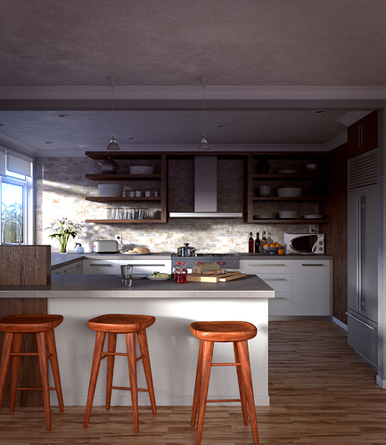
I created this kitchen scene about 6 weeks ago but couldn’t render it as i am working on a dual core CPU and 3gb RAM and I thought it would take to long to render. Just a couple of days ago i decided to give it a go and render it no matter how long it takes. Well Finally after almost 30 hours of rendering I got this image rendered.
The entire scene except for the models on the counter top and the shelves is created by me(including the stools). The models on the counter top and most of them from the shelves are from The Architecture Academy.
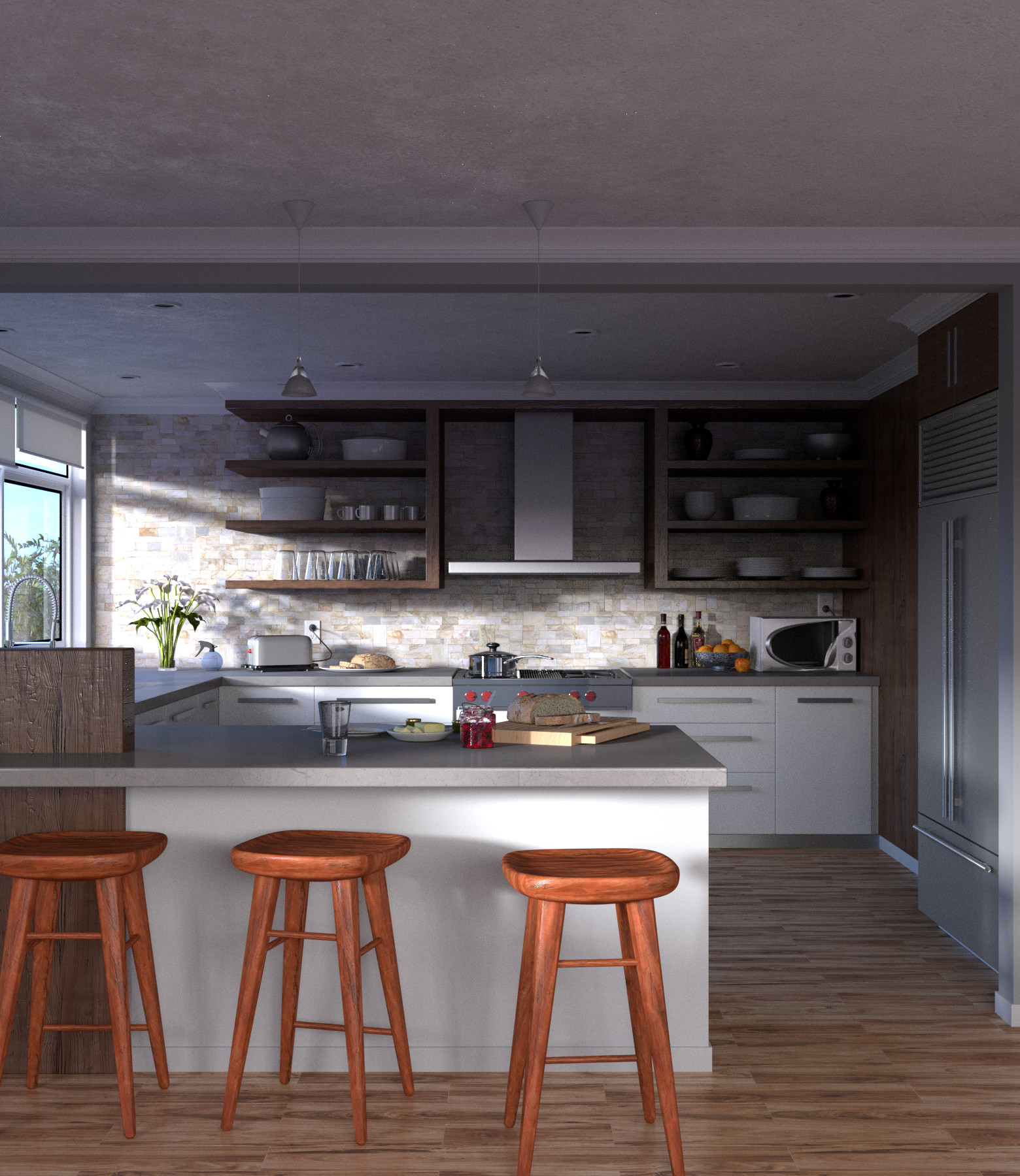
I’ll attach the non-composite version of the image and also a cropped image to see how the camera looks better.
what’s wrong guys, Is my image to good for critiques or is it so bad that no one’s interested to critique or is it the fact that I used some one else’s models. Guys I have really worked hard, so I was actually hoping for critiques. I will at least know the things I shouldn’t do for my next project.
Thanks for the critique, thought I wouldn’t get a reply… What you said about saturation, is it the same for non-composite image or is it the composition I should work on…
Hi It looks really great. I like the main light form the side and the atmosphere your image creates. You used many different materials in your scene, I am sure it was a lot of work to set them up, but there are still some points that could be improved. The metal surfaces like the teapot, bowl and teacups look too perfects. Some micro detail in the roughness would add a lot of realism (I am used to the PBR workflow, so the corresponding in blender cycles should be glossiness?). The glass of the microwave seams unrealistic. I would aspect some reflections on it. All in all it the surfaces look to perfect to seem real. Nevertheless, this is a good and keep on working on these things
I agree with Weisl, everything does look rather to “clean” and “new” to be real. The modelling is spot on in my opinion, perhaps invest a little time with subtle dirt mapping, to emulate aging, wear and tear and subtle imperfections on your surfaces.
Also, you’re lighting looks as though it is supposed to be heavy sunlight from the windows to the left, but you’re shadows seem way to soft in comparison to the light intensity? I think they should definatley be harder and darker. perhaps lower the size of any lamps facing through the window to around 7cm-20cm?
Also, something about those stools sticks out to me and screams “Not Real”, But i can’t quite place my finger on what it is?? Maybe the image texture is too saturated? or the value of the RGB is too high? Or it could just be as mentioned before that the woods reflection is slightly too uniformal?
Other than that this is a fantastic piece of work, i recently started trying to get serious work done with interior renders and architectural scenes, so i know what a huge (And sometimes annoying) undertaking it can be to get convincingly-realistic shots! But this really looks like it could be really great with just a little bit more work in some areas
Did this really take 30 hours to render? 30 hours! And I thought a 10 hour render was a long time. Now seriously, that’s way too much. What you need to do, I think is set a clamp value (I normally use a value of 8) to help reduce noise and fireflies. You’ll probably need to bump up the samples too as I see a fair bit of noise in the shadows. What machine did you render on?
I’m quite new to blender so don’t take my word for it, but I think this could do with a few normal maps. Crazybump is free software that can generate normal maps, displacement maps etc. from normal photo’s. If you ever find yourself looking at a flat, evenly lit brick wall, go to crazybump.


 What you said about saturation, is it the same for non-composite image or is it the composition I should work on…