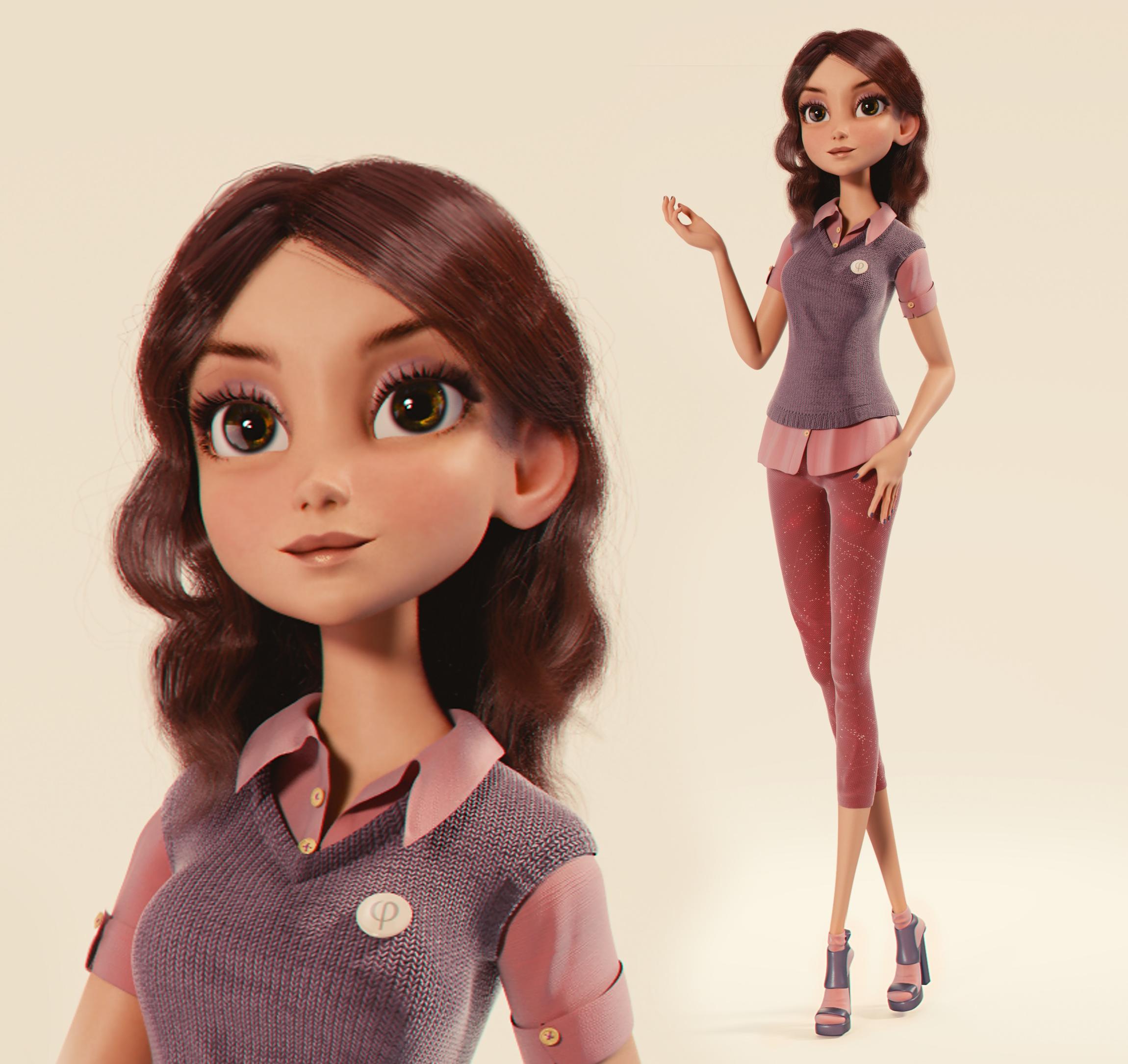
Character design for science-popular project Fibonacci.
My page
Demo reel of the project
Really a great job!! 5*
More info?
Spot on lighting on the fabric!
face is a tick to flat for me considering the left eye shows a light source or something reflection
I just love her!
*****!!
paolo
Absolutely gorgeous! Her doll-like features are wonderful, and it’s just so amazing!
Very nice result!
Already top row while there are no stars, too much!
Joke, good job for the character.
I think the lower legs/feet are too extreme even for a cg character. If you started the feet where the trousers ended it would still look ok but over all she is very nicely done. 
I completely disagree. The directionality of the silhouette would be completely destroyed if the legs of all things were shortened. If I fuzzy my eyes, she has the shape of something like a pen. I think that fits the actual character personality communicated through the design pretty well, but I could just be projecting. If anything, I’d push it even further to get that fine point across, and shorten her torso by about a third. The character has a very graphic and 2d center, I believe, and I actually really really really hate when sacrifices like that are made to a balanced design for the sake of blind adherence to anatomical correctness. It generates some of my pettest peeviest pet peeves in mainstream 3d animation. Anatomy is a tool, not a rule. Then again, I came into animation and character design through impressionism and graphic design and shit that intentionally breaks anatomy.
Actually wait, her legs are the same length as her torso from the bottom of the pelvis to the tip of the head. This is actually correct, I think! Welp shrugs
Basically, take design crits always come with a heap of salt. Like, I’d have recommended making her undershirt a much lighter shade of pink or even white, because her body is really monochromatic compared to her head. Maybe have some color landmarks on her hands too. I think her flesh tones are lost against her clothes. That’s it though.
That cloth material is incredible.
Well that’s a rather unnecessary rebuttal of my opinion. In fact I didn’t say anything about blind adherence to anatomically correct proportions. I said the lower legs were too extreme IMO. If you scroll the page so that the lower part of the image is hidden you can see that it wouldn’t diminish the slenderness of the character at all if they were a bit shorter. Lets hope no Barbie haters turn up and rant about body image to really wind you up.
Wonderful work!
A question: how do you do the wool material for Amy’s vest?
Thanks a lot for your answer and congrats for an awesome work!
I didn’t mean any negative tone in my post, I was just disagreeing and stating why. I’m sorry.
Woooohoooo! Top row!!! Naz my friend u deserve it!!! Keep u the sexy work 
Bro congrats looking great! I noticed your age, respect man!
very very nice work, I mean it … but
If you want to bring your skills to the next level you have to think about your character as if it was real. What does it feel to be her. Where does she come from and what is she doing in that picture.
That pose just looks “fake”. There is an asymmetry on body language intentions … the right side is pointing outside probably to communicate with someone near her, while the left side is pointing inside just to close that communication. Also it seems she is walking or something. I mean it is not a standing pose anyone would feel comfortable with. But her left hand doesn’t communicate any dynamic. Let alone the face expression that is almost inexistent. Hipnotized may be ?
The design itself is barely believable. I mean, who would dress a pullover with short top and pants. Is it hot or is it cold in there ?
Again … think about your character. Pretend she is real. Pretend she is living in that picture.
very nice fresh character.
why that defocus effect?
She is beautiful  Nice work!!!
Thanks!
I combined the wool texture with diffuse colour by multiply, then a little bit displacement, glossy and white facing.
hey Naz, great work.
I’d like to know how you got the speculars on the eye…I typically mix a transparent and glass shader factored in by a fresnel node…it works especially if the character is looking directly at an emitter…but the emitter might end up lighting the front if its too close, and thus destroy the desired look.
gret work and grats for making it onto main page