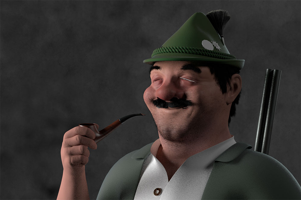
this is my idea for blenderguru character competition. He’s called Sepp and lives in the Alps. His hobbies are hunting, drinking and smoking…
I’m not going to win but this competitions somehow keep me motivated to do some Blender stuff. Next to daytime job, kids, household I’m struggeling a lot with “Blender-motivation”.
Was working hard the last days to improve. Considered the fact that this is my second blender project that’s not from a tutorial I’m quite happy so far.
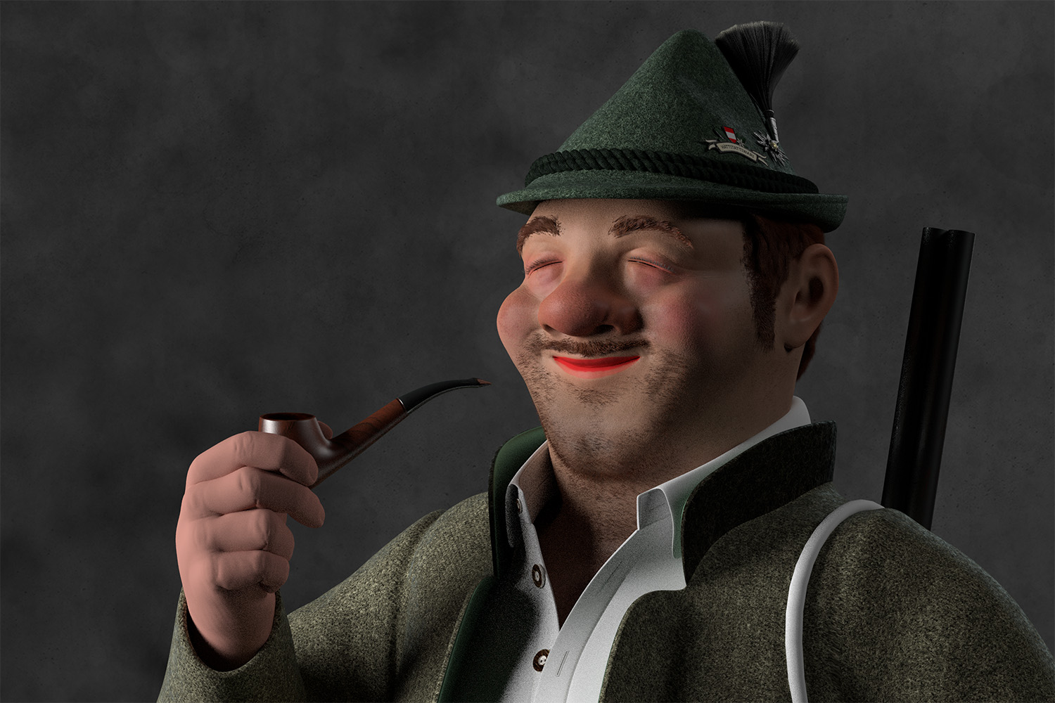
Yes, definitely doing well The fabric is getting a nice wooly feel to it. One small thing you may want to change is the color of his lips to be a lot less saturated and darker, maybe something closer to the color of his cheeks. Right now they are kind of the focal point of the image with how bright they are.
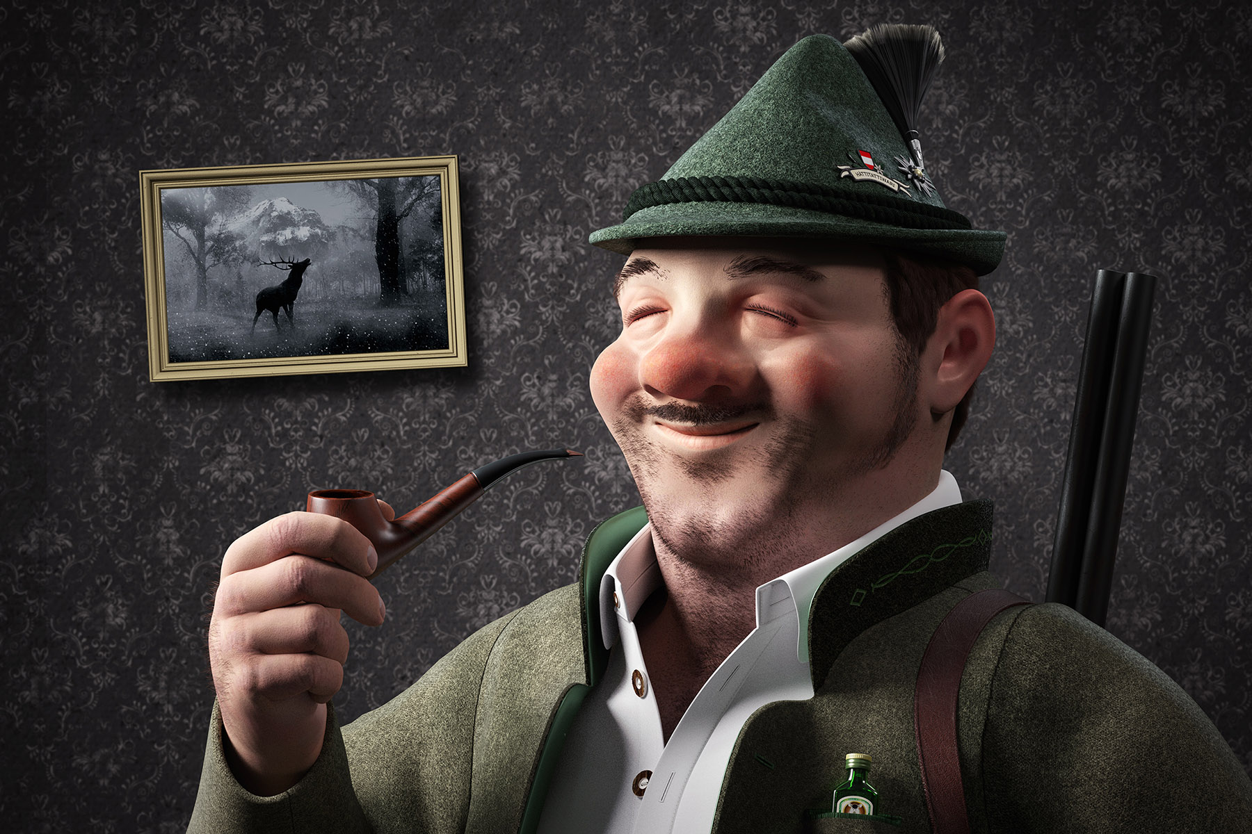
Another update. There are still a lot of flaws here and there and everywhere but I have to call this kind of finished. I got so many other work to do…
It was a nice and fun project, learned a lot of new stuff -> topology does matter even for still images, don’t mess up uvs, need to learn rigging,…
Good work.
But going with the style of the image I would suggest to try out more stylistic lighting and rendering. Also you may want to retook at the wall paper behind the character. It’s related pattern is a little distracting. What does the tilted picture frame on the wall dipict?