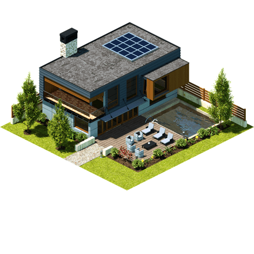
hello everybody.
I made this building in the style of a commercial project I worked on. I got some sincere, negative feedback, but it only boils down to “it does not cut it”.
The best explenation I got was something like:
There’s something odd with the rear border of the roof, it looks taller than the rest of the building.
Now, if a piece of game art does not cut it for a gamer it does not cut it at all, and expecially for new employers. Can anybody share a thought or two about this building, please? It would help immensely. Thank you.
I’m not in the industry so to speak. But I don’t see anything inherently “wrong” with the models. Considering the viewing angle it looks like it could be right out of an isometric/ pseudo 3d game. It’s quite possible the person you’re talking about simply didn’t like the overall design, but didn’t express it that way. I’m not sure what problem the rear border of the roof presents. Not from this angle at least. Was the negative feedback based on images like this one? Or the actual meshes?
The roof comment may be related to the orthographic projection.
Was that a one off model? Or were there different iterations?
Were you given specific parameters, or just a vague idea of what was required?
Was the model intended to be viewed from the perspective shown, or something closer to first person?
Hello Macser, thanks for your feedback.
Answers to your questions:
The negative feedback was given by three persons, probably because they’re not used to the orthografic projection. Maybe the mistake I made is the shape cannot be read (!! I got a cube wrong…)
The model was meant to be viewed in ortho projection.
I was given no parameters, I simply found a real building I liked and I made a model for my portfolio.
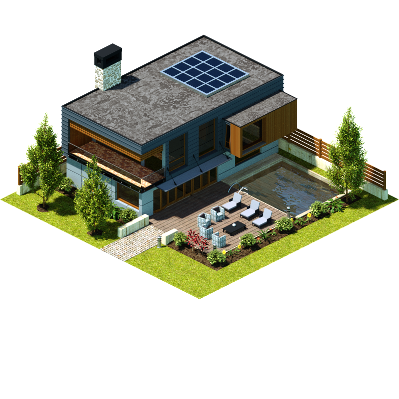
The building is made according to the style of my latest huge assignment, only difference I made a higher resolution render than the pieces that were actually put in-game.
For videogames the trees look hi-poly on this render. Overall the render is oversaturated and I suggest to play a little bit with the lighting direction. Maybe it worth to check texture tiles to match real life sizes (on the chimney mostly)
I used the lighting rig which was used for the game (used under permission), it does work in game. I’ll edit the textures though, thanks for you feedback!
Hi, I am not really into game modeling, so take my opinions with a little bit of reserve, but what seems the most wierd to me is the kind of clashing of two styles:
very simple, squareish building and furniture vs. very detailed semi realistic or smooth foilage and water.
Well and the other idea - and dont take me wrong and I say upfront that I like the image - really, but I am afraid that it is not really that impressive. By that I mean, it is nice and OK and well done and I like the simplicity, BUT because it is so simple, many many people could do it as well. It has not a very distinctive style, no incredibly original idea, no tricky and hard to create parts, only simple textures…
If you want someone to hire you and pay you, you must convince them that YOU are the guy they need. That YOU can do something others can’t. Maybe this is partly the reason why others were telling you it is not enough. It is just not outstanding. This might be painful to hear, but if you really want that particular job, maybe consider starting something completely new, familiar and usefull for the employer (of course), but unique in some way.
Yeah okay sorry, only now I read that it is for a particular style game (shame on me) I thought it was some generic portfolio. So that makes my point partly useless and stupid :-D. Sorry.
But perhaps if you could provide us with some previews of the game and its style we could more easily compare and think of what to make better…
If it’s for a portfolio, then I don’t see a problem. Opinions are always going to vary. People either like what they see or they move on. If you did what you set out to achieve then keep it. The render may not set the world on fire in terms of composition, but I assume the primary concern was presenting the models themselves. But perhaps make that clear for the viewer, so they have some context.
By that I mean a brief explanation of why you present it in orthographic projection, and a wide angle shot. As opposed to a walk-around in closeup. Some people might look at it and think it’s something to do with architectural design.
Work wouldn’t always be about coming up with original concepts. Although they’re nice to include in a portfolio. I’m sure the average working 3d generalist has to cover a lot of ground. Whether it’s functional or purely artistic.
Hello .Adam. Don’t worry, you got the point: this building is nothing special, simply a sample of what I did for a project. I actually need something more complex in both concept and execution to impress someone… Anyway, I posted it here because I needed someone else’s opinion.
@ Macser: it’s a piece for an isometric city builder game, think of Sim City. The general style, angle and so on are based on the ones I used for that project. Only difference is the render is higher resolution because I wanted to show more details. You got the archviz feeling correctly, usually they ask me less realistic stuff (and the pieces I made are somewhat less realistic, it’s simply I could do what I wanted with this one).
Sim-city was exactly the kind of thing that sprang to mind.
If it’s purely a showcase, demonstrating your ability to create assets for an isometric style game I can’t personally fault it. Perhaps the target resolution would be more appropriate though. Does that sound fair?
Well, front and rear roof lines seem to converge, sure there’s no perspective? Probably wouldn’t have noticed if I wasn’t looking for something off. As a gamer it wouldn’t bother me though. Could explain it away as a slope for drainage even.
Nice work as far as city builders go imo.
Edit: I’d sooner critique the smaller balcony railing glass. The bright sunlit patch is enlarged / shifted while the floor tiles aren’t.
The railing glass thingie is due to the fact that’s the standard cycles glass material applied to a solid railing and not to planes. I’ll make a try with simples planes, maybe it’s going to look better, thanks for pointing that out.
Aside from the roof thing, what I noticed was that the materials for the pool make water look a bit unpleasant … the brown stone material seems to be making the water look brown, and that’s a bad thing for a pool.
And the edge between the between the grass and the mulched planter is way too razor sharp, especially at the corners. The height of the grass should make the edge a little feathery.
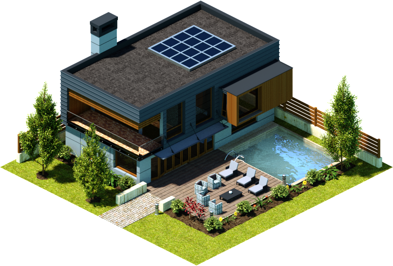
Hello folks. @Liasaurus: you were right about the grass edge, but I managed to do nothing workable due to the render size. I edited the ground dirt and now it looks less artificial.
Everybody: thanks a ton for your feedback, it helped me a lot.
And now here you go my final render: