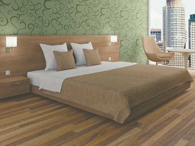
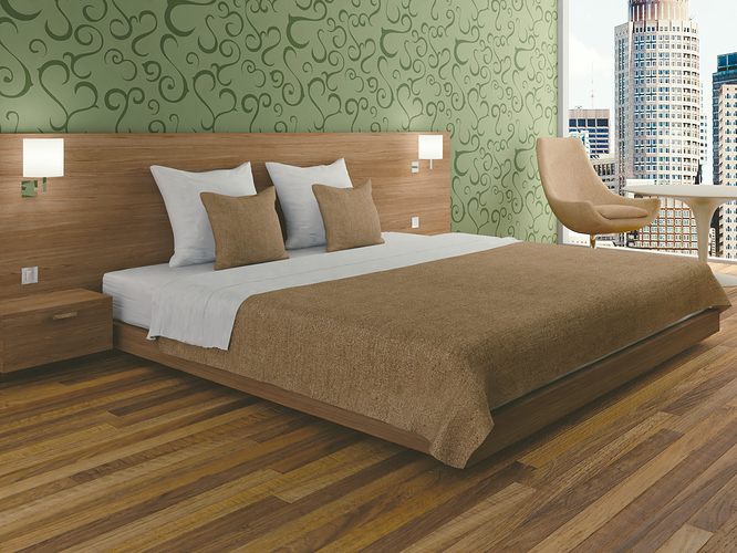
A simple hotel room
First image set: blender cycles with denoising

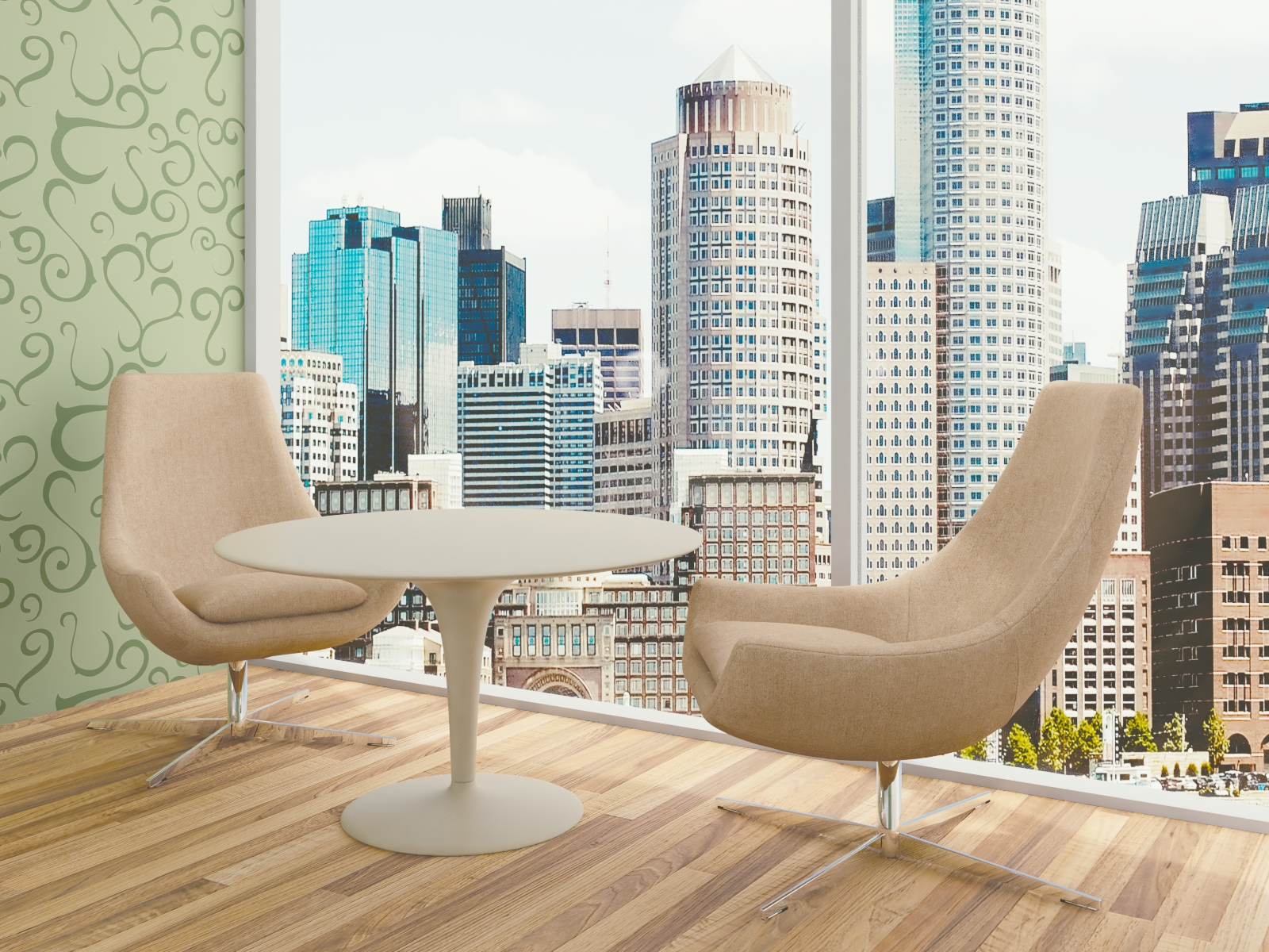

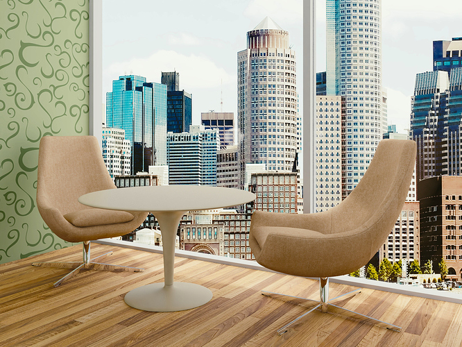


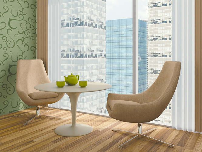
It seems like it’s a bit too sharp and the perspective of the background doesn’t seem to match the perspective of the hotel room. It’s as if the hotel is collapsing and the room is tilting and you’re about to fall backwards. It’s also very bright, the interior scene would be slightly darker than the outside world.
The image used for the outside of the room is introducing a feel of artifice for 2 reasons:
- The light in the picture is exactly the opposite direction than in your room.
- The room and the image have different perspective, also the distance and scale is wrong.
Also i think personally the floorboards are too big.