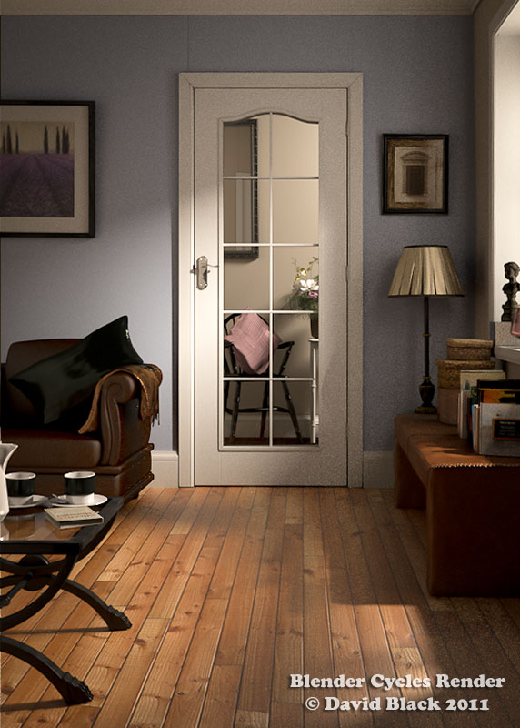
Awesome renders… really impressive.
Hi David, your image is astonishing, you heard this many many times now… 
If you want answer to everyone individually is fine, maybe you can use the same post arranging answers in this form:
@ alysius: etc…
@ Bao2: …
@ danilius: …
this way all answers are collected in the same post and the thread is still readable.
Wait for your next work 
I wanted to see the image in its place and certainly it looks awesome:

Hey, it was probably due to the composition, I mean it’s a great render but it’s a portrait image, and it would be hard crop without loosing the overall feel / composition of it. ![]() It’s brilliant, but maybe it didn’t belong as a splash. Thank you for sharing it here with us.
It’s brilliant, but maybe it didn’t belong as a splash. Thank you for sharing it here with us.
Yeah, sorry, it can’t be a splash if it can’t look good in the Splash resolution.
If this worked, I’d prefer this over the one that was actually selected for 2.61.
Hi sorry it has taken a while to reply, been very busy with degree work then Christmas, hope everyone had a nice one!
@ V1K1ngo, JamesNZ and Andreu - Thank you very much for your kind comments.
@ Isscpp - I know, thank you for your encouragement.
@ Bao2 - That reason was never mentioned but understand what you mean.
@ wjbarber - Thank you kindly.
@ alysius - Firstly thank you for your kind feedback, thank you also for your helpful posting tips.
Wow! Thank you Bao2 for your time in putting this together, when first saw it my heart skipped a beat, thought something different had been decided.
@ Casio23 - Image aspect ratios was never mentioned. Thank you for your encouraging feedback.
Thank you FreeMind, since Blender has a nice big square as the basis for its splash, help & other links, it is a shame that only a landscape golden aspect ratio renders are considered, portrait renders would sit quite nicely if the links where moved to one side, stacked vertically, or placed either side of a portrait splash. Idea for the future maybe?!
If aspect ratios had been mentioned as a possible cause, I would have happily rendered the scene again with a wider field of view. Not to worry! ![]()
Thank you everyone again for the fantastic feedback.
David
If aspect ratios had been mentioned as a possible cause, I would have happily rendered the scene again with a wider field of view. Not to worry!
The same splash screen image template has been used for years so I can’t see how this should have been a surprise.
…freaking awesome render, completely realistic… even to the point of, if you took the photo, utterly pointless!
@ Richard Marklew - Hi, being quite a new Blender user I did not know that.
@ Slyporkie - Thank you kindly for your feedback. Yes, I took the photograph, the reason for the render comparison is threefold and all part of my degree work. 1) A study of people acceptance of what is real/fake. 2) CGI room-set design is an area I have great interest in, also vocationally. 3) A nod towards and acknowledgement of the direction the room-set photography industry is heading.
@ displaced - Thank you for taking time to give helpful feedback. It’s great that you are able to utilize and teach open source applications, hope this is going well for you.
@ Bao2 - Ah I see, do you upload to graphicall, wondered if I have been using your builds? As for the splash, thank you, I would imagine that only new renders will be considered. After I have updated my blog (sadly not been done for a while due to completing degree work) I am considering sending my image to the blender.org gallery.
Thank you again everyone for your encouraging feedback.
David
Variations on a Theme
The main room-set is complete, adding a few extra renders using different textures and colours, these (plus others) have been created for use with an interactive website I am developing.
Here are just a few…
You will notice a little more noise present, to save time these were rendered at a lower resolution for around 2.5 hours each.
David
looks great!
Agree, but also agree it’s resolution/perspective was wrong for the splash.
your render was absolutely amazing!! i would def give this 5 stars and you are extremely talented with blender/cycles… i personally dont know how to use cycles but this was such a great render i might just have to learn it! cant wait to see more from you in the future 
Outstanding
Nice work sir, i think there should be tuts related to the same it will views you never expect because that’s awesome and something to learn for sure.
Great render, just took a look at your blog and was very impressed as well with the other rooms, you can barely tell them apart from the photo references, which is crazy! Great texturing and lighting, you nailed it.
Fabulous! Assuming it isnt a photo - how do we know!? Very inspirational to new modelers.
For a long time I had been thinking that modelling was the most important part of creating 3d visuals. However, your renders affirm that the repeated reminder of ‘importance of materials and lighting’ are true. The knowledge-able of the field might just consider your work to be one of the examples of ‘noob to pro’ (in six weeks) - Cheers.
Amazing attention to detail! So realistic. I like the darker render as well, the one with the knotted wood flooring.
Only six weeks? It would have taken me two decades. That is amazing!


