the last image: Ha, I like how sophisticated this tea cup is, and at the same time, sound like the perfect thing when sick, and at the same time slightly gross lol. But interesting! I really like the gentleness the gold rim gives it as well.
i like the idea of the many handled lid. Reminds me of something I saw in a talk on udacity about the design of everyday things, where they had a cup with three handles meant to be passed around. I thing the handles will look better a little thinner. I do like the choice of yellow here as it gives it a warmness to it I think. But I am not sure about the exact kind of yellow.
Trash can: Neat, texturing has always been difficult for me, but I think has a lot of interesting textures on it. The M looks slightly stretched.
Tower video: haha neat! Very interesting looking. Nice music as well. i think I would like to see this building in a sci fi novel somewhere.
I really like the robot, but its face is a little too close to that robot on Futurama, and otherwise it is very unique looking.
I live the towel on it, though it looks like a tiny tie, which I think might be really funny too. Where can I order one of these for my house??
i love the super curvy pipe. I really like all the invention type things that don’t actually exist. like this super curvy pipe. Just very fun.
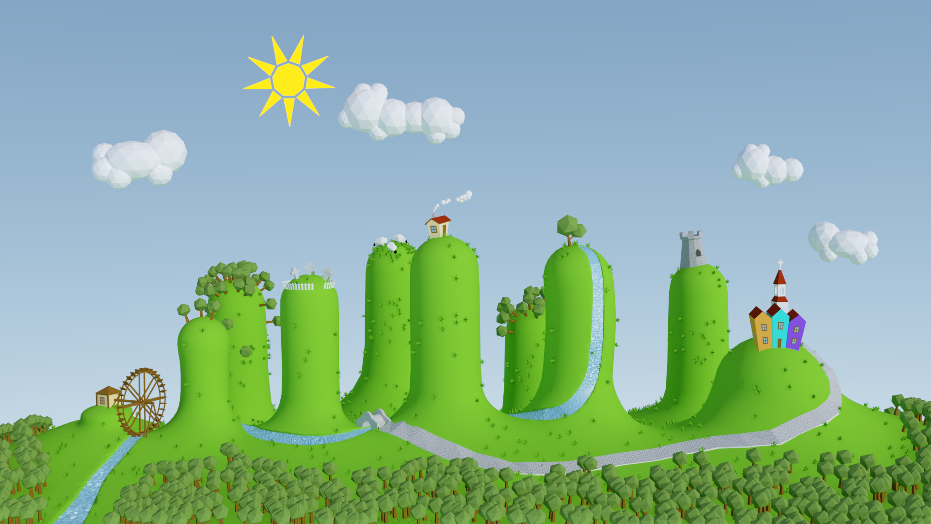
And absolutely great full blown city! I don’t know how to do wow factor but once you get that, I am sure this will be amazing!
Monument render is Nice…I like the way You have mixed the shape , feel good for My eye’s.
The monument itself let My fantasy fly…
Render from you floor plan need some lighting…Put some light in and they will shine.
And maybe play a little with some other angles…They are all stait on…Puff puff
oh yes I know, but I don’t won’t to bother more… it took me too much time as it is… it’s not much work to correct it, but when I count in the rendering time it is…