Lol. The Logo is 666
Thanks, @ Tvaroog , an interesting link to the history of the logo , clearly I know that logos are not created in Gimp:) , I tried something in Incscape.
Your logo looks good , I like it. …maybe sometimes we will see a new logo:eyebrowlift2:
Wow these are awesome keep them coming Bishop. Do you have the SVG files to download?
To quote something:
A few good reasons for a logo redesign include the introduction of a new line of business or product, a shift in the marketplace or consumer behavior, or to target a new audience.
Notice what each of these logos borrow from their precursors: a familiar theme, color and image.
#1. Don’t stray from the general look and feel of the company.
When you change the colors, style, or visual goals of the company, that’s called rebranding – not redesigning a logo.
Blender doesn’t really need a “rebranding”.
The logo and branding are fine, even good.
The rest of the program needs evolution (of which blender has made amazing strides over the past few years), but rebranding? Na.
Is the logo in the OP supposed to represent a typical left hand coordinate system? That’s clever.


I’m rather attached to the current logo…but that has almost no effect on progress…
@ s12a…like the blending of the 2D and 3D…nice statement
@ Herbert123…thanks for a early morning chuckle…
 funny things happen here… maybe we should think twice about a new logo… like that vector things… but the old logo… I like it too…
@ herbert… good mix in my opinion…
A new logo probably should happen, just as the new website happened. Its really a matter of timing though, save it for a major milestone in Blender development. Say something like 2.8 or 3.0.
Thing is you have to understand that impressions are made fairly quickly… Blender has had a negative impression for quite some time. Its slowly starting to change, but a lot of users in the field will hold onto that impression until theres some mental trick to help them re-evaluate that impression. New logos, new version numbers…anything that conveys that its “new” pretty much does the trick.
There is a lot to gain from a bit of polish when it comes to the brand. I think it needs to happen eventually, rather it would be in Blenders best interest to evolve a bit more on branding.
As SaintHaven wrote…“A new logo should probably happen”… we should be prepared …another idea for the new logo
if you are interested in logo design I can highly recommend this series.
http://shop.gestalten.com/dos-logos-244.html
los logos, dos logos, tres logos … great series and good for inspiration.
I think a new logo design should start b/w using & probably explore using negative space. find that perfect shape.
I’m not sold on a new logo, mostly because all of the suggestions for new logos are really, really bad so far. If someone can come up with a logo that’s at least equal to the current one it might be worth considering changing it, but even then it wouldn’t be an easy choice unless the new logo were significantly better as well (remember, changing a logo significantly is trading away existing brand awareness so you need a significant step up in quality to make up for that)
It’s so easy to change a logo and change is nice once in a while. May as well.
They updated the logo and it looks terrible  . I wish they kept skeuomorphic.
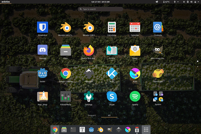
As logos go, I think the Blender logo is pretty good and works well as an icon compared to most, although I admit the one I click on in my dock is the Papirus Dark version. It’s easy to spot, is good on most backgrounds, has a strong sillouette and looks pretty flat to me.
the only free software that needs a new branding is gimp


