my thks to you ![]()
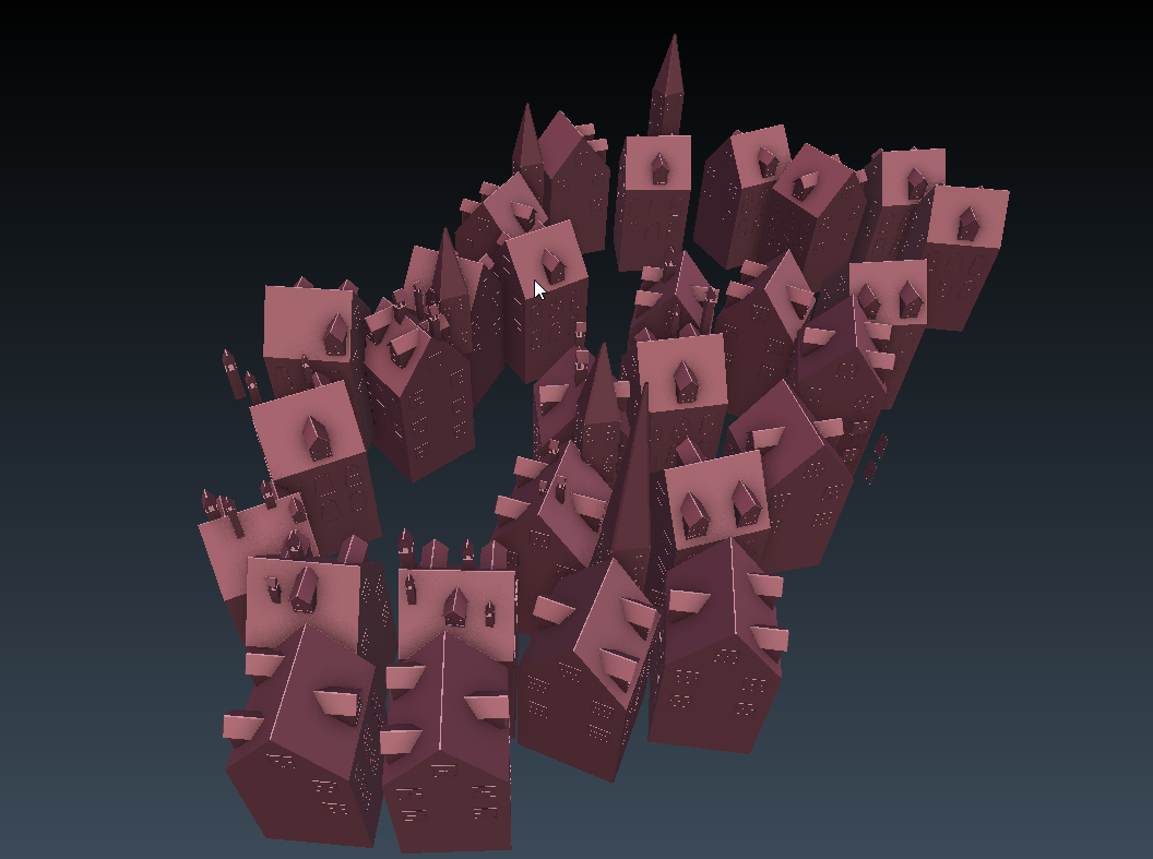
they are generally low poly, i arranged them in a path-like road, make room for the tower, add some variation to it, some pointy tower and smoke chimmy,…etc ![]()
My favorite part is the originality, nice work.
ok, but the drawing is better  It has clearer colours and silhouettes. Goes to show that doing something in 3D doesn’t necessarily make it better.
i agree with you, at first i tried to re-create the concept, but i think it’s best to take myself into the work, not the other people. i’m still learning, sometimes i will be better ![]()
Too much post effects and blur. That ruins it for me. Can’t clearly see where the person is standing or how is holding the umbrella. Other than that very good work.
Y’know, as impressive as this piece is … there is still one important thing about this interpretation which … I cautiously and timidly suggest … really does not work well (IMHO). And that one thing is the horizontal white line that slashes across the picture, with “UFO’s in the sky of the city below.” This absolutely rips my eye away from the intended subjects (the child, the town), because my eye always seeks the brightest and most contrasty parts of any image (CG or photographic).
If you compare this to nokeek’s hand-drawn image with these things in mind, you’ll observe important differences between the two, and all of them are directly concerned with the treatment of both contrast and light. Here’s what nokeek did (and you didn’t):
- Horizontally, the frame is divided by a very narrow white line with a mixed-contrast line directly above it. One line is part of the top-half; the other is part of the bottom.
- No explanation is given for the reason why the rain-shadow beneath the child’s umbrella is brighter than the rain surrounding it, but this creates a direct visual counterpart to the lamp of the lighthouse immediately beneath it. The color of the lamp is used only elsewhere for “lit windows.”
- The “light” of the lighthouse really does not proceed anywhere outside of the aforementioned space. It really does not “light” anything at all: anywhere else there is “light,” every window 'lights itself."
- The artist’s composition is absolutely symmetrical. (In fact, it forms a cross.) Decidedly different color palettes are used in the upper and lower regions.
Mind you, I’m not suggesting at all that you should, with Blender, “copy nokeek.” But I do suggest that there might be a few compositional take-aways that could make your beautiful and expertly-crafted image even stronger yet.
Thks sundialsvc4 for the in-depth opinions :D, i will take your word carefully and next time, i will make an even better work ![]()
Fantastic work! Lovely style!
Amazing work. Grats for making it onto the home page
Absolutely fantastic image!
I like it. However, I had a hard time understanding the image without looking at the drawing that inspired it. I couldn’t tell that the town was under water, and that the water went up to the highest building. An impressive start and I like the style.
Well done and nice compositing on final render!!
Very, very nice!
Stunning work! My eyes are having a hard time focusing on one part of the image. In the concept, I know I should be looking at the lighthouse and the person on top. In the render, that bright white streak across the composition leads my eyes out of the image. Just something to think about.
I really, REALLY love the ethereal feel of this. Amazing.
Wow! The original concept and the render are equally awesome!