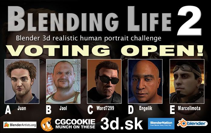
TIME TO VOTE!
All of you who entered made it really difficult for us judges this year! Well done and keep it up! Of 49 total entries we settled on the below five.
One vote per person only. It’s very important that you make your decision carefully, and base it on the Judging Criteria (also pasted below) and the overall guidelines contained within the main contest thread which you can view here. You don’t have to allocate points, but should you feel like joining in for fun feel free to post your scores in this thread.
Your vote is just as important as the five judges’ scores as they will count towards 50% of the final scores. The judges scores form the other 50%.
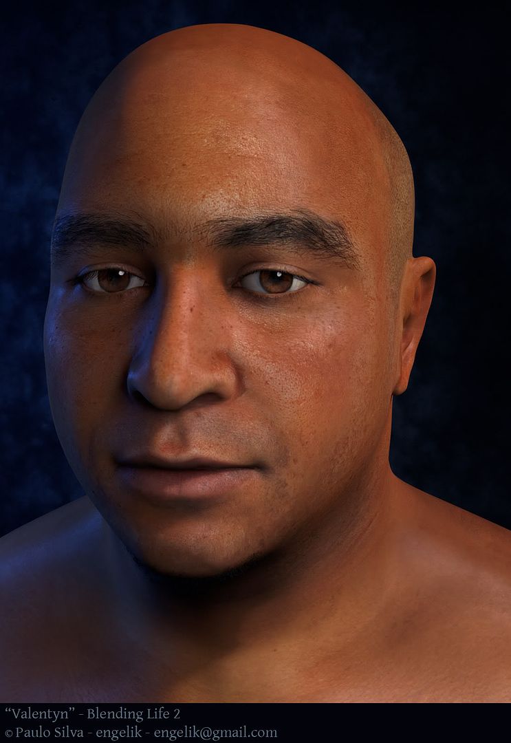
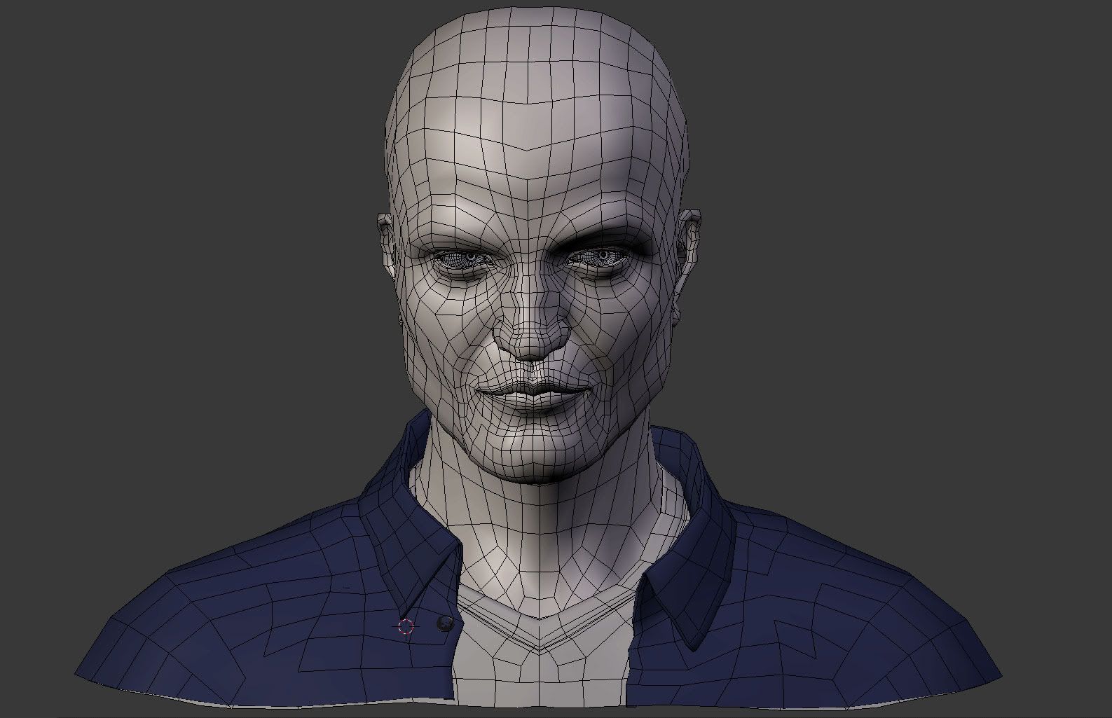
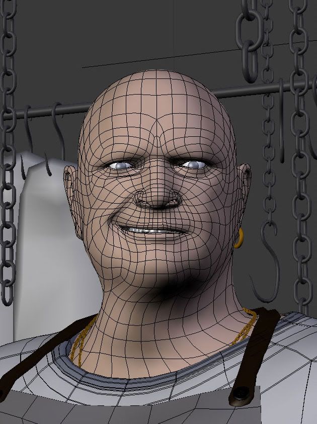
Make sure to view the full resolution of each by clicking on each thumbnail (make sure to zoom in to 100% to see the fine details) and also view the wireframe and alternate of each.
Comments welcome.
Polls close 3 May 2010.
HAVE FUN!
Pasted from the main contest thread, use the following as a guide to make your decision:
Judging criteria, forming a total of 60 points.
Mesh topography: 10.0
Character realism:
Skin texturing and shading: 10.0
Eyes texturing and shading: 10.0
Hair*, including eyelashes (and facial hair if applicable) texture and shading: 10.0
Character personality & lifelike expression: 10.0
Overall presentation: 10.0
This includes (but doesn’t consist only of) the background and the texture of clothing (if any).
- Should your character be bald, the scalp’s skin texture will be taken into consideration.
A. Juan

Wire here
Alternate here
B. Jaol

Wire here
Alternate here
C. Ward7299

Wire here
Alternate here
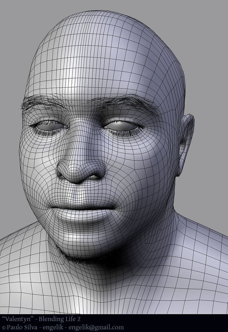
D. Engelik
Wire here
Alternate here
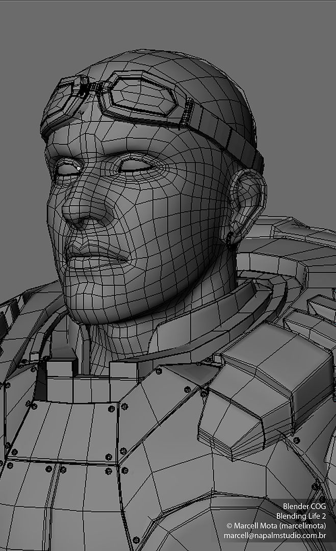
E. Marcellmota

Wire here
Alternate here
.
 One’s initial pick does not necessarily reflect the total requirements. Trust me, I took part in narrowing 49 entries down to five, in this case I know what I’m talking about!