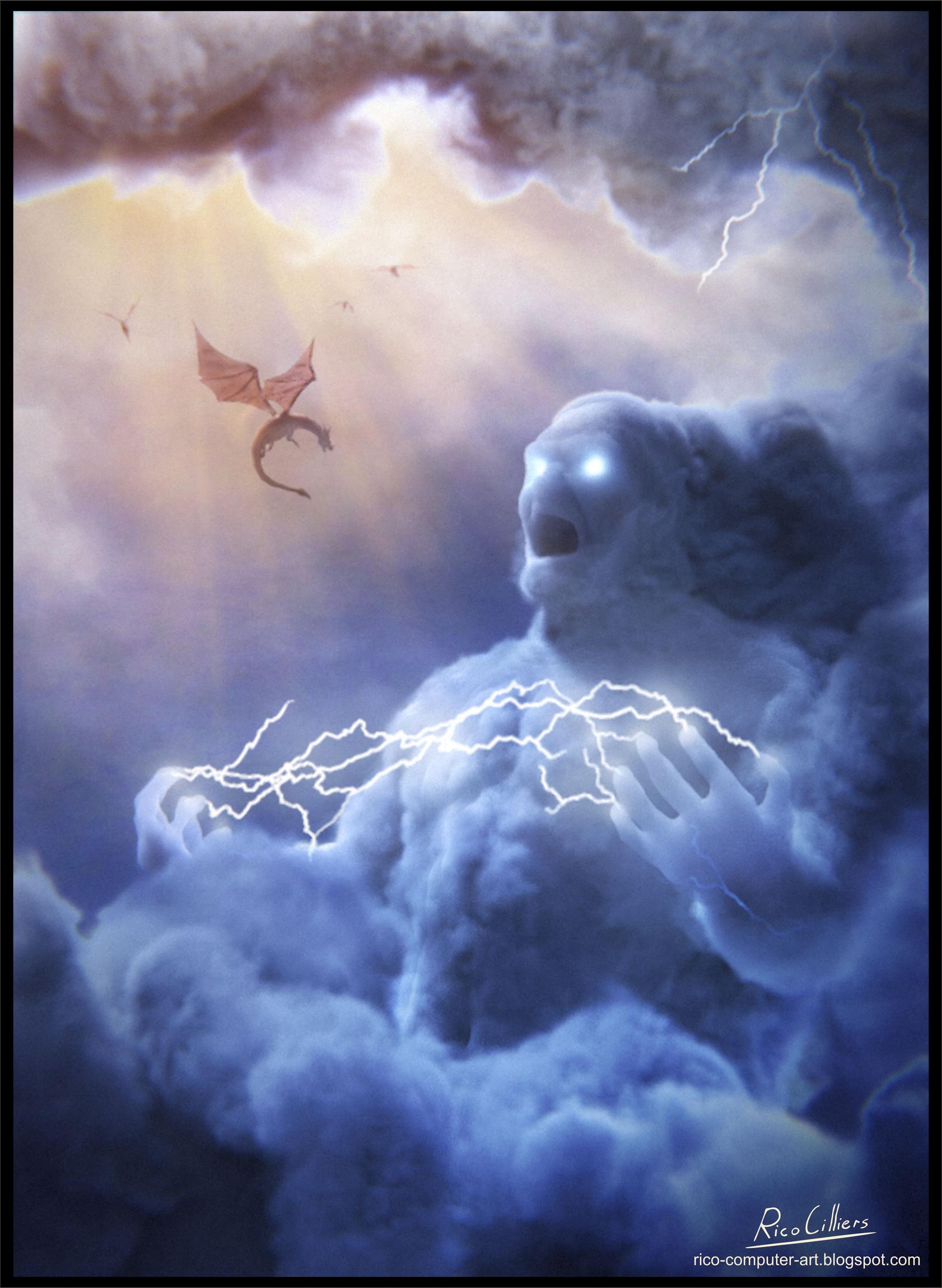
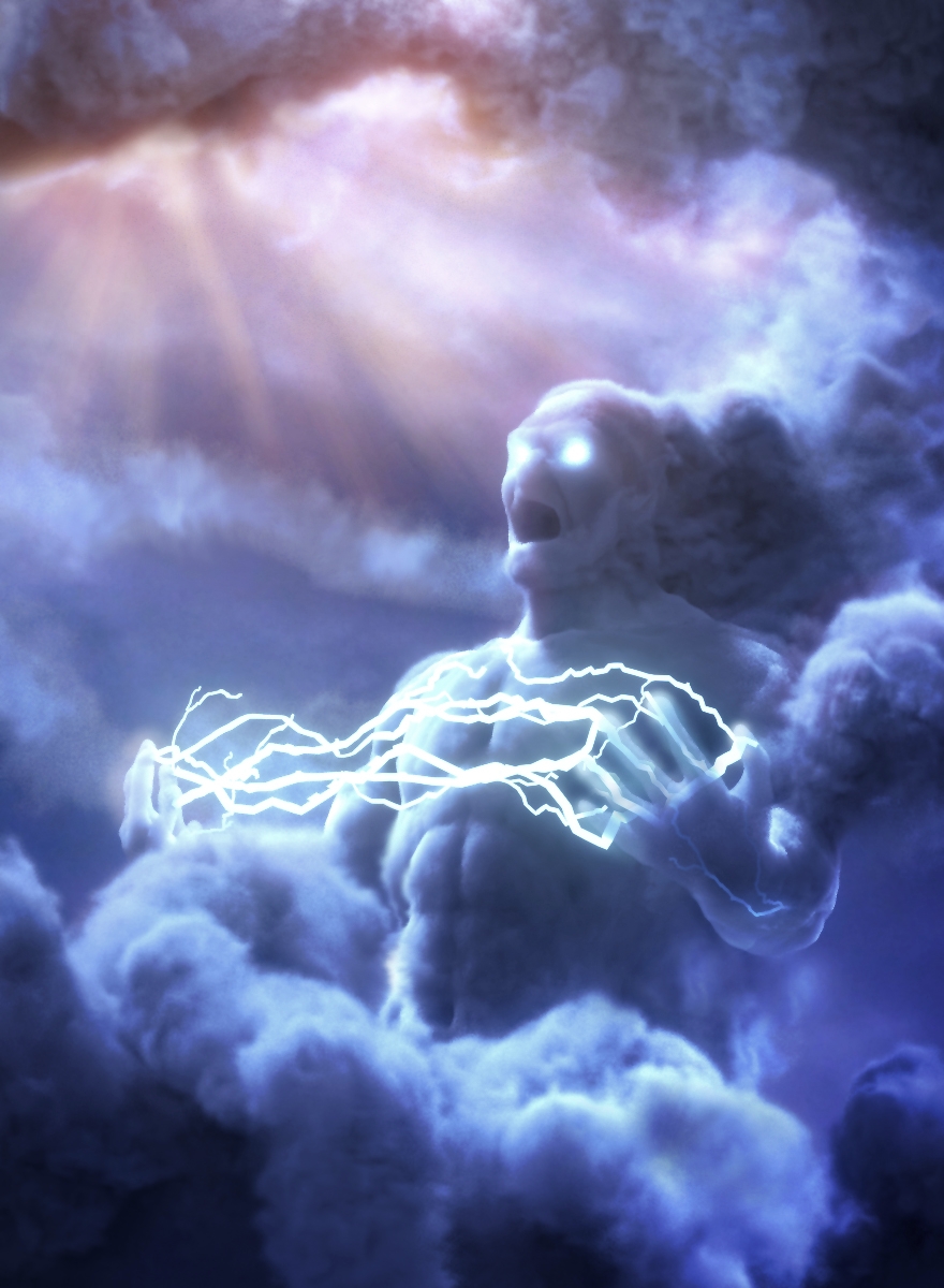
So I never got the chance to take part in the Blender-Guru “Nature’s Fury” Competition, but I still very much wanted to do something depicting the power of nature… also, I thought this would be an excellent opportunity to thoroughly try out the new Volumetrics in Cylces.
(sorry for the noisy image, just 50 samples for now)
stunning idea, very powerful image, so IMO you achieved the fury that you set out to do, only thing i would like to see is that the god has a whole lot more muscles, i really think that it would add to the scene.
Hi Speed777777,
Thanks for your input good idea about the muscles. I was also thinking to enhance his muscles somewhat. also, maybe I’ll be doing some lightning as well, maybe inside his arms or in his chest. like there’s a storm inside him just building up and waiting to explode
Tremendous potential here (already looks superb). I agree that lightning bolt between fingers/hands (illuminating volumes nicely) will add a lot. Additionally something about face or general shape needs more definition/interest to make it truly epic.
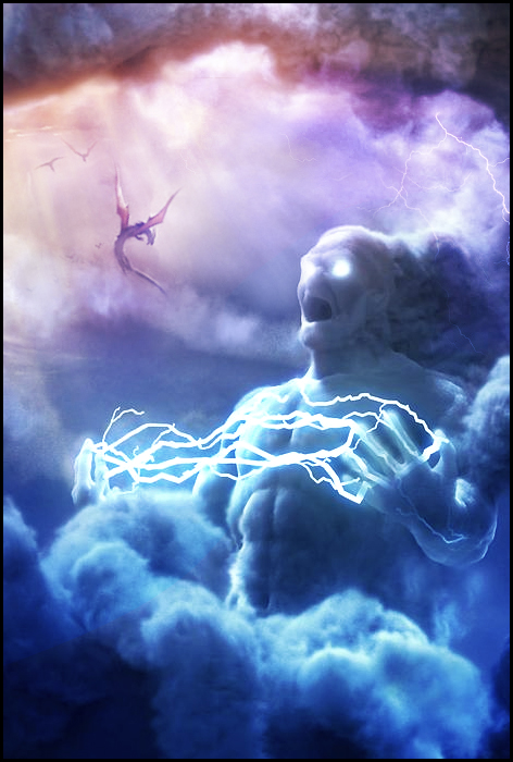
This is 100% subjective and may or not work, however in top left corner(currently empty) you can also add some interest and make it more of a scene by adding extra detail (cool clouds, very small birds/flying creatures in distance - whatever to tell the story).
Thank you all for your encouraging words! @ cgstrive:Thanks mate! I think that’s a great idea. I shall definetly experiment… Maybe some birds small in the background will work… Also yeah his face needs a bit of character. :)@ johhnygibbsThanks. I’m considering doing a detailed walkthrough of my workflow
When I first saw him, I got the impression he was screaming in pain or something; that the clouds were overwhelming him and converting him into basically water vapour, like he was being consumed. I didn’t get the feeling of a ‘god’ persé, more like god’s furious handiwork on a poor soul.
Reading your descriptions though, I can see where you’re trying to take the image. Presumably, you’re looking for someone who’s content and elated, hence the hand positions and the ‘excited’ face? I don’t know, I think if it were me I’d take some cloud away from his head because I’m drawn naturally to his eyes and the back of his head is spewing out cloud for some (drastic) reason. If you want him elated, I do definitely believe you should work more on his mouth. Right now it’s basically a gaping hole on his face and doesn’t really convey any emotion (other than, at first instinct, pain.)
All in all, I do like the image and it did make me stop and think which is good for a piece of art like this. I do think what you want the image to represent and what third parties see (particularly yours truly) is a bit mistranslated though and the balancing of the emotion a bit off.
Actually he’s supposed to convey a sense of intimidation/anger/awe, so I’m still working on bringing out those emotions. Particularly through his face.
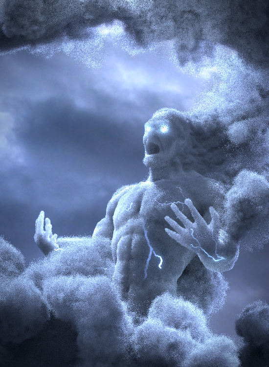
minor Update
I started playing around with some lightning, also mad him more muscular and also changed the facial expression a bit.
Still so much to do I need to work more on the lightning and volume structure of the clouds, as well as add something in the background…
basically it all has to work together seamlessly to create a powerful image. I’m not there yet. Crits welcome
I hope I did not offend you by quickly and loosely drawing over it but It’s very easy to get caught up in 3D that will soon become rigid and unchangeable. It’s the best time to put some attention to design and direction
Things done:
introduced some whispy clouds (hair, shockwave like clouds around him)
increased volume of character defining muscles and face a bit (face is a bit thin right now)
lightning arc between fingers also illuminating chest and volume of finger tips
utilized the empty part of image by adding god rays
@cgstrive:
Offend me?? absolutely not your critiques are most helpful! that’s one incredible concept image you made and I’m definitely follow it! I owe you man. I’ll put you in the credits lol.
hmm the “wispy hair” idea is great, but not sure how to pull that off. I’ll have to experiment.
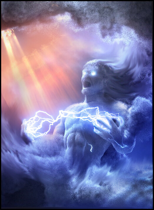
Hi all,
here’s another update… I worked some on the lightning between his hands (credit goes to cgstrive for the idea)
I won’t be doing much until monday because I’ve got some buddies at my place for a LAN. but please feel free to critique.:eyebrowlift:
I added sunbeams and worked on some minor stuff, and then I ran it through the compositor. I’m really not quite happy with this, the saturated colors are distracting, also the lightning is making the image to busy. I’m considering removing the lightning. please let me have your thoughts. please critique.
i agree with the colours, this image should not have them, the original concept colouring that you started off with is correct, it is bringing confusion to the image.
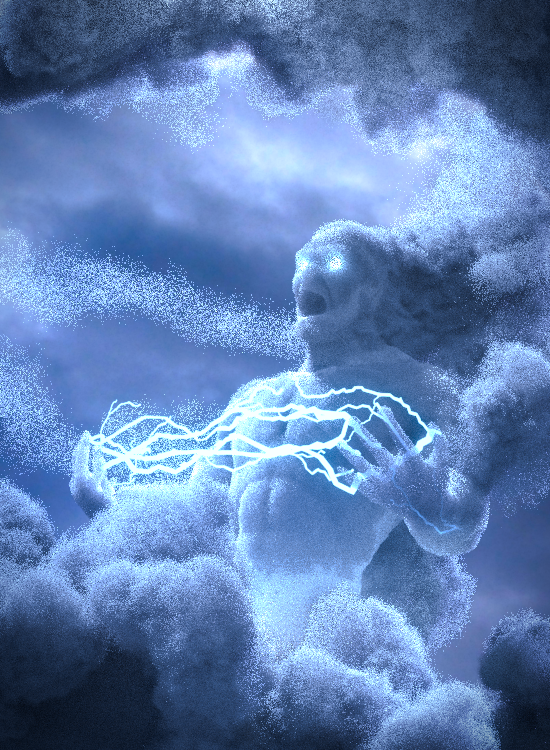
i think that the lightning is good and should stay.
for composition i would move him over to the right a bit so that a section of his arm is out of the picture, i think that this will create some intrigue.
i feel that his body is too well formed, by this i mean that his cloud content should have less volume and that you can maybe see through him a bit.
Said that, i understand why you feel there is a problem with harmony. There are a few reasons to it. Firstly the bright area grabs all attention and creates some sort of association between the god and lightrays. Light rays themselves are not bad but they are there as a background detail, not to tell the story or compete for attention.
More:
god rays are more parallel, yours are a bit too omnidirectional
the lightning arc needs work to sell it, it’s very dominant feature it needs to be perfect if image is presented in such a way.
PS. Feel free to remove everything you need to, i only demonstrated 1 way how it could work( by utilizing available pose) if enough effort is put into it It would be wonderful if this image could spell EPIC, tell a story and have visual interest. Good luck
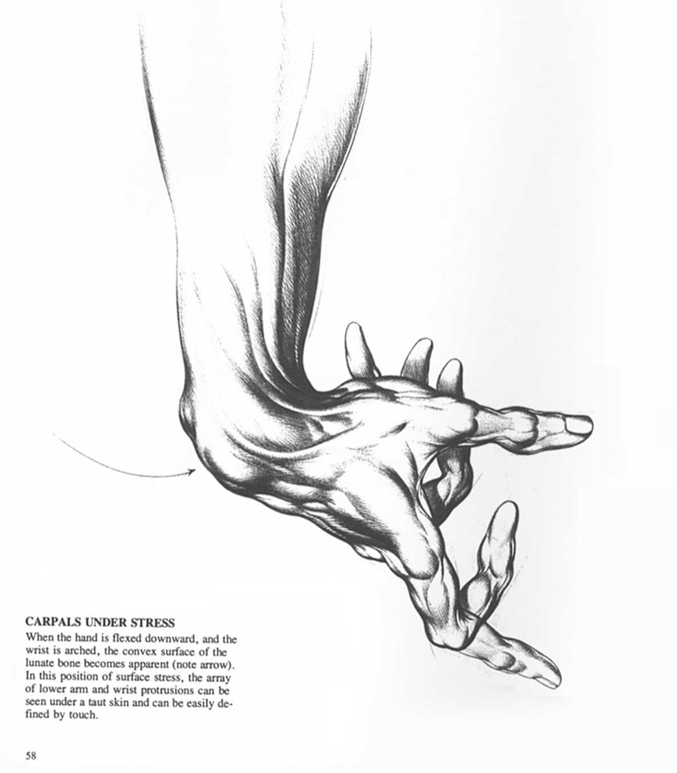
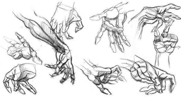
Perhaps it’s a bit far along in the process (and I have no idea what system you’re using for the cloud particles, like if it’s rigged or not) but the finger position is a bit static. I’d expect if a thunder god was summoning lighting the fingers would be a bit more tensed and dynamic. A few examples of what I mean:
Just an idea, since the hands are one of the key parts of the comp. Also I’d suggest making the pose more asymmetrical, maybe look at this videofor inspiration.
Perhaps a closer, wider lens angle could help even more to portray the scale of the character.
Hope that helps!


 and a happy new year to all you Blender-heads.
 good idea about the muscles. I was also thinking to enhance his muscles somewhat. also, maybe I’ll be doing some lightning as well, maybe inside his arms or in his chest. like there’s a storm inside him just building up and waiting to explode
 It would be wonderful if this image could spell EPIC, tell a story and have visual interest. Good luck
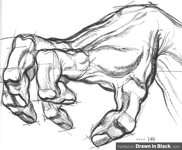