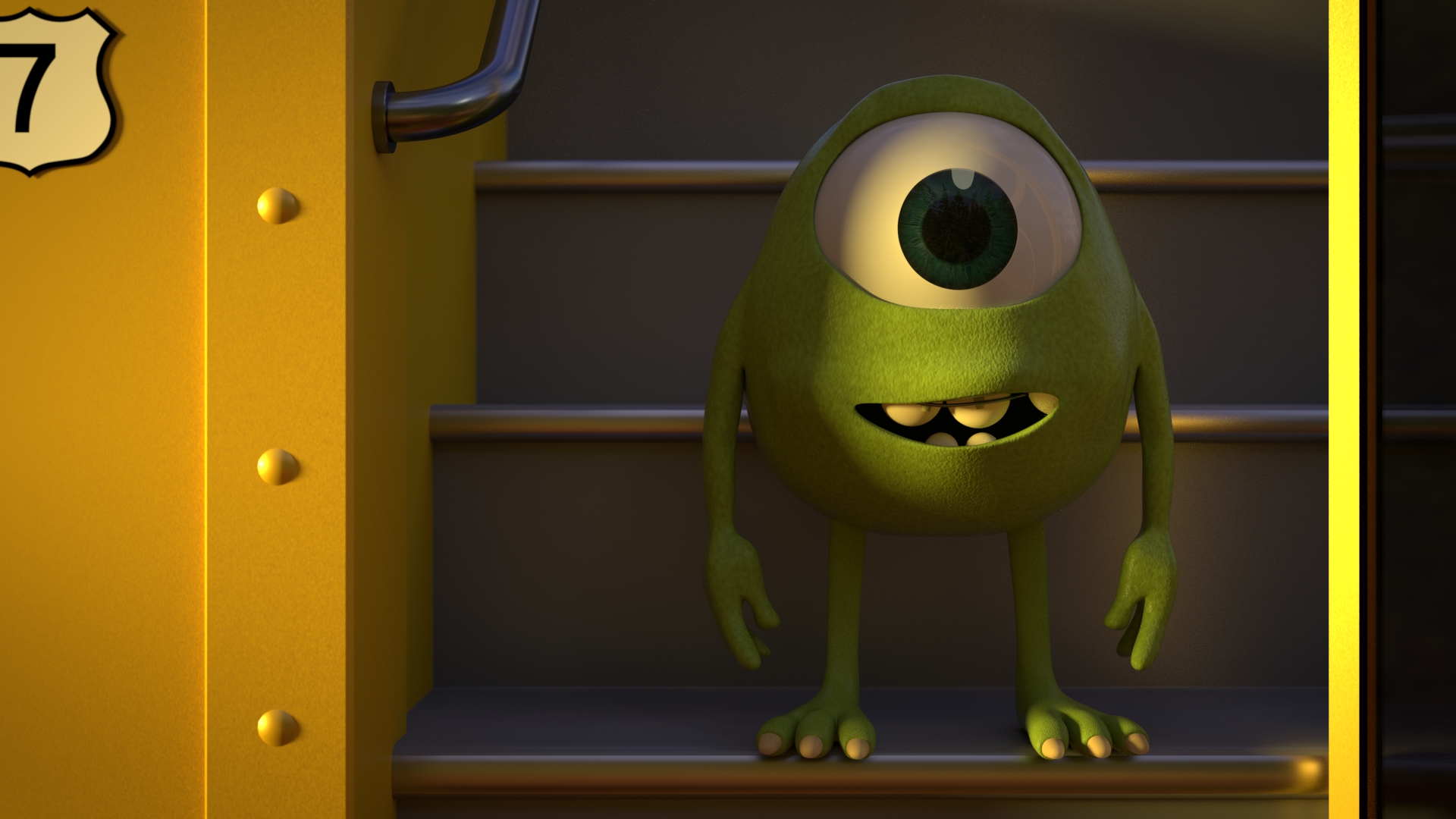
My interpretation of little mike wazowski from monsters university.
Resolution : 1080p
cycles samples : 3000
Unfinished, Any feedback welcome !
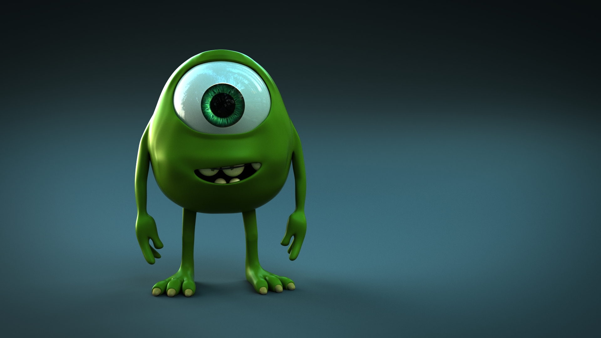
Updated render
My interpretation of little mike wazowski from monsters university.
Resolution : 1080p
cycles samples : 3000
Unfinished, Any feedback welcome !
Updated render
the texture bump is too strong on mike.  on young characters you want to make them look as soft as possible and that bump kind of ruins that, yes mike is a monster but he still looks somewhat soft when he is young. his pose needs a bit of work. he looks very stiff. not to mention you need to put some ware and tare on that buss. maybe some dirt on the top of the stairs scratches and loss of paint. overall the buss is too clean.other then that everything is ok. but a word from the wise. doing fan art of existing characters is hard because even if it is better then the original people will only see how different it is from the source( an example: i am looking at it right now and can only see how it isn’t mike, but if i forget that it is suppose to be mike it looks like a good character render). fan art is good practice for this reason, it will bring more attention to you because it is a well known charterer, but it will also point out areas you need to work on more clearly. but on your future serious works stay far away from fan art.
You’re doing excellent!
Here’s what you could do to further improve:
Good luck!
Really nice to see classics revesited ! Your render’s nice !
But I’d like to see a wire of your model, as some edges seem too sharp to me, they should be softer…
Good luck !
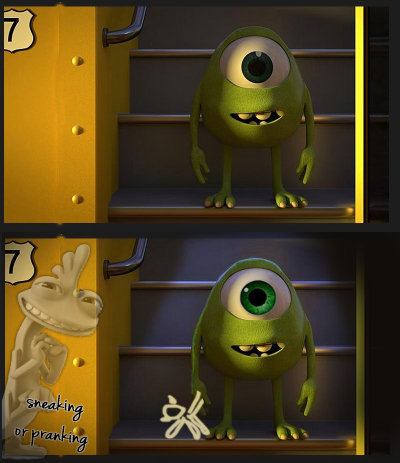
Totally agree, new render looks great. However I think the top of mike looks bare. Not sure whether you should add his little spikes/ears or whether his hat would look better but maybe try experimenting with it. Also I like the story of the first image, maybe just make the lighting more dynamic, crop in a little and add a little more story. Try adding more of a glint to the eye to empathize that cartoony style more but its you creative decision in the end hope this is helpful. Looks great so far.