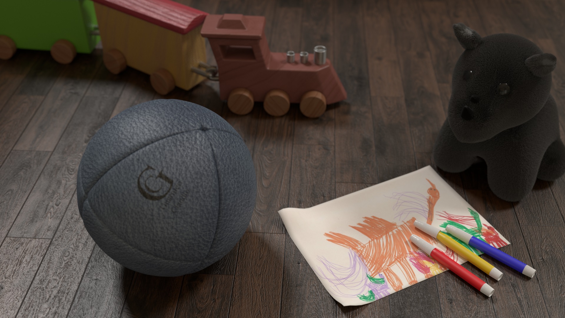
Unhappy with the hair system (still fighting with the density, damn), yet I am quite satisfied with the result.
Rendered in cycles, 850 samples
Enhanced with The Gimp
Blender

“Gimped”
comments and suggestions are welcome!
Cheers
Unhappy with the hair system (still fighting with the density, damn), yet I am quite satisfied with the result.
Rendered in cycles, 850 samples
Enhanced with The Gimp
Blender
“Gimped”
comments and suggestions are welcome!
Cheers
could you share floor setup for cycles?
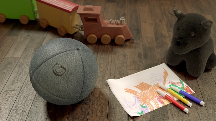
The picture and felt-tips are exquizite, the ball is boringly grey, but fine, you know to work on the hair, i would actually tone down on the floor bump, but these are all minor details, but man, you should work on the composition… Some focal point is essential! It will be a great image then.
Personally I prefer the blender image here. The gimp version does light up the scene but also adds a yellow-ish glow to the image and somehow makes the ball, paper and stuffed animal flatter and less realistic. Compliments on the floor and train though, those bumpmaps really work. However, Adam is right, it seems that composition should be your main point of interest now.
To all: thanks a lot for your advices, I admit that composition is something that I never got into, I mean it.
@ zcaalock: no problem, but I cannot now, because I left the file into the other computer, tomorrow I’ll share it, I hope you don’t mind!
@ Adam what kind of node on composition should I use?
@ Joarn, same question, eheheh!
Cheers
Claus
Sorry, maybe we misunderstood each other. I wasn’t talking about post-processing in compositor, I meant composition more along the lines of object distribution, camera angle etc. It is usually (almost always really) beneficial to have one object or spot as a focal point (kind of a hero of the image) to tell the viewer look at this! this the most beautiful/interesting thing in the whole world (or the image at least), this where the story is told, this is what you should look at. And the rest of the image just provides atmosphere and detail.
At the moment you have four equally lit objects, none of them has a prominent position (look up rule of thirds for example) and the viewer will be lost at what and why should he/she look.
I for example (and this is just to convey what I mean in no way am I suggesting this the optimal solution) could make the focal point the image with the felt-tips (which looks really great btw.) Put it in the lower left third (it is very white so it immediatly attracts attention) and put the other objects kind of scattered around the edges of the frame maybe just a little out of focus or darker and on the paper there would be crude image of the objects - how the bear rides on the train looking for the ball and the viewer would immediately know “I see, there is a kid who played with these objects and made up stories and whole new world for them… maybe we are looking through its eyes, the camera suggest so a little” and so on… You would immediately have a little bit of story there and it would be obvious what’s going on.
This is what I meant by composition. Or maybe I miseunderstood your question and all my rambling is completely out of place… 
Anyway I just felt something like this would greatly improve the image. So to summerize, I think your objects look very good, now it’s time to make great image out of them.
Hello
I really like all these toys and want to buy it for my daughter.
I’m thinking the ball looks oddly out of focus? It’s a bit blurred and I didn’t expect it to be …