Please I am new in blender I need your assessment of this, it is my first real work in blender
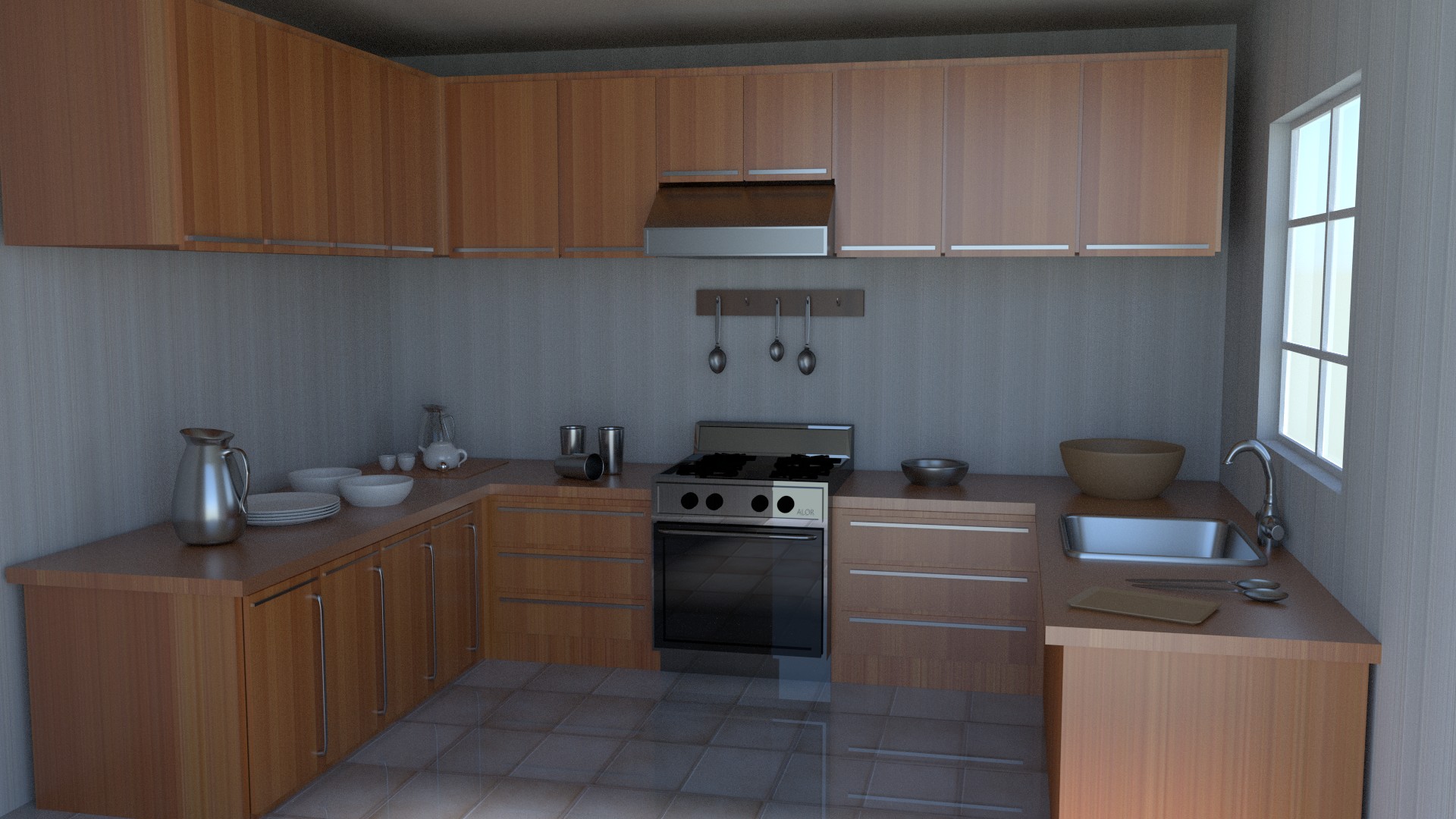
First of all, it looks good in general but the problem relies in the details, it looks dull:
- very repetitive textures
- no specular light
- perhaps the composition / point of view of the camera…
There two basic problems in your picture.
- the scaling - the cupboards look wierd and small. Did you work with real-life measurments?
- the materials - the floor especially is too glossy and too uniform. Chech out Andrew Prices tutorial on realistic texturing for the basics…
other than that Pisto already mentioned that you should then make you render somehow interesting. You can use interesting shadows from the window, add something more saturated or visualy stimulating to be the point of interest, there are many possibilities.
also do you use bevel on the edges?
but it is a good start  share again if you re-rerender.
Well, for me, the issue here is the whole thing looks boring.
Looking at its over all design of the kitchen, it can be seen that it lacks visual interest. The colors are bland. The textures are generic. The patterns are weak. The shapes are unappealing. The arrangement of objects isn’t interesting. The lighting is unattractive. Nothing here appeal to the artistic sense.
But then, to be able to express your artistic side with interiors, you must be an interior designer, or have a will to learn about it. My advice is to actually study interiors and interior designing. Look at magazines, pictures, books, tv shows, etc… and learn even the basics of the art of decorating. Designing an interior takes a lot of effort.
On technical aspects, I say, a lot of work is still needed. The other reviewers has said a lot about this.
Needs a windowsill on that window. The lack of a windowsill makes the exterior wall look too thin to be realistic.
Also, tap too close to wall and I think the sink needs a draining board.
I will mirror what others have said about it being too boring. A scene should tell a story, this scene tells me nothing.
Aside from that, the window needs trim and should probably be set just a bit deeper into the wall. The floor is also WAY too reflective, even if they were brand new they wouldn’t look like that.
I remember this work. YR tutorial. keep it up men! The floor are maybe too clean. cheers!
Do not get discouraged It is just a first attempt.
The best way to work with interior is to look through modern kitchen designs and take things from there you like. For example: oh, there is a fancy vase, here is an interesting window, and this colour combination or a chair look appleaing. And use those things. Do not copy one single image or design, but adopt somthing from many.
Overall, do not be disappointed if something does not work out straight away
Looking forward to your next render.
Wow…this looks good…You’ve got 6 post? What is everyone complaining about? Great Job! So it’s not a hot dog on a stick, but what matters to me is how much work one puts into the modeling. You will just get better! Matt…Ummm…to much reflection on the floor…
Sorry, did not finish my thought yesterday. Mixing all these things I’ve mentioned also takes practice and some knowledge of colour combinations, emphasis, mood, light. So learning is good, I would advise also trying to copy already existing enterior, but not exactly. Try to borrow a colour palette only, or composition you like, but feel the room with your unique pieces