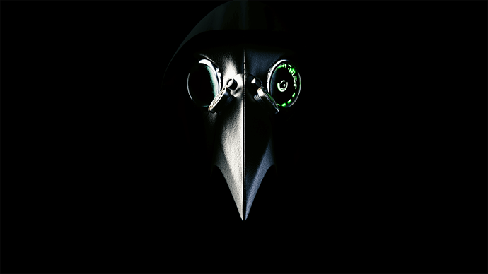
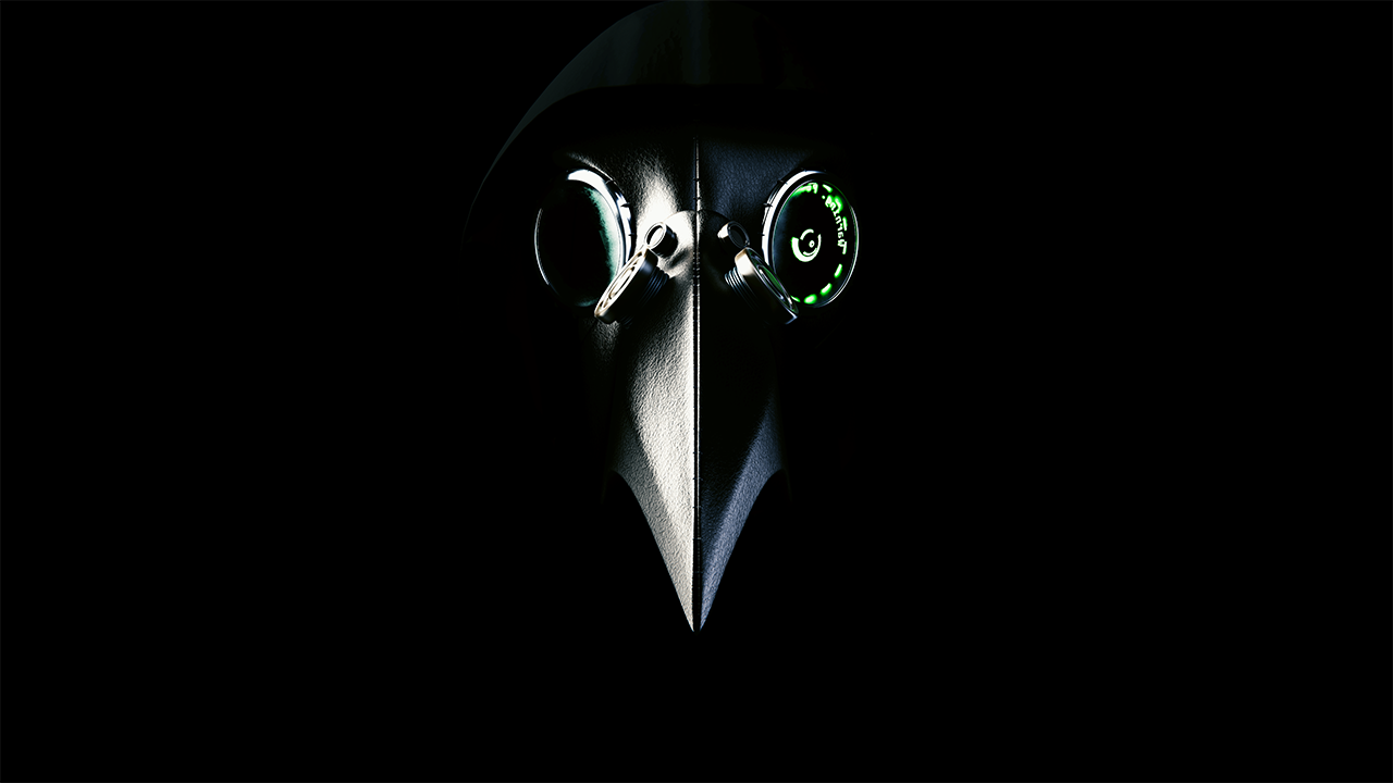
I made this mask a few months ago, and it’s my first real project using both modeling, lighting and materials, so i would like some critiques on it.
The mask is inspired from the old plaguedoctor mask, but with a modern touch. What could be done better, or just in another way? I appreciate all critiques, thank you
Its too dark and the image is too small to actually make out.
On overall design of what i can make out:
It doesn’t really look modern since it uses very similar design to a regular plague doctor mask. The holo AR thingie doesn’t convey the idea of modernity too much, its more like post steampunk or magicpunk.
Its probably because the material of the mask itself is still leather or some other kind of malleable material.
Something modern would be more hard surface, boxier, lower poly.
Nice low key lighting and overall design. Perhaps you could try contrasting the glowing electronic eye a bit more with the lighting.
The helmet is pretty splodgy at the moment but perhaps thats just because of my bad lap to monitor being unable to display dark gradiants very well.