I’m producing a series of illustrations for a new book by a Brazilian writer. As I am in the early stage, with only three ready illustrations, I understood that it would be better to create a tread in this forum, although I’ve already posted something on the finished projects thread . I hope you like them and of course any cc will be appreciated.


CC it doesn’t surprise me how fast you have moved on from ‘The Diner’. I knew one day I could say; ‘I knew him when…’ : )
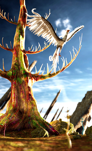
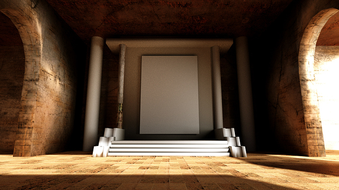
Man your period illustrations look to me like they were actually done doing that period and are outstanding in my book. I also like the vertical format for the stylized bird.
I would imagine you now have to become somewhat versed in working with printers and what they want or require in some cases. Anyway best of luck with your new project. It seems like you are off to a flying start. Sorry no CC here just Happy Talk. : )
Hello theoldghost,
It’s always a pleasure to read your comments and feedback. Yes, three years ago I was learning through you and friends. Time goes by too fast. I’m spending about one week in each illustration and this ends up offering me pleasurable moments.
It was great to hear from you.
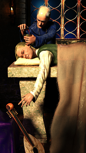
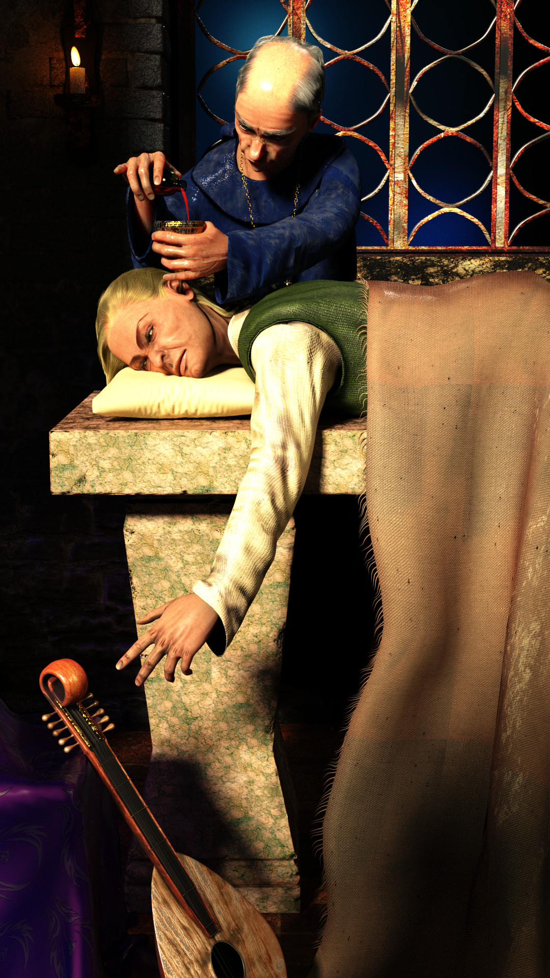
The first one looks awesome! I think a version between the normal and the oversaturated one would be perfect. If you wanted, you could also add more depth on the ground by adding grains of dirt as particles or something like that.
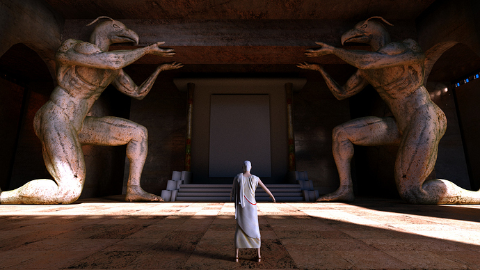
The other ones need more work, but that is not your fault but rather the fact that making realistic humans in CG images is not easy to achieve (I myself have not yet dared to really try). But I will try to help you on that: I think the materials are a bit too reflective, both for the skin and the clothing. The facial expression seem a bit too much for me, but maybe that’s just me.
Otherwise: Wow! Really coming along! 
Hi CCTrevis,
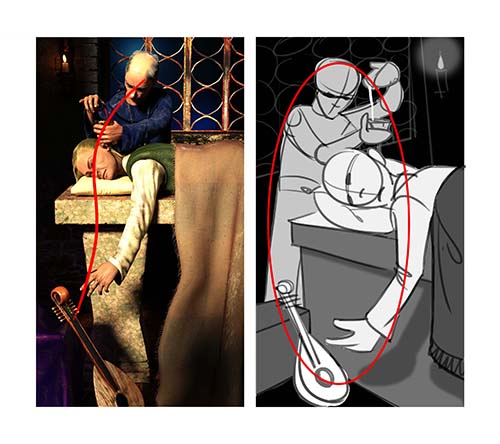
I cooked up these compositions trying to better the silhouettes and flow. With so much exposure to widescreen videos, composing a good flow in vertical frame does seem lot more difficult than a horizontal one. I see a lot of 3D CG artists stick to real life proportions and physical limitations in their scenes. The fact is even while shooting live action most cinematographers ‘cheat’ for a better frame. Hope this helps. Cheers!

Many thanks Triastase and yes, you’re right. Skin shaders are really hard to manage.
Pradeepatil,
How can I say that? you spent your sacred hours trying to help me and I’m here without words to thank you …
Mate you did a great job here. In fact in all illustrations I used the rule of thirds in an attempt to get a better composition but these are magnificent.
Much appreciated. Thank you.

Looks like a really cool project to be involved with CC. I’ll look forward to watching your progress. As you mentioned, I think Pradeepatil gave you some good advice regarding the composition tweeks.
Hi CC, nice to see you opening a thread again here. And I’m sure that it means a lot of fun for you to do these book illustrations. 
You did a good job on the modeling and obviously you are going for realism in that aspect. From a technical point of view I wonder, why there is so much gloss in the fabrics and the skin shaders. In some images both, skin and fabrics, look almost like coated. That doesn’t match the realism of the modeling.
Keep it up and keep us posted
Thank you Carl, minoribus, it’s nice to be here again, love you guys.
Yes Carl, Pradeepatil got me a lot of attention and I’m grateful for this. His skills in matter of composition are amazing. Minoribus I’m always having troubles in how to control glossiness. I can say that is that the thing I need to learn more about nowadays.
And now a small step forward. Your attention at the left please. Thank you guys. I could say more in Portugese. English is another fight to win. :RocknRoll:
Attachments

The two sculpted figures are beautiful. The hands could be a little bigger and the forearms could be a bit longer. I say that because the bodies of them have human proportions.
I also dig the material of the sculpted figures a lot.
Hello minoribus, thank you.
Working with deadline has its advantages. But there is not long time to redo something that has not been good. Really the statues deserve more attention.
Here is the final version.
Attachments

Hi CCTrevis,
You are most welcome, and I honestly think you thank too much :). It is much easier and faster for me to draw than type in English.
I would not have been able to complete www.indivineinterest.com and win an ASIFA India without the kind support of people in this forum. Although on a shoestring budget and 2-3 member team; it won against some big studios.
I try my best to give back to the open source community all my learning that came from it.
On the last illustration you posted, and if you still have time for it, here’s the feedback:

Cheers,
Pradeep
First my congratulations pradeepatil. Could you send me the direct link to your work? I couldn’t see it in the links you posted.
Again I’m grateful. I see now the lighting was much nicer after your intervention.
My customer, the writer, asked me to consider new characters and this almost exhausted my PC processing power. The good new is that he will offer me more time to finish the illustrations then I hope I can redo them as you suggested.
Thank You. Here’s the link to the in-divine-interest project films: https://www.youtube.com/channel/UCuYuZymw8Zz1veiLTSzkxnQ
Its good that you have more time on your hands. Looking forward to some great results in the next few days. Good luck!
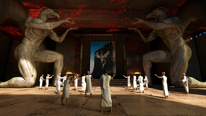
Hey pradeepatil, now I see. They are nice and if you allow me say they have a very comfortable vision about a serious thing. I’m curious about eastern religions and one of my best books is “The Tao of Physics”. Fritjof Capra did a good job bringing us some knowledge from the always fascinating Orient.
Here is my lastest updating.
Cheers.


Yes, I have tried arguments and fights in real life, but they only seem to backfire. In-spite of their simplicity and roots in classical Indian arts(particularly sculpture/idol-making for character design) these films managed to offend some people! The hope is that this work becomes a tool to spread awareness and make people rethink about their idea of celebrations.
On the witch doctor it might help to explore this option for a more dramatic effect: let the fire light up the scene more than the blender-lights around and throw everything except the in-circle dancers out of focus and darker…
Cheers
