I made this photorealistic scene in blender, rendered in cycles, and i would like some feedback and critiques on it, what can i do to make it better, and more realistic?
Feel free to ask me anything, and i will try to answer as good as i can.
Thank you 

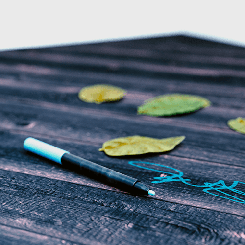


i love the leaves blending out borders. gives it an extra realistic touch. the second picture needs a little normals depth, the wood´s texture alone doesn´t have enough structure.
Nice!!
The only thing that doesn’t look realistic to me is that the signature looks like a single piece of plastic film on laying on top of the wood. The writing looks like a smooth on-paper signature, and doesn’t appear to be affected by the rough and irregular surface texture of the wood.
Good work! I think the writing needs to be masked with some irregularities on the edges (just a roughness illusion).
Dunno… I see an inconsistency in colors.
While leaves seems to be enlighted by the natural light, the table and the pen look like enlighted by a different kind of light.
In the second image I would put something in the background. As for now it seems as if the table was in the middle of a white empty room.
Also to be very picky, you have to take care of the mark on the table. The simulation of ink on a so rough wood is very difficoult cause the surface is made of many little chippings that create areas with no ink. Simply tweaking the transparency of the mark texture is not enough, and if you want to make a closeup, the issue could be very noticeable.
- Forget color grading with this strength. It is like when girls make a terrible selfie in the kitchen then they apply an ‘artistic’ filter to make it better. Your raw render is far better; it deserves no ‘overfiltering’.
- Leaves are too glossy and somehow lack details in specularity.
- The ‘tag’ seems to be too strong to me, I have the feeling that it should be more ‘transparent’ in reality.
Overall it is a very good start.
Looks good but first thing I noticed was that the leaves look to similar and to flat, I would curl and bend them more.
It looks nice.
Perhaps a little more variety in the leaf shapes would help though, as right now they look like clones. Maybe add a slight fold along the mid-rib, vary the base a bit more, and you could have one that has been partly eaten by a caterpillar.
I feel like if you need to call attention to it’s “Photorealism”(IE the title), then it kind of defeats the purpose. You shouldn’t need to draw attention to it, it should just feel natural. I should go “wow, they made this in a program?”. When I see photorealistic in the title it makes me want to look at it and point out all of the imperfections in the piece, instead of enjoying it. Just my two cents.
Okay, so i tweaked some things and changed some things, and this is the result after following some of your feedback. Thanks 

Doesn’t seem like that worked to well, here is a link untill i can fix it on a computer
http://imgur.com/qgkgROR
The updated render looks much better, though I think the leaves might still be a bit over saturated, and the stems (especially on the far left leaf) look a little flat/rectangular.