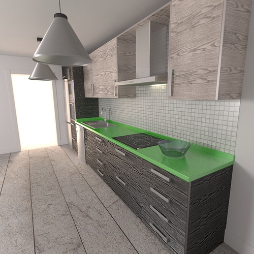
Kitchen rendered with cycles
You’ve posted this in focused critique so if it’s alright with you, going to go a bit to town with this.
A square image and a small fisheye type field of view doesn’t make the image look natural (like a human is seeing the image or taking a photo of it).
Camera is placed too high or the door, ceiling and lamps are too low. Check your dimensions on things like hieghts of cabinets and work surfaces. If you google this stuff, you’ll find house construction regulations that only vary slightly no matter where in the world you are.
No one would build bottom draws that close to the floor. When these open, they are going to scrape along the floor.
The colour of the worktop is ‘interesting’. Not sure how many kitchen customers would choose such a colour. If you do love that colour, you need some over part of the kitchen to share that colour. I propose the lamp shades.
Duct pipe on the extractor just stops at the top of the cabinet. Needs to go through into the ceiling.
Don’t think people place inbuilt ovens right next to fridges. I’d move the oven under the hob where it belongs (would also make the room more interesting)
The doorway looks like something out of a horror movie. You need some sort of scenery or another room on the otherside of the door.
Not sure what the floor material is meant to look like. The big gaps in the floor wouldn’t be good for kitchen spills. The room would be more interesting as a whole if the floor was a lot more shiny/reflective.
The edging around the door is only temporary I guess?
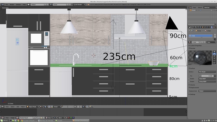
Hi, thanks for your feedback, but i need focus critic with render and texturing, kitchen design and sizes are ok ( i have designed kitchens for 15 years)., ovens and refrigerator are not problem.
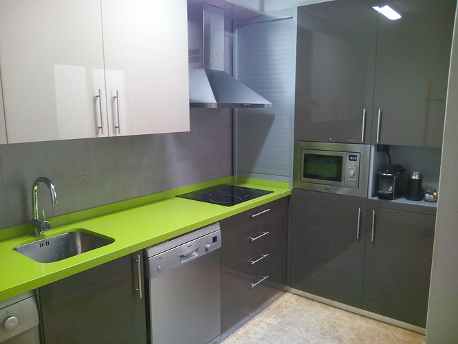
This is one kitched i designed and build for friend (is a photo)
I will post another image from other point of view. I need a loot of learn with materials and shaders.
for your comment, i must write a thread explaining all the standard sizes of kitchen cabinets.
What stings my eye at first is the sharpness of the cabinet and drawer textures.
I would turn down the bump to maybe half, and mix out the diffuse with a solid color. Same goes for floor, and as Bliz said, it needs some reflectivity.
I’m not sure, but it looks like the glass is a little too dark on the bowl. What I missed for years what that when you assign a glass shader (or any shader) it looks like Blender gives it a white color, but it’s not cranked all the way up to white on the color wheel. Try making it completely white and you will notice a big difference 
I’m hardly a good kitchen/interior designer myself, so I’ll keep it to the technical stuff:
The texture on the drawers and cabients very obviously repeats. Veeneer might have some repeating forms, but it won’t be a full repeat like that. There’s also some really strong bump mapping going on, which you don’t really want. A cabinet surface would be sanded and varnished so it’s fairly smooth, use spec/roughness maps to break up the reflection instead of bump maps.
The glass bowl is too dark, glass shader should have its color left as 100% white, use a volume absorption shader to add some darkening to the thicker regions (this more closely simulates the way light behaves in glassware).
Make sure you are using fresnel in all your non-metal shaders, the shine looks a little too intense on some surfaces.


