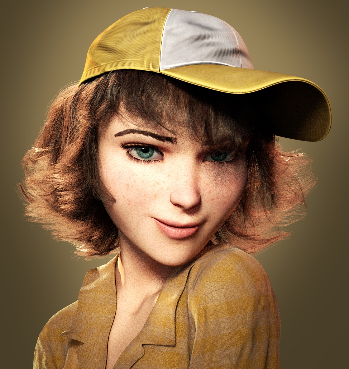
Hi guys, I’m currently working on a portrait here, and I’m just looking for some insights, as I feel I need some extra opinions on this. Right now I’m not too sure about the hair, eyes and facial structure in general. also the pose has some question marks, any thoughts would be appreciated. I’m actively trying to improve it so… yeah.
I worked some on small things like skin gloss, color tones, iris/pupil size, and facial expression. A bunch of small changes, but I think they do contribute to an overall better image. I did however make some kind of mistake with the hair clumping, I like the previous one more. I might try to revert back to that…
I’m really impressed on her hair and how realistic it looks in both the texture and color shading. The baseball cap is modeled and textured beautifully, I would be curious on how you did the seams and stitches.
A couple areas that I feel would be well worth additional effort would be her shirt… I think experimenting with using an image texture for the material would help. Her eyebrows are the other area I would continue to tweek. Based on how realistic you have her hair, it makes her eyebrows stand out to me.
But a beautiful job on this,I’ll look forward to watching your progress.
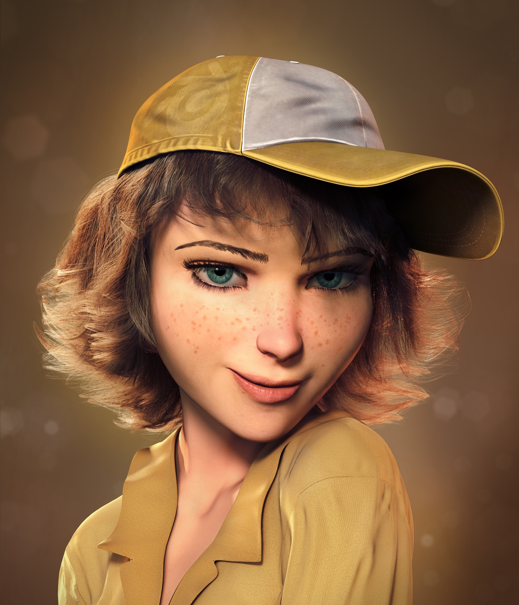
@Harleynut97: thanks a lot! The stitches on the cap were initially geometry (that is, modeled using arrays etc) but I recently deleted the geometry in favor of a 4K black and white mask. The mask is used to drive the color and bump value of the stitches, as well as the general visibility. Thanks for your tips on the eyebrows and shirt… I’m working on those, hopefully I’ll have something soon.
I think I’ve settled on a color palette that I like… need a bit of refining, but for now I’m working on her shirt, as that’s quite obviously still lacking. more updates soon!
@Harleynut absolutely here you go. it’s a simple black&white mask, baked onto the hat from the actual geometry. What I did was: set the stitches model emission to 1.0, and set the hat emission to 0, then I used blender internal to bake the Emission pass onto the hat.
(you may have to enlarge or download the image to see the stitches)
Thanks for taking the time to post the mask and node setup Guss. Looks like the stiches were hand painted, I’m sure it was time consuming, but well worth the effort.
Current progress: I’ve been working on the shirt, just need to do some stitches. After that I need wo fix up the eyebrows, and find a nice background maybe…
The glasses give it a bit of a unique look. I’m kind of questioning the stripes in the shirt, if it is a good look. Not the material itself, just the stripe pattern… just my opinion though
Hmm maybe you’re right. Perhaps I should just go for a solid color. Incidentally, I found that a very dark color actually complements the yellows, but I have some contrast concerns there, so I’ll just try to find some nice solid shade of yellow I guess.


 yeah definitely going for caricature style… I guess I’ll just try to get it that extra mile. Update soon


 The stitches on the cap were initially geometry (that is, modeled using arrays etc) but I recently deleted the geometry in favor of a 4K black and white mask. The mask is used to drive the color and bump value of the stitches, as well as the general visibility. Thanks for your tips on the eyebrows and shirt… I’m working on those, hopefully I’ll have something soon.