Okay , this a simple work with Cycles and some postproduction with blender compositor 
models from blendswap , the cutout from MrCutout website .
reference :
http://cgrecord.tumblr.com/post/42770639698

Hi! I think your lighting is not working, in the references you have more shadows, and a light coming from the left door
Big planes don’t product hard shadows, point light creates really hard shadows, you have to play with that.
In compositor, you have the shadow pass and the AO pass, they can help a lot. and play with the mist, it will help you removing that “clean” look.
thx man this kind of critics i need i will change the lighting and share the modifications
Looks good…
However, the left side of the photo is too bland
you could maybe add a few pot plants
Also the lighting is too bright. You might be better off actuslly adding sky and a window even if you cannot see it it will make the whole scene better.
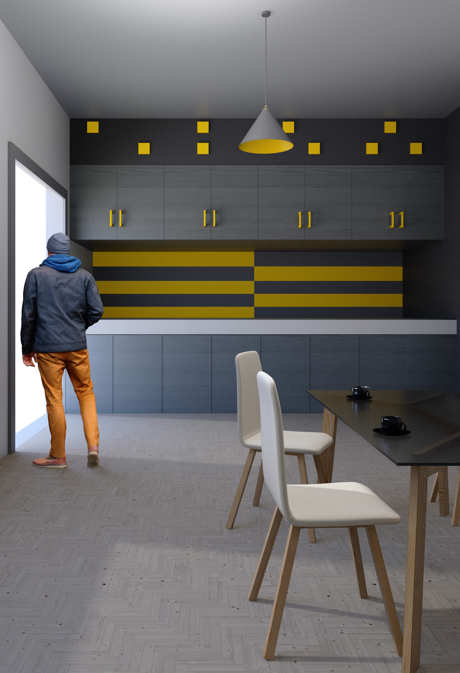
I also noticed that you added a person and a… Dog, cat
they dont look right to the image
Looking at your reference you will need to add more things too the counter at the back and the fromt
Also the wall is too bland maybe add a calender
I like the fact that you are going for an orange and white colour scheme which is awesome but really hard to get perfect. if the image looks bland then it wont look appealing
you could even change the colour for the wall on the leftt and make it yellow
Dont get me wrong The actual scene is great work
but you did post in focused critiques so this is what you got
The first most important thing in archiviz is PROPORTIONS!! The guy is just too small (compare his head to the carrot). That is why everything else look so giant.
@Yusuf Raja
thank you very much yusuf  you realy help with this critics and this point really help me so stay with me
  i will finish the mosque and return to this scene to finished
@maraCZ
thx i am agree with you and i will try to change it
your works really amazing i really like it
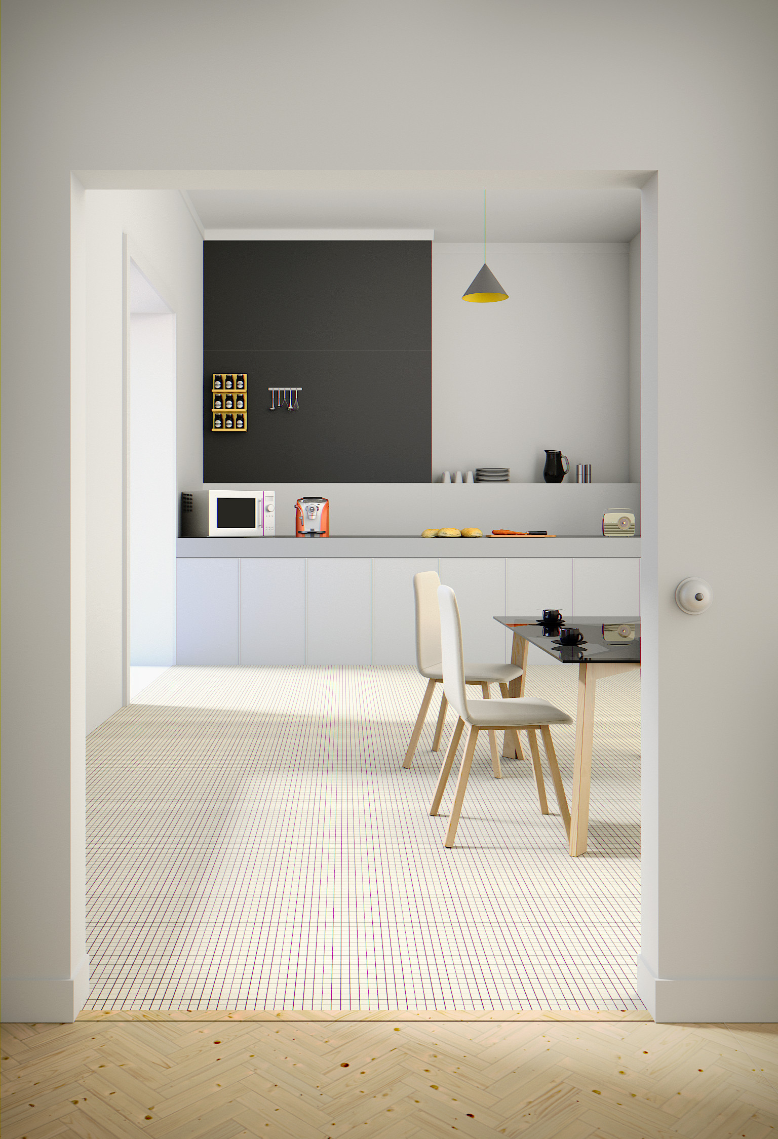
i try to change lighting using shadow layer and ambien occlusion … change some models scale … and the wall color
this lighting setup is much better now
The table also looks alot better
i see that you really are putting effort in this project
However i did not mesion this before but the walls cannot be only a diffuse
they have to have some texture to them
Here is some paint textures that i use:

This last render looks amazing
not to say the others didnt