Hi,
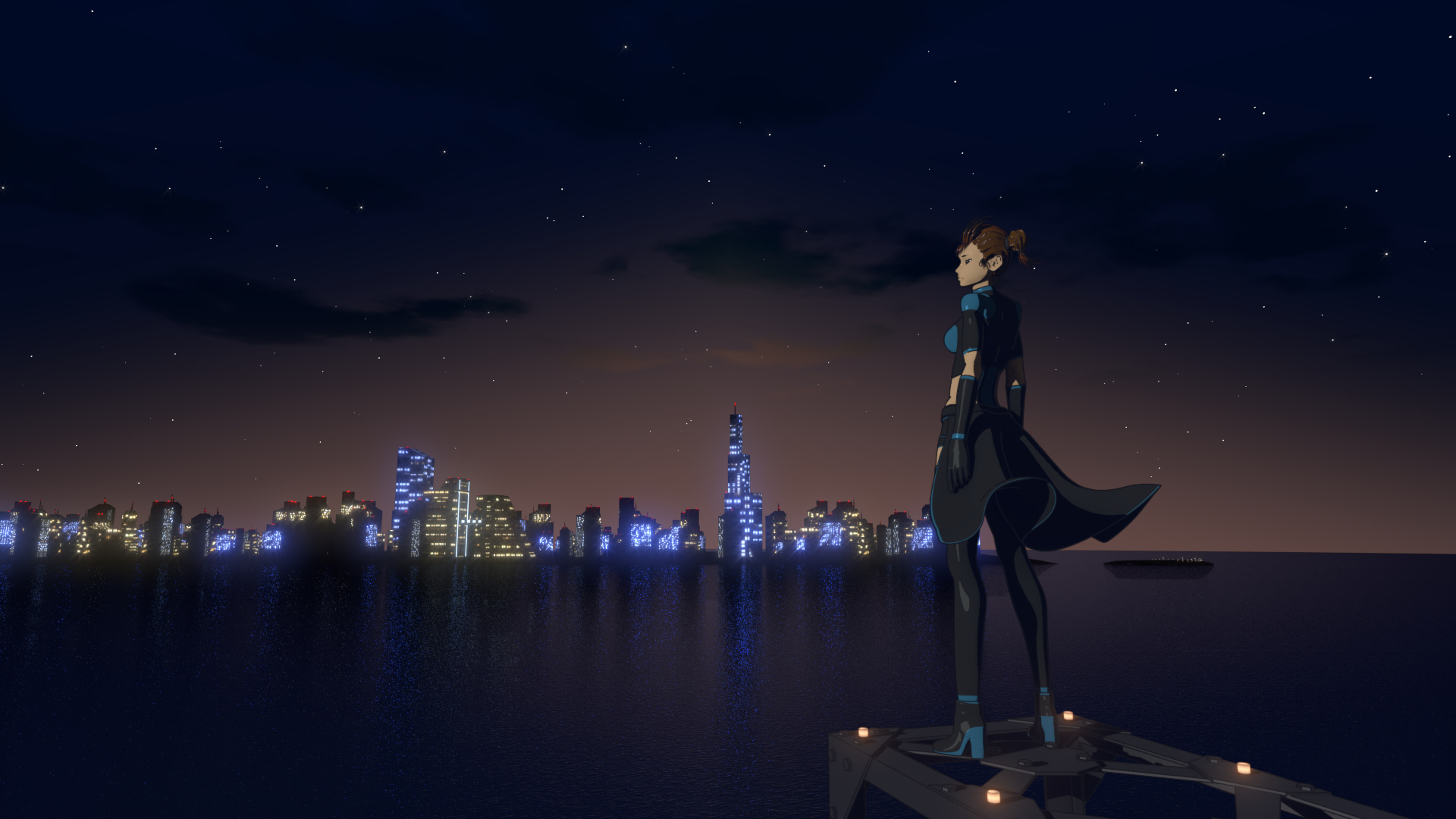
I’ve done some small animations until now and I’m planning to do something bigger than what I usually do in my personal projects. This time I’m creating a trailer for a anime series. I would like to share the first test render, please help me improve with your comments and critics. Thank you.
Blenjoy…

Wow just wow! It’s looking already amazing, and well why just a trailer? When you can do a whole series!  I look forward to it and the story that you are going to tell us! Happy blender!
This looks very impressive. I look forward to seeing more and am curious to how you set the whole thing up.
That looks quite good. I’d suggest, though, that you modify the environment; from what I’ve seen backgrounds in anime don’t tend to to be quite so realistic.
This looks very good, but I notice that it looks a little off.
Specifically, the character and the metal she’s standing on don’t really match the background, mainly because they look sharper, but also a little due to the colors.
To fix the sharpness, I’d put the character and the metal in its own render layer and use a Gaussian Blur node (x&y of 1 or 2). This very slightly blurs the lines and makes it look less sharp, which helps more than one would think.
As for the colors, I feel in this particular scene being at night, I’d recommend lowering the saturation and brightness of the character and the metal to better match the environment.
Your models looks very good; you nailed the anime-esque look, and the hard edge modelling on the metal looks very nice.
Good luck on your project!
Thank you guys for your comments and critics.
I’ve made some changes through your suggestions(some suggestions were through FB page) and I think the result looks a bit more cooler.

Blenjoy…
Definitely better! Can’t wait to see more!
Really nice!!!
Here are the only two thing I saw :
- the way the clothes reflect the light (I had first the impression that the clothes are torn). For me, it’s too “black or white”. The boundaries between reflective and not reflective part are too sharp. I would increase the roughtness of the glossy shader (have the reflect a bit blurred).
- reflect of the lights in the water is too “noisy” (lot of small points) for me. If you compare to real picture of cities reflected in water at night, you’ll see that it’s more smooth.
But wow, the current result is already beautiful!
I would love to see more!
Thanks for the feedback guys.
This is the new update on the night city scene(not much changed only the gloss on the cloth corrected):
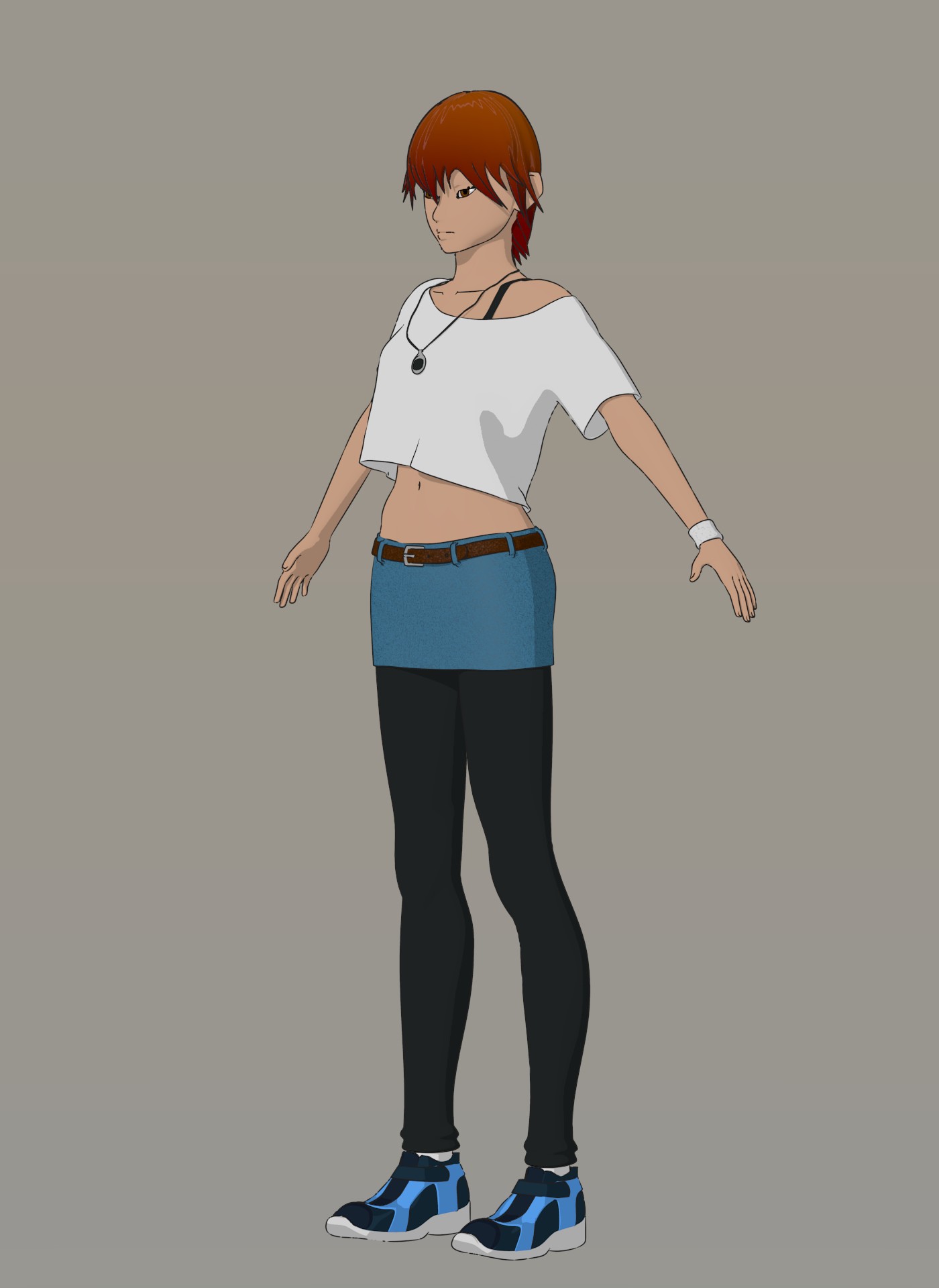
Here is a glimpse on Kaida(protagonist of the story):
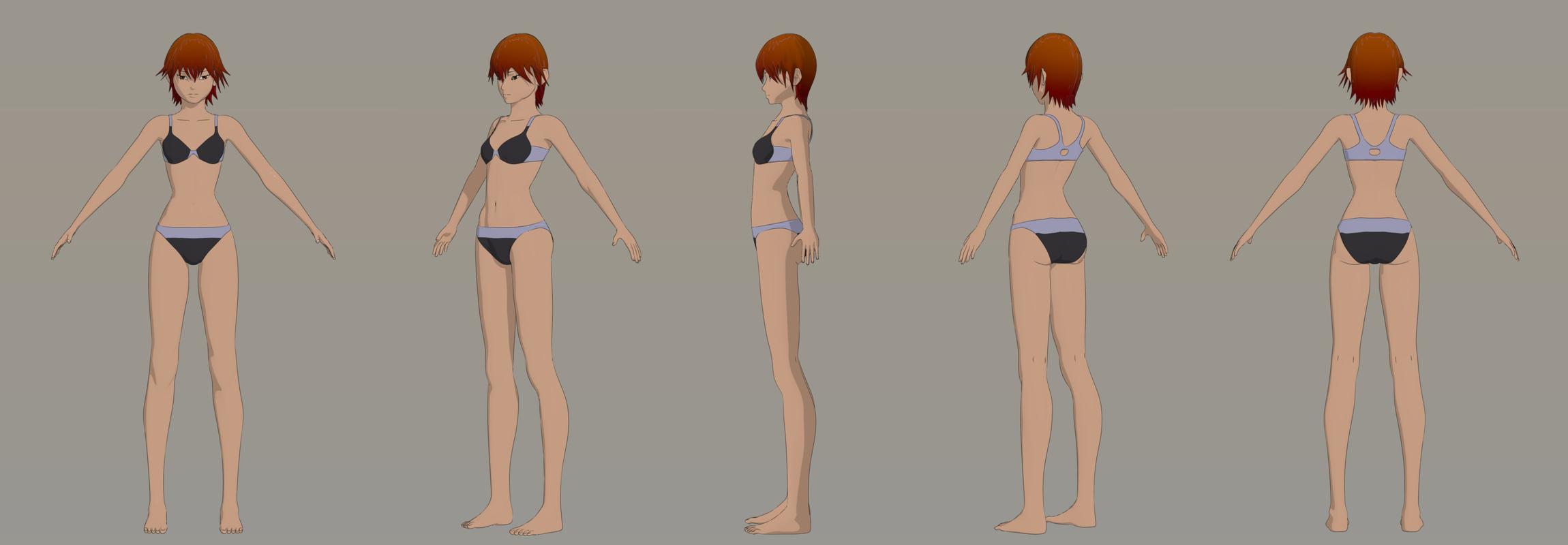
Costume still to be finalized.
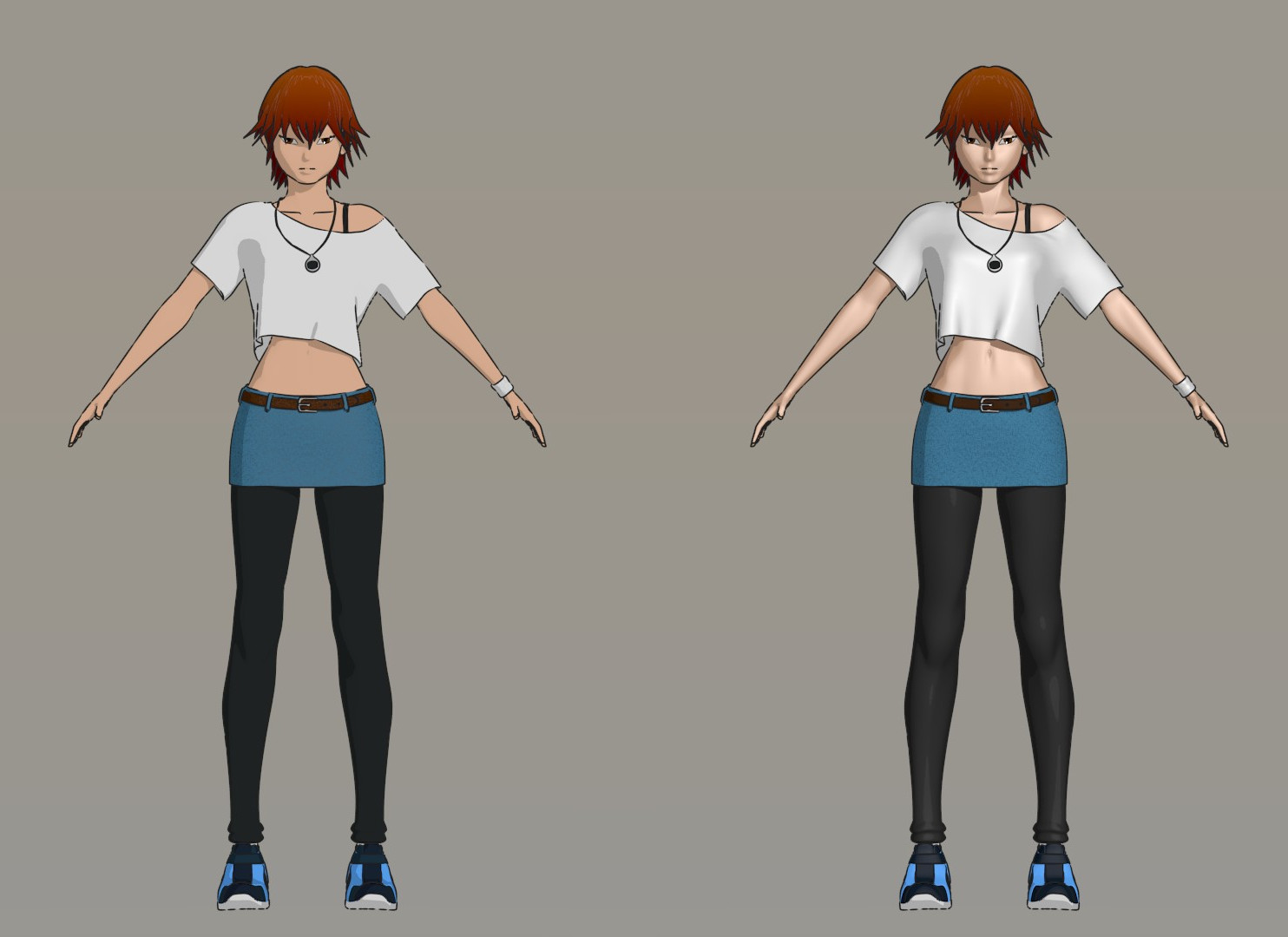
Here are some renders with the final costume(maybe I’ll add some accessories), but I’m not able to finalize the color combination/scheme for the dress. Please help me decide or please suggest me a good color combination (I’m pretty bad at choosing colors)
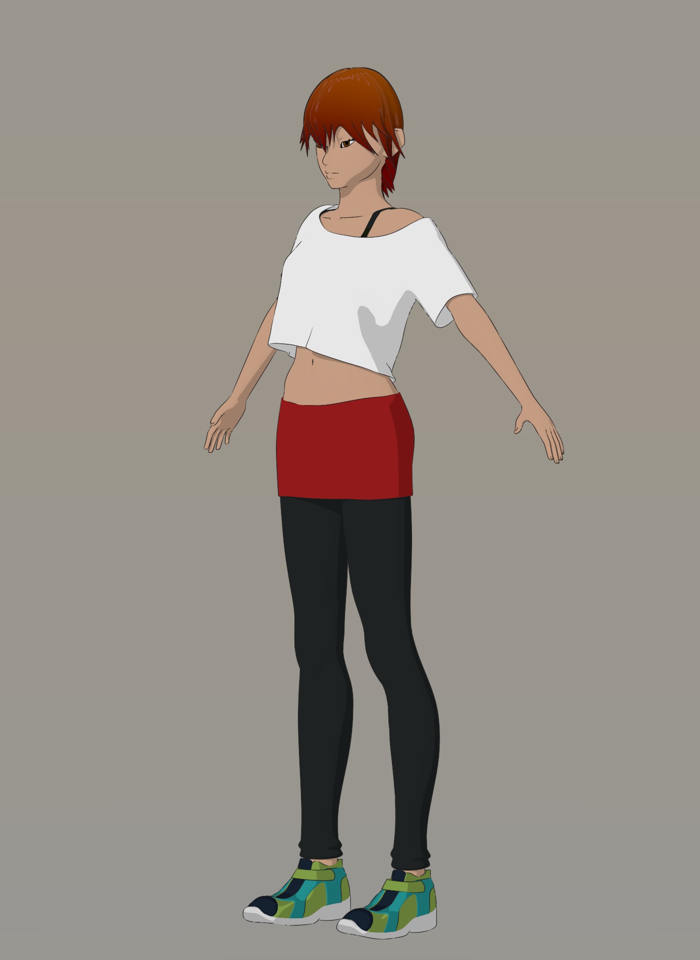
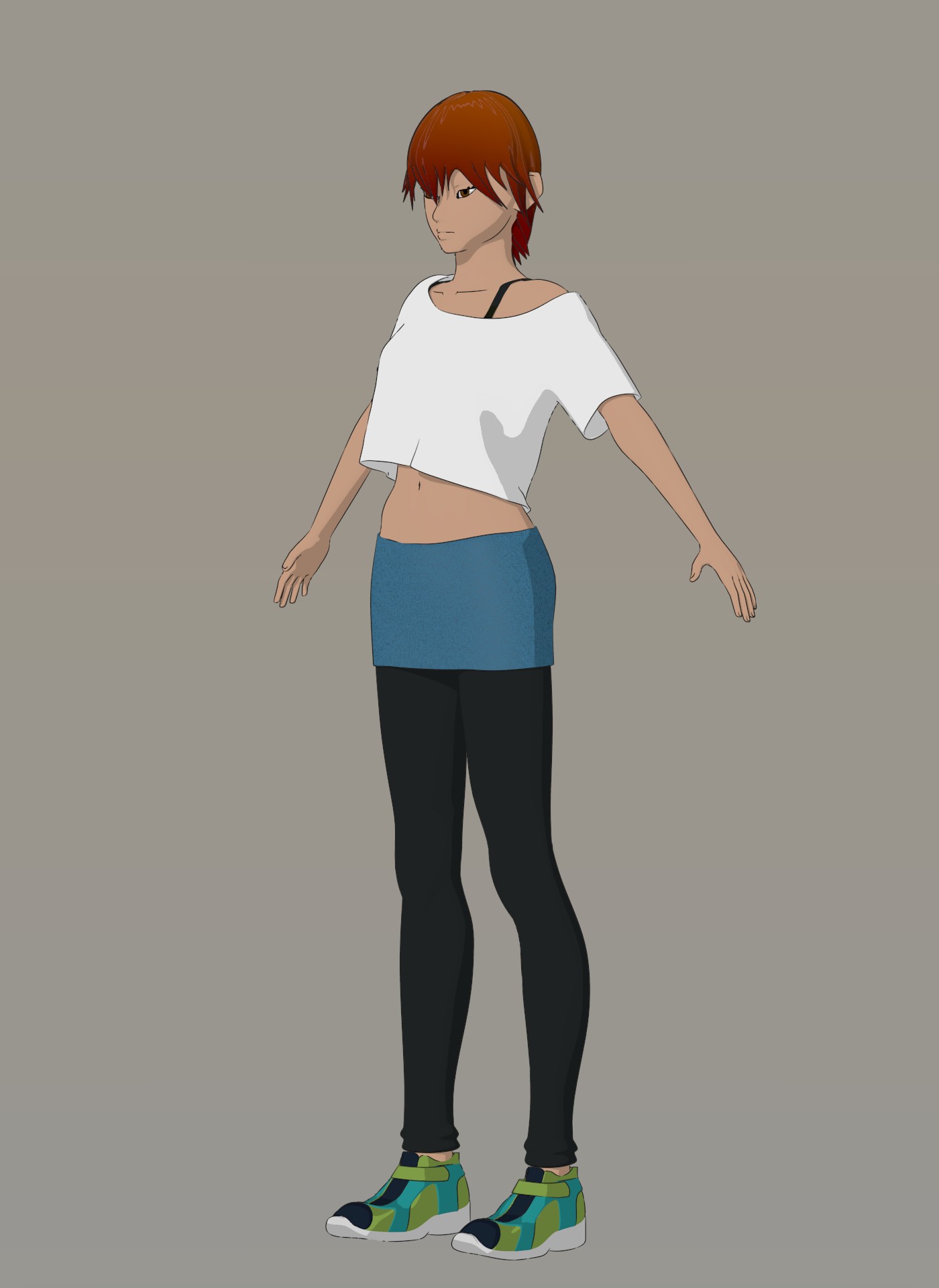

Blenjoy…
White and red in my opinion. Something that bugs me a little is your shading. Just curious, but are your shadows just the regular colors except with black added to it? I didn’t really notice it before until you posted a clearer closeup picture.
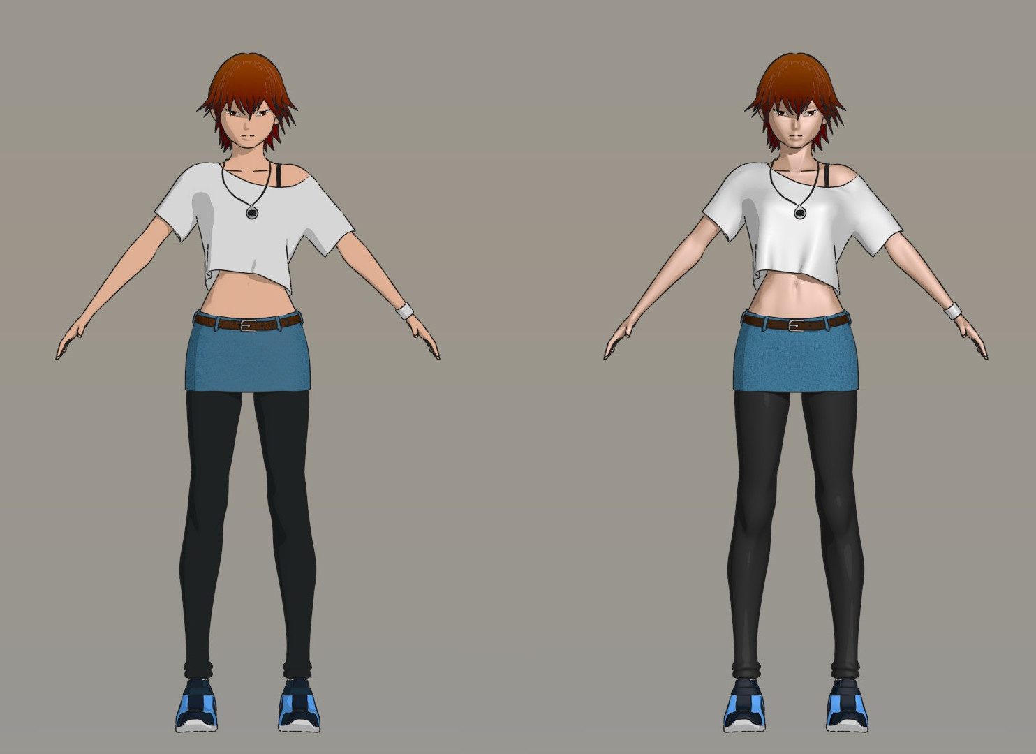
Added some accessories. I’ll keep these colors for now, maybe will change after the environment is final. Next update after rigging and set is finalized. Please tell what you guys think.
Thanks…
Blenjoy…
Hi The Omnilord, I use the toon shader from BI mostly. The dark shading doesn’t look black if you use AO.
Just a tip I picked up from someone somewhere. if you want to get more natural results, you can play around with the hue of the shadow to find a more natural look. For example, I made a quick example below. Just by adding a little red, the skin color looks more natural and smooth. It isn’t only limited to skin tones however. You can try adding orange to yellow shadows or blue to cyan shadows to get a similar results.
[ATTACH=CONFIG]450258[/ATTACH]
Experimenting with my old cell shader. Added one more layer to the shading + some details. What do you think, which one looks better:
1(the old style 2 shades) or 2(The new 3 shades)?
I do think the new style looks better, also amazing progress and very nice modelling!!
Thanks for the tip. It really adds more life… at least for the skin shader.
Here is the initial result(only on the skin):
I prefer the old style. While the shading on the right one shows off more detail, it gives it more of a 3D CGI kind of feel to it. The cel shaded one looks much smoother and natural to me.
Edit: Also post #17’s picture is the same as the picture in post #15.
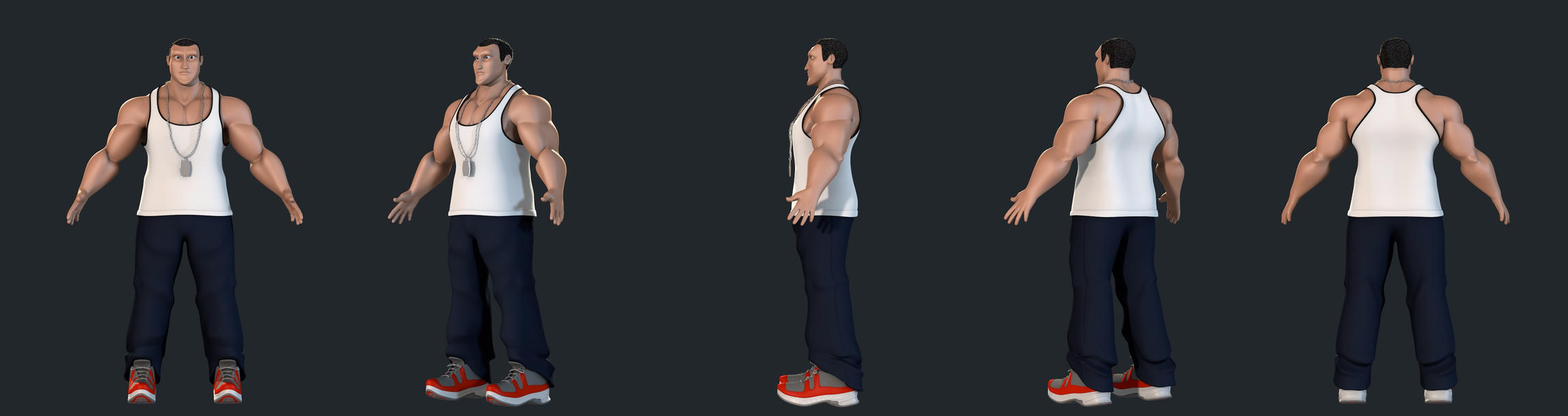
Long time since I’ve posted an update. Here is a glimpse on the 3rd character : Tatsuo.
I’m creating a 2D NPR style(all the images posted before this one) for the trailer animation and a 3D anime style for the posters. This image is the 3D anime style.
Hope you guys like it. Blenjoy…
Neato!
My suggestions (though this is based off of personal taste, so no offence intended)
-
how do I explain this…? Make the lines less parallel,
Especially for the metal girder thing she’s standing on.
cuz I find that if lines are ‘too parallel-ly geometrically perfectly even’, it looks less like anime. -
Also, I (personally) agree with The Omnilord’s response: I like the older version cuz it looks more like anime and less like cgi.
Though if it was blended colours you were looking for there might be a way that doesn't look 3D... Like... in a painting? Or colouring with crayons? Hopefully you wouldn't have to edit each frame using some kind of compositor software... Or you can find a team to do that. -
I’m not sure about this one, but, experiment by making the toon-lines a bit thicker? I can barely see them, and toon-lines make anime look like anime.
But don’t make them too thick, or else it might look too cartoony for a serious-looking anime. -
stick to npr anime, plz plz plz!!! >_<
(But this is just my preference; t’s your project, so it’s your call).
Otherwise, this is amazing!