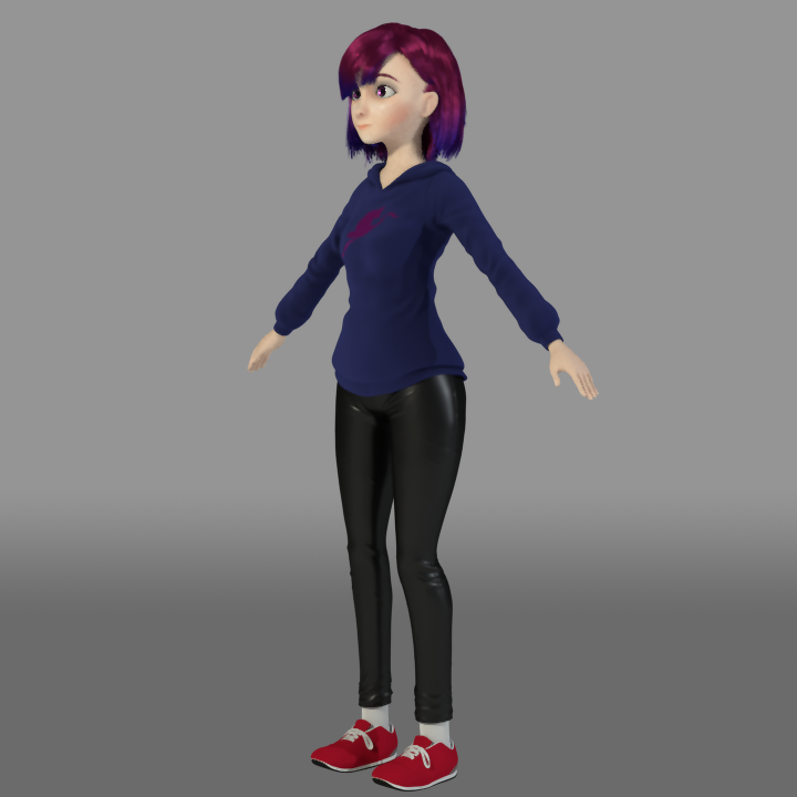
Hi, here’s the main (actually, only :P) character on a short I’ve been working on.
Any critique would be appreciated! Maybe the shading, the textures, the sculpting or the hair?
Here’s imo the best render I’ve done so far:
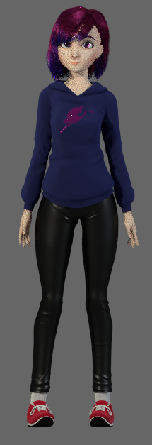
And some turn arounds:
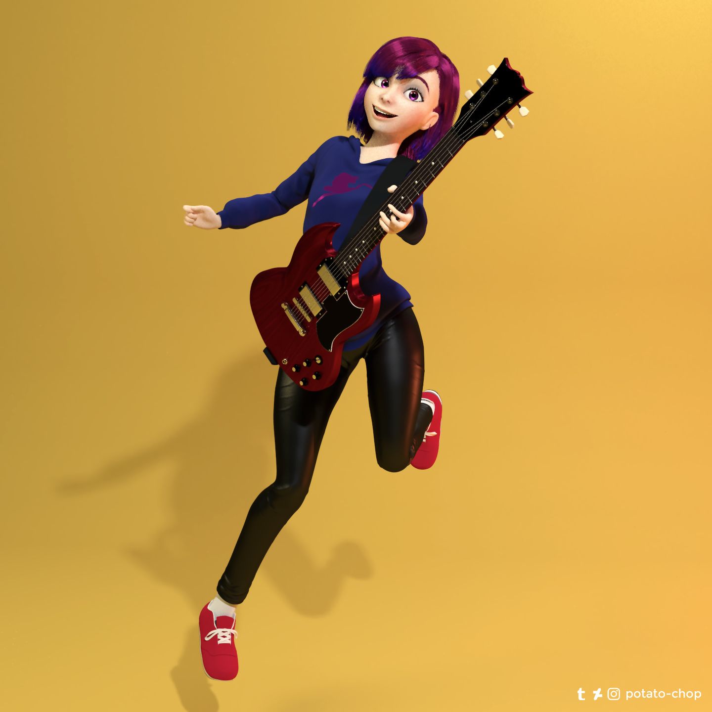
Hi, here’s the main (actually, only :P) character on a short I’ve been working on.
Any critique would be appreciated! Maybe the shading, the textures, the sculpting or the hair?
Here’s imo the best render I’ve done so far:
And some turn arounds:
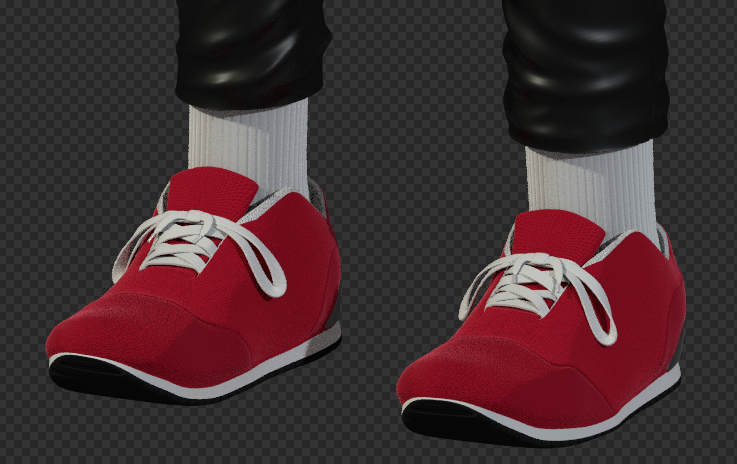
Nice work on this. I can’t see anything wrong with the textures – maybe the shoes but it’s hard to tell without a closer look. Good job.
The general style and mood are really good but I can’t avoid looking at those hips. They don’t look real. Too broad exterior side and too wide the gap between the legs…
Isn’t that the point though? To give the character a more stylistic cartoonish design instead of aiming for realism? Also, I’m pretty sure that hips that large are pretty common in animation.
But yeah, taking a closer look at it, I can see the shoes are a bit “blocky and rectangular” and don’t curve right like the way feet should do.
I like her hips 
thanks again for the replies guys! I tweaked the shoes to make it less boxy, and added a bit more variation to the shading so it doesn’t look “flat”.
the gap between the thighs was more of a technical preference, it can still be tweaked later on when posing. i’ll take a note of that though. (personally, i kinda like a bit of hips and thighs however :P)
Hi there! This is a really cool design I like the hips too. They are of course unrealistic but fit the character well imo. The first thing i noticed were the shoes aswell. Maybe if the socks were another color we wouldn’t be provoked to look at them so much (saying that, since i first didn’t see where exactly the sock ended and the shoe started). What i dislike a bit about the anatomy, even for such a highly stylized character are the knees and with them the uppermost part of the outer calves. They are imo rotated slightly too far inwards. I see that it increases the cuteness- factor, but i think it might be a bit much (In the first pose it works pretty well, but less dynamic poses might be probematic). Maybe look at that knock- kneed lady from the incredibles for reference (she is really cute and amazingly stylized too, but her legs would also work with the assumed bones in real life). All in all this is already pretty awesome. PS: I love the color choice!
Hope it helped and happy blending!
Chris
Nice job!, I’d suggest to saturate a little bit her skin tone or maybe increase the red channel value in the SSS shader,l you could also add a couple of freckles in the texture map; I believe it would make her look more alive. I really like the way the hair looks, congrats.
I agree with almost all of the above, but think the inside of the thighs don’t describe enough convex curvature, their profile in front view is almost vertical. The problem is that women with heavier hips (which are otherwise well-modeled!) tend to carry more fat in the outer hips and inner thighs, it’s an evolutionary trait. Also, the inner thigh musculature has certain convex curves that should be portrayed. As it is, the inner thighs look wasted, as if the expected muscle and fat there has been thinned by some unnatural influence.
“OMG,” you say. “he’s talkin’ about anatomy! In a cartoon character!” Well, yeah, sure, especially since the rest of your model does not depart at all from very standard proportions and anatomical considerations. It falls in a style I term “naturalism” because the exaggeration of anatomical aspects is mild at best. So, when part of the model departs significantly from the norms, it looks odd, wrong somehow. Not deformed, just a little distorted.
Places I’d recommend more convex curvature are in the upper inner thigh region – the pelvic gap should be narrowed a little also – and the inside of the knees, thickening that joint a tad. The new curves would better match her other very attractive contours.