In a near future

Hi!

I have been working on this scene for a while and I want to make it as great as it can be.
Right now I’m pretty stuck and don’t really know what the problem is.
The image doesn’t “POP” when I see it, something is missing or something need to go.
So please if you have any feedback or thought on lightning, composition, textures or materials. Please let me know.
What should I do to make the image as great as possible?

//Holmen


I have beens sitting some more with the postwork and did some changes. I think to the better.
Thought?


I think so. Lighting looks much more balanced and natural. I love how you balanced the left side – dump a load of bricks on it! :smiley:

@chipmasque - I got a question from mstuff if I wanted to try out “https://cgcookiemarkets.com/all-products/rock-and-gravel-asset-pack/” It fit pretty well into the scene I had in mind and yeah, nothing like a bunch of bricks to balance a picture :slight_smile:

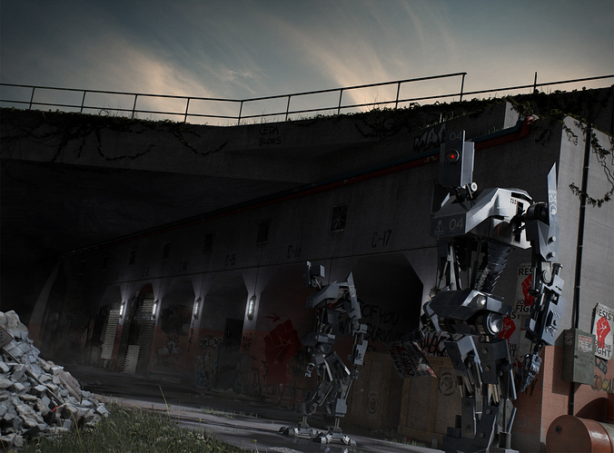
My suggestions shortly: Make the characters separate from the background and forms read better. More action to tell a story and give the characters reason for being in the image and in the location they’re shown, which is immediately apparent to the viewer without second guessing.

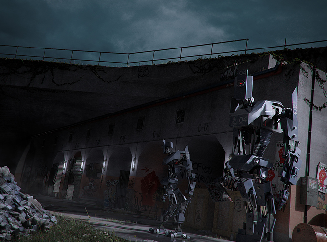
The biggest issue I had when I first saw the thumbnail and the whole image was to figure out the forms and the orientation of the characters because of the lack of value contrast (which is why the second picture works better). But after looking at it a while, I think the bigger issue is the story.

It took me the longest time to figure out even a hint of the story. The image is in a dynamic angle, so the poses could be dynamic, could have the robots doing something. The two are just standing there, but whatever they do in that location and why they’re there should be immediately apparent to the viewer. Are they guarding something, protecting something perhaps. apparently there is a fight of sorts but nowhere near this place, nothing to worry.

Character design could reflect their purpose.

Foreground character is holding a poster some kind, it could be handing it to someone (who is maybe off camera), drop something, signal something.

https://dl.dropboxusercontent.com/u/26346140/holmen_ja12_crit.png

Top image and the thumbnail:
Values get mixed with the background and the forms are difficult to read/differentiate also from each other. That flattens the image and with things like the wall corner and the left arm of the foreground character going a bit of tangent with each other, it gets confusing.

Also not sure if you noticed and if it’s intentional somehow, but the numbering on the back wall kind of continues with the chest plate number because it’s aligned quite perfectly in perspective.

Middle image:
Having value separation between the characters and the background helps to keep them separate in space. There are lights in the background so plenty of excuses to have it lighter because of “fog” or “dust” for example.

Bottom image:
There could be more movement. For example, there could be two bots going towards the left side and they could be escorting something/someone, dragging something, moving alongside a vehicle, and the foreground bot could turn and look more towards the camera and go “what you’re looking at!”, or it could give a stop signal/gesture to some people on the back left of the camera.

Where the two are going. Maybe could build a fence with signs that reveal the nature of the things. “Hydraulics Anonomous”, “Police”, “Prison”, “Wall-Wart” or somesort.
Thanks @JA12, really good points and wuality feedback.
The number alignment was not on purpose, now I can’t unsee it tho. :slight_smile:
I agree that I need to make both the readability and the story of the image much clearer for the viewer.

So far all the “story” is all in small details, grafitti, newspappers, posters, shadows.
The idea is that this is robots looking for a rebel group, this is supposed to be one of their hideouts.
I have to give it some though on how I can make it more clear.

The last mockup you made was great, I need something happening in the scene, some movement and/or purpose.

It looks really awesome, good job

This is progressing very nicely.

One suggestion I would have is to work on your edges on the background image. I know someone previously suggested that you add a bevel modifier but I don’t think that will offer you what you really want. The bevel modifier will only add additional, perfectly straight lines to an image that has a lot of them already there.

Instead I would suggest that you go into edit mode on your background geometry, select all of the verts, and then subdivide them once or twice. You will get a lot of polygons, but the overall shape should not change (i.e. it shouldn’t soften the shapes at all).

Then, go in and push and pull points all around the edges of your buildings. What you are looking for is some way to get the edges of your cutouts to not be perfectly parallel, to have some warble, and to introduce tiny chips and dings. Especially on the front edge of the building where it wraps around near the junction box.

After that, go over all the building pushing and pulling here and there to make the walls not be perfectly flat. This will catch light and throw subtle shadows that will make the whole thing lose a lot of the cg curse of too perfect surfaces.

All around, good work so far though!

(Alternatively, a lot of the same effect can be done with displacement in other renderers - I am most familiar with Renderman which excels at displacement. I suspect that Blender should also be able to do the same. I just personally have not progressed to that stage of my Blender training yet…)