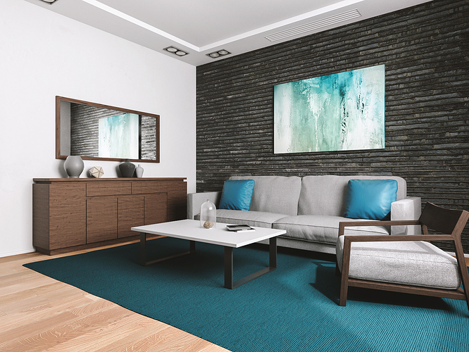
Blender+Cycles
samples 2500; rendertime: 40 min on GTX1080
No progress since your last interior work.
![]() 4me
4me
Thanks I appreciate.
PS: and thanks for the effort of a red thumb down icon
You’re welcome.
I find it fair to use pics to make my point understandable even by those who have trouble with words and letters.
next time maybe slightly larger so it is easier for me
Well, the light is definitly more natural in this render, than the last one. The room is bigger, there are details covering the transitions between floor/ceiling and the walls and lights/shadows are distributed more evenly across the image. All improvements suggested in the last thread have been implemented. What’s missing for you?
@ArcHWiZ
I think this room feels empty on the side that’s not shown. I’m not sure why, but it might be because no part of the furniture crosses the left edge.
Next flaw are the cushions, they look like they are exploding soon and this hard, glossy material creates a (uncomfortable?) contrast to the rest of the room.
When looking at the wall, it seems as strong as a sheet of paper, maybe because it’s so flat. I see that you’re using bevel on most or all edges, which helps, but maybe a normal map could add a “material” to the wall.
@LazyVirus
I’m not sure, what you intended, but your first answer sounds simply rude.
I usually speak and write very minimalistic, so I suppose, you wanted to write down your statement and nothing else. But here comes other people, who tend to connect words to emotions, like my friends, but they are used to it.
You probably expected a better result from ArcHWiZ, as you seem to follow his progress. The render did not match your expectations, so from your point of view, it’s a failure.
ArcHWiZ on the other hand posts his newly finished work, hoping to read a lot of motivating, inspiring answers, but finds your post: one negative sentence. Maybe you understand why he feels offended?
So maybe you cold try to add as many useful criticism or tips in your answer as possible, so people really appreciate your opinion.
I hope I didn’t attack you while trying to explain the situation. I just want everyone to understand everyone else.
THANKS Cebbi
what a great answer and helpfull criticism. I really appreciate that you have noticed improvements.
I’m not sure, what you intended, but your first answer sounds simply rude.
I agree. I would expect to see a trim piece where the brick wall meets the ceiling and other wall. If it’s there it doesn’t read well. I would also be tempted to try several more wood textures and maybe a little more gloss. Also maybe a foreground piece breaking the left border could help suggesting a world outside the frame while giving the composition some depth. A statue, table with glass vase, etc. Or, not. : )
ArcHWIZ, the books, crock ware, etc. could be a way to introduce some saturated color into the setting with or without texture. Google magazine covers and go large for color and texture. At that size and angle no viewer could pick out a specific magazine so I wouldn’t be concerned about copyright. Or, simply make your own.
I’m no decorator but does the material on the pillows belong on that sofa. And, maybe one of them being rotated a bit might look nicer. Picture on the brick wall could use some depth. Less assume it’s stretched canvas on a frame. Looking nice but maybe a bit to generic but the magazines and accessories could change that IMHO. Man attempting an animation project I would love that card you have.
Hey, with that card why not play with the camera height. Think like a illustrator for a minute and try a lower height. And, maybe a 45mm lens for the hell of it.
This is IMHO much better than your previous render! I would probably work a bit more on the wood shaders - they should be slightly more glossy.
I also recommend you to make a whole room so that you can show it from different angles. It is allways better if you can show a whole set of images and not just one view.
@theoldghost
thanks for your suggestions, yeh this card is rlly cool for quick render. 
@maraCZ
thank you, i will try next time to create a whole room with more perspectives.
I am new here. And I would love to create such pictures. Additional I would love to do such an picture in 40min only!! My computer takes several hours for such an image. For me it is a great work. Perhaps some plants would look nice.
Thank you goldenengel. Yeah, plants would be rlly nice but im rlly bad creating them.
ArcHWIZ if you ever do a bigger space try a 2d plant with an alpha channel. They’re several sites with freebies.
goldenengel simply take the default cube and make it however many meters a ceiling is in Switzerland on the Z axis. Make the camera 40MMs and move it into the cube. Then scale your cube on the X and Y axis to suit the 40MM lens. Putting a small cube scaled to the size of a average sofa or bed in the corner will help with scaling your room. Furniture sizes are available on the Net. Then deleting a wall or two behind your camera will help with a slow computer. Looking forward to seeing your room.
I tried to use some from blendswap once, but they always have different quality, shaders and amount of detail, so I just collected a few models and created similar ones for myself after having a look on how it was done in the downloaded file.
And, without a doubt they look better @Cebbi. I’m interested in animation where you cut every corner.
