Hey Everyone!
I recently finished an image called Mosaic One, and I wanted to hear your critiques on it.
Made in Blender and MakeHuman.

Good critiques should start with positive comments but I can’t think of any when looking at the image.
The image is just bunch of objects with nothing to relate to, and no apparent story or reason. It looks like you’re just playing around with Blender and once you get something out, you’re asking what others thing about it. If there’s no more thinking or reason behind it, the responses won’t be very positive nor encouraging.
The focused critiques section is for serious works only. There are some objects and rendered with default image resolution and camera lens. Shiny materials, colors, lights won’t do any good when those have no reason to be there.
The only thing to critique with random objects like that is the composition, which has problems

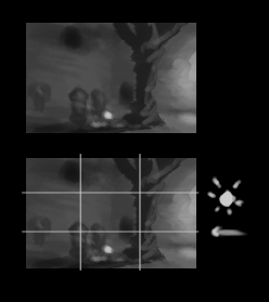
Character head is too close to the image border and creates a visual tangent. Character’s left hand shares edges and has too close values with background elements so it makes it confusing, and kinda looks like left hand might stretch way back.
Middle foreground fights with the focal point, which based on the position on composition guides and detail frequency must be the breasts. The contrast in the middle fights for the first read because of the high contrast and because of the framing created by the elements around.
And yes, I did eventually spot that the character somehow summons the tentacles from the ground or kills them, and is heading towards some trees/forest. That discovery doesn’t help the image, just makes it worse because you’re communicating badly. The story/idea/plot has to be clear to viewers immediately, the longer they have to look for clues the less interesting and likable the image is.
It’s like you’re trying to say something but just scramble all the letters. Yes there are words and all the letters are there, but would you like to communicate htiw lppoee ohw iterw kile hits. I wouldn’t.
Hey!
Thank you so much for your comment. You give so much helpful advice.
I totally understand what you are saying. I will try to rework the image and make some story out of it.
Do you have any ideas of what I could turn this image into (that would keep some of my elements) that would actually work?
Again, thanks so much for your comment. I will seriously try to rethink what I am doing in this render 
Blender2003
What is your process when beginning a project? How do you decide on a story?
Thanks again
Blender2003
The story can be almost anything that you can visually communicate, but to really think it through how you going to relay the message to the viewer is the hard part, and the design of everything.
The backstory in this one could be as simple as: a female protagonist walks on rural land and replaces everything with mosaic and tendril with her powers as she walks along.
So with that backstory the task is to create an image that shows: the protagonist which acts as the main focal point, the replacement of nature/land/architechture with mosaic, spikes/tendril/tentacles on the mosaic. The protagonist could have mosaic and tendril patterns on her design to show it’s her replacing the nature with mosaic, and not the other way around.
Nothing is set yet. The scale is yet to be desided, graphic style, the mood, colors, is it sinister/dark or colorful and happy, so the backstory could use some more detail to pull ideas from. But at least there are some decisions made about what needs to be in the image so that the viewer gets it.
How to continue? Could start thinking visually and draw very small thumbnails. The smaller the better, as long it is able to visually hold the information you’re thinking at the time, but without worrying about drawing ability or any small scale details when concepting the whole scene. That way you can make many variations in short amount of time, and then look them all and decide which one fits for the task the best.
Once ready you can use it as a scaled down reference of the final image you’re going to make, and start going through the gritty details. Or could go back and combine ideas from multiple and make a final thumbnail for that before moving on.
My example from another thread, actual size. https://blenderartists.org/forum/showthread.php?374895-Feedback-on-book-cover&p=2898356&viewfull=1#post2898356
In that thumbnail I’m thinking about object placement/composition, light placement and light sources, and the mood

Another of my examples from yet another thread, larger than the meant size for it to be clearer for others, since thumbnails don’t necessarily make much sense for anyone else since it’s just a tool.
- shows what not to do, trying to get realistic drawing on the page and spend a lot of time
- could just use whatever means and ability to record rough visual about what you’re going to show in the scene
- it could be as rough as just blobs/silhouettes as long those marks serve a purpose
- won’t recommend this rough, but even that can hold information (object placement in the scene, shown with value)
Hey!
Sorry for the late reply.
Thank you so much for this! It is so helpful.
I think i am going to ditch this project and try to start over using the process you showed me. I feel confident that my next work will be much improved because of all the useful advice you gave me!
Again, thank you so much!
Blender2003