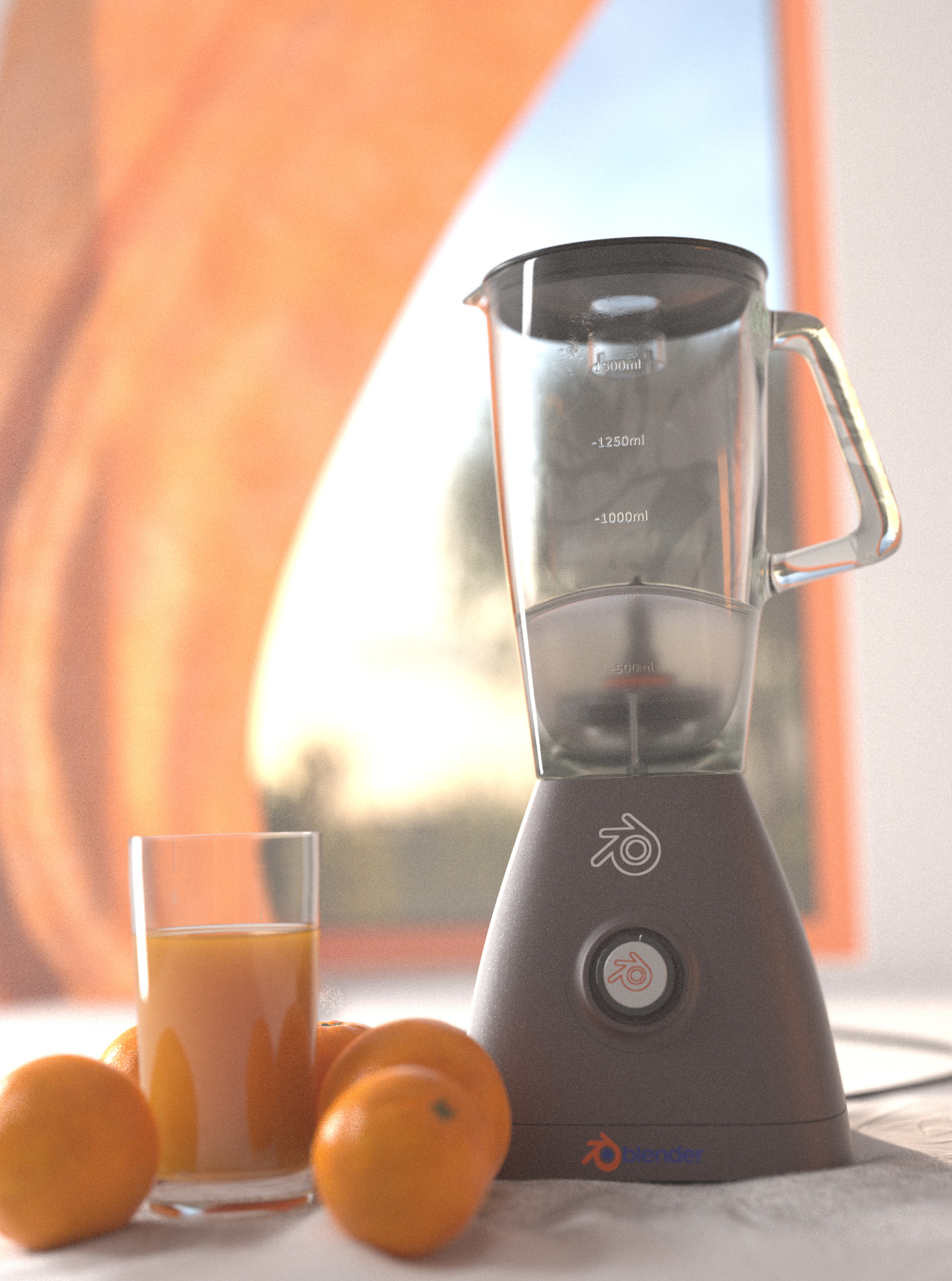
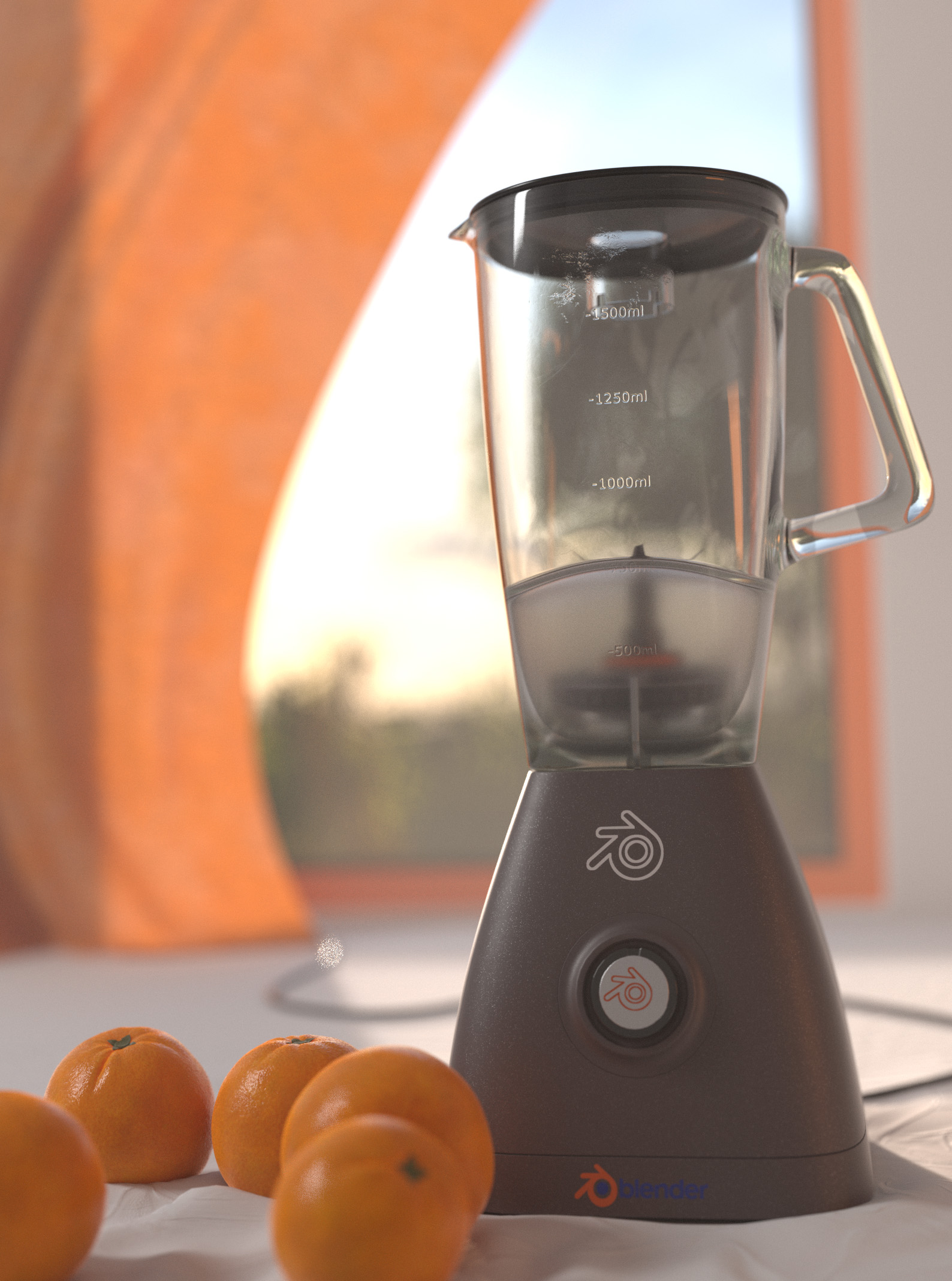
Hello, everyone! I’ve been working on this scene for a while, and I think it’s finally at a point where I can ask for critiques before posting it on Finished Projects. I’m trying to go for a realistic and detailed look. And just like on the Blender logo, the most dominant color is orange. Here’s what I got so far:
Maybe try different camera angles and changing the distance it is from the objects to put a different perspective on the scene. It feels as though the camera is to close to the objects. I’d suggest positioning the camera in a way so that one is drawn to the blender instead of having it forced into their face. The other thing is the curtain in the back just looks weird to me maybes its the noise texture used or the fact that it looks oddly smooth to me, maybe a place to improve as well.
First of all, I have to say, that I really like the realism in this Image. As you said, the left part seems empty.
You can avoid that, ba adding a glas of orange Juice maybe, os other kitchen Utensils. You can also crop the Image down, so the “blank Space” gets smaller.
On the other hand the plastic glass material on the blender (clear one) looks somehow weird … like real glass imo (especially handle) and thats a nonsence on blender right? Others seems good enough … maybe slightly softer DoF?
Sincerely, JayM
PS: And maybe move the camera even more down to the fabric and rotate it upwards to make the blender “bigger”?
Interesting that I was 1st to make comment here and now two others are BEFORE me … time zone?
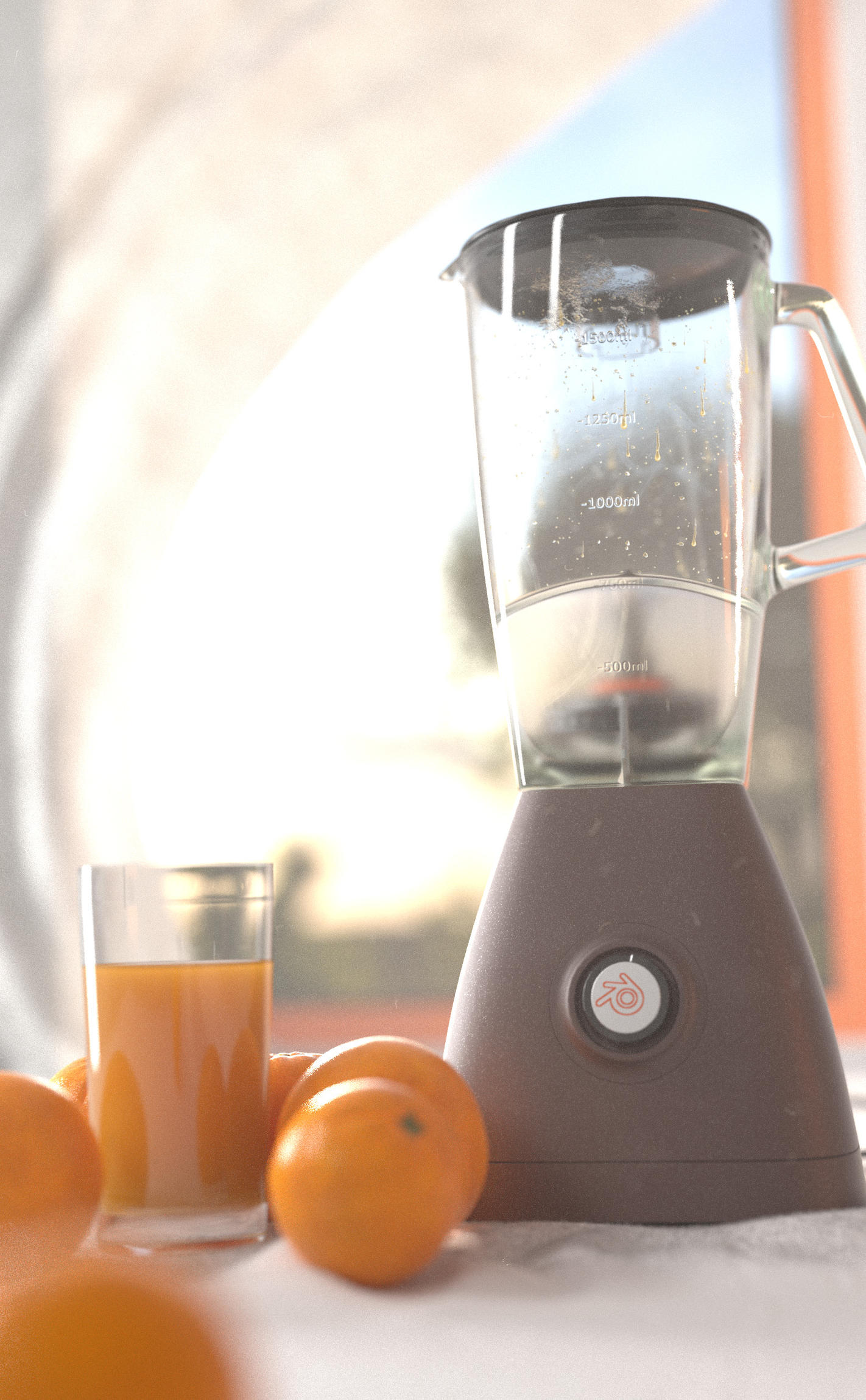
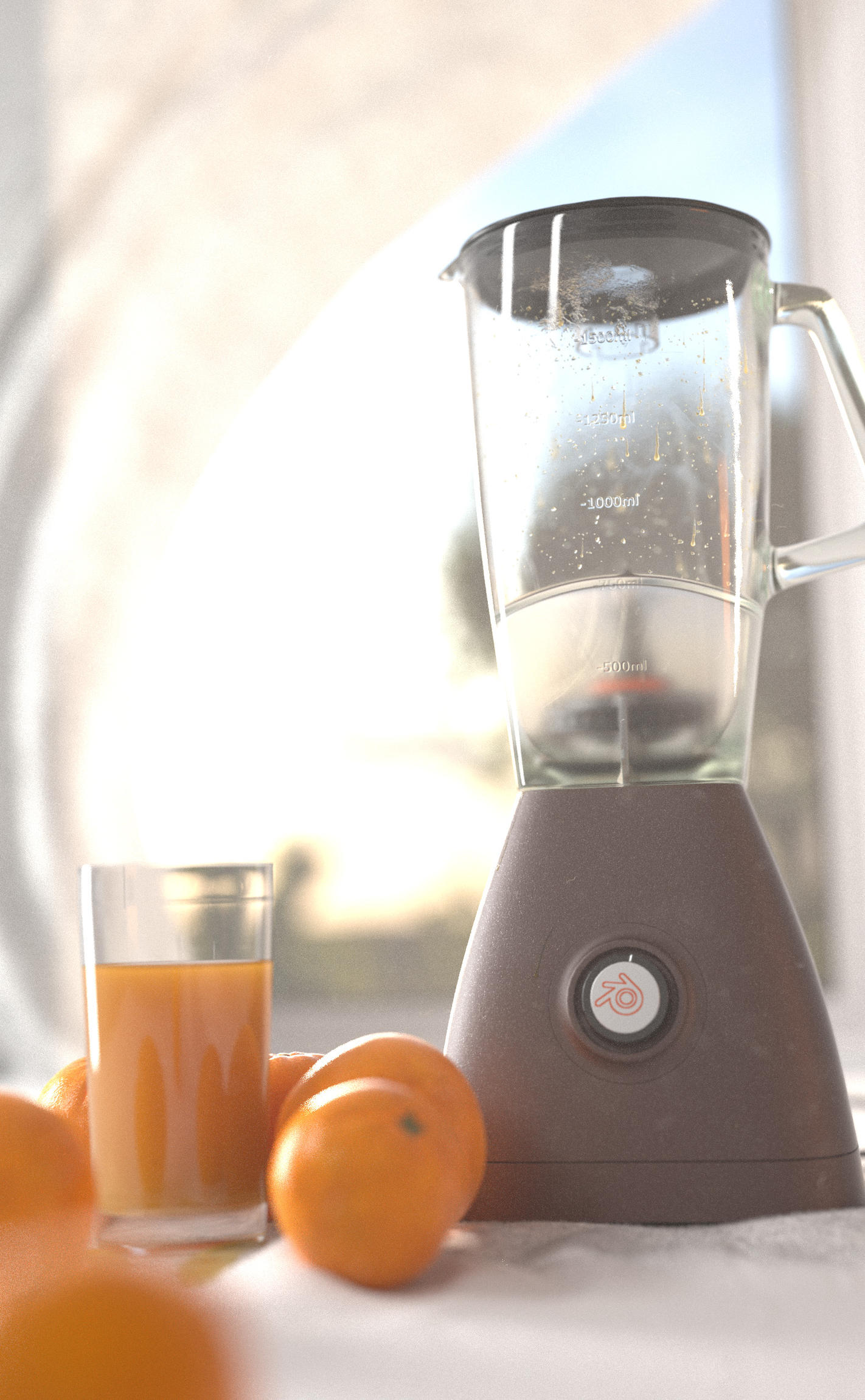
Hello again! Sorry for not posting recently, i’ve been busy with many other things, but I managed to make some changes, like change the camera angle, add hair particles to the white table cloth (It wasn’t in the critiques, but I decided to do it anyway for extra realism.), slightly increase the DOF, try to make some small adjustments to the curtain, and add a cup of orange juice. Don’t worry, I will make more changes. It’s just that I haven’t had much time recently.
The blender does not need 3 logos - most appliances only have one. I would choose one of them. My preference is the one on the button.
2.Change the curtain color in the back to something other than orange. Let the Oranges/orange juice provide that color and they wil jump out more. The curtain could be “blender blue” as a complimentary color, while also solidifying the concept.
The image is a little cold. I think having some nice wood, like a butcher-block, for the countertop would add more interest to the ground plane and reduce the colder colors.
Put some juice, oranges, or remnants of juice inside the blender. Otherwise, it appears that the blender was actually useless.
Yes! That is looking better. The pulp/juice inside the blender looks great. Only one thing is bugging me: the orange window frame. Just seems a bit unrealistic, but maybe its ok. Good work.
Much much better. The pulp spatter on the blender gives this a more authentic feel and adds a hint of story. I would keep going in that direction. More pulp, some juice at the bottom of the blender. More grunge on the plastic. Oranges should be squashed as less spherical and more pores/bump on them. Shape of blender a little weird maybe too organic. Orange juice in glass thicker (more diffuse and sss, and add a a particle system of pulp, right now looks more like Tang. Maybe throw in a halved, juiced orange, that would really help to sell things, and add some nice asymmetry to the image. I think the lighting is fine but the background image/hdr is looking too blown out. Nice progress!
 ?
?