Hello artists !
i somehow scew up my first thread here ! so i’ll restart!
i started my Blender adventure about 2 years ago, i do this for fun, and i’m not in anyway a pro !
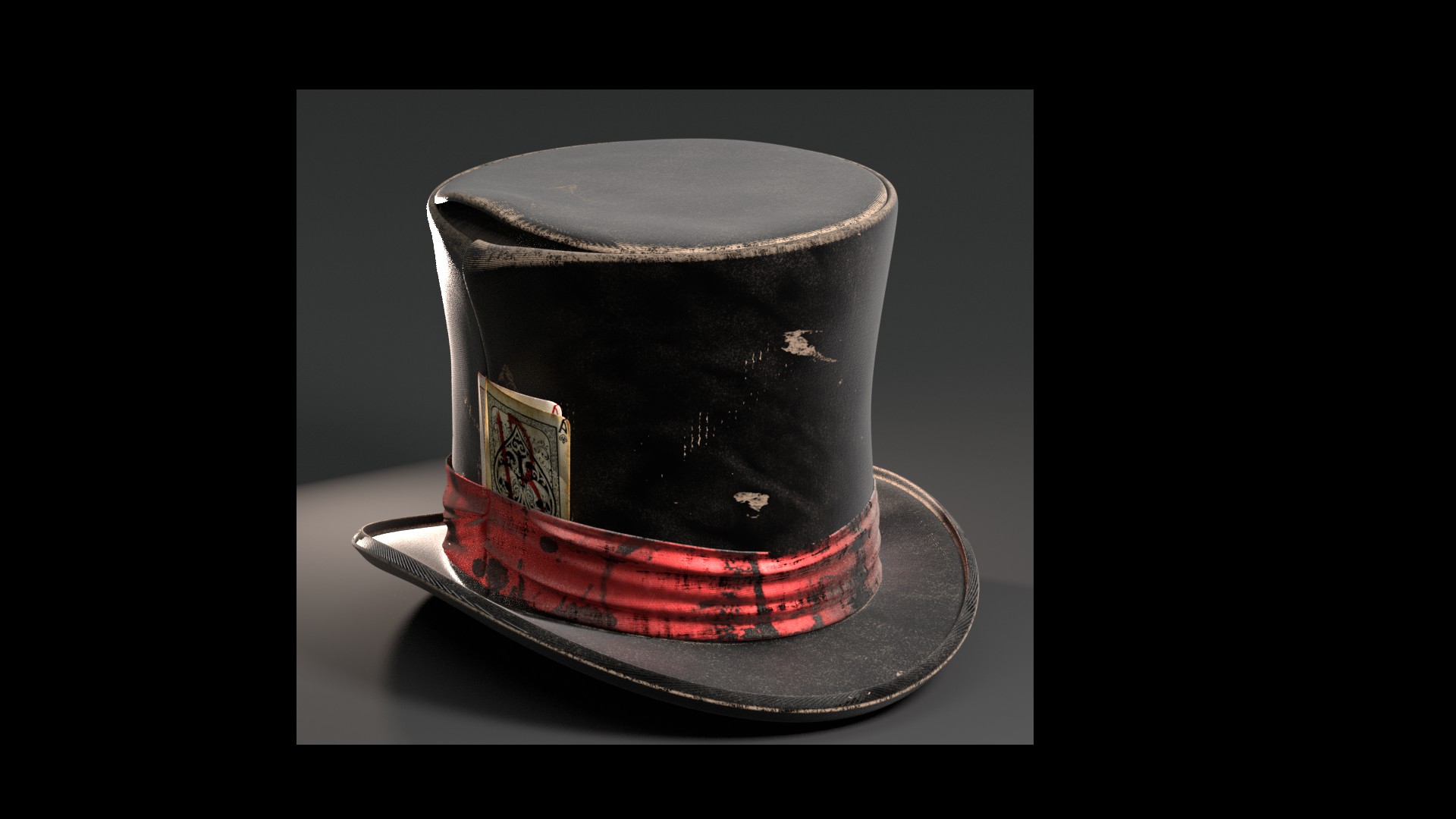
i’m working on a scene inspired by the american traditional tatoo ! one of the most known design is Mr Lucky !
i’m happy to share the steps of this WIP with you , and i wish to hear all your feedbacks !
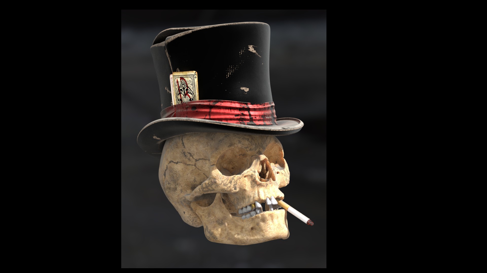
i finished sculpting the skull recently ! tell me what u think !
and please esxuse my bad english!
See u around.
good looking skull and the hat looks great too. i wonder what these holes you put into the skull are?
hello,
thank u for ur comment  the holes are opening in the bone for vascular and nervous structures to pass through , in human skull ,they r a constant feature , this image showcases them,
Ps : i liked ur tutos on CG Cookies , a great help !

Good work so far, the hat in particular looks perfect for the character. For the skull, it seems too evenly-colored, and too cool in color tone, like porcelain rather than bone.
@ doris – the little holes are called “foramina” (sing. foramen), if you want to look them up.
hey! thank u for the comment ! it’s just a basic AO shader to showcase the sculp and shapes , i didnt finish the shader for the skull yet ! i’m going to texture paint + some procedural texturing , and try to find out a good SSS for the skull !
see u around
That is a nice looking skull!!!
Just for fun, in this link you can see differences in the skull of different etnias: link
(the occipitotemporal suture is missing)
thank u , the link is interesting ! and i totaly forgot the occipital-temporal suture ![]() have to add it !
have to add it !
see u around
Nice render! it seams you are going for a very old bone that has been in the ground right?
I’m working also in a skull right now, I hope it end up as nice as yours!
One detail that you’re really going to have to pay close attention to, when lighting Mr. Lucky, is that his hat should not put his eyes … err, his eye sockets … in shadow.
Personally, I also think that you should take a cue from the concept-art about the shape and positioning of his hat. It is not realistic: it fits his head very tightly, is probably much smaller in the front than in the back, and it is generally shaped to emphasize the playing-card (which is also out of scale) and the 8-ball (ditto).
To me, this generally suggests the use of a more cartoon-like approach to both modeling and rendering. This is not a real skull wearing a real hat: this is a magical or at least stylized being. “He is … … ‘Mister Lucky!’”
hello there !
thank u for the comment ! i didnt figuer out how to light the scene yet… a think it’s going to be sun light passing through holes…i dont know yet…
for the style ! my idea is to go realistic as an unusual interpretation of Mr.Lucky , and make him less shiny !!!
see u aroud ![]()
I think your approach to materials is a cool idea, playing their “reality” against the fantasy of the character. In the last image, I also think the hat could fit more snugly and be placed slightly askew to one side, the skull’s left given the camera view, for a more rakish look. I do hope you plan on adding the Van Dyke and monocle, they are critical to the character!
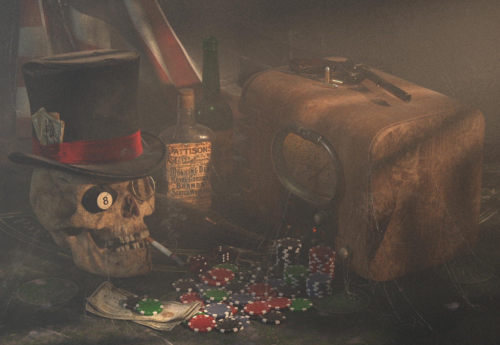
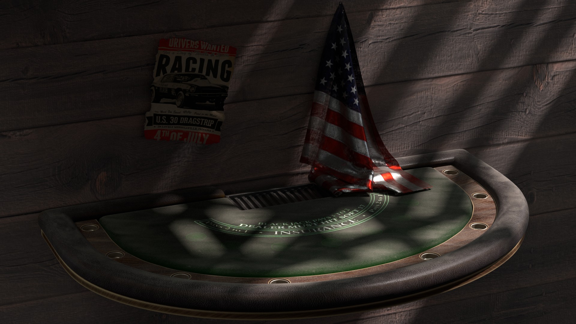
Choice of final background will be very important, I think, and perhaps help determine a final lighting scheme. For example, a poker table with green felt covering, well-used, maybe a nearly-empty whisky highball and a half-crushed pack of cigs in the BG (heavy depth of field would be OK) and the kind of harsh lighting typical from a single overhead lamp, to place Mr. Lucky in a slightly dodgy gaming context.
hey ! u r reading my thoughts !!! i started to work the backround ! a Blackjack table with chips and dice ,and an old school american flag , some bottle , and a 1940 radio !!! i m not sure about the monocle , i planned to put the 8 ball in the left orbit !
will post some images later !
thank u ,see u around
staring to add some elemnts to the scene !
a old style radio ! the materials r just place-holders for now !
see u around 
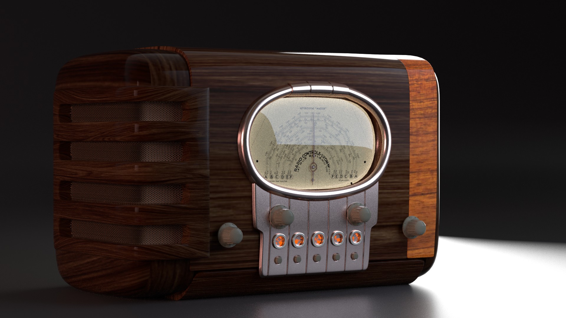
That radio induces some serious wayback machine thoughts – my parents had a full-size console unit much like this (even for them it was an antique) on which I spent hours scanning the many broadcast bands it could pick up (hence the complex tuning dial graphic – good find!). The only thing missing is a “tuning eye,” a pre-LED glowing device that brightened and dimmed depending on the signal strength. Not sure if smaller units had one, but given the range of frequencies these sets can pick up, they likely did.
Our unit had a magnificent white oak chassis, paler than your prelim wood mat but definitely showing off a prominent grain structure. I don’t recall the exact look of the presets panel but your design looks appropriate for the era (commercial art deco). All-in-all a good start on the props!
i start to think the backround ! a basic render for the Blackjack table ! need more work !
what do u think ? let me know
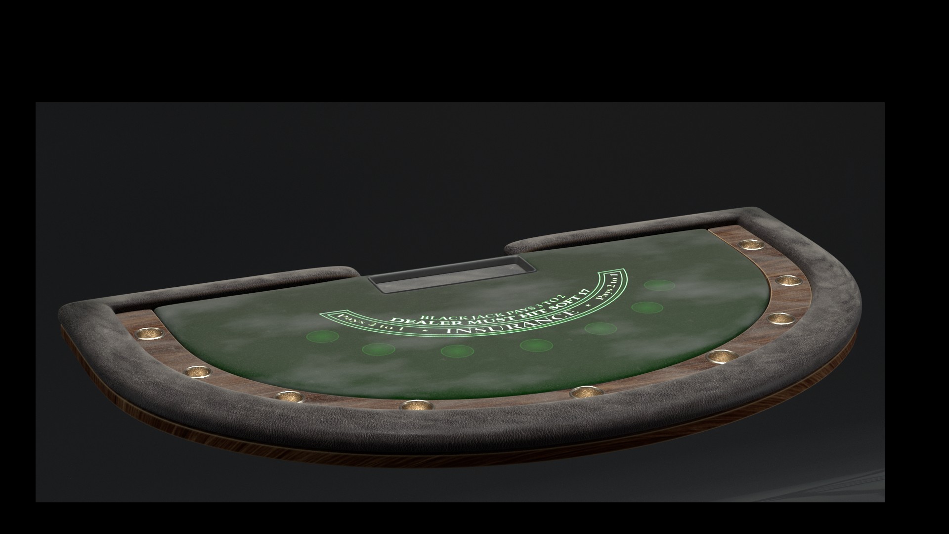
It is looking interesting! and dusty! and old, and really nice!
thank u i really appreciate ur words !