Hi:
Need tips for more photorealistic render…
Hello,
you have some nice models here and I like your attention to detail.
what jumps out to me is:
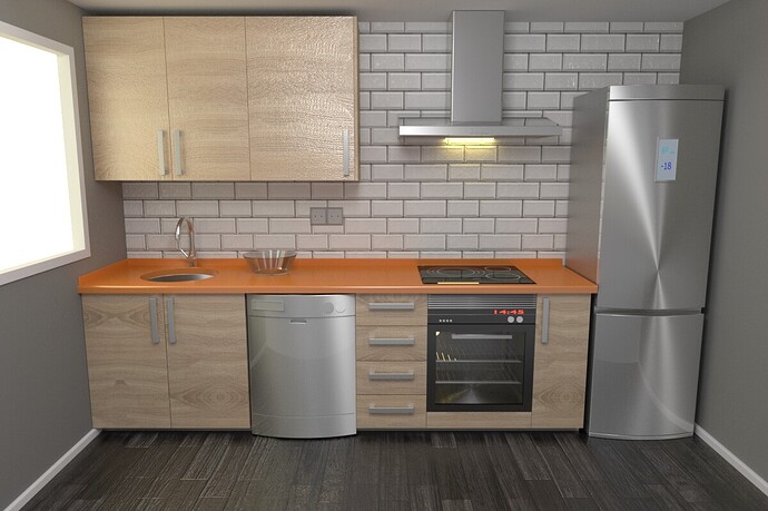
- the window (obviously), but I am sure you are going to do something with it later
- the tiles on the back wall. Firstly, they are ugly
 (sorry, but who wants those in their kitchen? they are more for a bathroom or something) Also they end halfway in the ceiling… This is not how tiles work. There would at least have to be some gap there, but more probably, there would only be several rows of tiles (or something similar) to protect the wall from water and dirt, but not all the way to the ceiling.
 - the bump on the wooden cabinets is too much. Such cabinets would be “brushed” and polished wood (or more often just some wooden texture) and would be almost completely flat.
- the scaling. There is something bothering me about the scales of everything. I guess it just seems weird to me, that each and every cabinet in your picture has a different width or height than all of the others. Usually these things are mass produced and bought together in a set where most of them would have the same measurments.
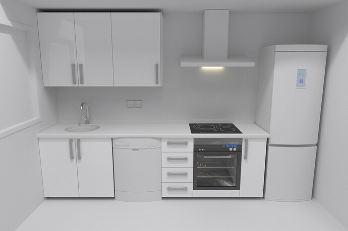
- and lastly the overall aesthethics of the image. Dark floor, grey walls and ceilings (really even ceiling? such a room would be dark as hell), light wood, orange board and white tiled wall. The clay render you have below is actually much nicer then the supposed render. It’s much cleaner and nicer. Look at some refernce pictures. You should have some balance in colors. Don’t use all of the colors you can find, stick with just a few and balance them out (not 50%-50%). Yes, I know you want to be photorealistic, but this counts as well. Nobody in the real life would decorate their kitchen like this.
- some more details (obviously) the kitchen is very bare as it is. Adding more junk helps a lot with realism

Hi,
nice image.
There seems to be some scaling issues, though. The cabinet handles are way too big. And the top cabinets are too close to the wall, i don’t think you’d be able to open the door on the left. And as mentioned above, the bump is too strong on the doors and on the floor too. I quite like the colors. Maybe not the most controlled color scheme, but i think it looks believable. The oven looks really good.
Small details is key to realism, also some problems with light

