Hi guys 
i wanted to try a camera matching exercise and i’m quite happy about the result, although there are some differences.
The first image is the render, the second the reference.
I hope you like it , critics and comment are welcome 

Impressive.
However, the title isn’t really camera matching - I don’t think. Image replication maybe? Camera matching to me is where you use a photo or video and re-create a camera in Blender to match the one in the photo/video. Well, maybe you did do that in this photo - but I think your intent was to replicate the photo - which you did very well.
One difference I see between the two is the rendered image has much more detail in the background objects - mainly the brick wall, where the photo it loses that detail - which makes sense. Not sure if a subtle amount of DOF added to the render would help that. Or maybe it appears to have lost detail due to the amount of paint/mortar applied to the brick wall and ceiling.
The other part I see a difference in is the ceiling. The rendered image has more of a procedural pattern than the photo.
Also, the wire/power cord for the lamp in the photo has a few minor kinks (bends) in it, where the render is a perfect arc.
I’m really getting into details for the 100% perfect replication. It took me time to find those details.
Very nice try to reproduce an image in cg, i like your scene, nice models, nice lighting and textures.
The only thing i would say is that the material for the glasses is a bit too dark.
Keep making so nice images.
Your render is much better than the reference.
The light is beautiful! I think your reference is cg too?
Anyway, a stunning image, well done!
Cool  Love your work and reference photo
The result is great!
Overally Great Result!
Your image looks more sharp and cold. In mine opinion, you can try to use the new displacement future in 2.78, for those white bricks.
It will works perfectly fine for the top part and for the walls. In the reference image, Bricks -they look more bumpy-puffy and soft.
Your image is great! Congratulations
Cheers
First of all thanks to all for the comments, i really appreciated it ![]()
My intent was to replicate the photo so, I think you have right and i did a mistake in the title.
I tired to improve the brick wall, the power cord for the lamp , the background details and the flowers too,but the differences about the first and this render i don’t think are so rilevant
you have right, i noticed it too. But if i do a material more “white” for the glass , it is less reflecting; so i found this “compromise” (sorry for my english)
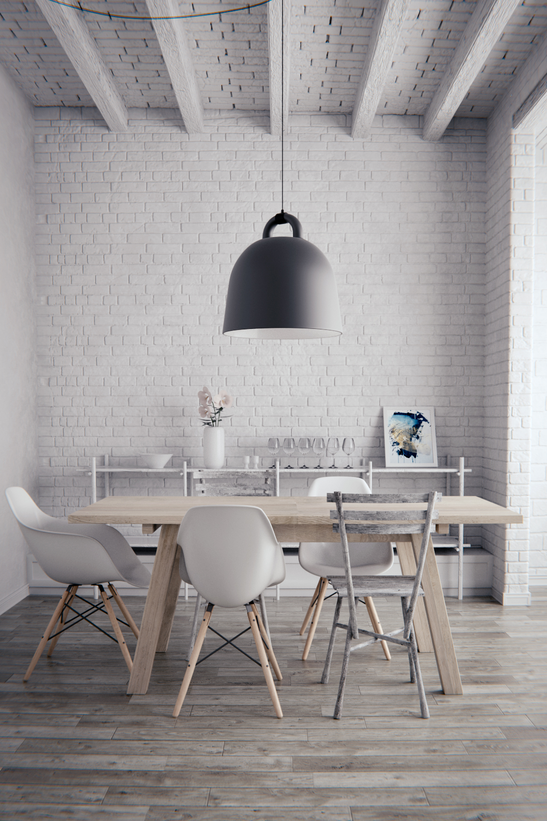
The reference should be a photo, credits Plechac et Henry Wielgus.
Actually i used the micro-displacement feature … i did many attemps, and in this last render i tried to improve it.
Attachments

I can clearly see that you nailed it.
I have to agree. The contrast in the render is much better.
Thanks reynante and thanks Candall 
Beautiful work. I really need to tackle a project like this as I think it would be a great learning experience.
I have the same opinion with you
Many thanks friends
We receive many info during this group
keep great publishing & wonderful pict

As many have said it before me, the textures are to “perfectly clean”. Also the wooden floor is a little too busy for my taste. In addition to the comments so far I would suggest a dial back on the achromatic abbreviation. Right now it really distracts me. Otherwise great work!
petty cool image - model texture depth is very impressive. lighting is also great!
Few things to consider:
the brick is wrong at the wall facing the camera right side of the image.
comparing the rendering to the photo you can see that your scene lacks indirect light strength
your image is darker in corners.
Interestingly your table is too bright - specifically the sides are way too bright compared to the table top surface.
Also I would step away from all those lens distortion effects. I think those rather harm the image.
I would call this effect design, you add some stuff to add just stuff without really needed it - nor does the effect
have any meaning in the image.
The scene is nice and clean very orderly and then you corrupt the top and bottom with the effect.
You also overlooked the fact that the camera in the photo looks horizontal preventing vertical lines to rotate.
Nice work. Can you show me your mat node for floor and can you show me how you made these chairs and bricks with step-by-step instructions?
Can i ask how you did the camera matching, did you use the BLAM addon or did everything manually?
The geometry and the shaders are great, but the lighting is completely off :-/ And it’s the most noticeable difference.
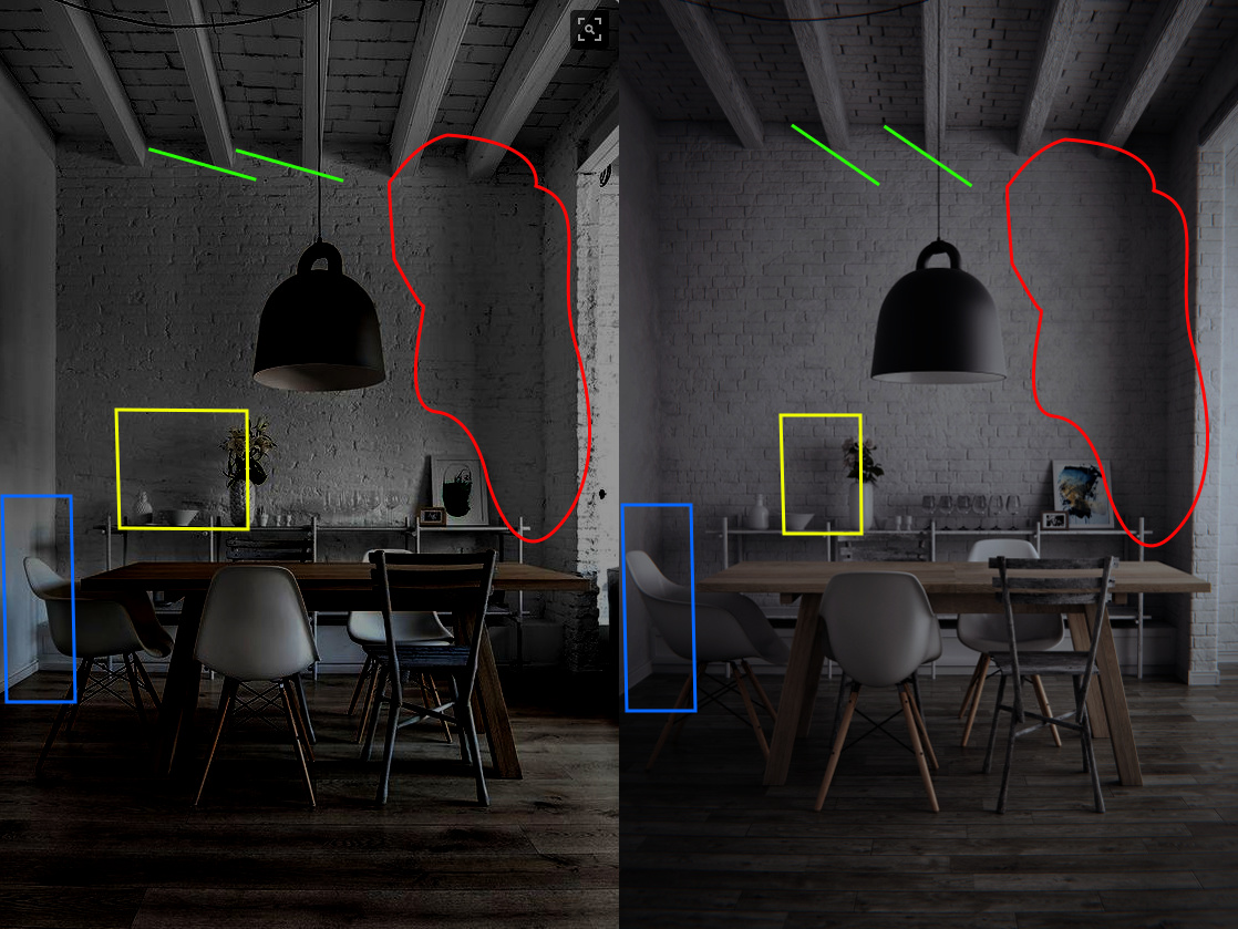
The angle of shadows on the ceiling shows where the strong light comes from (green lines). And in reference it’s more sharp. The second render has even worse blurry shadows than the first (blue area). It seems that the room on the right (offscreen) is a bit larger, and has its window not so close.
And the vertical shadow (column on the right, red area) shows that there are few different distinguishable light sources there, but in the scene it’s more uniform like from single light area. Also the vase’s shadow shows clearly that the light position is incorrect (yellow area).
There is a physically honest way to get the light right: try to ask the author to show what is on the right of the shot ![]() And there is another way: just fiddle with some large and small lights on the right to get correct shadows.
And there is another way: just fiddle with some large and small lights on the right to get correct shadows.
Anyway the details are Great!
The attached image is just a high-contrast version to better see what I’m talking about.