It’s nice to see how much blender is advanced, because many of the new modo features are in blender for many years.
On the other hand, e.g. mesh fusion has amazing feature - filleting, which is not possible with blender’s booleans/ booltool.
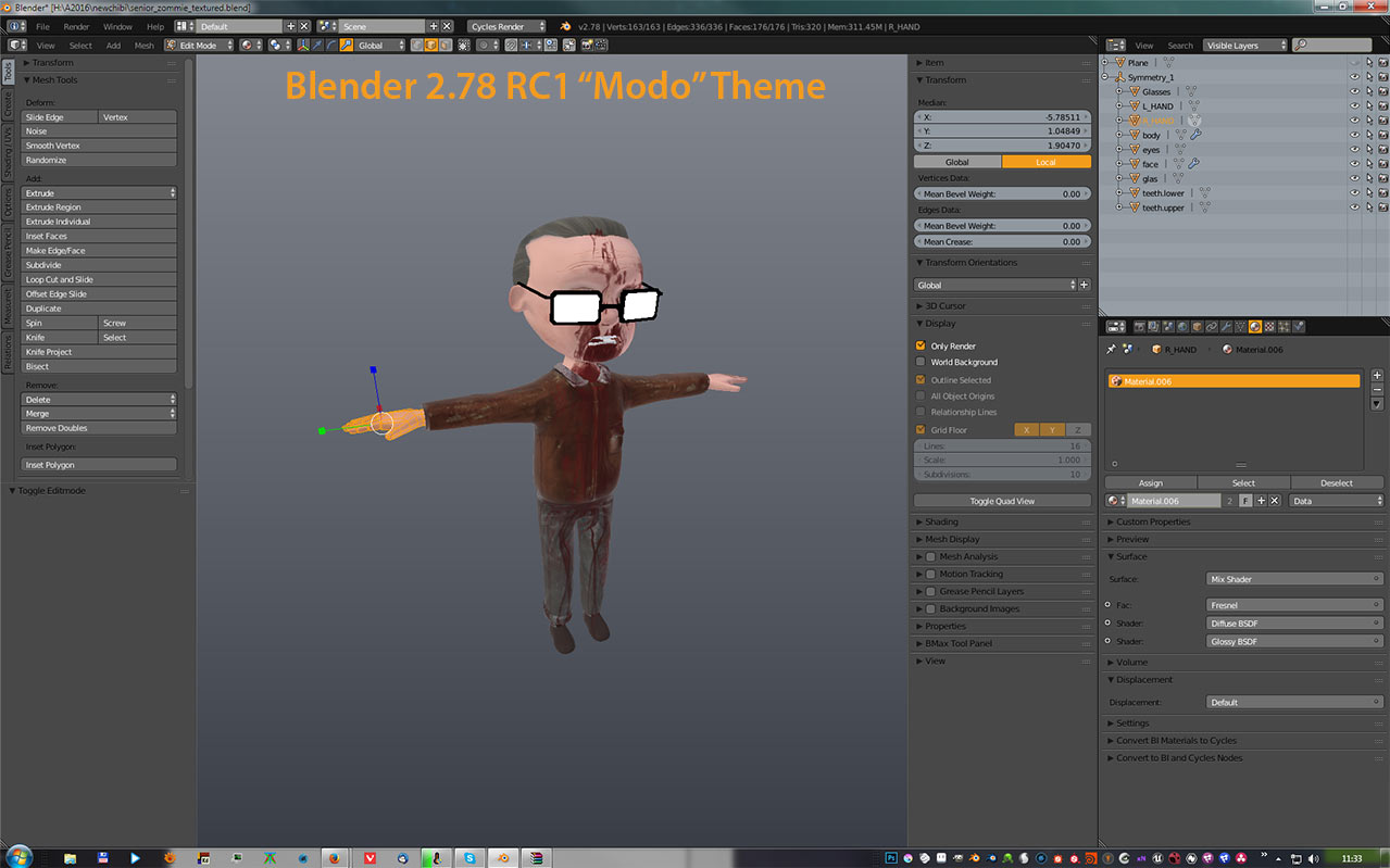
how come it looks so much as Blender ?.
Modo seems to be advancing faster than ever now, though I did kind of balk at that huge list toward the end of the procedural modeling video (I’ve seen complaints of Modo being too reliant on lists in their community and it looks like 10.2 won’t change much).
The automatic retopo also seems to have trouble automatically detecting feature lines with thickness (looking at the video, better than Blender’s current remesh solution even though it was never designed for such tasks).
I also wonder what the use would be in making the viewport render the final render (wouldn’t you likely have an odd resolution due to it being dependent on window size)?
Exactly… But nobody says Modo’s UI is bad… Hmmm…
Clearly you’re not too familiar with the MODO community. Almost everybody says that the MODO’s UI is inefficient, convoluted and outdated and urgently needs to be revamped - especially since Maya has gone above and beyond to streamline and beautify their UI over the last two years.
MODO’s UI was really sleek when it came out, but it’s showing its age - both visually and in terms of functionality. It’s not terrible but it’s no longer one of MODO’s strong points.
If you ask me, Blender’s UI has a nicer feel to it than MODO’s, but it needs to be rearranged, streamlined and de-cluttered. In terms of its look I really enjoy it - that is, if I use the Elsyiun theme.
I think Modo looks better, in terms of look (i like the icons), but i agree that the UI is inefficient, convoluted and full of lists.
I would say Blender will have a nicer feel to it if it is rearranged, streamlined and de-cluttered. The feeling i get occasionally from Blender is “indifference”.
I used Elsiun for the longest time then i found out that the low contrast made my eyes more tired than other themes so i switched to the one which was modeled after Modo.
In 2.78 i really like the new Amaranth and Energy theme.
Where can I find those? They’re not in the Presets list by default in my 2.78.
In the past, the Blender builder releases were the ones that comes with a lot of themes and stuff… I don’t know if it’s still the case…
Just give it a shot: https://builder.blender.org/download/
Hello, guys! I see many of you are in search of better theme for Blender (just like I am). So let me suggest you Momo (or here) - my humble attempt of recreating Modo UI colors in Blender. Also you can check my GitHub page (link in my signature), there’s a couple more themes.
As for Modo I wish we had one particular thing I fell love with - falloffs.
Momo looks very good , Big thanks to sharing this theme !

Chris, i use the first RC candidate of 2.78. The second has somethings missing (forgot what it was, sorry) so i didn’t upgrade.
TimoShch, thanks for the theme, its lovely and has nice contrast and visibility and i just love Dark, grey, Orange combinations.
In 2.78RC1 there is one other theme blatantly named “Modo”, that is not the same as your Momo theme. Is that yours too?
Anyways it seems we have more Modo themes than Modo now? 
Man, that Revamped Mesh Fusion looks really sexy as hell and they made it really user friendly, it seem like a killer feature now. I don’t know any other Highpoly workflow which is as fast as this. Especially for things like spaceships and other vehicles…
No, it’s not mine. I used it as a basis for my theme, but I modified it quite heavily. But I haven’t used my theme myself for very long time, and only recently, when I decided to take part in “Test Drive Modo” challenge on ArtStation (which forces me to spend much time in Modo), I updated “Momo” theme (now it’s fairly close to actual Modo UI colors, much closer than the first version). Anyway, I’m glad you, guys, like it :).
Modo´s UI has looked basically the same since 101, which was… 2004?
Wasn’t Modo’s current UI inspired by Blender’s old one (2.49b and earlier)?
As far as I remember, they took pages from that design and improved on it (and now it looks like they have the issue of the application outgrowing the design like Blender did).
I don’t think I can take any opinion seriously that includes Maya in the list of streamlined and beautiful UIs, even post-updates. Maya’s interface (and keep in mind, I only use Maya for rigging, animation, and rendering) has very little coherency, and especially for rendering puts related, vital settings all over the place, especially when Hypershade is tossed into the mix.