i appreciate any suggest in order to improve the lighting, shading, composition of the image, and every constructive critic
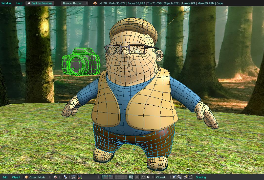
all from the concept was made in blender (by now) i wanna improve the textures in PS, and maybe do some post too.
Please let me know your impressions, i really want to level up my art. thnx and grettings.:o
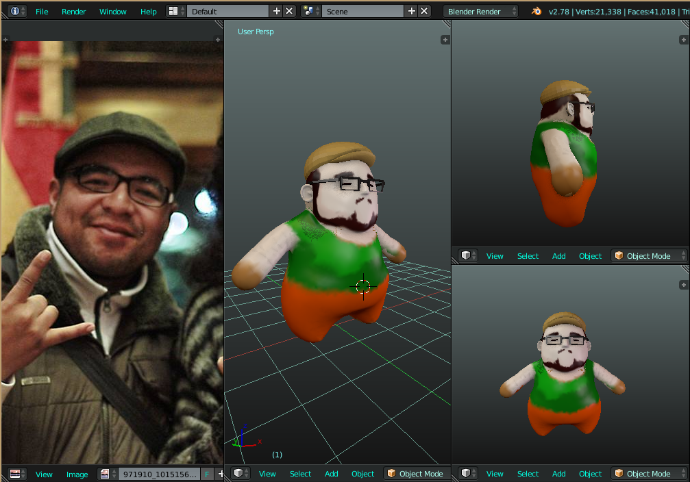
I Really like this start. The character has an authentic feel to it (perhaps due to the likeness) There are a few big issues that jump out and fixing them will improve it greatly.
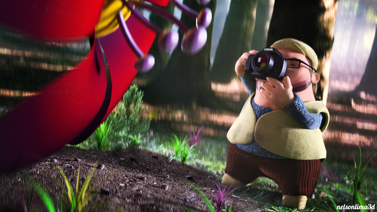
Color scheme. There is none. There are saturated hues in red, green, purple, blues… it jumps off very loud and messy.
The background tree photograph contrasts styles too much. And the ground plane of grass looks too flat at the viewing angle. The character and the big flower are toon and the rest is realistic. I would model simple toon trees, etc…
hi there, thnx a lot Photox really nice crits, i change a few things included the ground and i try to make the color more pleasant, so now i go for more detailing and clean up
I think you did a nice job on transporting the real life person into this character. The ground doesn’t appear to be too flat anymore. I can mostly replicate Photox, but I will try to explain it more from my pov:
colours: your aim is to guide the viewer with colours or make something pop. Atm my eyes are drawn to many different locations and can’t rest on something specific (eg the flower or the man).
different styles: well put by Photox. Currently you’re mixing the styles too much. I’d even say, that the man is a different style compared to the flower, since you’ve got nice textures with bump on his clothing, esp. his trousers and his sweater. The flower looks very flat. And the third part is the ground and the background. Modeling more assets and putting more time into the materials will cost more time, yes - but I’m sure it will also help your image!
blur: to me it seems not like standard gaussian blur but more like in-motion unsharpness. It may be just a personal feeling, but I guess it makes my eye even more unrest. Maybe try a more standard dof and see whatcha prefer =)
Different styles still have to fit, and putting more than 2 together might be very confusing, if it’s not the main purpose of the image, which I guess is not the case here. I would try to focus on thinking about what kind of story you want to tell, what the most important part is and the go for it