Any advice?
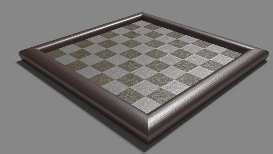

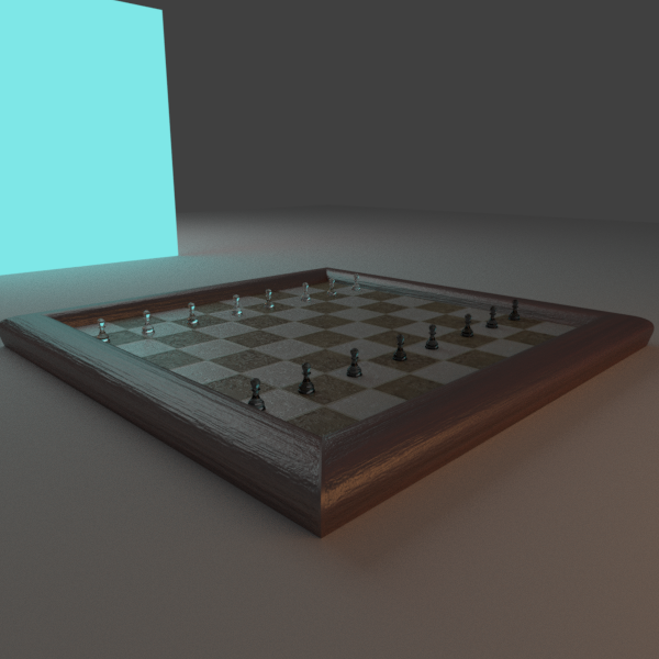
I know it is a bit boring at the moment, i probalby will add some chess peices soon. I think that at the moment it looks ok, if you have any critique, feel free to speak.
Thanks
Any advice?
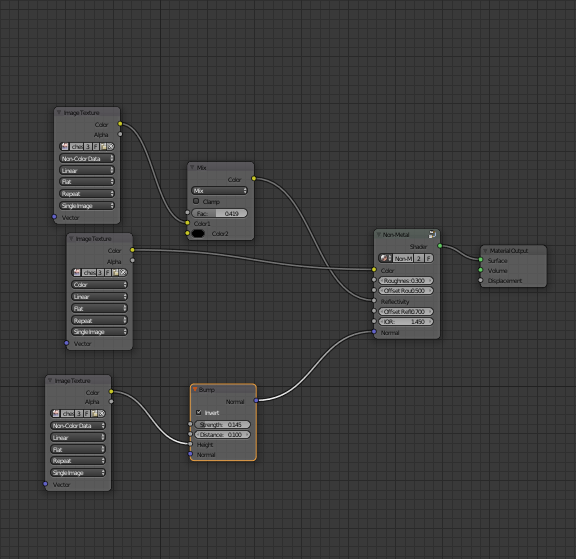
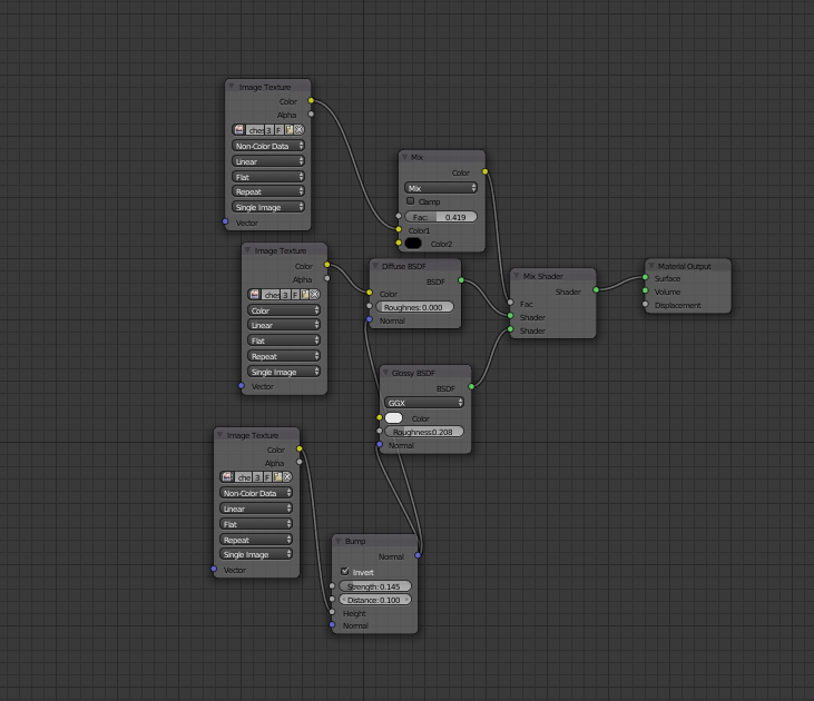
First thing to point out is that you have three image nodes on the left of your material - all appear to be the same image, if this is the case and for ease of maintenance you can remove two of these and plug the “Color” node of the remaining Image Texture into you “Mix” , “Diffuse” and “Bump” nodes. What you have done is not incorrect, but as your material gets more complex, or you want to change the image, you only have one node to change.
I like the idea, let’s see where it goes…
Cheers, Clock.
Ahoy,
I would say you could improve your picture with better lighting, an HDR maybe. To get even more realism you could mix some variation into the roughness of your glossy shader (maybe a musgrave, but you’ll have to tweak that a bit) and for me the wooden frame could need a tiny little bit color variation, maybe a real wood texture or some procedural stuff.
Harle
wow, i didnt expect so many replies.
firstly: they are not the same image, They are all different texture
Secondly: nice composite!
Thirdly: i have just made some adjusments to my lighting aand added some pawns
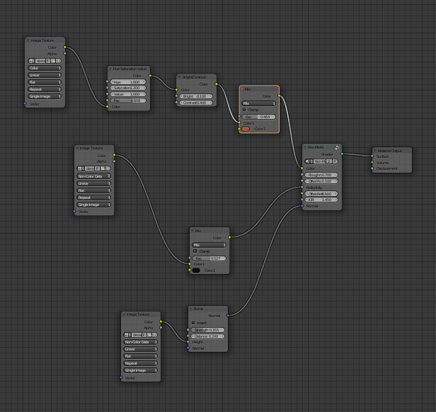
also, this is a real wood texture
You need to mix your glossy shaders with the diffuse using a fresnel input if your going for realism 
Have a read through this, it helped me out last year when i was still getting to grips with realistic cyles materials 
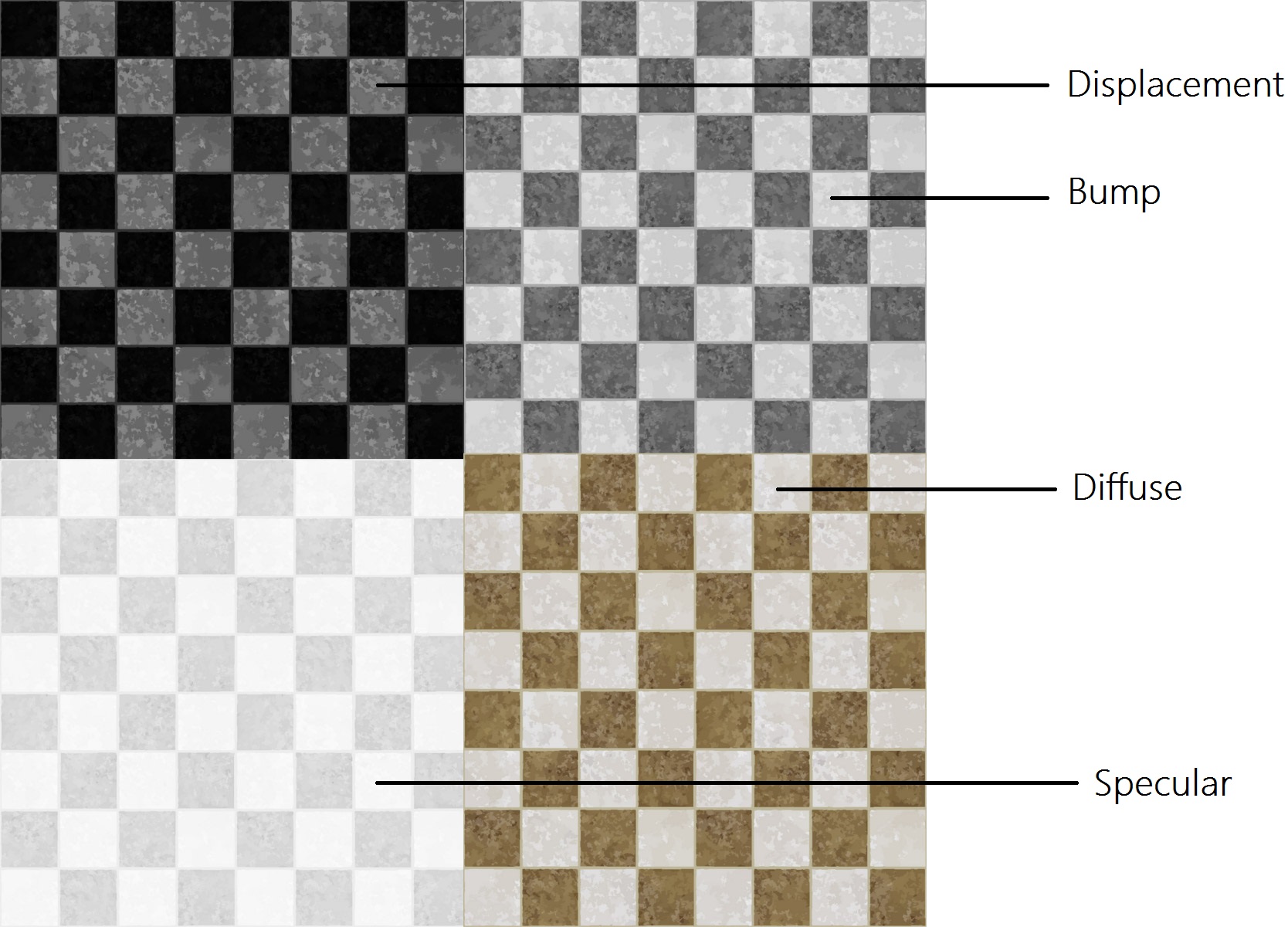
Well ok then, ijust remembered, i have a PBR material shader from andrew prices tutorial:
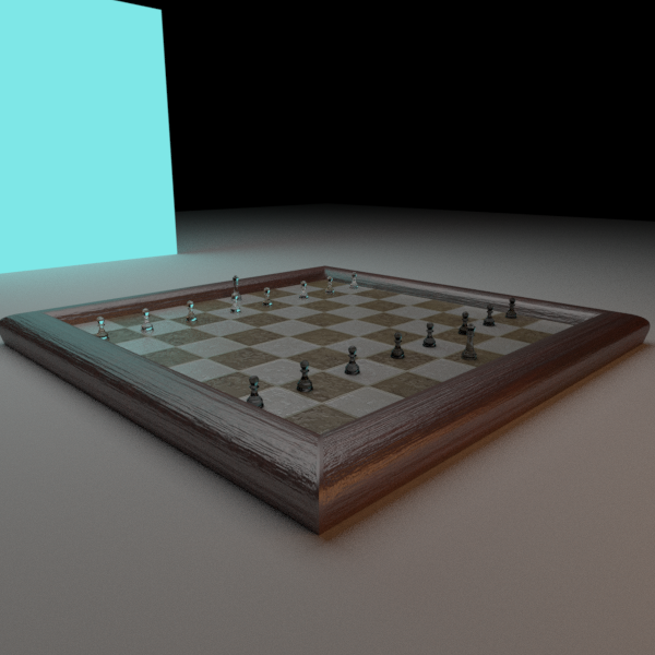
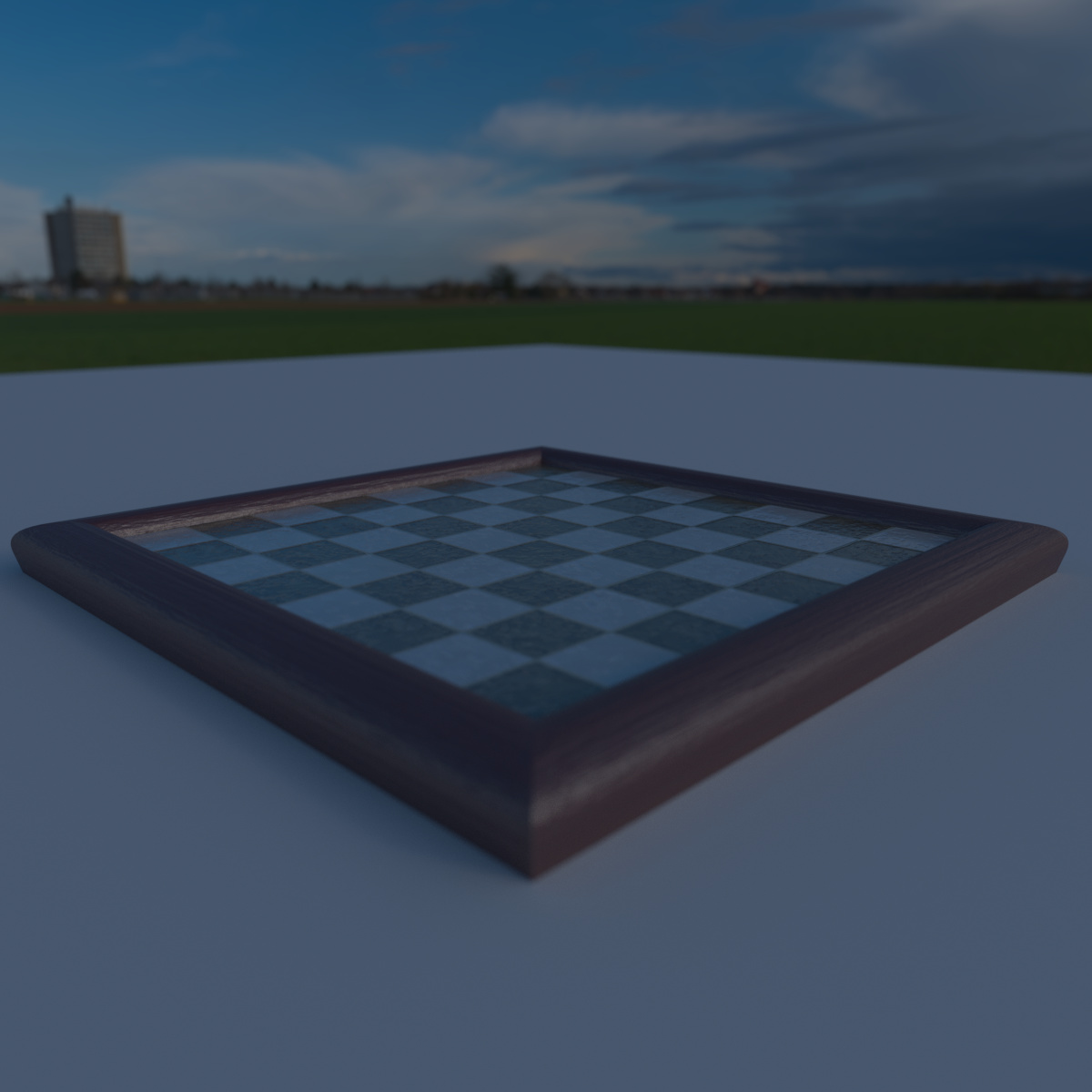
well anyway here is the new render
i think that i am going to put tuhis in a scene, maybe a fancy resturant kind of stting, any thoughts?
something along the lines of this:https://www.google.tt/search?newwindow=1&tbm=isch&q=fancy+restaurant+interior&sa=X&ved=0ahUKEwj338HipPTPAhWLKyYKHdEbBHUQhyYIHg&biw=1745&bih=873&dpr=1.1#imgrc=iSOfzvxwW62wMM%3A
Hi
Looks good…
But I think…The Chess Pieces are too small, and the board is too far down in the frame…?
A chess piece takes up almost the entire field it stands on.
Nice work
Tai
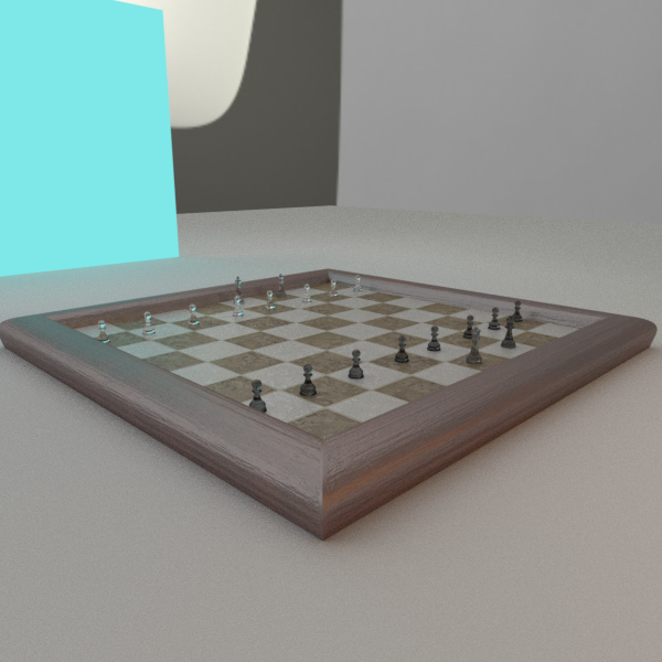
A good start! I think you may have too much bump, particularly on the board itself. I’d expect the surface of the board to be smooth, depending on the material. What is it made of?
Id also agree with adding a HDR to light the scene. If you can’t find any, I’m pretty sure Andrew Price at Blender Guru has a couple of free ones floating about in his Arch Academy intro tutorials.
ok taken some advice, used a hdr, moved the boardup and i got rid of the displacement.
It kind of lookf out of place.
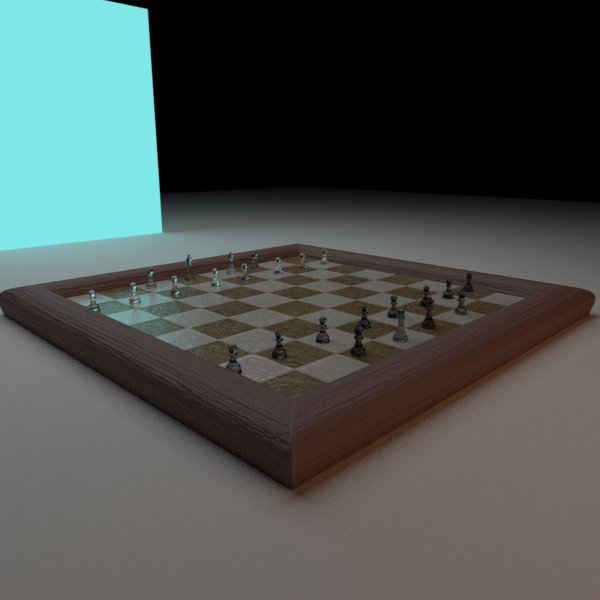
I actually got my inspiration from 2 chess boards i have at my house.
one is flat and the other has a shinypattern and bump on it:
not sure of the material though
Wack the HDR strength up quite a bit.
If you’re planning on including the chess pieces, they are a bit too small in my opinion–by about a factor of 2 I think. Looking better and better with each revision.