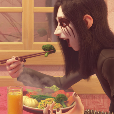
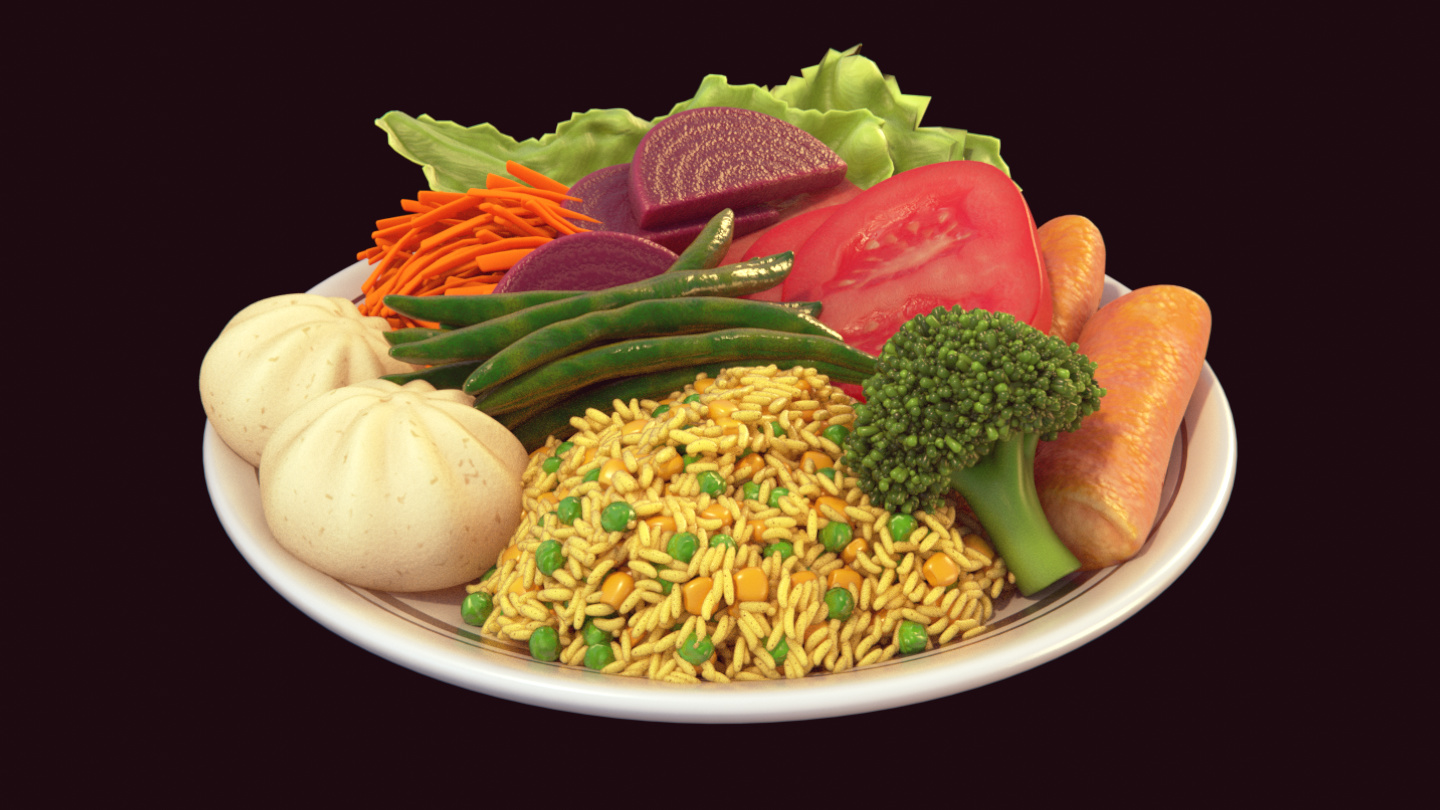
This is my lastest work, which I finally finished. The basic idea that I had in mind was create a contrasting situation that was funny and unusual between this young black metal dude and his colorful vegetarian meal.
Big thanks for everyone who gave feedback and helped to improve the image. :yes:
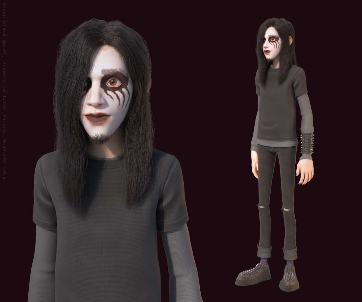
Tools used to create the image, Blender, Krita and Substance Painter and the render was done in Cycles.
Great work! I really like the attention to detail and just the overall fidelity of the scene! Looks like it could be straight from a pixar movie
Really love that style! You totally nailed it!
That is a really fine work, but since you asked for criticism in your WIP post, here it goes.
Is it just me or the image is just not sharp at all. I really, really find those details amazing and perfectly made in every aspect, but all these works bypasses my eyes because the image is not sharp enough.
I didn’t notice any of those unbelievably details until you showed me here or in your WIP post. If this was a picture, it is like saying it was taken by a bad quality camera.
Also, maybe balancing the colors would be a good idea. Maybe adding a blue background behind the window would balance out all this overwhelming red in the image. But I am no expert on this subject, so it is up to you to take your own conclusions.
And that’s it. I do find this an amazing work and I would never achieve such thing, but these tiny detais bother the heck out of me, because in my opinion, it could be so much better.
frankerzederede, oh thank for the that feedback! I didn’t see that before, but the quality of the image on the attachment is not good. I’ll fix this right now, thanks again.
Wow I really like the cartoony shade of material in the table cloth and chair and clothes. Also wonderful detail in the wall, and nice smoke too. This is a downright amazing image, only thing is its kind of a weird story lol. He seems so excited about his food.
Yeah, great stuff. Reason I clicked was I immediately saw the picture tried to tell a story - a funny and unusual one even I rarely comment on “great renders” of which there probably are many, they would have to be exceptional of which there are few. But tell me a story, and even bad renders mean more to me than great ones without a story.
I pretty much agree with frankerzederede’s criticism go; a bit soft. Although a bit red heavy, maybe the situational contrast counterweights that a bit? Maybe… When cartoony, I really like strict color scheming.
Edit: The original png doesn’t looks so soft, so maybe just my browser acting up, combined with a bit of lack of color contrast.

